Advance with Assist shares quick solutions to common challenges encountered by the InterWorks Assist on-demand team.
Question: How do I use the new map layers feature without having to join, blend or use relationships to connect my data?
The answer to this question varies based on which version of Tableau you’re using. To work with map layers with 2021.3 or earlier, reference Ryan’s blog post. For those with 2021.4 or later, follow along here.
It’s easy! Let’s begin by jumping into a workbook with the Global Superstore data in Tableau Desktop. We start by looking at a map of the United States with each state showing its profitability ratio.
For our example, let’s say that you’re an analyst at the Superstore, and you want to look at advertising opportunities in airports across the U.S. in a combination of the states with the highest profitability, the size of the airport in terms of traffic and its flight cancellation rate. We’re going to use map layers to do this analysis quickly and easily by simply bringing in the flight data.
Finding Geographic Patterns with Map Layers
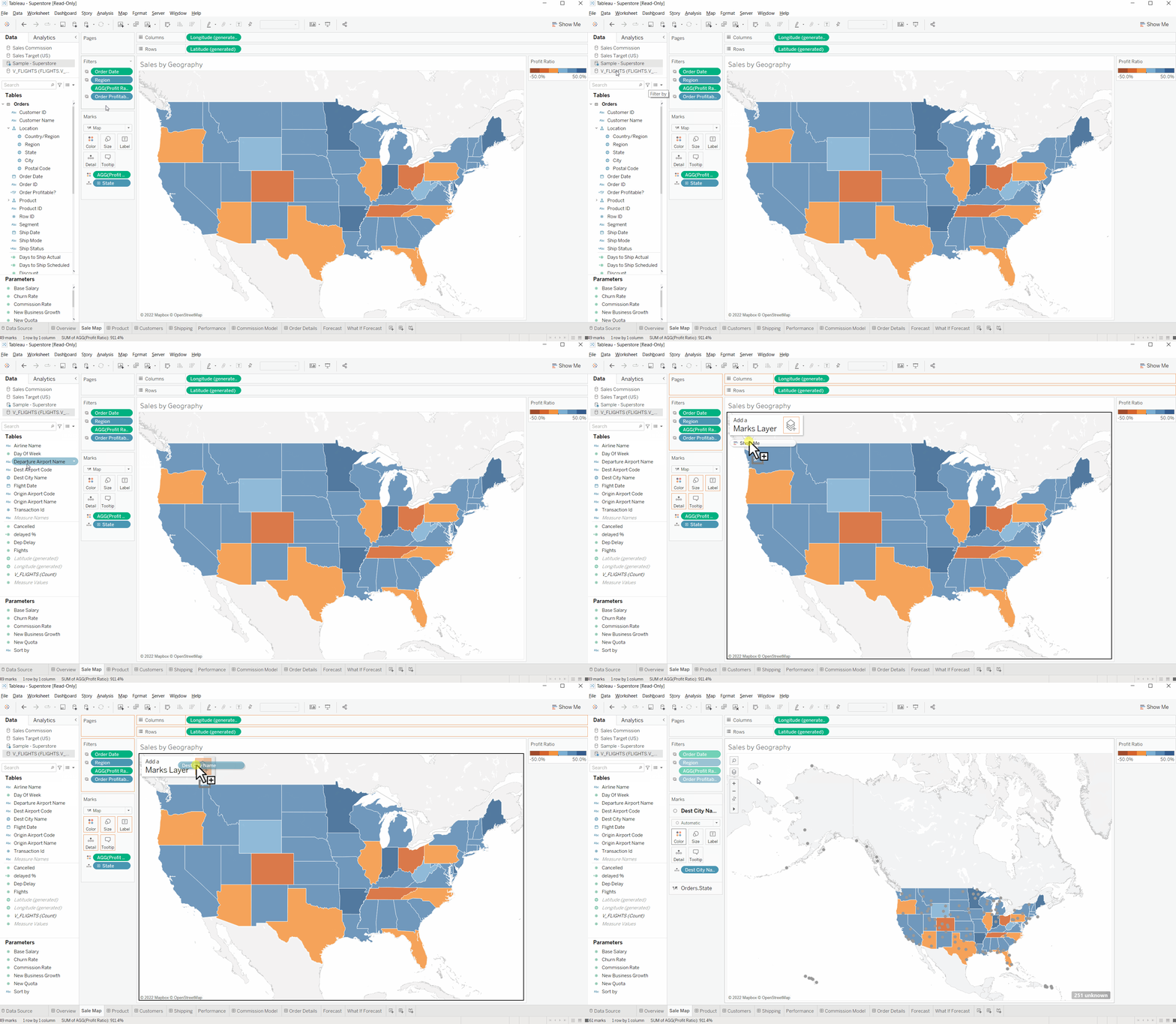
Using map layers is really simple. Once you have your first map built with your first data source, click on your second data source and drag the geographic field into the map layers button which appears in the top-left of the view. You can see how below:

Simple! Notice how you did not need to define any blend, relationship or join. Think of it as two separate sheets stuck on top of each other geographically.
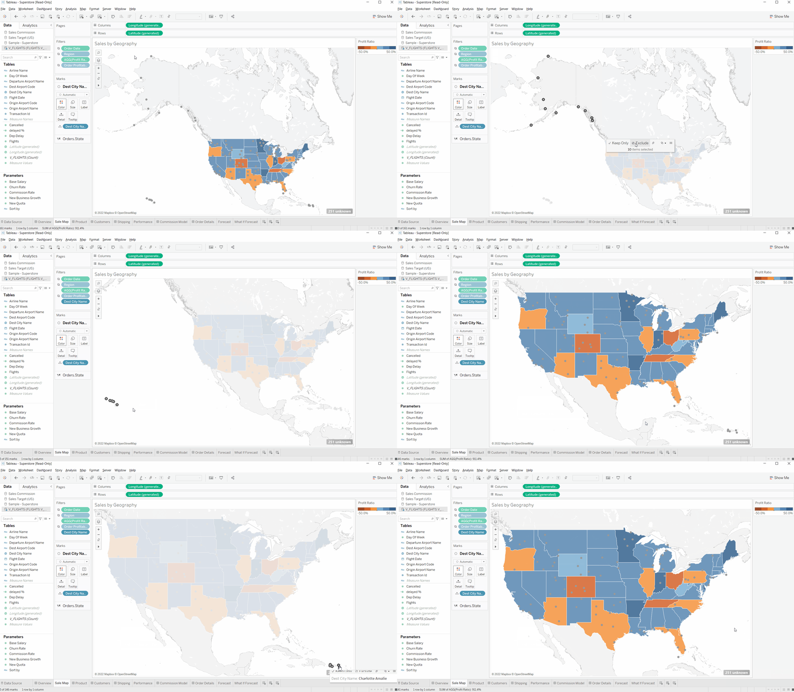
For our scenario, we want to look at airports within the contiguous U.S. We can make a small adjustment to exclude the data we aren’t considering, leaving the geographic area we want to know more about:

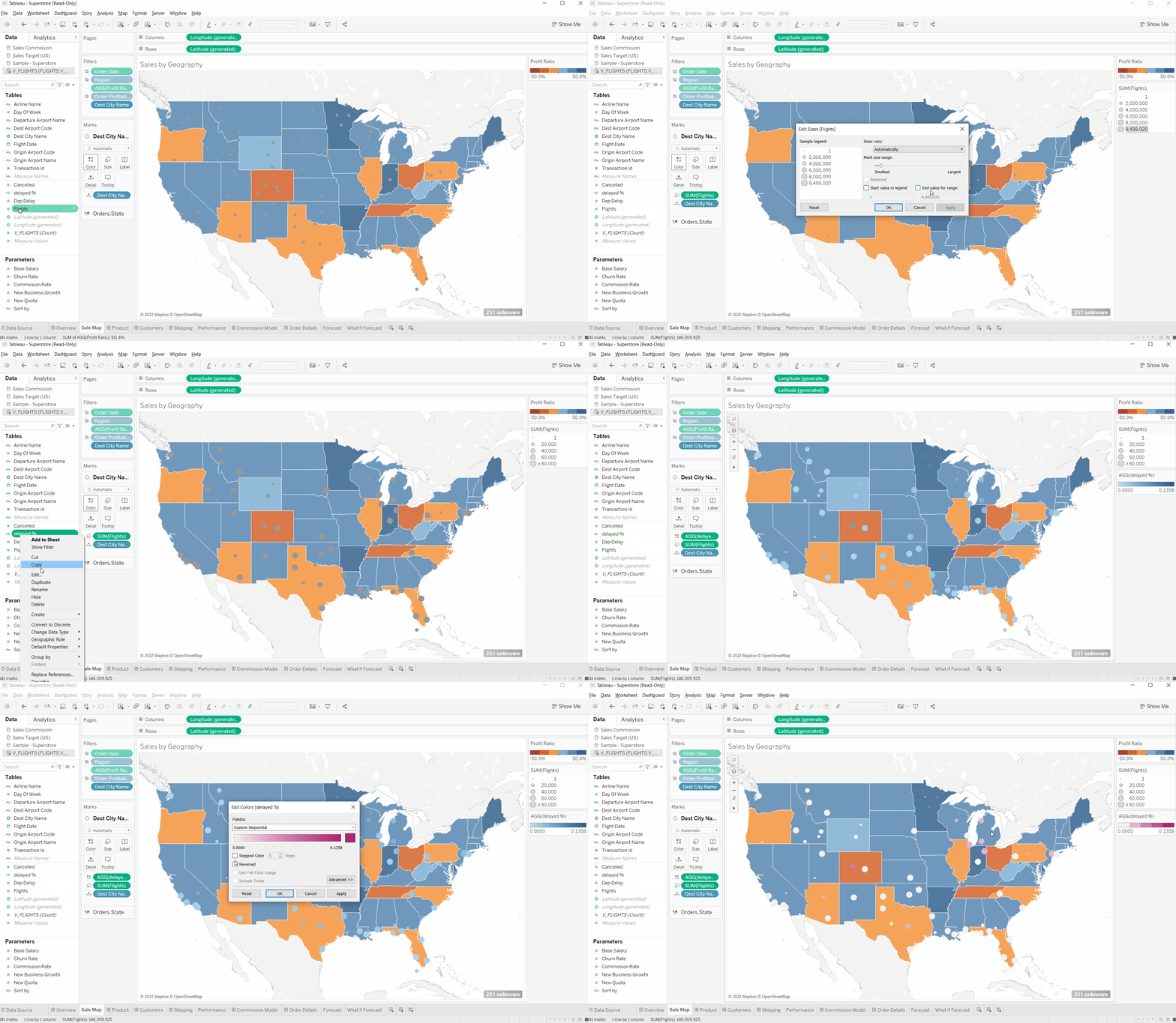
Next, we’ll look at the number of flights across these airports. Take flights and drag them onto Size, which reveals how much traffic each airport yields. Then we’ll take cancellation rates and bring it onto Color. This highlights the airports with high cancellation rates, up to 14%, compared to those with low rates:

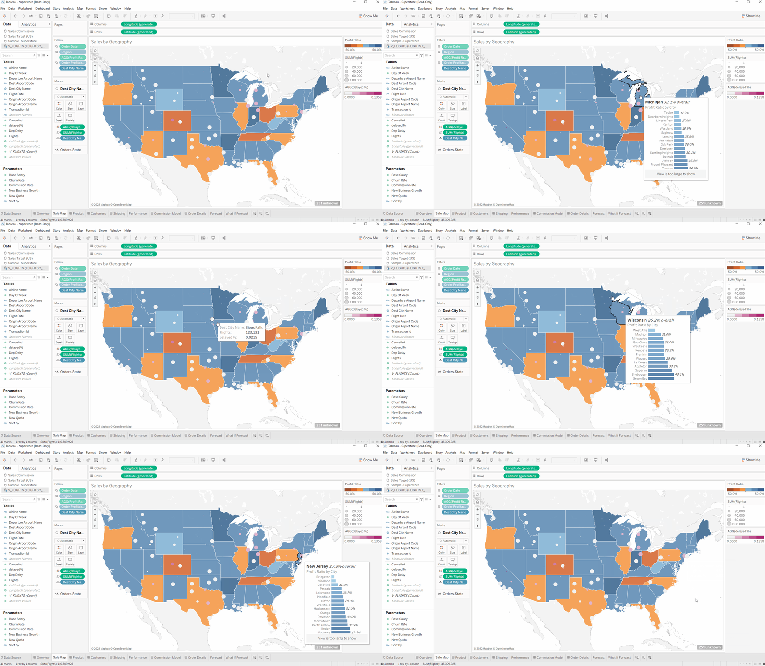
Have a look at all the insight we can now draw. We can compare the patterns that emerge geographically between the profitability of the states (from the original data sources) and the opportunity within the airports (cancellation rate and flight traffic) that emerges from the secondary data source—all within seconds and all without needing to connect the data sources together:

For a thorough walkthrough of this solution step by step, watch the video below:

