Portals for Tableau 101 shares the basics of interacting with InterWorks' embedded analytics solution, Portals for Tableau.
Please note that Portals for Tableau are now officially known as Curator by InterWorks. You can learn more at the official Curator website.
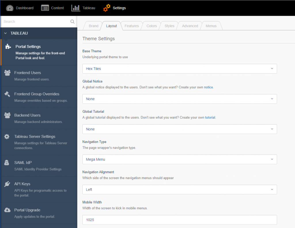
In Portals for Tableau, we understand the need to customize the look and feel of your portal for the front-end users. We provide a few different styles that you can utilize to give a unique experience for your users. These navigation types are the standard Top Navigation, Top Navigation (No Subnav), Mega Menu, Side Menu and Mobile Menu navigation displays. To change these settings, navigate to the portal backend and log in. Once there go to Settings > Portal Settings > Layout and select the Navigation Type drop-down field.

Top Navigation
Our Top Navigation is the standard for most web sites. This navigation rests at the top of the page.

Our menu depth is fixed to display three levels in total. An admin user can set the Top Navigation to either be left or right-aligned. You can also add in your own custom CSS to style the front-end user experience to suit your tastes.
Top Navigation (No Subnav)
This navigation is the same as the Top Navigation, except it does not have a sub-navigation bar under the normal navigation bar. The sub-navigation bar is used to display titles for pages, dashboards, etc. as well as the dashboard action buttons. This menu type combines them all into the Top Navigation bar. Use this if you don’t have many menu items to display.
![]()
Mega Menu
The Mega Menu forgoes the traditional display of the Top Navigation menu in favor of showing you all the content at one time. It displays a large panel of content that is shown below a menu item. The colors of the Mega Menu use the sub-navigation colors to allow for a contrast with the main menu.

Side Menu
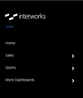
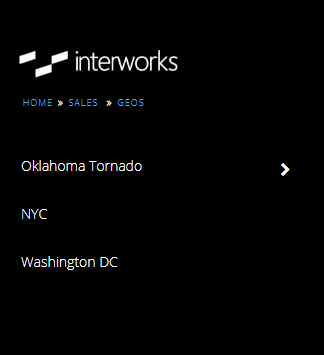
When you have too many top-level menu items to display, the Side Menu will come to the rescue. This menu type displays on the left side of your portal. It stretches the full height of the page and allows you to add in many top-level menu items. The navigation from one menu item to the next is all contained inside the menu instead of displaying hidden dropdowns. This allows us to display more than three depth levels. We also add in a breadcrumb navigation trail to navigate back and forth. As with all the menu types, it can be styled to fit your needs with custom CSS.
 |
 |
Mobile Menu
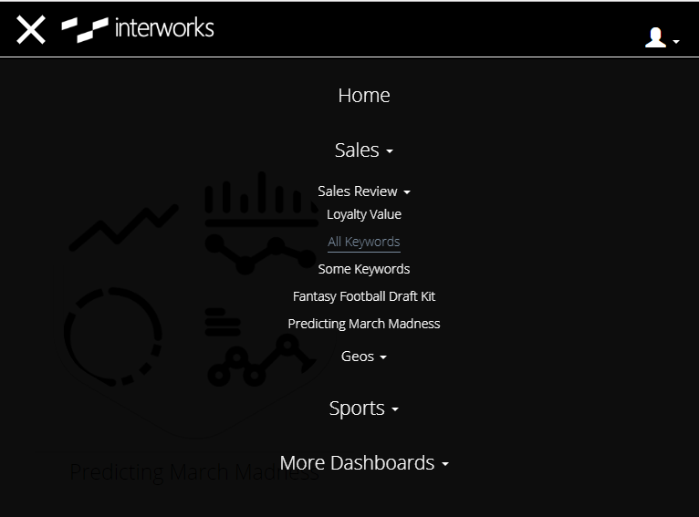
With all our menus we do use responsive design. You can set a specific width in the backend to display our Mobile Menu. The Mobile Menu will trigger when a resolution matches the value you entered and anything less. By default, we set this to be 1025px wide.


All these options cover most of the current menu types found on the internet. As more and more unique styles come out, we will continue to add more menu types so that we can provide our customers with options that best suit them.

