Tableau Deep Dive: Sets – IN/OUT
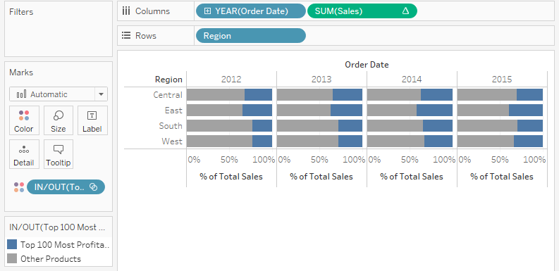
In all of our previous examples of this Deep Dive, we’ve been adding our new sets to the Filters card. That’s filtering our view (as well as limiting the membership available in our filter control as we did in part two). What happens if we drag our set directly onto our Rows or Columns? What […]
InterWorks Blog Roundup – October 2016
October was a busy month for InterWorks. We were in the heat of planning for two major conferences, InnoTech Oklahoma and Tableau Conference 2016, but our bloggers came through with some really great content. Give it a look below! News InterWorks Sponsors 11th Annual InnoTech Oklahoma InterWorks Earns Distinguished 2016 CRN Triple Crown Award Tableau Conference […]
Tableau Deep Dive: Sets – Computed Sets
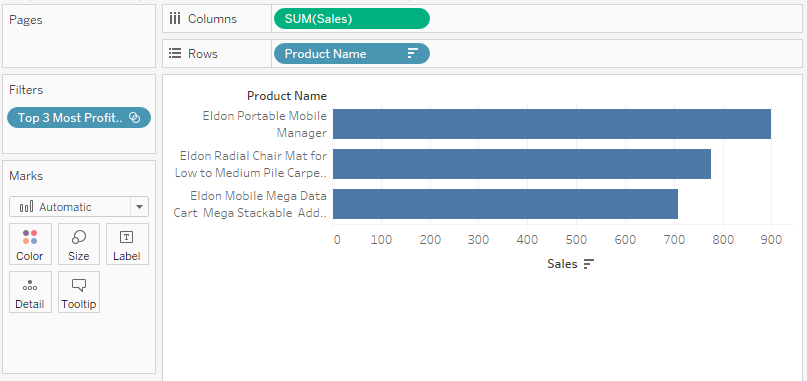
Computed sets use logic to dynamically update the membership of the set. This is the key distinction between constant sets and computed ones. Changes to the data will change the set itself as it re-computes what gets classified as IN the set and what gets classified as OUT of the set. Computed sets can only […]
Tableau Deep Dive: Sets – Constant Sets
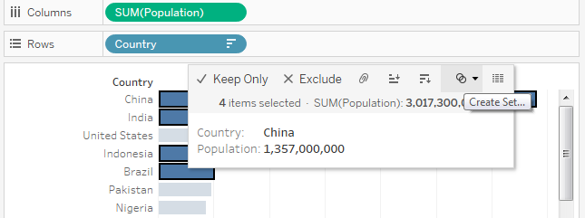
Constant sets are sets that once created do not change. If the underlying data changes, the membership of the constant set does not change to reflect these differences. These are also known as manually created sets. In this part of our Deep Dive on sets, we will examine how to create constant sets using a […]
Exploring D.C. Metro Delay Data in Tableau
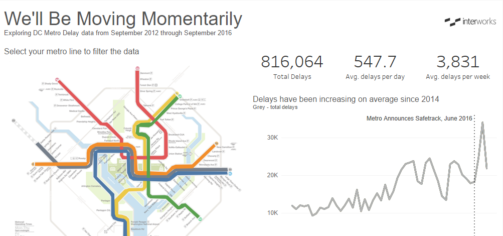
Washington, D.C.’s Metrorail, opened in 1976, covers 110 miles of subway track, 6 metro lines and 91 stations. System upgrades have been long overdue, with considerable malfunctions and delays surfacing at greater frequencies over the past few years. From a train fire that killed a passenger to operators abandoning their trains once their shifts are over, the […]
The Tableau Conference 2016 Session Finder
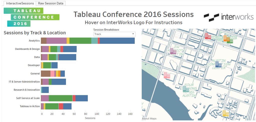
Tableau Conference 2016 is rapidly approaching, and data visualization aficionados from around the world will descend upon Austin. While the expo hall will be a great place to explore the Tableau community (be sure to visit InterWorks at booth #107) and events like Data Night Out promise to be a blast, the sessions make up […]
Tableau Deep Dive: Sets – Introduction to Sets
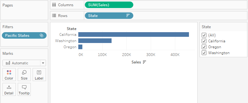
The idea behind a Deep Dive article series is to spend far more time and energy on mastering a topic than what would be possible inside a traditional learning environment. We’re going to dig really deep into sets over multiple articles with real world use cases and examples. Here’s our article schedule: Part 1: Introduction […]
PYD19 – Behind the Scenes at InterWorks for TC16

Ever wonder what it takes to get 35+ people from all over the world into one place all while designing a booth and collateral at the biggest conference for this Terabyte sponsor? In this episode, you’ll go behind the scenes with members of the InterWorks Marketing and Operations teams to see how they pull it […]
How I Went from Homebody to InterWorks Road Warrior
Working at InterWorks has changed my life in so many positive ways. One of the biggest changes was taking on the challenge of traveling to new cities across the country (and world) every week. To understand the magnitude of this change, let me tell you a little about myself. I grew up in Baton Rouge, […]
Brace Yourselves, Tableau Conference 2016 Attendees – InterWorks Is Coming
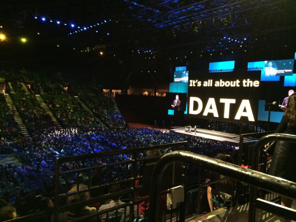
Above: The keynote for last year’s Tableau Conference. Expect another landmark year! The 2016 Tableau Conference (TC16) in Austin brings together customers, partners and data enthusiasts from around the globe to discuss, connect and learn about data analytics. TC16 features more than 400 sessions, 100 hands-on training labs, inspiring keynotes and appointments with Tableau experts. […]