Not everyone is a Tableau guru, at least not yet. To help Tableau rookies, we’re starting from square one with the Tableau Essentials blog series. The series is intended to be an easy-to-read reference on the basics of using Tableau Software, particularly Tableau Desktop. Since there are so many cool features to cover in Tableau, the series will include several different posts.
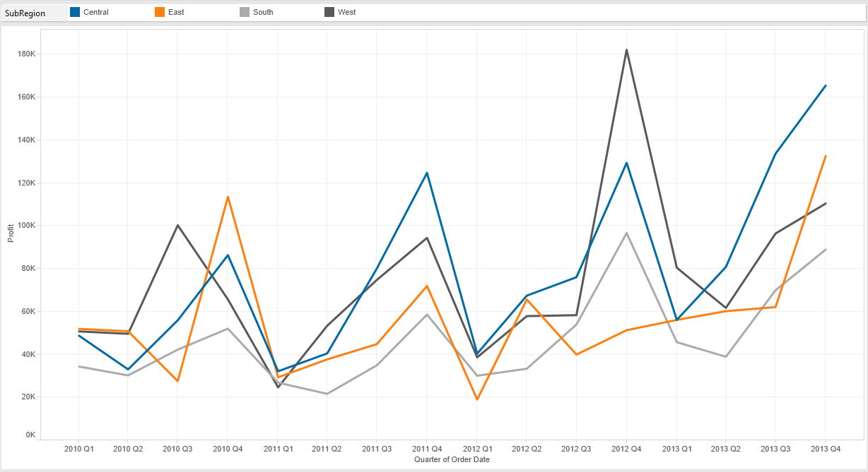
The line chart is ideal for when you want to illustrate trends over time. To use the line chart, you must have a date field. In the below example (Figure 1), we are comparing the quarterly profit by SubRegion over the course of several years. Each colored line represents a different sales region.

Figure 1: Line chart (continuous).
You can immediately see that there is a sharp uptick in profit during each Q4 season across regions. That shows that our fictional company is extremely seasonal. That’s the main “story” that is being illustrated with this view.
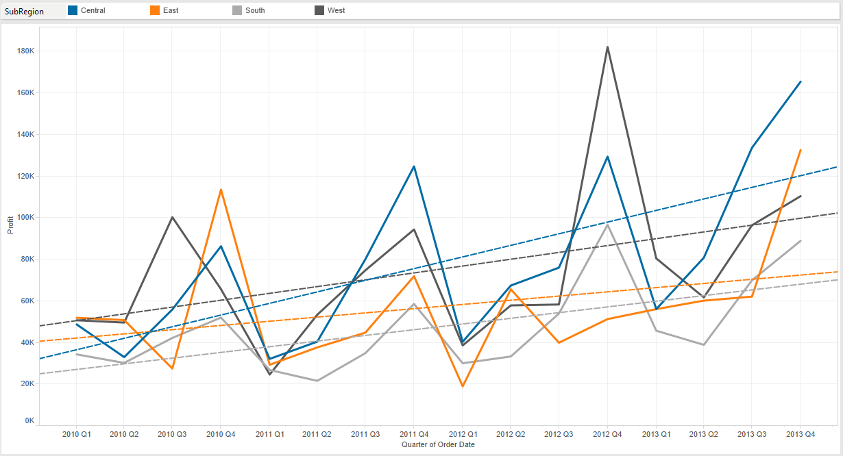
If I were to add trend lines to this visualization, it would tell a different story. To add a trend line, right-click in the view and select Trend Lines > Show Trend Line.

Figure 2: Adding trend lines.
You can now see that rather than emphasizing a quarterly spike, we’re showing that our business is steadily growing despite seasonal fluctuations in regional sales.
Continuous vs. Discrete
Tableau presents two options for line charts in the Show Me menu – Lines (continuous) and Lines (discrete). Continuous fields can have an infinite number of values, such as temperature on a thermometer.
Discrete fields, on the other hand, contain a finite amount of values, such as the number of students in each classroom for a school. Tableau gives you a hint on which fields are discrete or continuous. Discrete fields are colored blue when dragged to the Column shelf or Row shelf, and continuous fields are colored green. You can learn more about continuous vs. discrete in this post by Michael Treadwell.
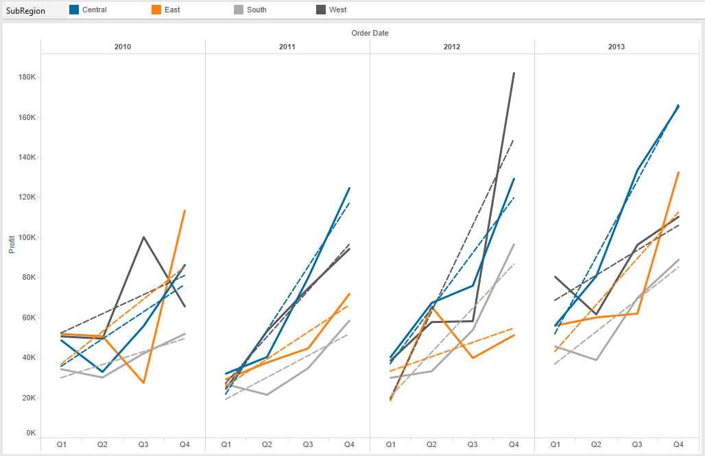
Let’s look back at our example from Figure 2. What if we wanted to illustrate the seasonal uptick in Q4 for each business region with a trend line? We would use the Lines (discrete) chart type.

Figure 3: Line chart (discrete).
You can see that regional sales volume is now broken into discrete values by year. The trend lines for each year clearly illustrate the increase for seasonality.
Whether it’s looking at the whole picture or honing in on specific trends, the simple examples above show us that each type of line chart in Tableau has a defined purpose. Use them accordingly!
Other Chart Types
Here is the complete list of chart types from the Show Me menu. Be sure to check back often as we continue to release new articles in each chart type in this sub-series.
- Text Table (Crosstab)
- Heat Map
- Highlight Table
- Symbol Map
- Filled Map
- Pie Chart
- Horizontal Bar Chart
- Stacked Bar Chart
- Side-by-Side Bar Chart
- Treemap
- Circle View
- Side-by-Side Circle View
- Line Charts (Continuous & Discrete)
- Dual-Line Chart (Non-Synchronized)
- Area Charts (Continuous & Discrete)
- Scatter Plot
- Histogram
- Box-and-Whisker Plot
- Gantt Chart
- Bullet Graph
- Packed Bubbles
More Tableau Essentials
Want to learn more about Tableau? We have several posts outlining all of Tableau’s fantastic features. Check out the full list on our Tableau Essentials blog channel.
As always, let us know if you have any questions or comments about this post or Tableau in general. If you’re looking for personalized training or help with something bigger, contact us directly!


