
Not everyone is a Tableau guru, at least not yet. To help Tableau rookies, we’re starting from square one with the Tableau Essentials blog series. The series is intended to be an easy-to-read reference on the basics of using Tableau Software, particularly Tableau Desktop. Since there are so many cool features to cover in Tableau, the series will include several different posts.
Compared to the other chart types, the box-and-whisker plot (also known as the box plot) is a bit more complicated. Before we can delve into an example of how it is used within Tableau Software, we have to explain the logic behind this type of view. After that, we’ll build an example.
Here is a box-and-whisker visual:
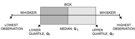
Figure 1: The box and whiskers.
The box represents the values between the first and third quartile (also known as the interquartile range=Q3 – Q1). The whiskers represent the distances between the lowest value to the first quartile and the fourth quartile to the highest value. Each quartile has a specific numeric value, determined from the data set.
You start by determining the median of the data set. That is where the box turns from grey to light grey. Then, the upper and lower quartiles are determined. These are simply the median of the upper half of the data and the median of the lower half of the data. That forms the “box.” The maximum of the data set is the upper range while the minimum of the data set is the lower range. That forms the “whiskers” of the plot.
4, 5, 11, 12, 13, 15, 17, 17, 19
Consider the numbers above as a very simple data set. We’ll illustrate how a minimum, Q1, the median, Q3, and the maximum are derived from them.
| Minimum: | 4 | the lowest number in the data set |
| Q1: | 11 | the median of the lower half or first quartile |
| Median: | 13 | the middle number of the data set |
| Q3: | 17 | the median of the upper half or third quartile |
| Maximum: | 19 | the highest number in the data set |
Things get a little more complicated when you start to consider outliers or data points that are not representative of the data set. For instance, what if the data set above had another number in the range like 287? That’s so far out of the normal set of data that it wouldn’t make sense to let it serve as the maximum.
Instead, it is an outlier, which is represented by a single dot.
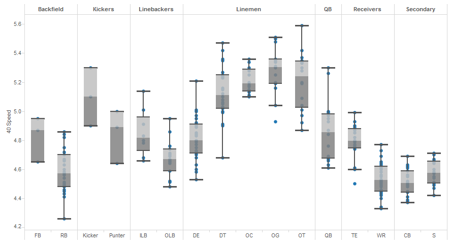
Figure 2: Box-and-whisker plot.
The plot above (Figure 2) is a great way to illustrate the effectiveness of the box-and-whisker plot. The visualization is a representation of the 40-yard dash times from the 2014 NFL Scouting Combine broken out by position. You can see the standard grouping of speed by each position in the box and the dispersion of widening scores in the whiskers.
In the guards (OG) and tight ends (TE), you can see the only two outliers on the plot. If you look at the upper whisker (i.e. the slower players) and the compare it to the lower whisker (i.e. the faster players), you can see that they are approximately the same size for those two positions. If the bottom whisker extended down to either one of those outliers, the lower whisker would be significantly longer than the upper whisker (or quartile). That is why that data point is an outlier.
Let’s click on one of the box-and-whiskers for more information:
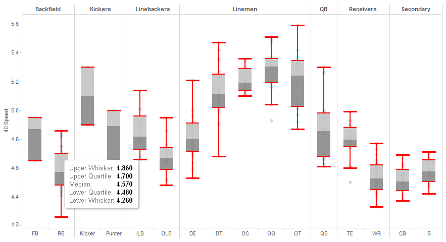
Figure 3: Quartiles.
Clicking on one will bring up a tooltip with the different data points defined. The upper whisker is another name for the maximum, and the lower whisker is another name for the minimum. For running backs (RB), the typical speed for this position in the 2014 draft was 4.57 seconds.
The box-and-whisker plot is a bit more complex than the other chart types. Let us know if you have any questions or need clarification on anything that we covered above.
Other Chart Types
Here is the complete list of chart types from the Show Me menu. Be sure to check back often as we continue to release new articles in each chart type in this sub-series.
- Text Table (Crosstab)
- Heat Map
- Highlight Table
- Symbol Map
- Filled Map
- Pie Chart
- Horizontal Bar Chart
- Stacked Bar Chart
- Side-by-Side Bar Chart
- Treemap
- Circle View
- Side-by-Side Circle View
- Line Charts (Continuous & Discrete)
- Dual-Line Chart (Non-Synchronized)
- Area Charts (Continuous & Discrete)
- Scatter Plot
- Histogram
- Box-and-Whisker Plot
- Gantt Chart
- Bullet Graph
- Packed Bubbles
More Tableau Essentials
Want to learn more about Tableau? We have several posts outlining all of Tableau’s fantastic features. Check out the full list on our Tableau Essentials blog channel.
As always, let us know if you have any questions or comments about this post or Tableau in general. If you’re looking for personalized training or help with something bigger, contact us directly!