
Not everyone is a Tableau guru, at least not yet. To help Tableau rookies, we’re starting from square one with the Tableau Essentials blog series. The series is intended to be an easy-to-read reference on the basics of using Tableau Software, particularly Tableau Desktop. Since there are so many cool features to cover in Tableau, the series will include several different posts.
We’ve covered symbol maps and filled maps in our review of all of the different types of chart types in earlier articles. Today, we’re going to look at some of the formatting options you can apply to your maps beyond formatting the marks and fills. Let’s start with a simple map, exploring sales across the continental United States. We’ve converted it to a symbol map, just so we can get a better look at the map underneath.
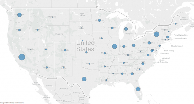
Figure 1: Gray map style.
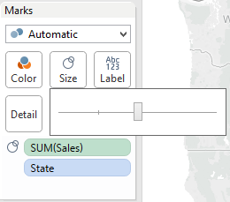
Before we get into additional layers of information, we can add to the background map. Here are a few tips for formatting the marks on the map:
1. Increase the overall scale of the marks by moving the slider to the second tick mark:
 >
>
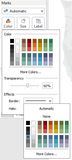
2. Click on the Color button to dial the transparency of the marks down to about 60% and add a grey border:
You can take this a step further by assigning a field to control the color of the marks, but these two points are ones you should always be sure to do with a symbol map.
Back to exploring options for our map image …
At the top of your Tableau Software interface, click on the Map drop-down menu and then select Map Options.
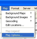
Selecting this option will bring up the Map Options formatting box in the sidebar.
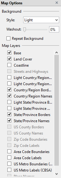
Background
Let’s start with the first drop-down box, Style. There are three options: Normal, Gray, and Dark. The map at the top of the article with the light grey land and the white oceans is Gray. Here is the Normal map style (lighter grey land and blue ocean):
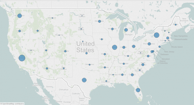
Figure 2: Normal map style.
And here is the Dark map style (black land and dark gray oceans):
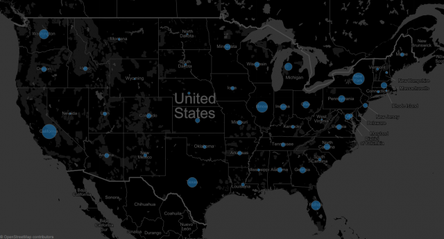
Figure 3: Dark map style.
These different styles give you some visual options to allow your map visualizations to synergistically match with other stylistic elements in your dashboard. Remember, you can further match your map to other formatting with your marks and labels, whether other charts or corporate brand standards.
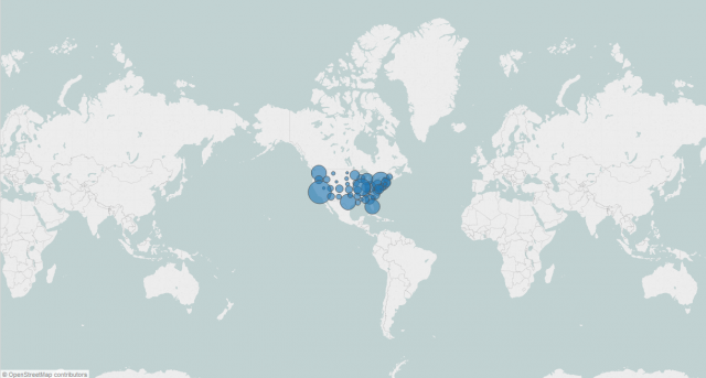
We’ll come back to the Washout option when we discuss filled maps, so let’s move on to Repeat Background. Check the Repeat Background box, and the map will wrap around if you zoom out, like so:
Map Layers
The next group of features is called Map Layers with a series of checkboxes beneath. For most of these options, you must be zoomed in enough for the details to be visible. In other words, if you’re looking at the entire world, it would be impossible to show the streets/highways at that level, so that option is greyed out until you zoom in on the map.
Here are those options within each option:
- Base – Turn off/on the map background. Turning it off will have only a flat background.
- Land Cover – Turn off/on shading for terrain features, like mountain ranges.
- Coastline – Adds a dark boarder around all coastlines
- Streets and Highways – Turn off/on the street and highway maps. You must be at least zoomed in on a country or closer to have this option.
- Light Country/Region Borders and Names – Turn off/on the borders and names for countries and regions (i.e. China, Brazil etc). The border will be a lighter shade than the rest of the borders on the map.
- Country/Region Borders – Turn off/on the borders for countries and regions at the normal border shade for the map style.
- Country/Region Names – Turn off/on the names for countries and regions at the normal border shade for the map style.
- Light State/Province Borders and Names – Turn off/on the borders and names for provinces and states (i.e. Colorado, Ottawa, Queensland, etc.). The border will be a lighter shade than the rest of the borders on the map.
- State/Province Borders – Turn off/on the borders for states and provinces at the normal border shade for the map style.
- State/Province Names – Turn off/on the names for states and provinces at the normal border shade for the map style.
- US County Borders – Turn off/on the borders for US counties. For this feature, you must be zoomed in regionally or closer into the United States.
- US County Names – Turn off/on the names for US counties. For this feature, you must be zoomed in regionally or closer into the United States.
- Zip Code Boundaries – Turn off/on the zip code boundaries. For this feature, you must be zoomed in on a US state or closer for larger states.
- Zip Code Labels – Turn off/on the zip code labels. For this feature, you must be zoomed in on a US state or closer for larger states.
- Area Code Boundaries – Turn off/on the area code boundaries. For this feature, you must be zoomed in on the United States or closer.
- Area Code Labels – Turn off/on the area code labels. For this feature, you must be zoomed in on the United States or closer.
- US Metro Boundaries (CBSA) – Turn off/on metro boundaries for the United States only. You can turn on this feature when you’re zoomed in on the United States, though it is far more effective when you are at least zoomed into the state level or closer.
- US Metro Labels (CBSA) – Turn off/on metro labels for the United States only. You can turn on this feature when you’re zoomed in on the United States, though it is far more effective when you are at least zoomed into the state level or closer.
- Place Names – Turn off/on the names of significant cities. You must be zoomed in on at least a country level. As you zoom in closer, more place names will appear.
Here are a few examples with different map layers turned on:
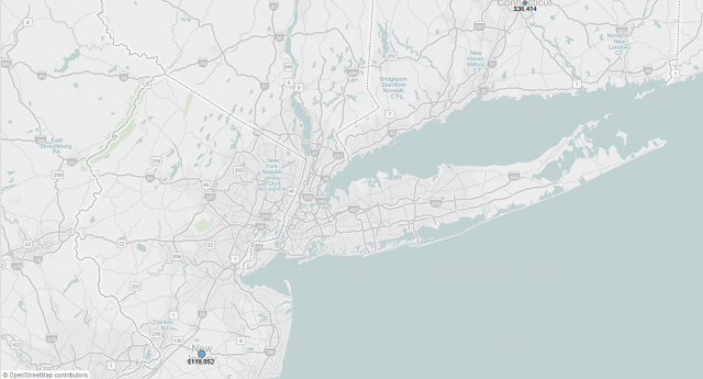
Figure 4: Streets and Highways, US Metro Areas & Labels.
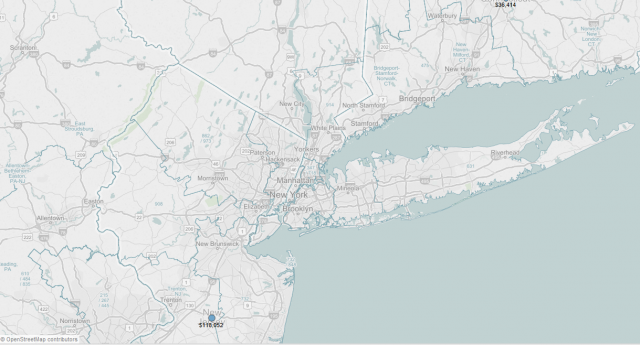
Figure 5: Place Names, Area Code labels and names.
Let’s flip this worksheet to show a filled map instead of a symbol map.
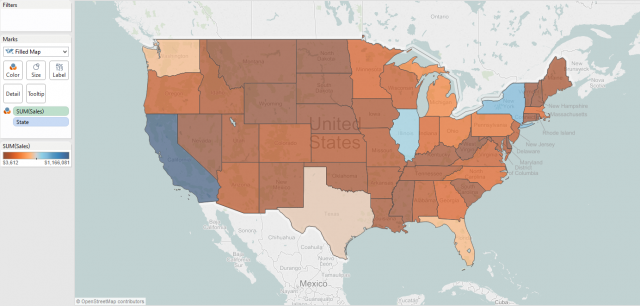
Figure 6: Filled Map.
As discussed in previous posts, we can adjust the colors of the states in our filled map by the SUM(Sales) measure and further by editing the color palette. Now that we have a filled map, let’s explore the Washout option for the map to see how we can use this cool function.
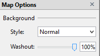
Set the Washout to 100%, and the map updates as shown below:

Figure 7: Filled Map with Washout set to 100%.
So, what’s happening? Tableau is simply washing out the areas of the map for which we do not have data. That means if we didn’t have data for New York, then when we set the Washout to 100%, New York would be a white gap in our map. How else could we use this tip? Maybe your organization or company works solely with the Northeast. You could create a filled map that would just show the states you serve and eliminate the ones you don’t, making a clear image for your dashboard to better tell your data story!
There’s a ton of different ways you can use this all of these features and options. For instance, you are creating a symbol map of your regional stores based on sales profit and decide to add a per capita data layer to your map. Or you decide to show your company’s mortgage originations at the state level to account for the different regulatory environments for financial services. The possibilities go on and on. We’ve only scratched the surface of what makes Tableau so incredibly powerful and accessible for the normal business person.
Formatting Tips
Below is a complete list of Formatting Tips posts that can help you transform your vizzes into works of arts. Check back frequently for new additions.
- Custom Shapes
- Labels
- Color
- Tooltips
- Maps
More Tableau Essentials
Want to learn more about Tableau? We have several posts outlining all of Tableau’s fantastic features. Check out the full list on our Tableau Essentials blog channel.
As always, let us know if you have any questions or comments about this post or Tableau in general. If you’re looking for personalized training or help with something bigger, contact us directly!