Not everyone is a Tableau guru, at least not yet. To help Tableau rookies, we’re starting from square one with the Tableau Essentials blog series. The series is intended to be an easy-to-read reference on the basics of using Tableau Software, particularly Tableau Desktop. Since there are so many cool features to cover in Tableau, the series will include several different posts.
A histogram is a visual representation of the distribution of data. There are two ways to create a histogram:
1. Select a single measure. Right-click on that measure to create a bin field. Drag the bin field from Dimensions to the Column shelf. Drag and drop your measure on the Row shelf and change the aggregation to Count.
2. Select a single measure, then just click on the Histogram chart type on Show Me. Tableau will do all of the extra steps listed in #1 for you!
Either way you choose to go about creating the visualization, you’ll notice that a new bin field of your measure is created, dividing your measure into discrete intervals or “bins.” By default, Tableau will name this field, which will be a dimension, field name(Bin), but you can rename as needed.

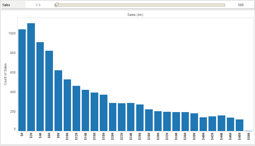
Figure 1: Histogram.
In the example above (Figure 1), I have built a histogram that breaks down individual sales into bins of $20 increments. I’ve added a quick filter, appearing at the top of the visualization, to reduce the scope of the data we are interested in looking at. You can see that it only includes sales of less than $500. You can also see that for this imaginary company, sales transactions of less than $100 are a very important component of their business.
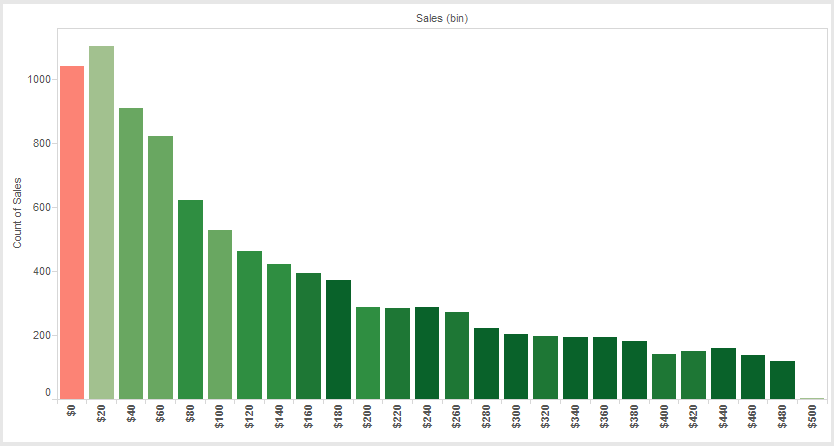
This might lead to the question: Are small-price items profitable? Let’s use our analytical tools to dig deeper and add more value to our visualization. To do this, let’s drag the Profitability measure onto the Color button on the Marks card with a red to green gradient. Any sales bins that are not profitable will now be shaded red while profitable ones will be shaded increasingly darker shades of green.

Figure 2: Histogram with color.
You can now see that our fictional company is actually losing money on these less-than-$20 sales transactions. Clearly, this histogram provided a significant business insight that requires further analysis and improvement. This is the power of Tableau. Analyses like these give the company intelligence on their business that will lead to impactful decisions. That is the core of business intelligence.
Other Chart Types
Here is the complete list of chart types from the Show Me menu. Be sure to check back often as we continue to release new articles in each chart type in this sub-series.
- Text Table (Crosstab)
- Heat Map
- Highlight Table
- Symbol Map
- Filled Map
- Pie Chart
- Horizontal Bar Chart
- Stacked Bar Chart
- Side-by-Side Bar Chart
- Treemap
- Circle View
- Side-by-Side Circle View
- Line Charts (Continuous & Discrete)
- Dual-Line Chart (Non-Synchronized)
- Area Charts (Continuous & Discrete)
- Scatter Plot
- Histogram
- Box-and-Whisker Plot
- Gantt Chart
- Bullet Graph
- Packed Bubbles
More Tableau Essentials
Want to learn more about Tableau? We have several posts outlining all of Tableau’s fantastic features. Check out the full list on our Tableau Essentials blog channel.
As always, let us know if you have any questions or comments about this post or Tableau in general. If you’re looking for personalized training or help with something bigger, contact us directly!

