Not everyone is a Tableau guru, at least not yet. To help Tableau rookies, we’re starting from square one with the Tableau Essentials blog series. The series is intended to be an easy-to-read reference on the basics of using Tableau Software, particularly Tableau Desktop. Since there are so many cool features to cover in Tableau, the series will include several different posts.
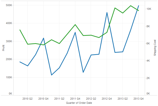
A dual-line chart (also referred to as a dual-axis chart) is an extension of the line chart with a notable exception: It allows for more than one measure to be represented with two different axis ranges. This is done by assigning the right and left sides of the vertical axis with different measures. In this way, you can compare two different measures.
Be careful. Even though you can use any measure in this chart type, make sure that there is a meaningful relationship between the two. In other words, keep in mind the “story” you want to tell with your visualization.
A Simple Example
Figure 1 shows Profit and Shipping Cost in relation to each other. Profit uses the left axis while Shipping Cost uses the right axis. This comparison can highlight important relationships between the two fields.

Figure 1: Dual line chart.
In the above chart, Shipping Cost spikes with each fourth quarter. Profit, on the other hand, only spiked in Q4 for 2011. Is this because seasonality plays a part in shipping methods? Or, are there promotions that reduce the profit margin in Q4?
These are all good questions to ask and might provide interesting answers and opportunities for efficiency with further analysis. These types of insights are invaluable to a business because they ask the right questions that lead to business improvements and refinements. The dual-line chart is just another tool in your belt for getting your story out of the database and into Tableau.
Other Chart Types
Here is the complete list of chart types from the Show Me menu. Be sure to check back often as we continue to release new articles in each chart type in this sub-series.
- Text Table (Crosstab)
- Heat Map
- Highlight Table
- Symbol Map
- Filled Map
- Pie Chart
- Horizontal Bar Chart
- Stacked Bar Chart
- Side-by-Side Bar Chart
- Treemap
- Circle View
- Side-by-Side Circle View
- Line Charts (Continuous & Discrete)
- Dual-Line Chart (Non-Synchronized)
- Area Charts (Continuous & Discrete)
- Scatter Plot
- Histogram
- Box-and-Whisker Plot
- Gantt Chart
- Bullet Graph
- Packed Bubbles
More Tableau Essentials
Want to learn more about Tableau? We have several posts outlining all of Tableau’s fantastic features. Check out the full list on our Tableau Essentials blog channel.
As always, let us know if you have any questions or comments about this post or Tableau in general. If you’re looking for personalized training or help with something bigger, contact us directly!
