Not everyone is a Tableau guru, at least not yet. To help Tableau rookies, we’re starting from square one with the Tableau Essentials blog series. The series is intended to be an easy-to-read reference on the basics of using Tableau Software, particularly Tableau Desktop. Since there are so many cool features to cover in Tableau, the series will include several different posts.
The highlight table allows us to apply conditional formatting to a view. Tableau will automatically apply a color scheme in either a continuous or stepped array of colors from highest to lowest. It is great for comparing a field’s values within a row or column.
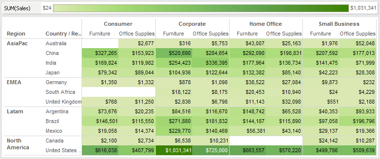
In the example below (Figure 1), I’ve taken select countries from our sales regions and compared them with our customer segments and departments. The resulting grid is colored in a green gradient scale from highest (darkest) to lowest (lightest) in sales volume. I’ve included the gradient scale as reference, running along the top of the table.

Figure 1: Highlight table.
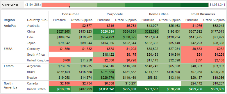
Rather than a smooth gradient in varying shades of green, we can make it a stepped color pattern and change the bottom half of the spectrum to red. This will allow us to better highlight poor performers, particularly if we set custom ranges on our color formatting.
Here is the updated view:

Figure 2: More options.
I set the middle of my color range arbitrarily to $10,000. Any region producing less than $10,000 in total sales would be formatted in the bottom half or the red half of the color spectrum. It is clear from the data above that our fictional company is very strong in the US, Latin America and Asia, but perhaps is only at the beginning of a building a foothold in Europe.
A highlight table is actually very close in style to a heat map mark type, and it may be a great visual to support a transition from a traditional crosstab to the more abstract heat map.
Other Chart Types
Here is the complete list of chart types from the Show Me menu. Be sure to check back often as we continue to release new articles in each chart type in this sub-series.
- Text Table (Crosstab)
- Heat Map
- Highlight Table
- Symbol Map
- Filled Map
- Pie Chart
- Horizontal Bar Chart
- Stacked Bar Chart
- Side-by-Side Bars
- Treemap
- Circle Views
- Side-by-Side Circle Views
- Lines (continuous & discrete)
- Dual Lines
- Area Charts (continuous & discrete)
- Line Chart Extra
- Dual Combination
- Scatter Plot
- Histogram
- Box-and-Whisker Plot
- Gantt
- Bullet Graphs
- Packed Bubbles
More Tableau Essentials
Want to learn more about Tableau? We have several posts outlining all of Tableau’s fantastic features. Check out the full list on our Tableau Essentials blog channel.
As always, let us know if you have any questions or comments about this post or Tableau in general. If you’re looking for personalized training or help with something bigger, contact us directly!
