Not everyone is a Tableau guru, at least not yet. To help Tableau rookies, we’re starting from square one with the Tableau Essentials blog series. The series is intended to be an easy-to-read reference on the basics of using Tableau Software, particularly Tableau Desktop. Since there are so many cool features to cover in Tableau, the series will include several different posts.
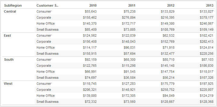
The text table (also known as a crosstab) is essentially the same view you would see from an Excel data source or by clicking the View Data button in the Sidebar. The mark type is text, and the data is organized simply into rows and columns.

Figure 1: Text table.
While text tables are applicable to most data sets, they do not tell a very compelling story or highlight important pieces of data without additional formatting on your part. Text tables are not normally recommended as the primary visualizations in your dashboard or presentation. Consider using them as an appendix inclusion for those report consumers that want more detail in a traditional format instead.
With that being said, you can add more information and context to your text table. Just because it’s a text mark type doesn’t mean your table has to be completely boring.
Spice Up Your Text Tables
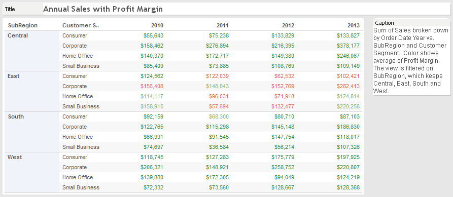
I’ve taken the same table below and added a title at the top, a caption on the right and color formatting. The sales figures are now color-coded in green for a positive average profit margin and red for a negative average profit margin.
With this additional information about our fictional company, you can see that the East region is woefully underperforming with multiple customer segments. It’s losing money year after year. That simple addition of color-formatting on a second measure opened up a whole new aspect to this visualization and completely changed the story.

Figure 2: Extra features and formatting.
The goal with each of your worksheets should be finding the story in your data and building your visualization to best convey that story to your report consumer. Believe it or not, this is even possible with a simple text table.
Other Chart Types
Here is the complete list of chart types from the Show Me menu. Be sure to check back often as we continue to release new articles in each chart type in this sub-series.
- Text Table (Crosstab)
- Heat Map
- Highlight Table
- Symbol Map
- Filled Map
- Pie Chart
- Horizontal Bar Chart
- Stacked Bar Chart
- Side-by-Side Bars
- Treemap
- Circle Views
- Side-by-Side Circle Views
- Lines (continuous & discrete)
- Dual Lines
- Area Charts (continuous & discrete)
- Line Chart Extra
- Dual Combination
- Scatter Plot
- Histogram
- Box-and-Whisker Plot
- Gantt
- Bullet Graphs
- Packed Bubbles
More Tableau Essentials
Want to learn more about Tableau? We have several posts outlining all of Tableau’s fantastic features. Check out the full list on our Tableau Essentials blog channel.
As always, let us know if you have any questions or comments about this post or Tableau in general. If you’re looking for personalized training or help with something bigger, contact us directly!

