Not everyone is a Tableau guru, at least not yet. To help Tableau rookies, we’re starting from square one with the Tableau Essentials blog series. The series is intended to be an easy-to-read reference on the basics of using Tableau Software, particularly Tableau Desktop. Since there are so many cool features to cover in Tableau, the series will include several different posts.
The area chart is a combination between a line graph and a stacked bar chart. It shows relative proportions of totals or percentage relationships. By stacking the volume beneath the line, the chart shows the total of the fields as well as their relative size to each other.
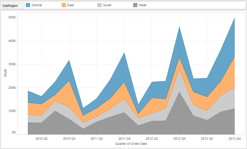
Consider the chart below in Figure 1:

Figure 1: Area Chart (continuous).
In this example, I am comparing profit performance by region for our fictional company by quarter. The strength of this chart type is that I can immediately see that the West (in gray) is consistently the largest portion of the area for each quarter. As you trace along each quarter, the West is the largest portion of the stacked volumes.
In addition, we can visually see that Q4 is always the strongest performer throughout the year with a sharp decline into the following Q1. You can also see that the Q4 peak is getting higher and higher, year after year.
A quick trend analysis is the strength of a line graph. With an area chart, we can see the underlying performances and relative totals of the sum.
Continuous vs. Discrete
Just as with the line chart, the Show Me menu offers the option of Area Chart (continuous) and Area Chart (discrete). The easiest way to think of this is that continuous data is measured whereas discrete data is counted.
For instance, the length of an object is a continuous field. It can be any length, and the number line stretches to infinity. The value can be any value in that number line. A discrete number could be the number of stores in a franchise or the number of employees in the HR database.
In Tableau, continuous fields are colored green while discrete fields are colored blue.

Figure 2: Continuous (green) and discrete (blue).
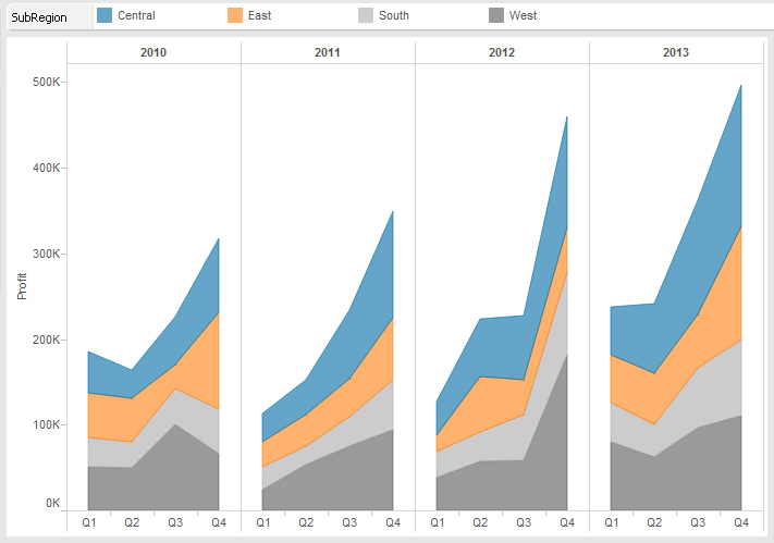
Let’s switch our chart type in Figure 1 from continuous to discrete and see how it changes our view:

Figure 3: Area Chart (discrete).
Just like with the line chart, each year is split into discrete date parts. This gives us a clearer idea of seasonal trending while still letting us see the underlying relative performances of each region.
Area charts are useful tools in your visualization arsenal, but be sure that you use them only when appropriate. If you’re trying to show performance against other business units, customer segments or product categories, then you’d definitely want to use a line chart. The area chart is great for showing a total trend with relative performances of individual components of that sum.
Other Chart Types
Here is the complete list of chart types from the Show Me menu. Be sure to check back often as we continue to release new articles in each chart type in this sub-series.
- Text Table (Crosstab)
- Heat Map
- Highlight Table
- Symbol Map
- Filled Map
- Pie Chart
- Horizontal Bar Chart
- Stacked Bar Chart
- Side-by-Side Bar Chart
- Treemap
- Circle View
- Side-by-Side Circle View
- Line Charts (Continuous & Discrete)
- Dual-Line Chart (Non-Synchronized)
- Area Charts (Continuous & Discrete)
- Scatter Plot
- Histogram
- Box-and-Whisker Plot
- Gantt Chart
- Bullet Graph
- Packed Bubbles
More Tableau Essentials
Want to learn more about Tableau? We have several posts outlining all of Tableau’s fantastic features. Check out the full list on our Tableau Essentials blog channel.
As always, let us know if you have any questions or comments about this post or Tableau in general. If you’re looking for personalized training or help with something bigger, contact us directly!

