Not everyone is a Tableau guru, at least not yet. To help Tableau rookies, we’re starting from square one with the Tableau Essentials blog series. The series is intended to be an easy-to-read reference on the basics of using Tableau Software, particularly Tableau Desktop. Since there are so many cool features to cover in Tableau, the series will include several different posts.
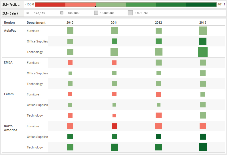
To take a more visual approach to showing data than we might typically see in a crosstab, let’s consider a heat map. A heat map is a great way to compare categories using color and size. In this, you can compare two different measures. In the example below (Figure 1), I have created a heat map to show performance by global region for the different product lines of our fictional company.

Figure 1: Heat map.
The size of the square indicates the volume of sales. You can see the legend breaking down the four tiers into a minimum ($173,140), lower middle ($500,000), upper middle ($1,000,000) and maximum ($1,671,761). In our fictional company, Technology sales have consistently been a big sales generator across the different global regions. You can see this as the marks in the Technology rows are comparatively larger than the others. North America and Asia Pacific are clearly the best performers across regions.
I’ve also color coded the marks based on profit margin. Our fictional company wants to see every global product line that is performing beneath a certain threshold (50%). Those are highlighted in increasingly darker shades of red while the profitable regions are coded in increasing shades of green. The darker the green, the more profitable the product category is in that region.
We can immediately see that across global regions and years, the Furniture product category is among the least profitable in the company. While this seems to be improving by 2013, North America is still below our arbitrary profit margin threshold. Conversely, Technology sales seem to be the strongest performer – except in Latin America until recently.
That is the story of this particular visualization, and the heat map view tells it nicely. There are a lot of different ways to use the heat map. Hopefully, this visualization gives you ideas to use with your data.
Other Chart Types
Here is the complete list of chart types from the Show Me menu. Be sure to check back often as we continue to release new articles in each chart type in this sub-series.
- Text Table (Crosstab)
- Heat Map
- Highlight Table
- Symbol Map
- Filled Map
- Pie Chart
- Horizontal Bar Chart
- Stacked Bar Chart
- Side-by-Side Bars
- Treemap
- Circle Views
- Side-by-Side Circle Views
- Lines (continuous & discrete)
- Dual Lines
- Area Charts (continuous & discrete)
- Line Chart Extra
- Dual Combination
- Scatter Plot
- Histogram
- Box-and-Whisker Plot
- Gantt
- Bullet Graphs
- Packed Bubbles
More Tableau Essentials
Want to learn more about Tableau? We have several posts outlining all of Tableau’s fantastic features. Check out the full list on our Tableau Essentials blog channel.
As always, let us know if you have any questions or comments about this post or Tableau in general. If you’re looking for personalized training or help with something bigger, contact us directly!
