Not everyone is a Tableau guru, at least not yet. To help Tableau rookies, we’re starting from square one with the Tableau Essentials blog series. The series is intended to be an easy-to-read reference on the basics of using Tableau Software, particularly Tableau Desktop. Since there are so many cool features to cover in Tableau, the series will include several different posts.
Not everyone is a Tableau guru, at least not yet. To help Tableau rookies, we’re starting from square one with the Tableau Essentials blog series. The series is intended to be an easy-to-read reference on the basics of using Tableau Software, particularly Tableau Desktop 8.1 and 8.2. Since there are so many cool features to cover in Tableau, the series will include several different posts. This is the eighth post in the series. Check out the full list on our Tableau Essentials blog channel. This is also the first post in the Chart types sub-series.
 We are going to look now at one of the most exciting topics in learning Tableau – the different types of charts.
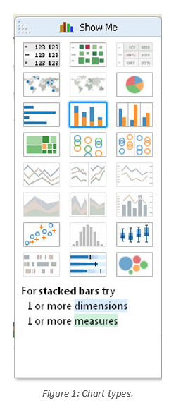
You can see the entire selection of chart types in the Show Me menu.
If you mouse over each chart type, Tableau will offer guidance on which chart type is best suited for the data you’re trying to present. For stacked bars (see Figure 1), Tableau recommends one or more dimensions and one or more measures.
Chart types that are not applicable to your worksheet as it is currently constructed will be grayed out and not selectable until you have the appropriate combination of measures and/or dimensions.
There are so many little modifications and changes you can make with your formatting, labeling and other tricks. You’re only limited by your imagination.
The Chart Types
Here is the complete list of chart types from the Show Me menu. Be sure to check back often as we continue to release new articles in each chart type in this sub-series.
- Text Table (Crosstab)
- Heat Map
- Highlight Table
- Symbol Map
- Filled Map
- Pie Chart
- Horizontal Bar Chart
- Stacked Bar Chart
- Side-by-Side Bar Chart
- Treemap
- Circle View
- Side-by-Side Circle View
- Line Charts (Continuous & Discrete)
- Dual-Line Chart (Non-Synchronized)
- Area Charts (Continuous & Discrete)
- Scatter Plot
- Histogram
- Box-and-Whisker Plot
- Gantt Chart
- Bullet Graph
- Packed Bubbles
Conclusion
Obviously, there is a lot to cover when dealing with chart types and the different methodologies behind each of the above visualizations. Let us know when and how you like to use these different views.
Want to learn more about Tableau? Here are the other Tableau Essentials posts we have so far:
- The Toolbar (Interface)
- The Sidebar (Interface)
- The Worksheet Canvas (Interface)
- Measures & Default Properties
- Connect to Data
- Title, Caption & Summary
- The Status Bar
More articles are coming soon, so check back regularly.
As always, let us know if you have any questions or comments about this post or Tableau in general. If you’re looking for personalized training or help with something bigger, contact us directly!
