Alteryx: The Multi-Tool for Your Data Journey

At InterWorks we are all about the data journey. In the past, the journey to become a data-driven organization was slow and expensive like a long-term expedition force. InterWorks has a different way to climb the mountain, focusing on fitness, speed and experience. We help to quickly empower your existing people to embrace the goals and […]
When Average Isn’t Good Enough: Using Tableau to Visualize Distributions
Averages are great. They take up very little space to report, everybody wants them and we all understand exactly what an average is … or do we? An average as we typically think of it is what we call the mean in statistics. To find the mean, we take the sum of all values and […]
Predicting March Madness in Tableau
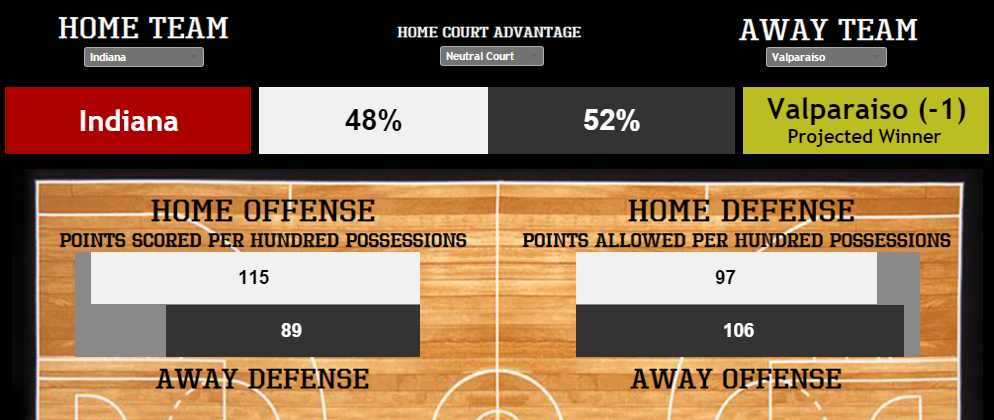
I know, I know. The idea of actually predicting March Madness with any accuracy is an exercise in futility, although that may partially explain why the tournament so fully captures the attention of so both the casual enthusiast and the diehard fan of the game alike. After Selection Sunday, the night the committee releases the […]
Questions from Tableau Training: How Do ZIP Codes Work in Tableau?
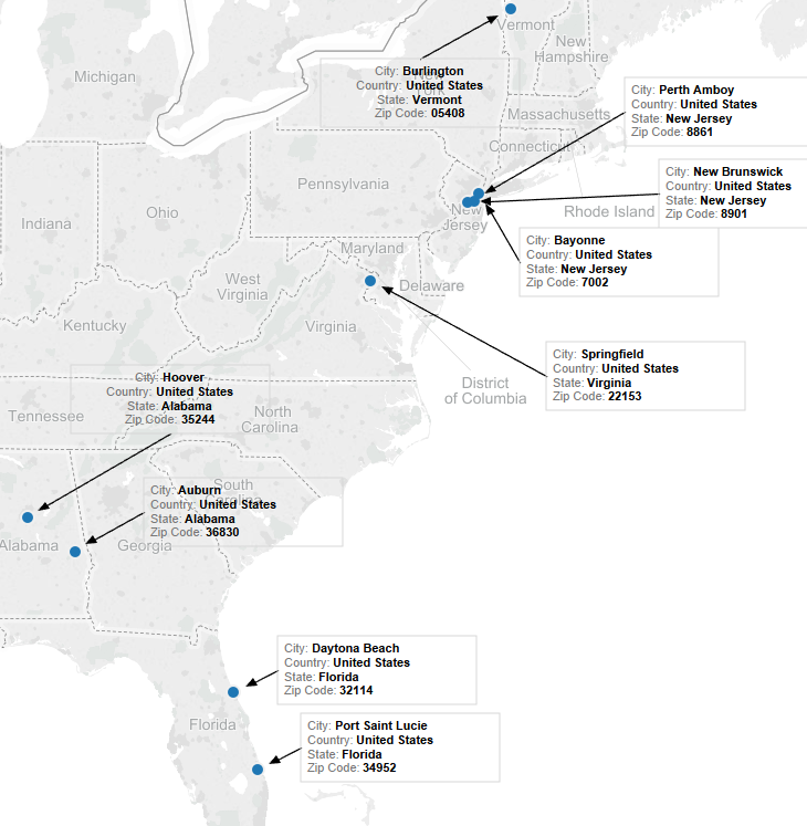
A common question that comes up in trainings is: “How do ZIP codes work in Tableau? Do I need to add in leading zeros, or can I leave them out?” As geographic fields become increasingly available in the field of analytics, aggregating customer information to ZIP code level becomes greatly desired. Tableau offers a great way […]
Questions from Tableau Training: Setting Weekday Start
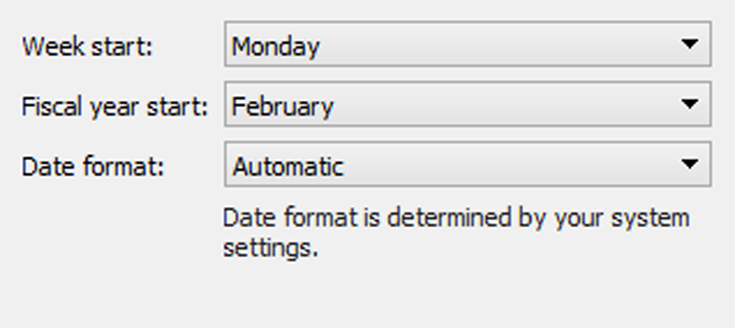
It’s been a while since I wrote in this series, but I was recently conducting a training and was asked a question that I have never been asked. I’m sure it comes up regularly, but I never came across it. I was asked: “Tableau makes the week from Sunday to Saturday, but my week is Monday […]
The Tableau Performance Checklist: Local Computations – Table Calculations
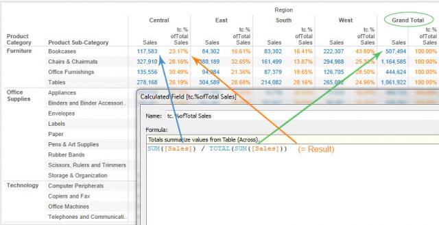
Here’s the second item under Local Computations: “Table calculations are powerful, but they can be slow. They are dependent on the local computation engine and can require substantial memory.” Let’s get started. Table Calculations Table calculations are computations that use the values in the entire table and can restructure them for different views and fields. […]
The ‘Corruption Perceptions Index 2015’ Visualized in Tableau
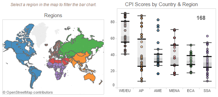
Transparency International publishes an annual index of government corruption perceptions for 168 countries. The index attempts to gauge how the population within a country feels about it’s government. Take a look at the results visualized in Tableau below: Do you think that your country is fairly represented?
Thinking About Data: Part Three – Data Visualization

In Part 1 and 2 of this series, we explored data science and big data. In this post, I’ll discuss how data visualization helps people makes sense of what data scientists are creating and storing. Whether the goal of the visualization is to expose a story like a journalist or to provide insight for a business […]
Tableau Viz Showcase by Industry: Retail
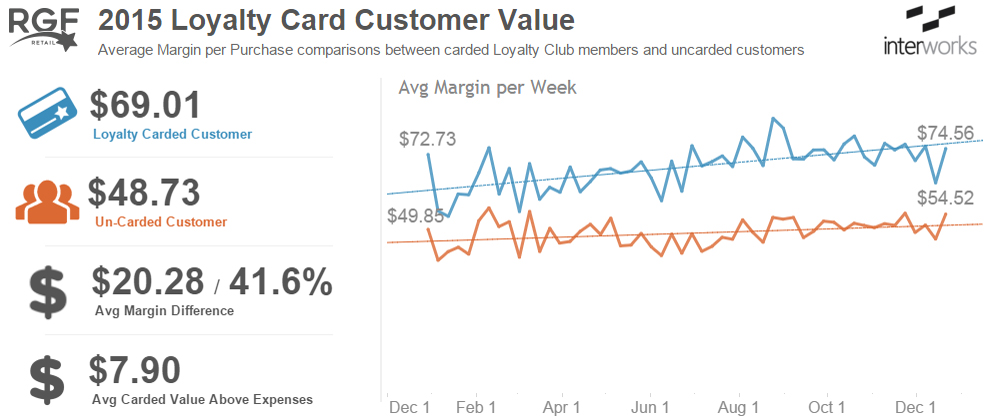
As leaders in data visualization with Tableau, we are contacted every day by potential clients seeking information about how we can help them leverage Tableau to make better decisions with data. Because Tableau is such an amazing tool and not industry specific, we get to work with a wide variety of client types: internet service providers, search engines, […]
The Tableau Performance Checklist: Local Computations – Server Performance
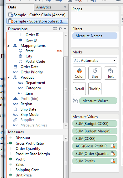
Here’s the first guideline from the Local Computations category: “Even if a workbook is published to Tableau Server, local computations still impact performance. Leverage the power of Tableau Server whenever possible by limiting local computations such as groups, hierarchies, reference lines, table calculations and blending.” Let’s get started! Computation vs. Calculation Perhaps it is best […]