
PART 2 In part one we familiarised with Tableau’s automatic Trend Line, information provided and inferences possible. Now I want to focus on the fun part: how to calculate the trend line ourselves using Tableau-R integration as well as two applied examples “How much above/below ?” and “What if”. HOW TO CALCULATE A LINEAR TREND LINE USING TABLEAU & R INTEGRATION? Tableau provides (at least) two main options to calculate a trend line: either you could use Tableau’s R integration or calculated fields.
- TABLEAU-R-INTEGRATION
If you know a bit of R, then you’re spot on – Tableau R integration saves you writing complicated Tableau calculations. Connect to R [1] and create the following calculated field ”R Trend Line”:
SCRIPT_REAL(
” tl <- lm( .arg2 ~ .arg1)
tl$fitted ” ,
SUM([x]), SUM([y]))
A note for Tableau-R beginners: the equation
lm( .arg2 ~ .arg1)
calculates all parts of the Trend Line (slope, intercept, estimated values). Because Tableau can only retrieve a single column from R (but no matrix or table), we need to extract the estimated values to be displayed in the dual axis chart by using „tl$fitted“. Now include the calculated trend line into the chart. To do so, drop “R Trend Line” onto the row shelf – don’t worry if the chart is empty at first! Right click on the Trend Line calculation and adjust ‘Compute Using’ to ID (see Figure 8). Then choose ‘Dual Axis’ – and you’re nearly done. The calculated and the automatic trend line do not lie on top of each other quite yet. It needs Axis Synchronisation – only Tableau does not allow this: this option is greyed out.
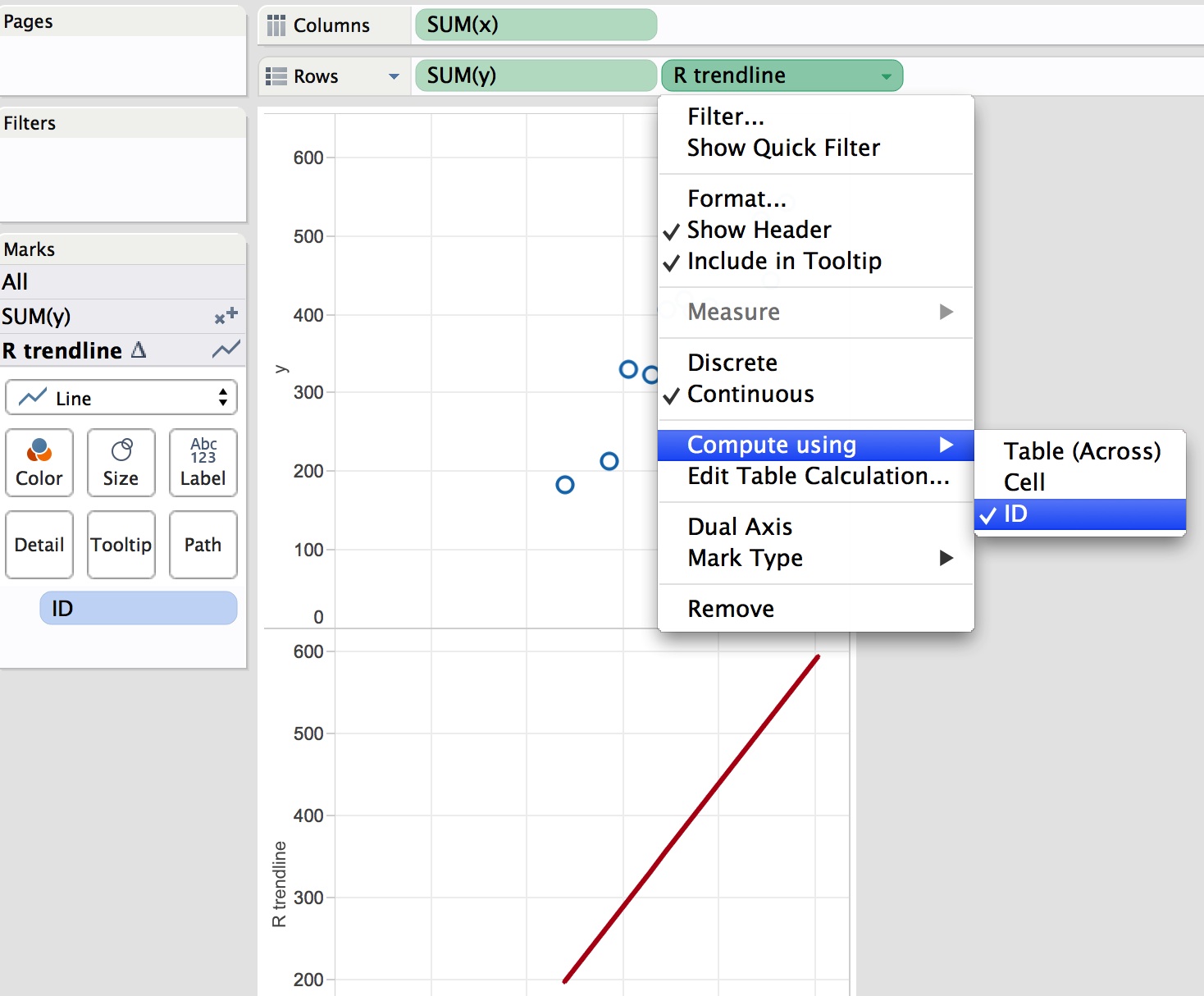
Figure 9: Interactive Menu ‘Axis synchronisation’ Why is this? The reason is simple: if data types of the two axes differ, Tableau cannot synchronise them. Thus convert the Trend Line with the INT() function:
INT(
SCRIPT_REAL(
” tl <- lm( .arg2 ~ .arg1)
tl$fitted ” ,
SUM([x]), SUM([y]))
)
And – voila! – there is the synchronisation function back. Now the Trend Lines matches. Note: the above calculation can be written in a single line, of course; the spacious presentation is only a way to make it easier for you to understand Tableau spelling. However, if your plot looks still strange, because your R Trend Line appears as a dotted line although you have chosen ‘Line’ in the marks card, then remove > Measure Names < (see Fig. 10, red circle) from the Trend Line card.
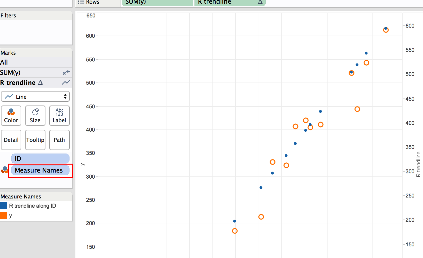
Figure 10: remove >Measure Names< from marks card to see R Trend Line as a line.
PRACTICAL EXAMPLES
Example 1: “How much above the Line?”
What do you do if you want to quantify and visualise the deviation of an observation (data point) from the Trend Line? That’s easy, now; right? Just calculate “How much above the Line?” in a calculated Field using
SUM([y]) – [Trend Line].
Remember: the y-axis in a scatter plot is SUM([y]) and NOT just y. When you have the trend line on the row shelf with ‘Compute Using’ on ID, drop the calculation “How much above the Line?” on to ‘Size’ on the marks card (and if you want to see the label, drop a copy on to ‘Text’ too). Then create a dual axis chart and choose from the marks card Gantt Bar for the trend line to visualise the deviation from the trend line (Fig.11).
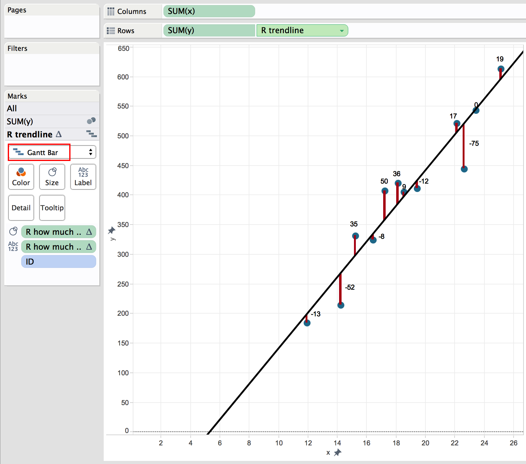
Figure 11: Visualising distance of observation from the trend line
Example 2: “What-If?”
Let’s imagine you would like to analyse the profitability of customers. When your company acquires a new client we’d like to evaluate what to expect based on the currently known trend. For this ‘what-if’ scenario we need to create an option for the analyst to choose a value within the data set or SLIGHTLY outside (if you want to do go far beyond your own data set, better use a different method of predictive analytics).
As a reminder to calculate the trend line we used the formula
![]()
So to answer your question we need to take three steps:
a) extract the constants
Intercept: SCRIPT_REAL( “lm( .arg2 ~ .arg1) $coefficients[1]” , SUM([x]), SUM([y]))
Slope: SCRIPT_REAL( “lm( .arg2 ~ .arg1) $coefficients[2]” , SUM([x]), SUM([y]))
b) we have to replace our known x-values from the data set with values the analyst can choose from. To do so create a parameter (Fig. 12) , which is then called in the trend line calculation replacing SUM([x]) with SUM( [Parameter]).
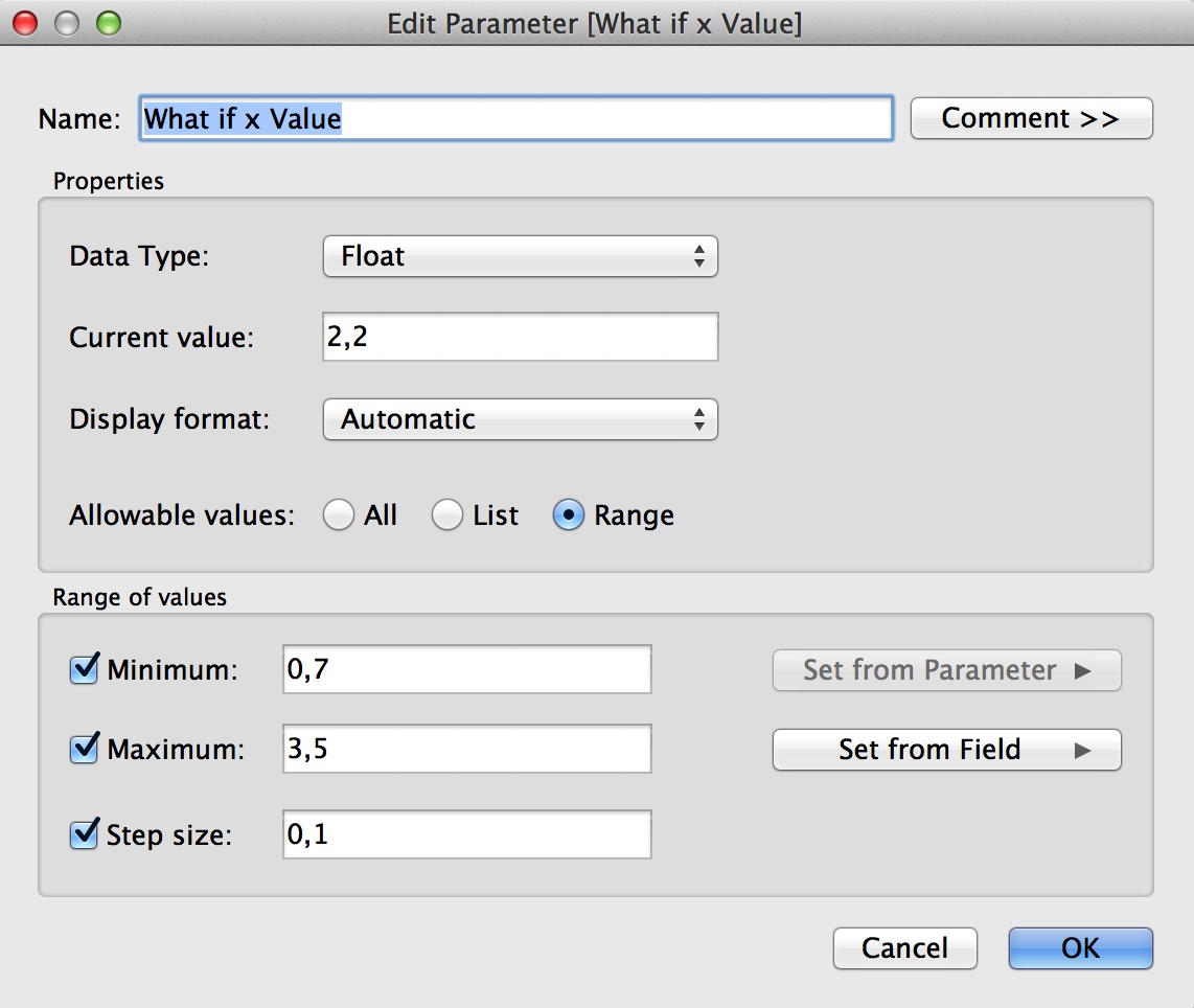
Figure 12: Create Parameter “What-If x-Value”
c) Finally, we want to see only ONE estimated value, not all the possible values. In other words we need to filter the returned y-values and the easiest way is to use the function First().
Piecing these three steps together the new “R What-If Trend Line (What if)” calculation reads then like
If FIRST() = 0 Then INT(( [R slope] * [x(what if)] ) + [R intercept] ) END.
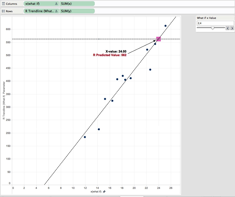
Figure 13: What-If Analysis using R in Tableau
HAPPY ANALYSING!
[1] http://www.tableau.com/wp-content/uploads/sites/default/files/media/using-r-and-tableau.pdf