When Tableau version 2022.3 was released, expectations for new features were quite low in the Tableau community. There were a lot of improvements for server and data related issues; but for the visual side of everything, the system enhancements appeared to be scarce. So, the tiny new feature I’m talking about here took me by surprise (and not just me).
Long story short: We are now able to hide or show elements on a dashboard controlled by a parameter or by a field.
This is one of those features that I didn’t know I wanted but I was always waiting for. So, enough with the prelude, let’s get into the fun stuff!
Dynamic Zones? What’s That About?
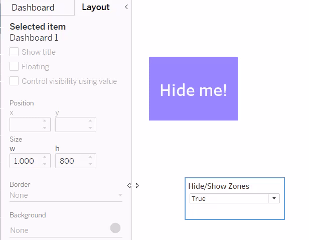
Zones are a new fancy title for dashboard elements – yes, any dashboard element. This could be a sheet, a textbox, a filter, a legend, a parameter and, most importantly, containers. As soon as we select any of these elements, a new checkbox called Control visibility using value becomes available in our Layout Pane on the left side of our dashboarding area:
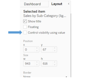
It connects a dashboard element with a parameter or field. If this parameter or field changes its value, the dashboard element will be shown or hidden.
As it’s either being shown or hidden, the parameter or field has to be a Boolean one, meaning the only values it’s allowed to have are TRUE and FALSE.
We cannot use string fields, number fields or anything else, or else the Control visibility using value checkbox is not available. Only Boolean fields and Boolean parameters will work .
Also, they have to be global. In other words, they have one value at a time for the whole data source. Parameters are always global, so we don’t have to worry about that. Fields, on the other hand, need either to be based on a parameter and convey or convert its value – thus keeping their global status – or we need to work with an LOD function that makes a value global (fixed to no dimensions, for example).
Now, these are the only two rules: The parameter and field must have a Boolean data type, and both have to be global values that don’t change.
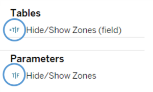
After we created such a parameter or field, it will become available in a new dropdown menu right beneath the new checkbox:
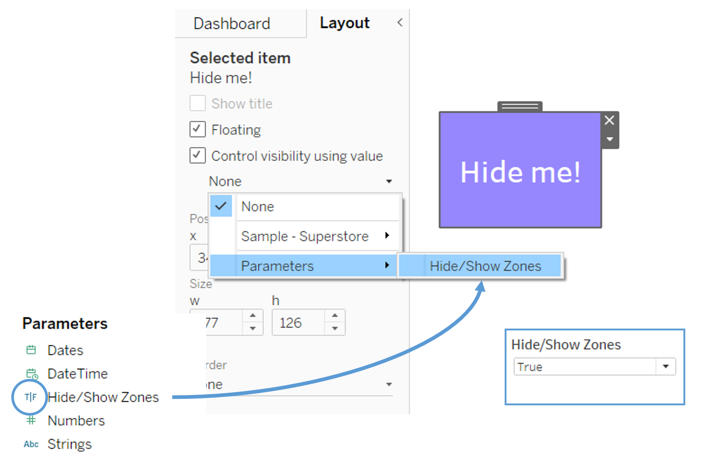
Note that the Boolean fields are separated by data source in this dropdown menu. After selecting the parameter we wish to click, no more work is needed. It already works:
That’s it. No more magic here. But as so often, it’s the tiny things that bring us the utmost joy.
How Is That Different from Sheet Swaps or Buttons?
Didn’t we have the fresh Show/Hide button that was introduced a few versions ago, with which we could build a button for every dashboard element to hide or show it? Even containers with a lot of elements in there?
Yes, of course. Before, each element needed its own button. Now, with Dynamic Zones, we can control a lot of elements, even whole dashboards, with just one parameter.
And couldn’t we do that before, too? Like, with parameters and sheet swaps?
Also yes, but these came with a few heavy limitations. With sheet swaps, we needed to hide the sheet title, needed sheets with at least one dimension and couldn’t control its attached elements like filters and legends. Now, we are completely free.
We should also note that sheet swaps usually slow down our dashboards as the associated filters had to reload the data. This isn’t necessary for the new Dynamic Zones.
Use Cases for Tableau’s Dynamic Zones
What starts little can become a great help, not only for experienced Tableau developers. The first four things that come to mind, are these:
Idea: Swapping Dashboard Elements
For that we need at least two things:
- The Boolean parameter controlling one of the elements.
- A Boolean field controlling the other element. The Boolean field would have a structure like this, to invert the parameter:
IF [Hide/Show Zones]
THEN FALSE
ELSE TRUE
END
So, whenever the parameter is true, the field is false and vice versa.
Idea: Automatically Hide Dropdown Menus
With this new feature we now can dynamically display dashboard elements that in the past gave us problems. Exclude action filters were a great way to provide drill down information to users but colour legends, filters, parameters or even the titles for these sheets were a pain to display dynamically along with the sheet. These can now be grouped together in a single container and displayed all at once with a single setting. Since this action can be driven by a calculation, we can also have more complex logic to decide when to display an item. Having multiple triggers to display a single element in a dashboard with exclude action filters was often complex in the past.
Idea: Tutorial Overlays
We could build an overlay before, usually using the Show/Hide Button on a dashboard element, but the button only controlled one element. If we wanted to show tutorial boxes in all four corners of a dashboard, we had to build a gigantic container with a lot of paddings or sub-containers, to arrange the boxes correctly. This container then was on top of everything else, so while the tutorials were visible, we couldn’t interact with the dashboard.
This is history now. We can add four textboxes (for example), float them into the four corners and control them with one parameter. And while they are there, we can still interact with the visualizations!
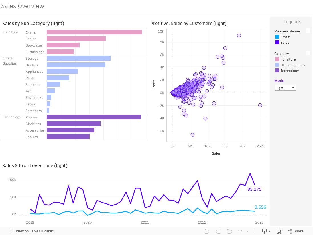
Idea: Light Mode vs. Dark Mode Switch
If we wanted to give our users the opportunity to switch to a dark mode version of a dashboard, we had to either create two separate dashboards and work with navigation buttons. This meant a lot of loading time in between. We could also work with a sheet swap between a white and a completely black sheet and use that as background, while everything else is floating above, and then swap the separate sheets, as well. Again, this means a lot of loading time as all the filters had to reload the data.
There are a few more ways to accomplish that, but now there is a pretty simple one:
- Create two floating containers that cover the whole dashboard canvas.
- Fill the first one with the light sheets and light elements.
- Fill the second one with the dark sheets and light elements.
- Set the background colour of the second one to black.
- Control both floating containers with a Boolean parameter and a Boolean field (see two paragraphs above how to do that).
- Done!
It works very smoothly and is really performant!