
With the recently released version 2021.2 of Tableau Desktop, Tableau fulfilled a wish I never knew I had: I am now going to use the Show/Hide button on any tiled element on every future dashboard I will ever build! (Well, at least I hope so.)
What Is This About?
Up until version 2021.1, Tableau offered a function for floating containers (and only those) on dashboards – to add a Show/Hide button. In the end, that essentially gave the user the option to hide or show this container and all its elements. That was (and is) quite neat, as you sometimes have clutter on your dashboard you wish to temporarily remove.
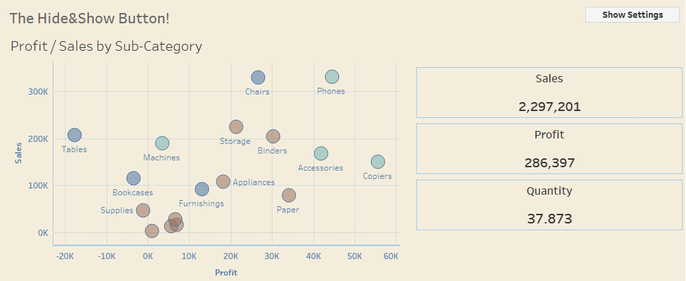
A famous example: A filter pane. All the filters a user can activate to customize the view are extremely helpful and necessary, but once they are set, they take away valuable real estate that could be used for the actual visualizations. Putting all those filters into a floating container and adding a Show/Hide Button solved this problem, especially when we build views for tablets, where space is especially scarce:
Now, in 2021.2, Tableau not only opened up this functionality for tiled containers, but it also made it possible to add that button to each and every element on the dashboard! Containers, sheets, legends, text objects, blank objects and everything else. Even the annoying default tiled container can be hidden, the very first element in the layout hierarchy.
How Does This Work?
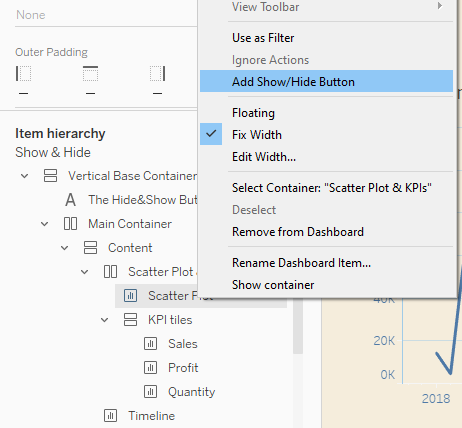
It’s pretty straightforward: click the drop-down menu of any element on a dashboard and choose: Add Show/Hide Button. A floating button will appear. Pressing the Alt key on your keyboard and clicking it will hide the element. Repeating that will show it again:
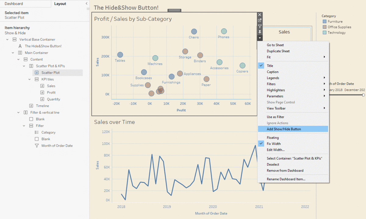
The button in itself is an element as well, so you can move it wherever you want, whether floating or tiled. And yes, as an element it also has the dropdown where you can add a Show/Hide Button for this Show/Hide Button. I can’t yet see any value in that, but I’m 100% certain that someone out there in the #tableau community will find a way! You can actually cascade as far as you like.
To remove this button, all you have to do is click on the tiny X in the upper-right corner of the element. You cannot remove it via the dropdown of the hidden/shown element.
What if I hid an element and then removed the button?
This is a very reasonable question as this happens all the time. If you are faced with this for the first time, I can feel your desperation. But fortunately, the solution is quite simple. All you need is your Item hierarchy in the Tableau Layout pane on the left:
Look for the lost item there (It turns out that labeling/renaming these items in the hierarchy is really helpful here), right-click it, and you will see the familiar option to Add Show/Hide Button. Downside: We have lost all formatting and settings for the button that we set up before.
By the way: The new button is also part of the Item hierarchy, so if you find yourself unsuccessfully searching for it on your dashboard, just hop to the Item hierarchy and select it from there.
Cascading Containers
Container hierarchies are dominant. That means, the status shown or hidden cascades downwards to all elements in the container and in sub-containers. For example: Let’s say we have an element in a vertical container, which is itself in a horizontal container (or any other combination); you can add Show/Hide Buttons for all these elements.
- Horizontal Container
- Vertical Container
- Sheet A
- Sheet B
- Vertical Container
Let’s further say we have three buttons: one for each container and one for Sheet A. All elements are shown. Now:
Hiding Scenarios
- Hide Sheet 1 > Sheet 1 is hidden.
- Hide Horizontal Container > All elements are hidden. Vertical Container, Sheet A and Sheet B cannot be shown. Their buttons are locked.
- Hide Vertical Container > Vertical Container, Sheet A and Sheet B are hidden. Sheet A and Sheet B cannot be shown. Their buttons are locked.
Showing Scenarios
- Sheet A and B are hidden. Vertical Container is hidden and shown > Sheet A and B are shown.
- Vertical Container is hidden. Horizontal Container is hidden and shown > All elements are shown.
If everything you do on a dashboard happens in one big container, you can basically hide your whole dashboard by hiding this container.
Use Cases for the Show/Hide Button
There are a lot of them! Here is just a teaser:
- Collect your filters: As mentioned above, you can collect all filters and parameters in one container (or two, if that’s more feasible for you), and then add the Show/Hide button for this container. By default, this should be hidden, enhancing the UX factor when the user opens the dashboard. Don’t forget to make this button easy to spot or even guide the user to it, as filtering might be essential for the dashboard usage.
- Legends: When the visualization is not self-explanatory regarding colors and shapes, a legend can help the user understand what is going on. But once they have understood and connected colors and shapes with content in their head, the legend is not necessary anymore. So give the user the opportunity to show or hide it, opening up more real estate on the dashboard.
- More elements on a dashboard than before: The golden rule is to show what’s necessary, and don’t show what isn’t necessary on a dashboard. This provides focus and gives the dashboard room for answering the user’s questions. With the Show/Hide button, you can increase the number of elements on the dashboard and let the user decide how many and what they want to see. For example: Show a scatterplot next to a timeline with both charts able to be hidden via buttons. The user is now able to hide the scatterplot and expand the timeline to dive deeper into that one.
- Build placeholders: Let’s say you are building a dashboard with three tables in a container and an optional fourth one that should only be used when the necessary data is there. Just hide that one with a button, and give the user the option to show it when the data is there.
Can I Make the Show/Hide Button a Rectangle Beside a Chart?
You mean something like this, where the grey/blue rectangle on the left will show/hide the scatterplot?
Yes, you can do that with a little trick:
- Add a Show/Hide button for the scatterplot (or whatever your element is).
- Edit the button and make it a text button instead of an image button.
- Add one space as text—for the button text for item shown, as well as for the button text for item hidden.
- Optional: Give it a different background color for item shown and item hidden.
- Remove any padding via the layout menu, and move it to the correct position in your dashboard. Edit the size and set it to around 10 pixels in this example.
- Optional: Add a blank object right of the three KPI tiles in this example, and don’t forget to fix the width of the three KPI tiles container. Otherwise, that container will stretch over the whole visible space.
I am sure there is a lot of dashboard magic to be done with these, and I’m looking forward to seeing what the Tableau community dreams up! If you have any questions, please reach out!