Our Certified Tableau Trainers are asked a myriad of questions each day. In this series, they share some answers.
Often times during training, students approach me with a pretty understandable issue.
“I already build this report. How can I use my current output to build a visualization in Tableau?”

My initial response is: “Let’s see if we can access the original data. Using the transactional database will allow for additional (and easily repeatable!) analysis.” But what if using transactional level data isn’t an option?
It makes sense, we have this straightforward sales report in Excel that’s readily available, and we want to continue using our current process – except our end product will now be in Tableau. However, there are a few issues. When we connect to our report, our data preview looks a little off:
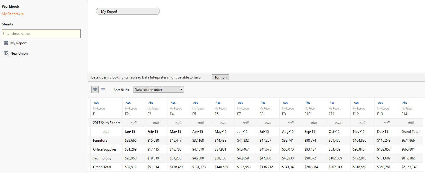
None of our columns have proper names, and we have one cell in the top left that shows us the title of our report (in this case, 2015 Sales Report). This is an easy fix through the use of the Tableau Data Interpreter.
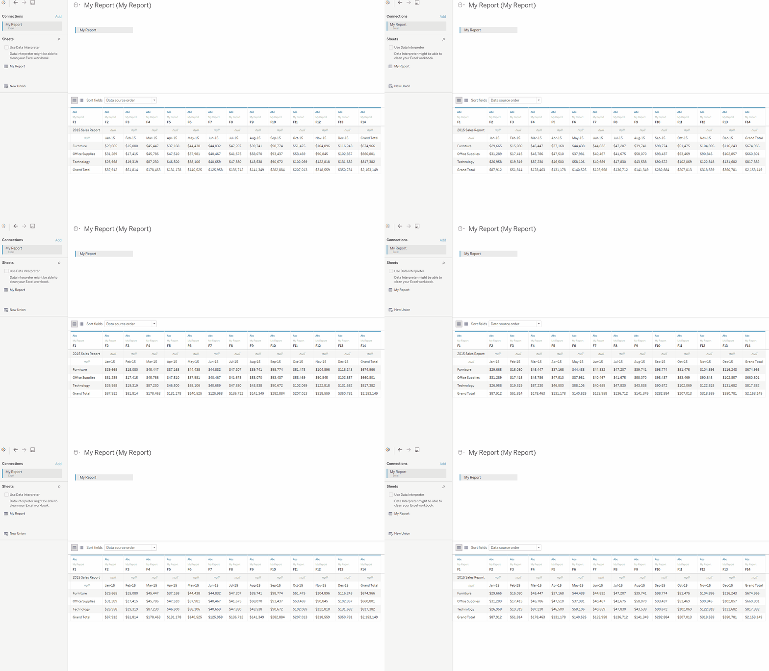
Much better. Our data is now in a more usable format than it was before. Understand that in our Department column there is a member called Grand Total. Once we begin creating our visualization, we’ll want to filter out Grand Total under Department or else it will be included in our viz (which, we don’t want). Additionally, we’ll want to hide our column called Grand Total as it’s just a summation of all of the months in our report. Remember: We can always add Grand Total to our views via the Analytics pane.

We’ll need to take one last step before we move onto our sheet and begin creating our visualization. Tableau works better with “tall” data as opposed to “Wide” data, so let’s use Tableau’s Pivot capability on our Monthly Sales columns so that we only have three columns in our data: Department, Month and Sales.
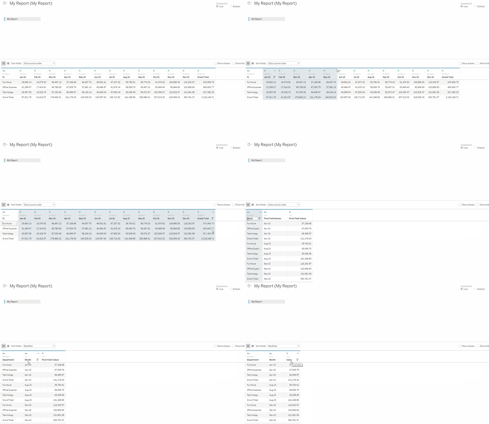
Once pivoted, we can rename our newly created columns to Month and Sales. Now let’s move on to Sheet 1.
Before creating our viz, we’ll want to filter out Grand Total under Department. Then bring Sales to Rows and Month to Columns and change our Marks to a line. Notice how our data is currently sorted?
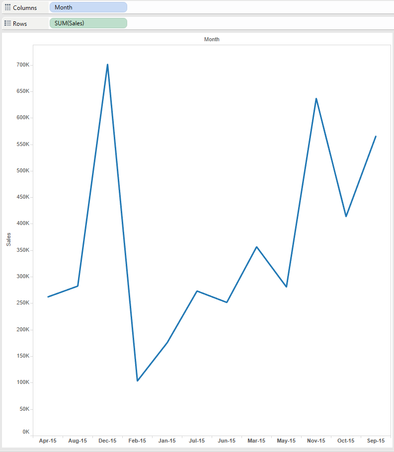
We’ll work around this by performing a manual sort. Once we’re sorted properly, we can bring Department to Color to show a time series of our monthly sales for each department.
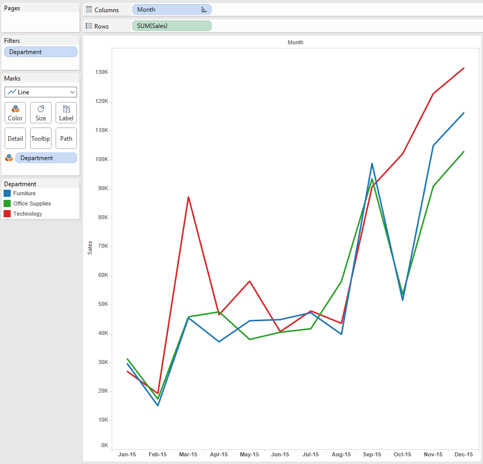
And that’s it. Ideally, we would be able to access the transactional database that originally created our sales report; but sometimes that’s not possible, and this solution works great in a pinch.

