Not everyone is a Tableau guru, at least not yet. To help Tableau rookies, we’re starting from square one with the Tableau Essentials blog series. The series is intended to be an easy-to-read reference on the basics of using Tableau Software, particularly Tableau Desktop. Since there are so many cool features to cover in Tableau, the series will include several different posts.
In this edition of Tableau Essentials, we’ll examine the Color button on the Marks card. Color options are a powerful way to add distinction to your visualization as well as depth to your data’s story.

The most important thing to keep in mind is that you can color your marks by a discrete field OR a continuous field. We’ll examine the difference in this blog and explore options for adding color to your viz.
Color by Discrete Field
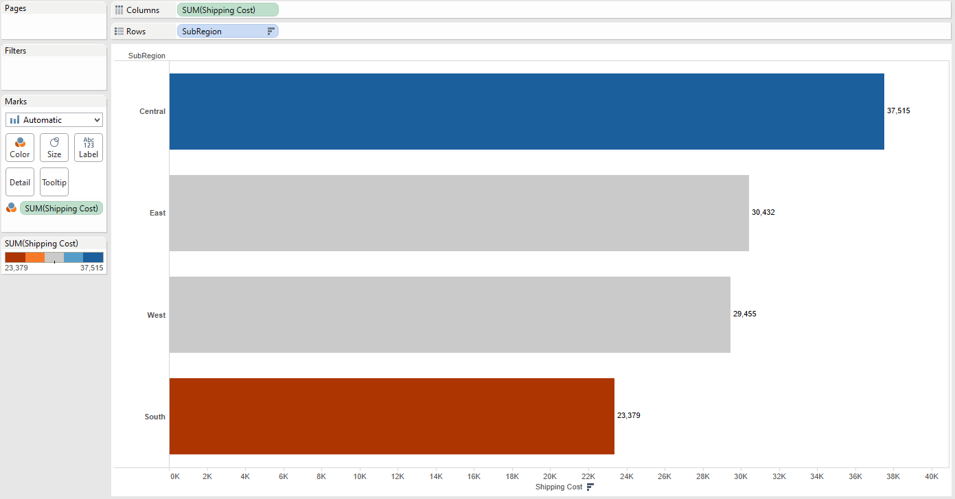
As discussed in previous posts in this series, discrete fields have a unique list of items. In the view below, I made a simple bar chart showing the SUM(Shipping Costs) by each SubRegion in our sample data source. The bars are sorted in descending order, and I dropped SubRegion on the Color shelf.
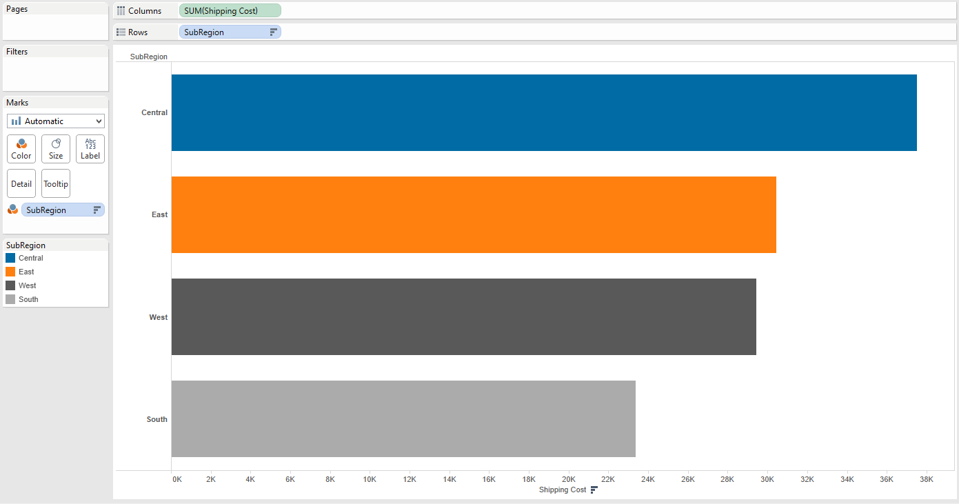
Notice that there are just four items in the SubRegion field: Central, East, West and South. When we click on the Color shelf, we have the option to edit the colors for these items:
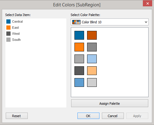
You can select from a list of color palettes that come standard with the Tableau Desktop software. You can also create and add your own custom color palette.
Color by Continuous Field
Using the same bar chart, I’ve swapped out the SubRegion field on the Color shelf with the measure Shipping Cost. See the results below:
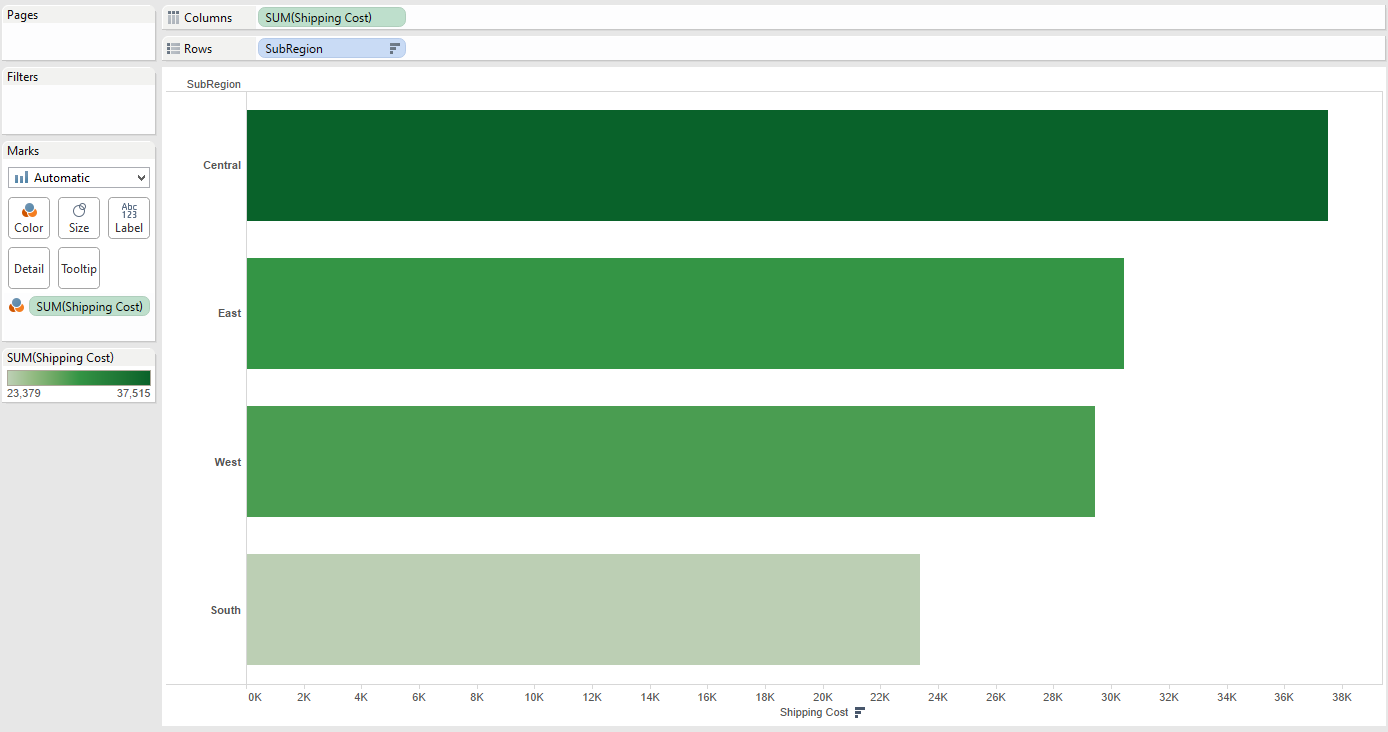
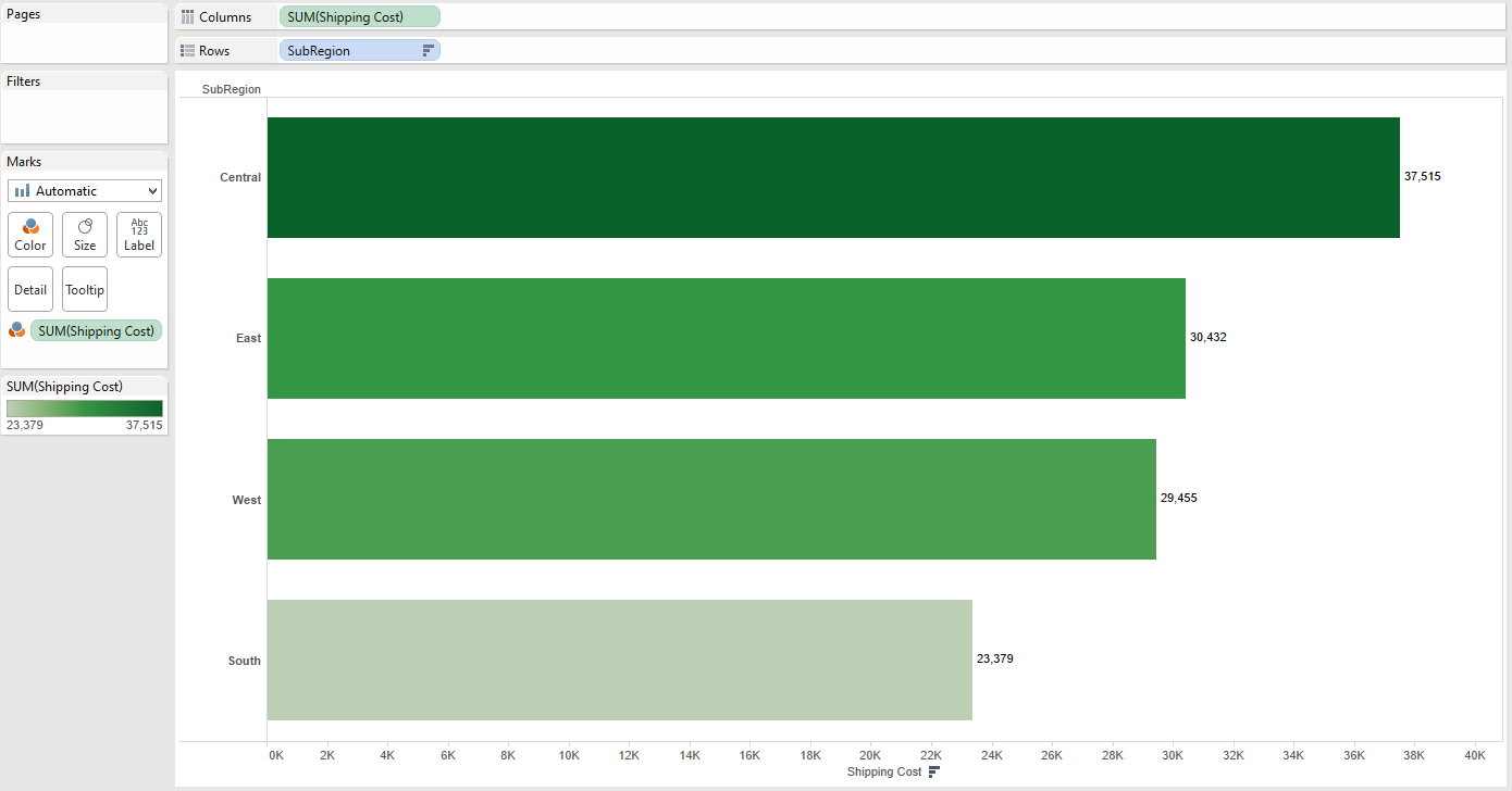
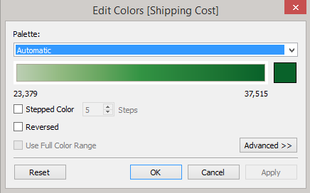
Notice that the color legend shows a continuous color range from light to dark green. Continuous fields have a range of values. By default, Tableau is coloring the bars based on the SUM(Shipping Cost), noting $23,379 is the smallest value and $37,515 is the largest. We can see where Tableau is getting this scale from by adding the mark labels (clicking the Abc icon on the toolbar):
Just as we can edit the color palette for a discrete field, we can edit the color palette for a continuous field.
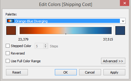
We have several options for controlling the colors of our bars. Not only can we select a completely different color palette (let’s choose a palette that’s color blind friendly as a best practice), we can also choose whether it’s a gradient from orange to blue:
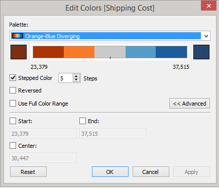
We can then choose to set the range into a set number of sections using the Stepped Color option. Reversed will just flip our colors to go from blue to orange. We can use the Advanced options to further refine the range:
Here’s the result of our changes to the continuous color palette:
Here’s something to consider: What if you wanted to create a view where if the SUM(Shipping Cost) is greater than $25,000, the bar would be blue (otherwise it would be grey)? There are a couple of ways we can do this, but one way is to create a simple calculated field and use that field to control the color of your bars. Below is the formula we’ll use for this scenario:
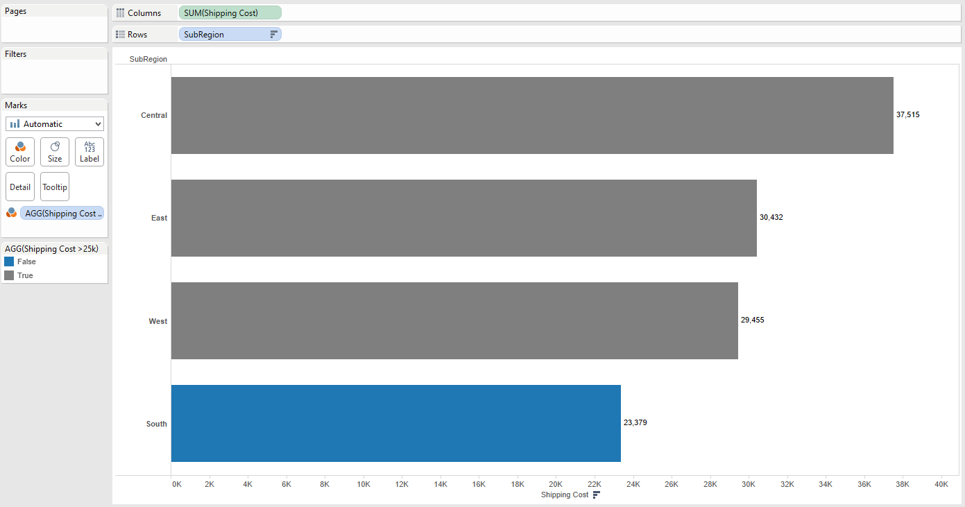
It’s a simple formula, but as you continue to collect data and refresh your data source, maybe the blue bar will reach $25,000 and turn grey one day!
Adjusting the colors of your marks and your visualization is ultimately more of an art than a science, but Tableau makes it easy to experiment. Just remember to use that Undo option every time you make a change that doesn’t suit your eye.
Pro Tip: If you really want to take your color palettes to the next level, check out our Color Tool for Tableau.
Formatting Tips
Below is a complete list of Formatting Tips posts that can help you transform your vizzes into works of arts. Check back frequently for new additions.
- Custom Shapes
- Labels
- Color
- Tooltips
- Maps
More Tableau Essentials
Want to learn more about Tableau? We have several posts outlining all of Tableau’s fantastic features. Check out the full list on our Tableau Essentials blog channel.
As always, let us know if you have any questions or comments about this post or Tableau in general. If you’re looking for personalized training or help with something bigger, contact us directly!