
Not everyone is a Tableau guru, at least not yet. To help Tableau rookies, we’re starting from square one with the Tableau Essentials blog series. The series is intended to be an easy-to-read reference on the basics of using Tableau Software, particularly Tableau Desktop. Since there are so many cool features to cover in Tableau, the series will include several different posts.
Today, we’re going to cover labels and some of the tricks and tips you can use with your visualization. To start, let’s take a simple horizontal bar chart.
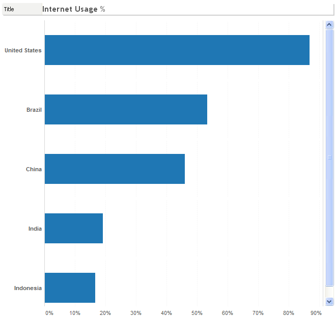
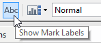
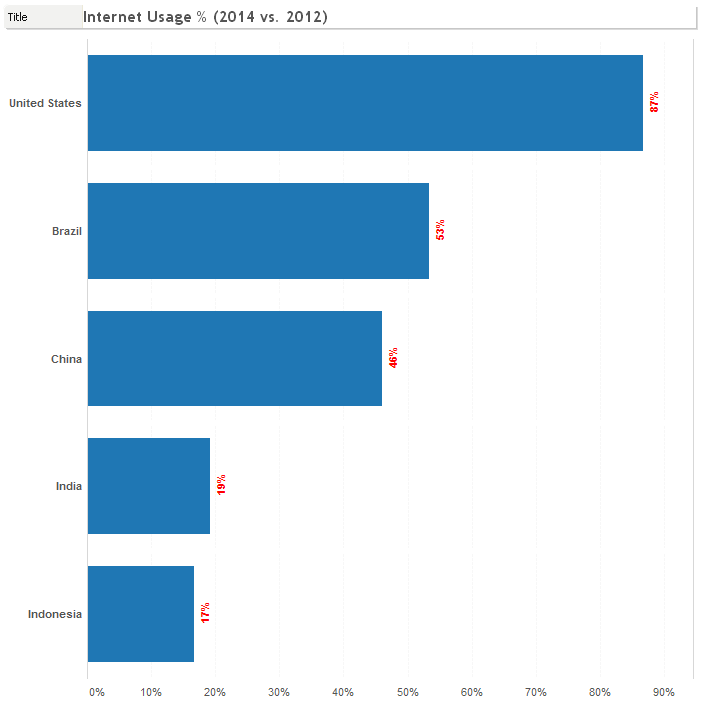
Our bar chart shows the penetration of Internet usage of countries with 200 million people or more. Now, let’s click on the Show Mark Labels button in the toolbar at the top of the Tableau interface.
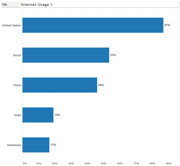
By default, Tableau will label your marks with the primary measure in the Row shelf:
If you have a densely packed visualization, like a packed bubble chart, then Tableau will selectively show some labels to avoid the labels being too cluttered and possibly overlapping each other.
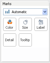
The first thing we’ll do is format our labels. Click on the Label button on the Marks card.
This will bring up the Label option menu:
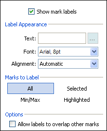
The first checkbox is the same as the toolbar button, Show Mark Labels. The next section, Label Appearance, controls the basic appearance and formatting options of the label. We’ll return to the first field, Text, in just a moment. The font and alignment control the stylistic elements:
- Font type
- Font size
- Bold
- Italics
- Underline
- Color
- Transparency
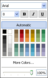
The Font menu is depicted here:
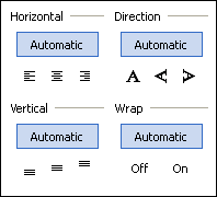
And the Alignment menu is depicted here:
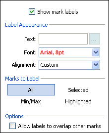
Let’s make our labels bold and red, and let’s also change the direction.
Here’s how our revisions look on the visualization:
Let’s add some additional measures to our labels. You can do this by dragging measures directly onto the Label button. Since there is no label specifically defined and Tableau is using the default, we have to start by dragging and dropping the primary measure else any other measure that we drag and drop will replace our current label. Then, we can add additional measures.
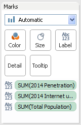
We have added three different measures to the label, indicated on the Marks card with the ABC 123 icon next to each. Now, each of those three fields will appear on the visualization, like so:

Let’s go back to that Text field on the label button menu. Clicking on the … button next to it will bring up the Edit Label window.
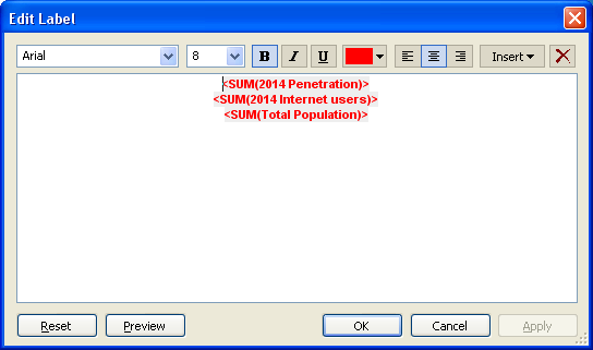
You can use this window to format the style of your labels very specifically or even use it to insert additional fields from your visualization with the Insert drop-down menu. The red X at the end will clear the formatting (but not your labels). You can even manually enter text into the text box.
Let’s change some of the formatting like this (as well as changing back the direction of our text on the Alignment menu):
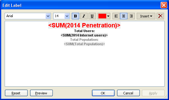
All of our formatting and changes to our labels makes our visualization look like this:
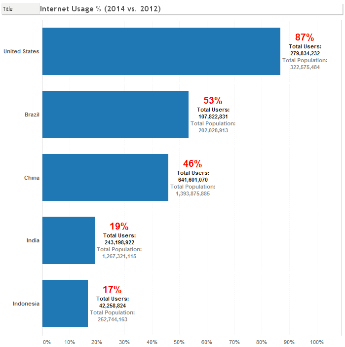
Now, you can see that our horizontal bar chart is much more informative and compelling than how we originally started. By making the primary measure more prominent, we kept the main message of our story but now with some additional information that really adds another level of detail.
Finding the right mix and blend of labels in your visualization will take a bit of an artist’s touch. There is no perfect formula to determine when you’ve hit the sweet spot between readability and too much clutter. Let us know if you have any questions or thoughts on labels!
Formatting Tips
Below is a complete list of Formatting Tips posts that can help you transform your vizzes into works of arts. Check back frequently for new additions.
- Custom Shapes
- Labels
- Color
- Tooltips
- Maps
More Tableau Essentials
Want to learn more about Tableau? We have several posts outlining all of Tableau’s fantastic features. Check out the full list on our Tableau Essentials blog channel.
As always, let us know if you have any questions or comments about this post or Tableau in general. If you’re looking for personalized training or help with something bigger, contact us directly!