Not everyone is a Tableau guru, at least not yet. To help Tableau rookies, we’re starting from square one with the Tableau Essentials blog series. The series is intended to be an easy-to-read reference on the basics of using Tableau Software, particularly Tableau Desktop. Since there are so many cool features to cover in Tableau, the series will include several different posts.
A bullet graph is a very powerful way to compare data against historical performance or pre-assigned thresholds. As you’ll see, we can include a lot of information in a small space with this type of chart that is also Tableau’s answer to those looking for a gauge or meter visualization. A bullet graph is similar to a standard bar graph except that there is a distribution showing progress towards a goal behind the bar. Like a standard bar graph, a bullet graph can be presented either horizontally or vertically.
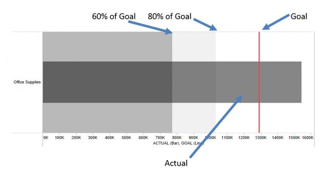
Here are the different components of a mark within a bullet graph:

In the image above, the dark gray bar represents actual performance while the red reference line is a goal. The underlying distribution range has been set to identify 60% and 80% goal completion. The example above shows that the current revenue is well above the reference line goal, indicating that this year’s performance was stronger than the previous one. Wondering if you can edit the look of a reference line or edit the distribution you want to display? When in doubt, right-click! Right-click on the axis to add (and if needed, edit) reference lines and distributions!
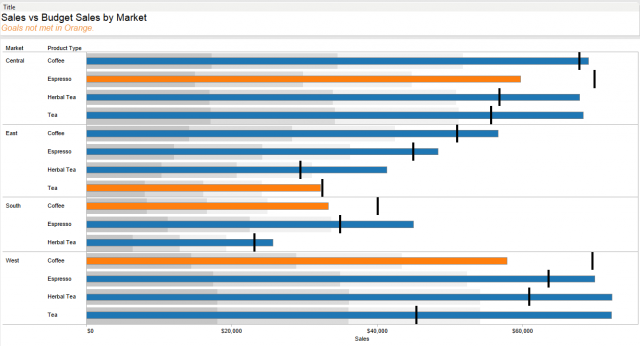
Here’s a more detailed view of how we can use a bullet graph to display a lot of information in a compact space using the Sample Coffee Chain data source that comes with your installation of Tableau Desktop:

Here, we can see actual sales values (the bars) for various product types in each market and the corresponding sales goal (the line) for each. I added a distribution for each bar to show 25%, 50% and 75% of the Budget Sales. Looking to further enhance your use of a bullet graph? Color the bars based on whether or not the actual values meet their respective goals (create a simple calculated field to determine whether the goal is met or not, and drop that field on the Color shelf). Note the use of the space in the worksheet title to include a bit of context — bars in orange have not met the Budget Sales goal.
The bullet graph adds a new level to the standard bar graph with the ability to compare against a goal. When you’ve got the appropriate fields selected in the Data window (hold down CTRL and click on multiple fields to select several at once), the Show Me button will do most of the work setting up your bullet graph. You can also do it manually by clicking on the measure axis and selecting Add Reference Line and Add Reference Distribution.
Other Chart Types
Here is the complete list of chart types from the Show Me menu. Be sure to check back often as we continue to release new articles in each chart type in this sub-series.
- Text Table (Crosstab)
- Heat Map
- Highlight Table
- Symbol Map
- Filled Map
- Pie Chart
- Horizontal Bar Chart
- Stacked Bar Chart
- Side-by-Side Bar Chart
- Treemap
- Circle View
- Side-by-Side Circle View
- Line Charts (Continuous & Discrete)
- Dual-Line Chart (Non-Synchronized)
- Area Charts (Continuous & Discrete)
- Scatter Plot
- Histogram
- Box-and-Whisker Plot
- Gantt Chart
- Bullet Graph
- Packed Bubbles
More Tableau Essentials
Want to learn more about Tableau? We have several posts outlining all of Tableau’s fantastic features. Check out the full list on our Tableau Essentials blog channel.
As always, let us know if you have any questions or comments about this post or Tableau in general. If you’re looking for personalized training or help with something bigger, contact us directly!
