Not everyone is a Tableau guru, at least not yet. To help Tableau rookies, we’re starting from square one with the Tableau Essentials blog series. The series is intended to be an easy-to-read reference on the basics of using Tableau Software, particularly Tableau Desktop. Since there are so many cool features to cover in Tableau, the series will include several different posts.
The Gantt chart was invented back in the 1910s by Mr. Henry Gantt as a way to visualize a schedule or progression of time. Since then, the Gantt chart has become a staple of project management methodology. Each task can be planned as an individual data point with interdependencies on other tasks and resources. You can see how a complicated project, such as developing a software application, could use a tool like this.
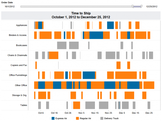
To exhibit the effectiveness of the Gantt chart and to illustrate a different way that it can be used outside of task planning for project management, let’s consider an example. Let’s look at how long it takes to ship items via different delivery methods used by our fictitious company.

Figure 1: Our Gantt chart.
To create the visualization above, we need the following:
- A dimension on the Row shelf (I used a field that shows various categories of items)
- A continuous date field on the Column shelf (I used the Exact Date value for my shipping date field)
- A dimension on Color (I used Ship Mode as shown in the color legend below the chart)
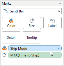
- The mark type set to Gantt Bar with a measure on Size to determine how large the segments of the bar will be (in this case, it’s a field called Time to Ship that calculates the difference in days between the Order Date and Ship Date).

Figure 2: A screenshot of our Marks card.
Hopefully, this whole exercise illustrates two things. First, the Gantt chart is a great visual tool for depicting information in relation to time, whether it is for scheduling or otherwise. Second, data and Tableau can be fun. I certainly hope you had fun in learning more about this chart type.
Other Chart Types
Here is the complete list of chart types from the Show Me menu. Be sure to check back often as we continue to release new articles in each chart type in this sub-series.
- Text Table (Crosstab)
- Heat Map
- Highlight Table
- Symbol Map
- Filled Map
- Pie Chart
- Horizontal Bar Chart
- Stacked Bar Chart
- Side-by-Side Bar Chart
- Treemap
- Circle View
- Side-by-Side Circle View
- Line Charts (Continuous & Discrete)
- Dual-Line Chart (Non-Synchronized)
- Area Charts (Continuous & Discrete)
- Scatter Plot
- Histogram
- Box-and-Whisker Plot
- Gantt Chart
- Bullet Graph
- Packed Bubbles
More Tableau Essentials
Want to learn more about Tableau? We have several posts outlining all of Tableau’s fantastic features. Check out the full list on our Tableau Essentials blog channel.
As always, let us know if you have any questions or comments about this post or Tableau in general. If you’re looking for personalized training or help with something bigger, contact us directly!

