Not everyone is a Tableau guru, at least not yet. To help Tableau rookies, we’re starting from square one with the Tableau Essentials blog series. The series is intended to be an easy-to-read reference on the basics of using Tableau Software, particularly Tableau Desktop. Since there are so many cool features to cover in Tableau, the series will include several different posts.
The horizontal bar chart is a bit of a misnomer, because simply switching the axes with the Swap button in the Tableau toolbar will magically make a horizontal bar chart into a vertical bar chart! That’s actually not the crux of this chart – it is simply that the measures are presented in a stand-alone bar. Should your bars be horizontal or vertical? Well, it depends on space and your labels. If you have to turn your head to the left for a long period of time to read the labels on a vertical bar chart, then it’s best to swap your view.
Some Cases for the Horizontal Bar Chart
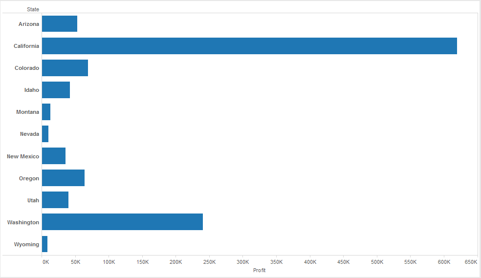
A horizontal chart type is right up there with the pie chart in terms of popularity, but it has far more utility. The chart makes quick work of information consumption for the report viewer. They can immediately see comparative relationships as well as approximate numeric values.

Figure 1: Horizontal bar chart.
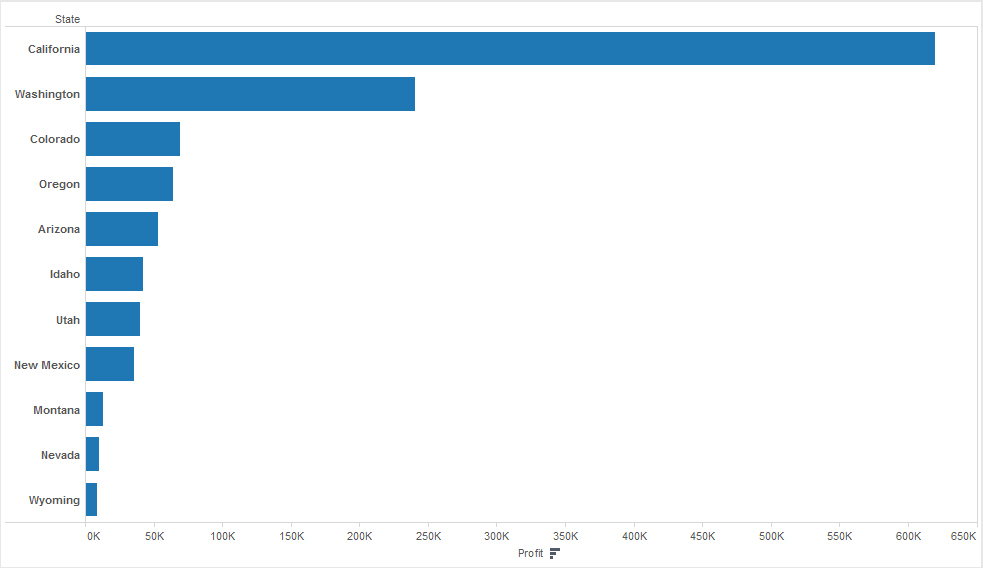
Horizontal bar charts are also easily sorted to present highs and lows. The example below highlights the real value of a bar chart in telling the “story” of the data.

Figure 2: Sorted by Profit.
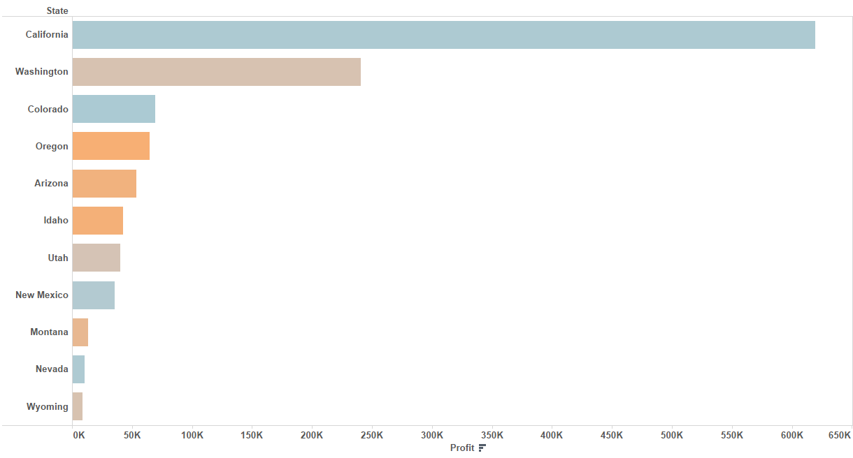
Finally, these types of charts are great for additional formatting to provide another level of information. An example might be a color scheme based on Profit Margin.

Figure 3: Formatted by Profit Margin.
In the final example above, I formatted the color of our bar marks by Profit Margin. Any value that was below 50% was colored with an orange scheme, and any values above that were colored in a blue scheme. The darker the blue, the higher the value.
There you have it! A horizontal bar chart is a simple yet effective way to communicate certain types of data, which is exactly why they’re so popular. They may not be flashy, but simpler is sometimes better.
Other Chart Types
Here is the complete list of chart types from the Show Me menu. Be sure to check back often as we continue to release new articles in each chart type in this sub-series.
- Text Table (Crosstab)
- Heat Map
- Highlight Table
- Symbol Map
- Filled Map
- Pie Chart
- Horizontal Bar Chart
- Stacked Bar Chart
- Side-by-Side Bar Chart
- Treemap
- Circle View
- Side-by-Side Circle View
- Line Charts (Continuous & Discrete)
- Dual-Line Chart (Non-Synchronized)
- Area Charts (Continuous & Discrete)
- Scatter Plot
- Histogram
- Box-and-Whisker Plot
- Gantt Chart
- Bullet Graph
- Packed Bubbles
More Tableau Essentials
Want to learn more about Tableau? We have several posts outlining all of Tableau’s fantastic features. Check out the full list on our Tableau Essentials blog channel.
As always, let us know if you have any questions or comments about this post or Tableau in general. If you’re looking for personalized training or help with something bigger, contact us directly!

