Not everyone is a Tableau guru, at least not yet. To help Tableau rookies, we’re starting from square one with the Tableau Essentials blog series. The series is intended to be an easy-to-read reference on the basics of using Tableau Software, particularly Tableau Desktop. Since there are so many cool features to cover in Tableau, the series will include several different posts.
We’ve already covered the other type of map view in the symbol map article. Now, let’s look at the filled map chart type. The filled map is another view ideal for geographic data. Instead of circles or squares to display data points, the filled map uses shading on a country or state basis to indicate relationships. You can control the shading with the Edit Colors option in the Marks card.
Note: Tableau 8.1 was used to create the map images in this blog post. For more on changes to maps in Tableau 8.2, see our post here.
Let’s just review the map navigational tool before we get started:

This tool has four controls. They are (starting from top to bottom): zoom in, zoom out, zoom into a selected area using a click-and-drag and reset map. For a more controlled zoom in and zoom out, hold CTRL and scroll with your mouse wheel. These controls will help you and your report viewers navigate around your view, particularly if you’ve got a lot of detail spread across the globe. To pan across your map, hold SHIFT and left-click drag your mouse across your screen.
Example: Visualizing Sales Around the World
Sticking with the data source we’ve been exploring in this blog series, let’s say we want to visualize our sales in our store locations across the world. We have a field in our data source which Tableau recognizes as having a geographic role (State). When you double-click on that field, Tableau will automatically generate a map. You might notice a few little hiccups in getting your data to convert into geographic locations. Tableau will alert you by putting a small grey box—the null indicator—in the bottom right-hand corner of your visualization.

This means you have some locations that Tableau isn’t exactly sure where to place. Clicking on the grey box will bring up a menu:
![Special Values for [State]](/wp-content/uploads/sites/default/files/blog-content/TECTfilled1_0.png)
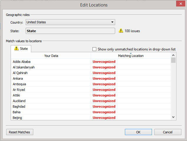
Often, our nomenclature in what we are calling a specific state or place doesn’t mesh with Tableau’s. It’s also possible to mix up international data with US states in the same field. Let’s try to fix this problem by first clicking on Edit Locations.

There are 100 states that are not matched in Tableau’s State list. As we scroll through the list, we see the reason why Unrecognized is listed—Tableau is looking to match states in the United States (which is selected above for Country).
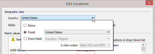
Correcting the issues identified by Tableau can be done a couple of ways. If you click on the red text that says Unrecognized you will see a list of states. From this list, you can select the state that matches your data point. This is particularly helpful in doing a little data-clean up in Tableau. You can then change the underlying data source later. In our sample view here, it would make more sense to choose one of two routes to correct the issues. Click on the drop-down option where United States is listed for Country to see the following options:

You can select None, meaning that Tableau will not limit your locations to a particular country. You could also select From field, another field in your data source that contains additional details for the particular location you are trying to plot. With this option, Tableau knows the exact state and country in which you want to display your data.
I’ll select From field and add the Country/Region field from my data source to clarify where my State data should be displayed.
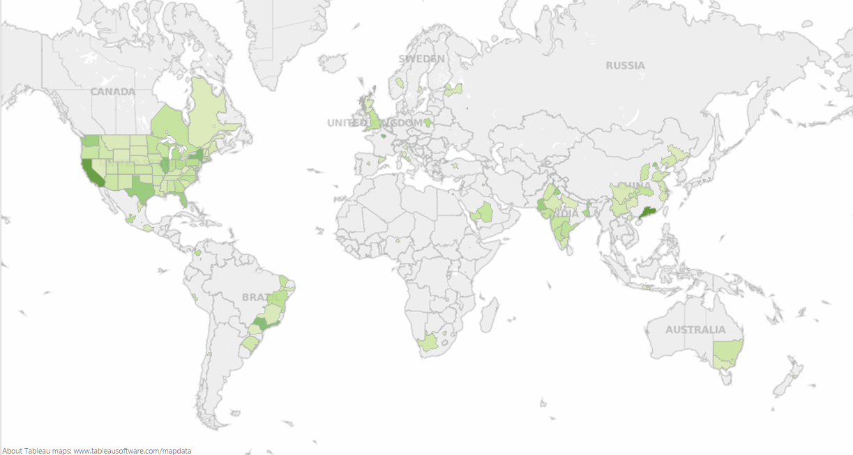
Click OK, and you’ve fixed the problem! I can now drag Sales to Color, and the Mark Type will automatically change to Filled Map. This quick process gives me the visualization below where higher sales are reflected by darker shades of green:

Figure 1: Filled map.
There you have it! It’s easy to see how filled map visualizations are one of the funnest views to create in Tableau.
Happy mapping!
Other Chart Types
Here is the complete list of chart types from the Show Me menu. Be sure to check back often as we continue to release new articles in each chart type in this sub-series.
- Text Table (Crosstab)
- Heat Map
- Highlight Table
- Symbol Map
- Filled Map
- Pie Chart
- Horizontal Bar Chart
- Stacked Bar Chart
- Side-by-Side Bar Chart
- Treemap
- Circle View
- Side-by-Side Circle View
- Line Charts (Continuous & Discrete)
- Dual-Line Chart (Non-Synchronized)
- Area Charts (Continuous & Discrete)
- Scatter Plot
- Histogram
- Box-and-Whisker Plot
- Gantt Chart
- Bullet Graph
- Packed Bubbles
More Tableau Essentials
Want to learn more about Tableau? We have several posts outlining all of Tableau’s fantastic features. Check out the full list on our Tableau Essentials blog channel.
As always, let us know if you have any questions or comments about this post or Tableau in general. If you’re looking for personalized training or help with something bigger, contact us directly!
