Our Certified Tableau Trainers are asked a myriad of questions each day. In this series, they share some answers.
Time for another question from Tableau Training, this time a question asked by Daniel from a DII: Intermediate course in Kuala Lumpur, Malaysia:
“I want to show my actual sales on a line graph, but I also want to combine that to show budgeted sales after today’s date.”
Let’s put on our crime solving hat and solve this very interesting question.
The Calculation
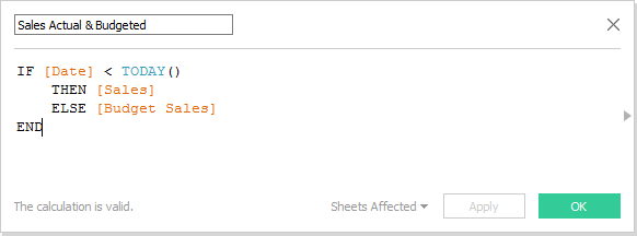
This is doable. We just need to set up our calculation first. I’m going to use some made-up data that has monthly sales as [Sales] in one column and budgeted sales as [Budget Sales] in another. Here’s our initial calculated field to combine the two measures together:
Now let’s create another field that we can use for our formatting:
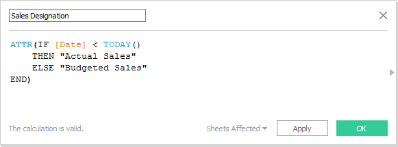
We are wrapping this calculated field in the ATTR function so that it doesn’t create two discrete lines when we drop this onto the color button. Instead, it will create a gradient color change between the two data points for actual and budgeted sales.
Build the Viz
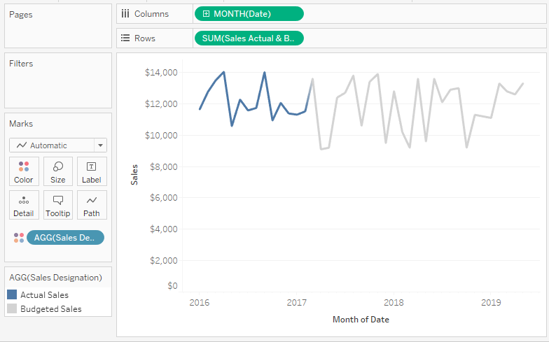
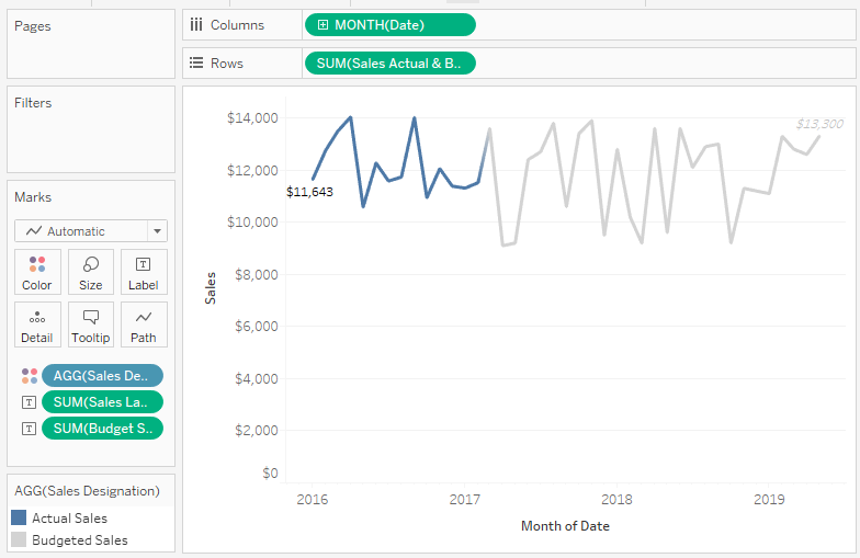
Let’s build our view by putting our Sales Actual & Budgeted measure on Rows along with the date value of month (i.e., continuous) on columns. Next, let’s put our Sales Designation on the Color button to get the following:
And here’s how we are setting up our tooltips:
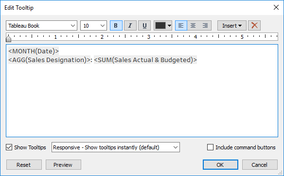
Our Sales Designation field will automatically adjust the tooltip label depending on where we look on our number line:
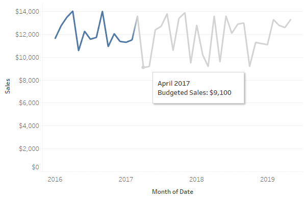
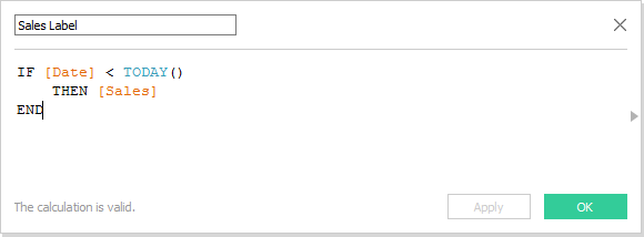
We can do more. Let’s make our field labels also dynamic for whether the line is showing actual or sales, and let’s also include conditional formatting for that. I’ll need a new calculated field for each label. First, actual sales:
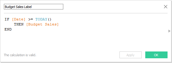
Next, budgeted sales:
Now, drop both on the Labels button and then format like so:
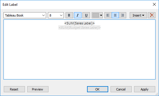
We have a lot of points of data on our view, 41 to be precise. So, I think it’s best we label our line ends to keep our visualization as simple as possible. Here’s what we end up with:
Thanks, Daniel, for the great question! Keep them coming!
