Questions from Tableau Training: Creating a Custom Legend as a Sheet

Data

Questions from Tableau Training: Creating a Custom Legend as a Sheet

by Kathryn Bridges
//

Our Certified Tableau Trainers are asked a myriad of questions each day. In this series, they share some answers.

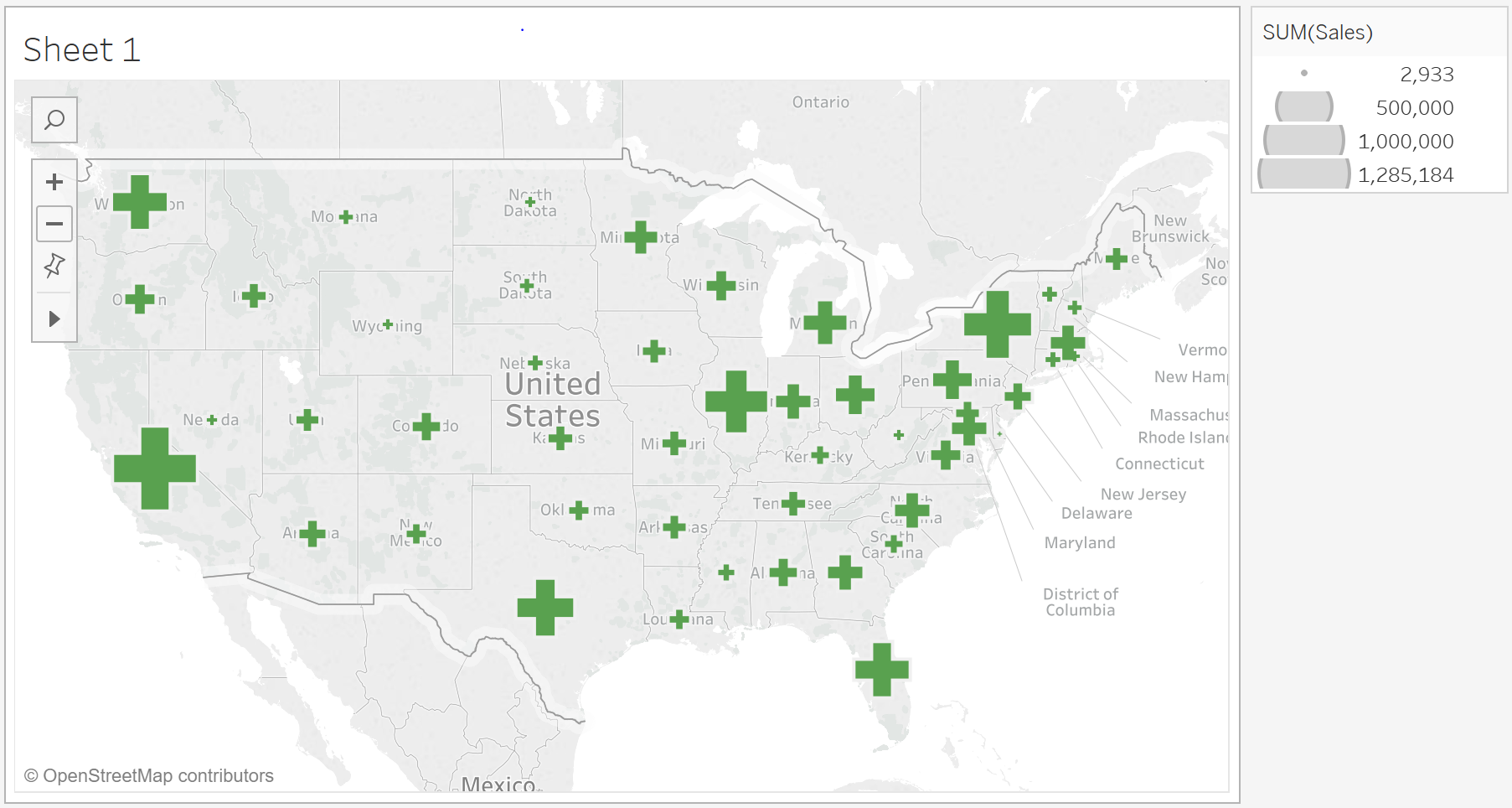
One of the exercises we often have in class involves plotting shapes on top of a map and sizing by a specific measure. Instead of using Tableau’s default (blue) circle, we use varying colors and shapes. However, regardless of what shape or color we use in our viz, our size legend always looks something like the one below:

Standard legend in Tableau

In a recent class, a student named Trent mentioned that having a legend with the appropriate colors and shapes would not only help show relative value, but it would also re-emphasize what measure we were looking at.

“So, how do we actually create such a custom legend in Tableau?”

First, a New Sheet

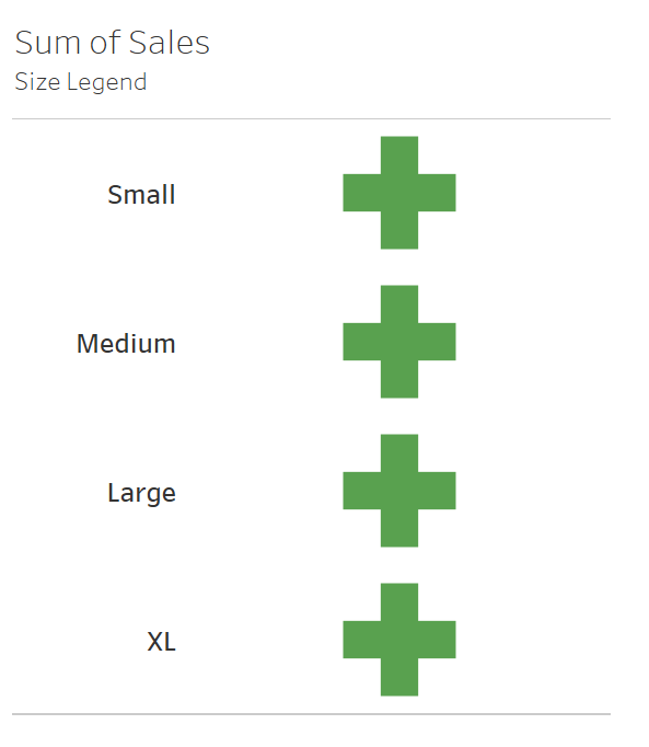
I worked with Trent to find a solution by creating a new sheet that will serve as our Legend Sheet. In this new sheet, the mark type is Shape, and the color and shape are the same as they are on our map (in this case, a green cross). Next, we will need a calculation that splits out the different relative sizes of the shape.  

Creating Size Brackets

In this sheet, we are sizing by total sales in each state, so I used a level of detail calculation to label my size brackets:

{ FIXED [State]:

if sum([Sales])<=3000 then "Small"

elseif sum([Sales])<=500000 then "Medium"

elseif sum([Sales])<=1000000 then "Large"

else "XL" end}

I bring this new expression, MAX(LOD Sales), to my Rows. Why use an LOD expression here? Well, if we just brought in SUM(Sales) or MAX(Sales), we would get one label that would have been XL, as Tableau would have aggregated across all states. Since we need a specific number of categories or size brackets, and we are sizing by state, we can create an LOD expression to satisfy exactly what we are looking for.

Sum of Sales Size Legend

Sizing Our Marks

Next, I want to size these crosses. I can bring Max(Sales) to Size, but in this case, the differentiation in the Max(Sales) for Medium and Large isn’t distinguishable, so I created one more LOD calculation, ({Fixed [State]:SUM(Sales)}, and then took the max of that value. Now, the crosses are sized by the state that has the most sales within each bracket.

Max(Sales) Legend

Adding Labels

Lastly, I add a label to show the values represented by each size by bringing that MAX{Fixed [State]: SUM(Sales)} expression to Text as well.

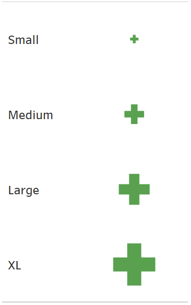
From a formatting perspective, I edit the label to include a >= sign, format my LOD expression to be currency and hide the headers for my initial legends labels (Small, Medium, Large, XL). Bringing that sheet back onto my dashboard, my new legend looks like this:

New Tableau map and legend

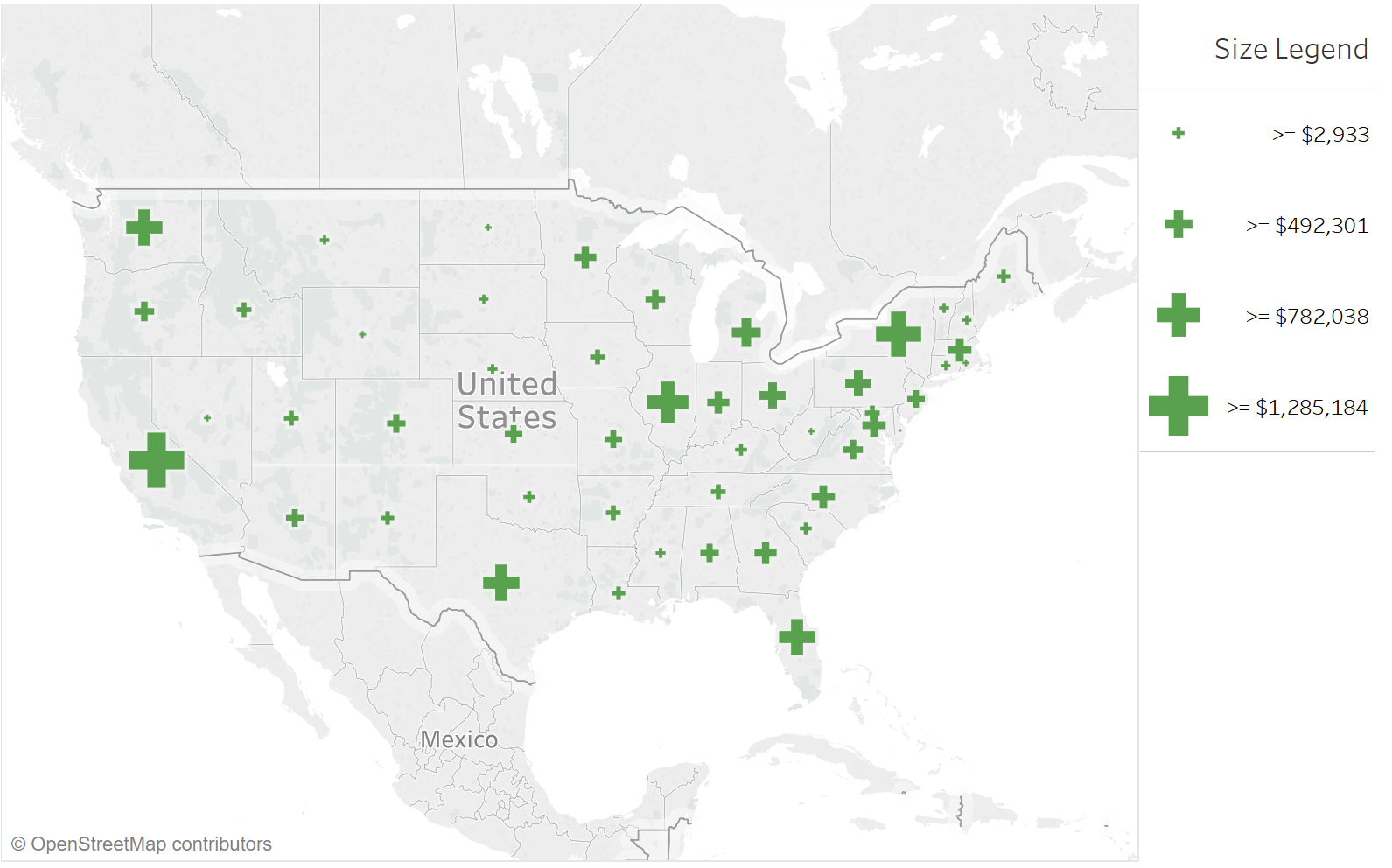
This works well for this chart, but I should mention that since we are sizing by an LOD calculation, if we filter our data, these legends aren’t going to change with the filter since they are fixed at the state level. If we have a dashboard that we know will have filters, we’ll need to get more creative about how we size and label these shapes.

Thanks for the question, Trent!

Want More Questions from Tableau Training

  1. Questions from Tableau Training: Quick Filter Interaction
  2. Questions from Tableau Training: Labeling with Table Calculations
  3. Questions from Tableau Training: Speeding Up Presentation Views when Using Tableau
  4. Questions from Tableau Training: Dashboard Actions
  5. Questions from Tableau Training: Business Day Calculations
  6. Questions from Tableau Training: Adding Gaps Between Bars
  7. Questions from Tableau Training: When to Pivot Data in Tableau
  8. Questions from Tableau Training: Adding Conditional Formatting
  9. Questions from Tableau Training: Setting Weekday Start
  10. Questions from Tableau Training: How Do ZIP Codes Work in Tableau?
  11. Questions from Tableau Training: The Small Grey Bar Within a Quick Filter
  12. Questions from Tableau Training: Matching Mark Color
  13. Questions from Tableau Training: Showing the Null Indicator
  14. Questions from Tableau Training: Can I Manually Set the Colors of a Stepped Gradient?
  15. Questions from Tableau Training: How Can I Get Box Plot Data into a Crosstab?
  16. Questions from Tableau Training: How Do I Clear a Worksheet? Make a Copy?
  17. Questions from Tableau Training: Opening URL Actions Inside of a Dashboard
  18. Questions from Tableau Training: Can I Move Mark Labels?
  19. Questions from Tableau Training: How Can I Use My Current Report to Create a Viz?
  20. Questions from Tableau Training: Can I Create Text Hyperlinks on a Dashboard?
  21. Questions from Tableau Training: How Can I Transform My Crosstab into a Flat List?
  22. Questions from Tableau Training: Labeling the Top N
  23. Questions from Tableau Training: How Can I Customize Charts with Parameters?
  24. Questions from Tableau Training: Combining Measures into a Single Line
  25. Questions from Tableau Training: How Can I Create Custom Color Palettes?
  26. Questions from Tableau Training: Can a Top N Parameter be Nested Within Other Fields?
  27. Questions from Tableau Training: Conditional Scope on Tableau Calculations
  28. Questions from Tableau Training: Top Ten Plus N
  29. Questions from Tableau Training: Dynamic Label Positioning
  30. Questions from Tableau Training: Using Cross Joins to Solve Active Tickets
  31. Questions from Tableau Training: Top N Highlight Table
  32. Questions from Tableau Training: How to Use Specific Dimensions in Table Calculations
  33. Questions from Tableau Training: Moving Reference Line Labels
  34. Questions from Training: Comparing Metrics for Same Weekday in Previous Year
  35. Questions from Tableau Training: Colouring Specific Columns and Rows in a Crosstab
  36. Questions from Tableau Training: Creating a Custom Legend as a Sheet
  37. Questions from Tableau Training: How Can I Draw a 45-Degree Angle?
  38. Questions from Tableau Training: Down the Aggregation Rabbit Hole
  39. Questions from Tableau Training: Percent Change from Previous Period on a Map
  40. Questions from Tableau Training: Union File Names as Years
  41. Questions from Tableau Training: Conditional Coloring on Sparklines
  42. Questions from Tableau Training: Moving Column Headers to the Top of the View
  43. Questions from Tableau Training: Isolating Rank with Parameters and Calculations

More About the Author

Kathryn Bridges

Analytics Consultant
Matillion 101: Completing My First Job in Matillion If you’ve been following along in this Matillion series, you’ve already set up and logged into Matillion. From here, I’m going to talk ...
Time Travel with Snowflake A couple years ago, as I was trying to teach myself programming, I managed to wipe out my computer. It was a silly mistake—all I was ...

See more from this author →

InterWorks uses cookies to allow us to better understand how the site is used. By continuing to use this site, you consent to this policy. Review Policy OK

×

Interworks GmbH
Ratinger Straße 9
40213 Düsseldorf
Germany
Geschäftsführer: Mel Stephenson

Kontaktaufnahme: markus@interworks.eu
Telefon: +49 (0)211 5408 5301

Amtsgericht Düsseldorf HRB 79752
UstldNr: DE 313 353 072

×

Love our blog? You should see our emails. Sign up for our newsletter!