Our Certified Tableau Trainers are asked a myriad of questions each day. In this series, they share some answers.
We get lots of questions conducting Tableau trainings across the country. Many of them unveil new functionality that Tableau releases that we as trainers come across first when teaching new Tableau users. The below question has many answers, but I wanted to highlight something from Tableau 9.2 that may have gone un-noticed by some, including myself.
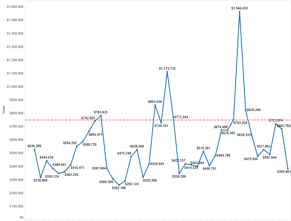
Is there anyway on my trend chart to make the dots and labels above my reference line the same color?
The student gave me the below visualization. What they wanted is for the labels and the marks to be the same color.

The answer is yes, this is possible. There are a couple ways to do it. How you want the visualization to look is up to you.
Option 1: Dual Axis with Matching Mark Color
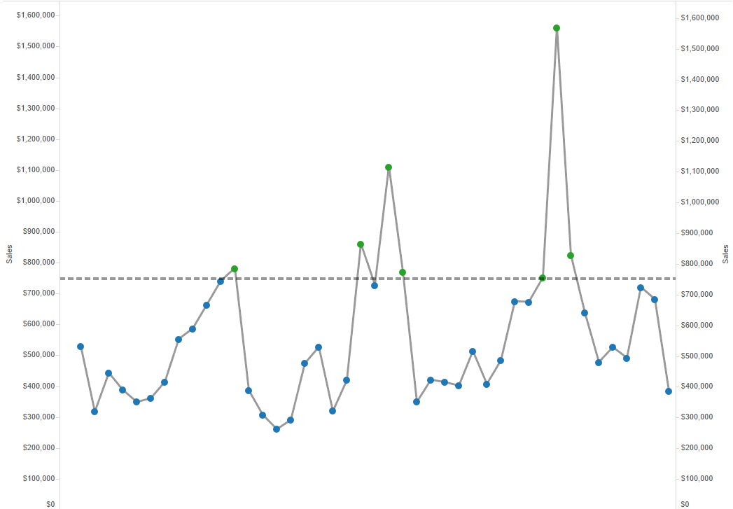
I first duplicated the chart that the student had created using the Superstore data set. I then created a dual axis with the same Sales measure and made the Mark type a Circle. I then created a calculated field to identify the marks greater than the reference line. I placed this on the Color shelf with the Circle mark type.

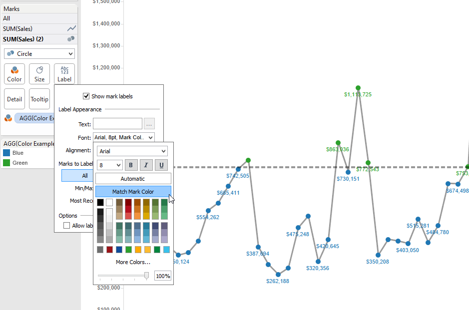
Now comes the new functionality. I can now click the Label card, check Show Mark Labels and then go to the Font/Color drop-down where I can check Match Mark Color:

My labels now match my marks as was requested. I also have the ability to make my trend line the color of my choosing in this example.
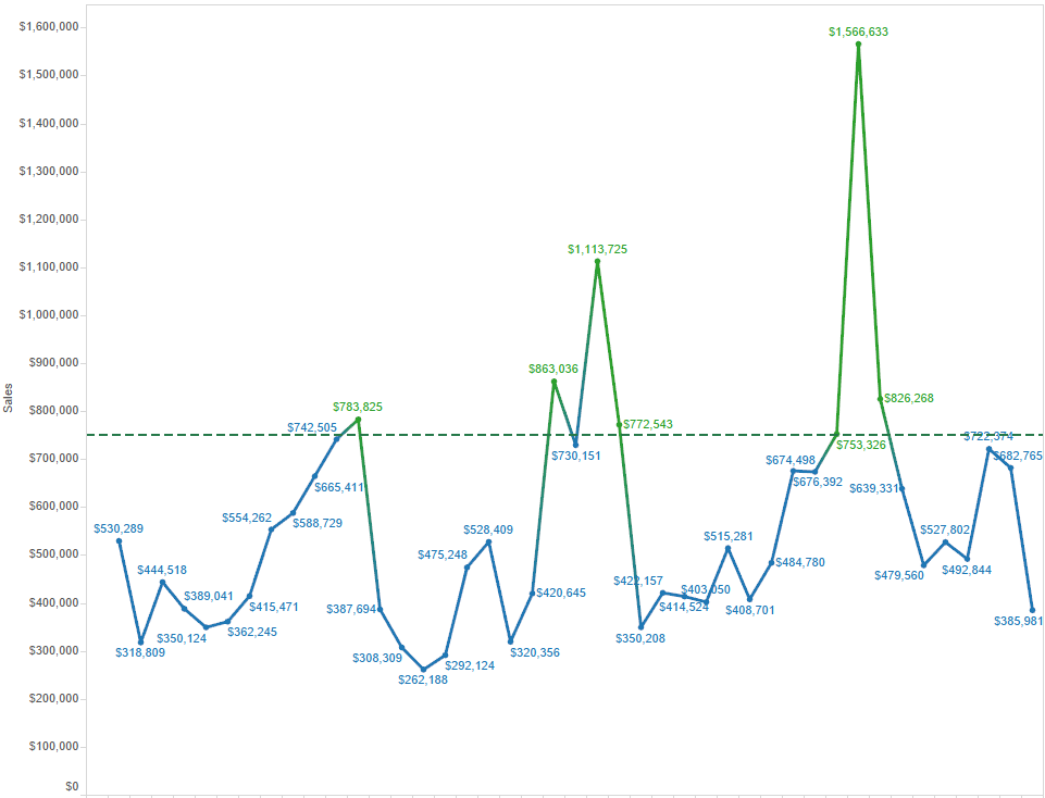
Option #2: No Dual Axis, Just Check the Box
Another option for achieving this result is by simply checking the Match Mark Color Box without a dual axis, but this may not be the clean look you are going for. This will color both your line and your mark. It may be useful in some instances, drawing attention to an area based on the color heat. Really, I just wanted to show both for reference.

