In the past, Tableau used to have a maximum number of 16 dimensions on the Rows shelf. Whilst it is generally not recommended to create tables that exceed that number anyway (there are other tools for that), Tableau has upped the limit to 50 and one would hope that this would be enough for anyone. However, back in the day when this limit was still 16, one workaround was called the Forklift.
Now, the primary goal of the forklift was to up the limit in a hacky sort of way. Instead of adding more dimensions to the Rows shelf, you add “fake” metrics to the Columns shelf. The mark label of this fake metric can then be used to add an extra dimension (or metric in text format). There are some other tricks you can use the Forklift for, like combining multiple mini vizzes into a table.
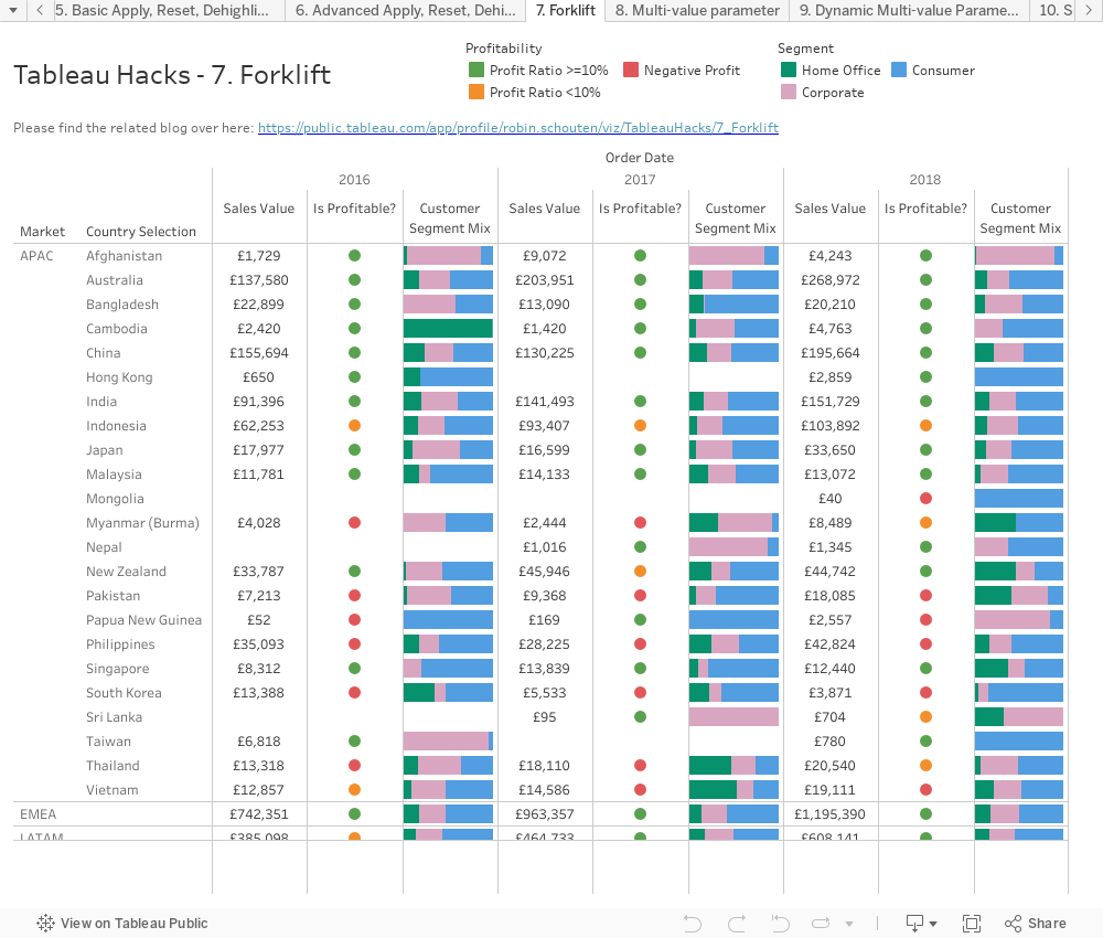
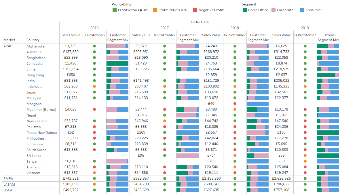
This part of our Tableau Hacks blog series will be short but quite useful, especially if you want to combine the power of visual analytics with the simplicity of a crosstab.
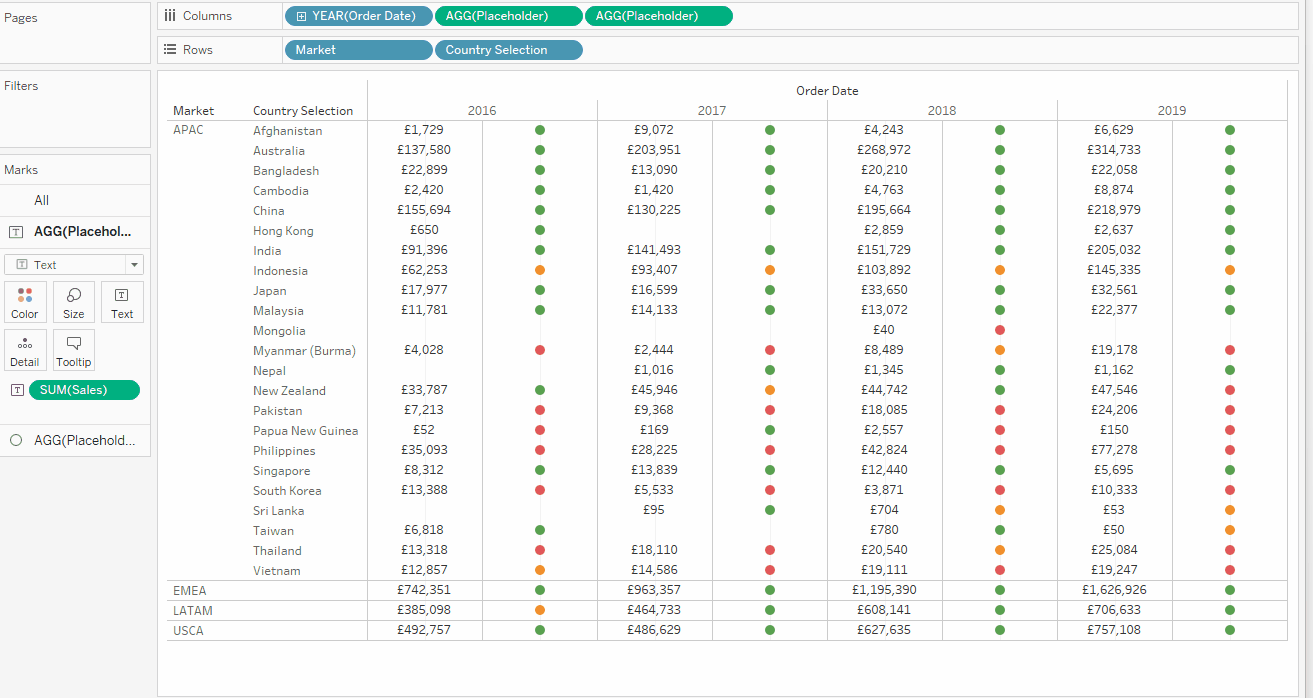
In one big table or crosstab, we want to see the total SUM([Sales]) by [Market] and [Country] as a number, a traffic light indicator to see profitability, and the Customer [Segment] mix, all of them also split by year. As icing on the cake, we would like to have [Market] in there as a higher level dimension that we can click to expand the countries underneath instead of the [Market]:
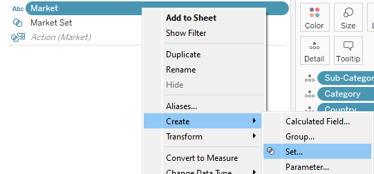
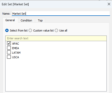
Let’s start with a fresh sheet. We need to create the [Market] set first, so right click the [Market] dimension and go to Create, then Set. For now, we will add APAC to the set:
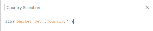
The next step is creating a calculation that will only show countries in the Market(s) that are in the set:
IIF([Market Set], [Country],’’)
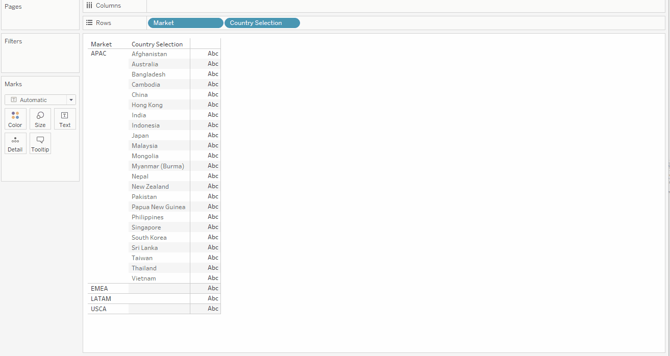
Let’s add [Market] and [Country Selection] to the row shelf. We will add the drill down logic later.
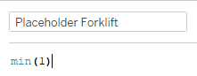
The next step is creating a fake or placeholder Metric. This field will act as a holding place on an axis to put our labels, values or even mini-vizzes on. The simplest way of doing this is creating this field called [Placeholder Forklift]:
MIN(1)
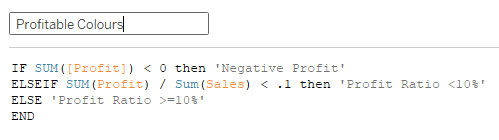
Now we create our calculation for the Profitability column that we will add in a bit.
IF SUM([Profit]) < 0 then ‘Negative Profit’
ELSEIF SUM([Profit]) / SUM([Sales]) < .1 then ‘Profit Ratio <10%’
ELSE ‘Profit Ratio >=10%’
END
Now add the YEAR([Order Date]) to the Columns shelf first and the [Placeholder Forklift] to the Columns shelf twice next to the year, one for the SUM([Sales]) and one for our Profitability indicator. Two bar columns will appear with bars going to one for all rows. Let’s change the mark type for the first [Placeholder Forklift] to Text and the second to Circle. Now drop SUM([Sales]) on the Text label for the first [Placeholder Forklift] and adjust the formatting to currency, and the [Profitability Colours] on the second [Placeholder Forklift] and adjust the colours. Finally, right click the axis at the bottom of the screen and untick “Show Header,” all of which you can see here:
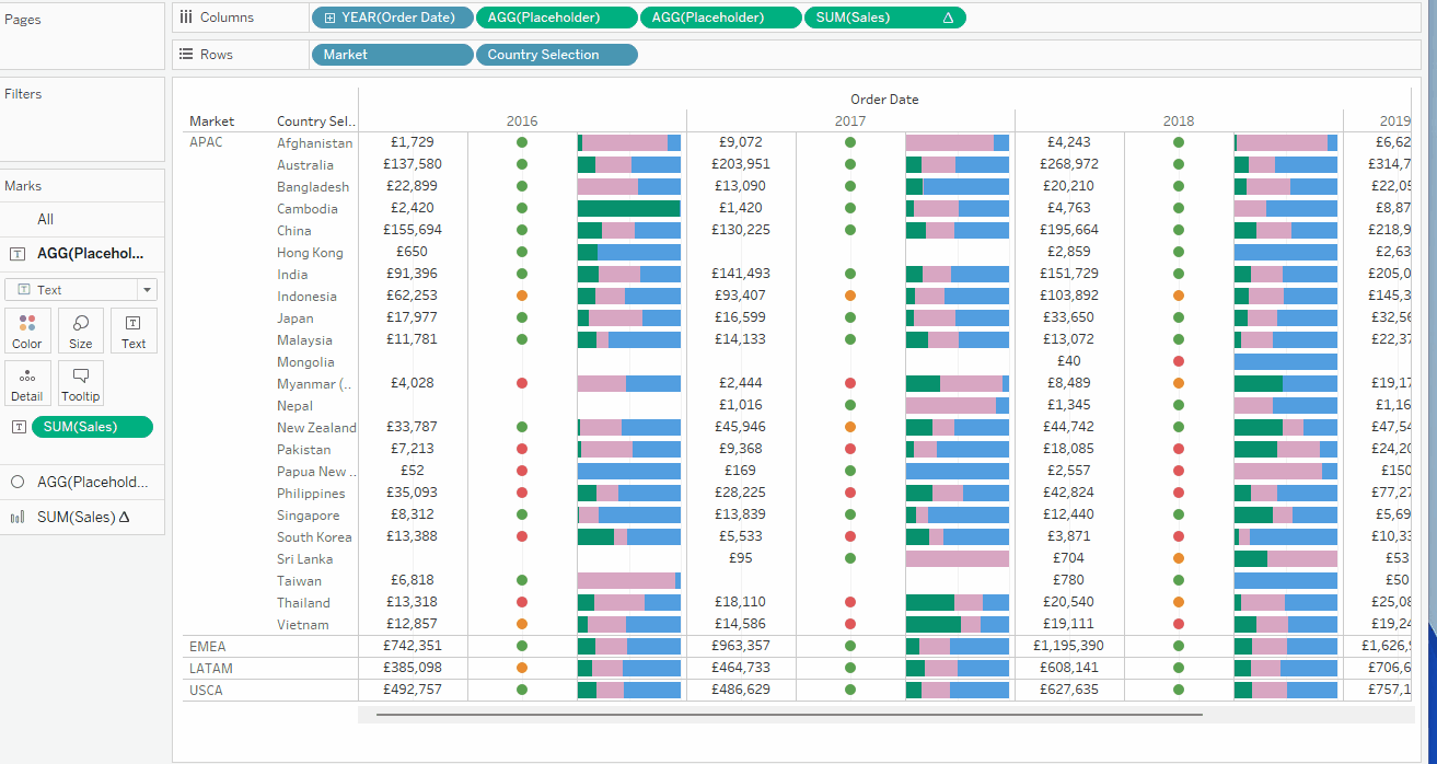
The [Segment] bar at the end doesn’t need to a placeholder column, as it is a stacked percent of the total SUM([Sales]) bar itself. What we will do is drop in SUM([Sales]) next to our second [Placeholder Forklift] on the Column shelf, right click the SUM([Sales]), select “Quick Table Calculation,” then “Percent of Total” and switch “Compute Using” to “Cell.” That will change all the bars to bars going to 100%, but if we drop [Segment] on Color, we get the mini stacked bar charts showing the percent of Total SUM([Sales]) by Customer Segment:
Now, you might have noticed that we don’t have labels for our Sales, Profitability and Customer Segment Mix columns. The problem is that Tableau will create Axis labels at the bottom of the screen, whereas we want Columns labels at the top of the screen. For this, the trick is to add an additional axis for every column, making them dual axis and making sure that no secondary mark is visible. You can make the secondary axis mark fully transparent, but the easiest way is simply making it a polygon mark.
We can than hide the axis ticks and add an axis label. Unfortunately, we cannot hide the bottom Headers completely when we want to be able to show the top Headers so we need to leave the bottom axis Labels blank and hide the ticks as well:
If you haven’t done so already, add the Forklift sheet to a dashboard. If you want, you can add legends for the Profitability “traffic light” and the [Segment].
Finally we have to add a Set Action to change the [Market] in the [Market Set] to update the [Country Selection] and change what countries we can see in the view.
On the dashboard, click Dashboard at the top of the screen, select Actions and add an action “Change Set Values.” Give it a useful name such as “Market Set Action” and select your Forklift sheet on the Forklift Dashboard as Source sheet. Now, select the [Market Set] as Target set and select “Assign values to set” for “Running the action will,” and “Keep set values” on “Clearing the selection will.” Finally, ensure the actions run on Select:
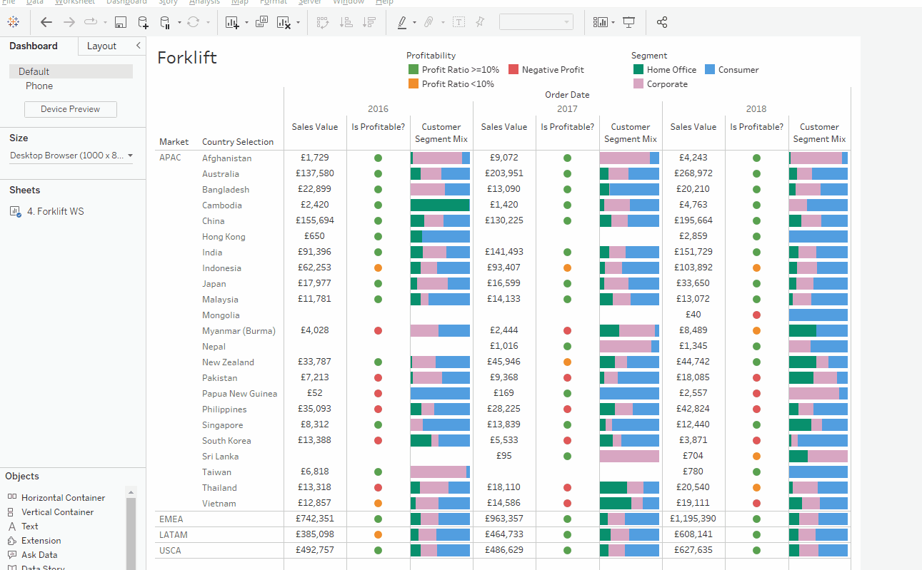
Check out the full dashboard for this blog post here: