Not everyone is a Tableau guru, at least not yet. To help Tableau rookies, we’re starting from square one with the Tableau Essentials blog series. The series is intended to be an easy-to-read reference on the basics of using Tableau Software, particularly Tableau Desktop. Since there are so many cool features to cover in Tableau, the series will include several different posts.
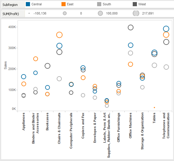
The circle view is another powerful visualization for comparative analysis. The example below in Figure 1 has quite a bit of information packed into a single visualization. First, you can see that we are examining the sales figures for each product category.
Take a look at the key on the top of the chart. The circles are colored by SubRegion and are sized by SUM(Profit). The larger the circle, the more profit that subregion generates for that product category.

Figure 1: Circle view.
With a quick scan, you can see that Chairs & Chairmats, Office Machines, and Telephones & Communication are all big sales generators. The smaller circles from Office Machines indicate that there is a much smaller amount of total profit than the other two more profitable categories.
Ask yourself a question: Is profit a useful measure to include on this visualization? Not really. It is safe to assume that categories that have more sales on the y-axis are naturally going to produce more profit and create larger circles. The circle chart in Figure 1 confirms that suspicion. Not very helpful. The relationship between sales dollars and profit dollars isn’t very clear in the subtle differences in circle size. What would happen if we substituted profit margin for profit?
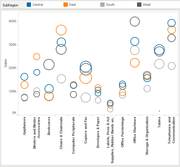
Take a look how our circle view changes from Figure 1:

Figure 2: Changing profit for profit margin.
We can now see that some product categories with high volumes in sales are actually less profitable. For instance, Copies & Fax is extremely profitable (large circles) while Envelopes & Paper is not (small circles). That’s a more compelling “story” because it adds to the information available to the viewer.
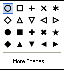
Additionally, almost everything in this visualization can be customized, including the circles themselves. If you want to change each plot so that a different color and a different shape represents your sales region, just drag the appropriate dimension onto the Shape button in the Marks card.

Figure 3: Shape options.
Above is a sample of the different types of shapes you can use in your circle view.
The circle view is a powerful tool with the ability to include several different fields into a meaningful visualization. I hope that you consider using this chart type in your dashboards and reports.
Other Chart Types
Here is the complete list of chart types from the Show Me menu. Be sure to check back often as we continue to release new articles in each chart type in this sub-series.
- Text Table (Crosstab)
- Heat Map
- Highlight Table
- Symbol Map
- Filled Map
- Pie Chart
- Horizontal Bar Chart
- Stacked Bar Chart
- Side-by-Side Bar Chart
- Treemap
- Circle View
- Side-by-Side Circle View
- Line Charts (Continuous & Discrete)
- Dual-Line Chart (Non-Synchronized)
- Area Charts (Continuous & Discrete)
- Scatter Plot
- Histogram
- Box-and-Whisker Plot
- Gantt Chart
- Bullet Graph
- Packed Bubbles
More Tableau Essentials
Want to learn more about Tableau? We have several posts outlining all of Tableau’s fantastic features. Check out the full list on our Tableau Essentials blog channel.
As always, let us know if you have any questions or comments about this post or Tableau in general. If you’re looking for personalized training or help with something bigger, contact us directly!
