Understanding Sequential and Diverging Color Palettes in Tableau
Tableau has two ways of coloring continuous measures: sequential and diverging gradients. The common understanding is that sequential palettes vary the intensity of one color while diverging palettes use two contrasting colors. This is generally true, but there’s much more to the story. Knowing how Tableau handles these can help you take full control of […]
Celebrating 1,000+ Posts on the InterWorks Blog
2014 has been a monumental year for InterWorks. From winning multiple awards and hiring like crazy to forging new industry partnerships, we have plenty to celebrate. However, just last week, we silently reached another landmark: The InterWorks blog reached 1,000 posts. To everyone at InterWorks who has taken part in blogging (which is a lot […]
Tableau Essentials: Chart Types – Box-and-Whisker Plot
Compared to the other chart types, the box-and-whisker plot (also known as the box plot) is a bit more complicated. Before we can delve into an example of how it is used within Tableau Software, we have to explain the logic behind this type of view. After that, we’ll build an example. Here is a […]
Highlights from Dell World 2014

Dell World. There aren’t many other brand-specific conferences bigger than this. Dell is obviously a company that needs no introduction. They’ve been a technology leader for decades, and that reputation continues to this very day. If anything, Dell continues to innovate with each passing year. That’s exactly why they’re still at the top. Dell products […]
Initial Configuration | DataGravity Discovery Series Part 4
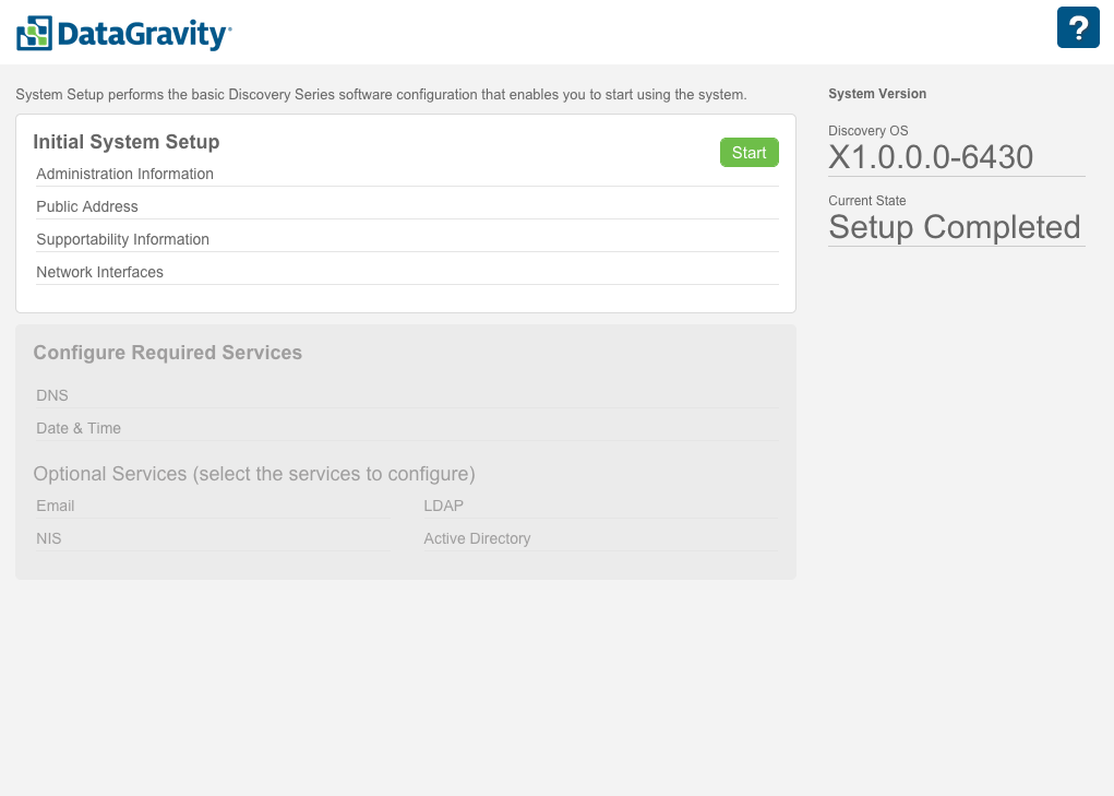
There are a handful of pre-requisites to cover before embarking on the configuration journey. Please review my prior article in this series if you haven’t already. Then, come right back. You now should have information on your various IP addresses, and the network should be configured. Now that those prerequisites are out of the way, the […]
Veeam 8 vs. Veeam 7: Failover Plan
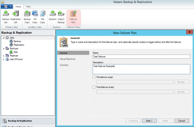
This is the third post in an ongoing series that compares new and improved features in Veeam 8 to those in Veeam 7. This article highlights the new Failover Plan feature. You can find all posts within this series on our Veeam 8 vs. Veeam 7 channel. To view a list of changes for Veeam 8, see this article. If […]
Traditional BI vs. Tableau – The Railroad and the Helicopter
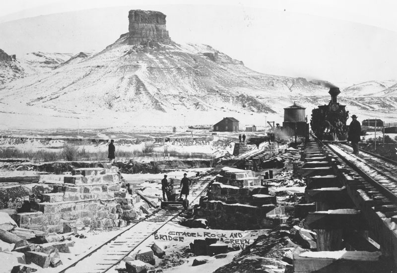
A few years ago while strolling through the streets of Barcelona during the European Tableau Customer Conference, I had dinner with a former Tableau employee (Bruno SAINT-CAST). He said something to me then that really resonated with my own experience with Tableau. Bruno said, “I think Tableau is a like a helicopter, and traditional BI is […]
Tableau Essentials: Chart Types – Histogram
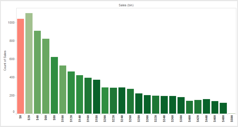
A histogram is a visual representation of the distribution of data. There are two ways to create a histogram: 1. Select a single measure. Right-click on that measure to create a bin field. Drag the bin field from Dimensions to the Column shelf. Drag and drop your measure on the Row shelf and change the […]
Veeam 8 vs. Veeam 7: Understanding Replication Jobs
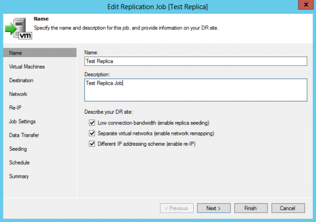
This is the second post in an ongoing series that compares new and improved features in Veeam 8 to those in Veeam 7. This article highlights the major new features in replication jobs. You can find all posts within this series on our Veeam 8 vs. Veeam 7 channel. To view a list of changes for Veeam 8, […]
19 Years of Bedlam Football Odds Visualized in Tableau
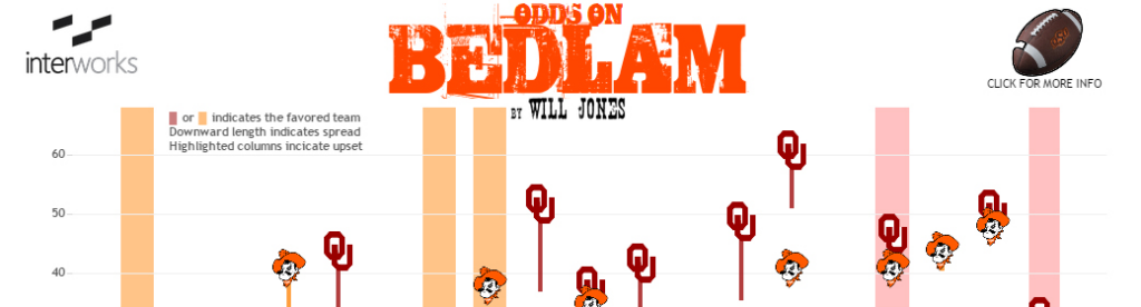
There are many of us at InterWorks who have deep roots at Oklahoma State University. Just recently, our CEO was honored by the OSU Spears School of Business as a top graduate. In addition to receiving a great education, we tend to pick up a fanatical devotion to OSU sports. OSU boasts a rich athletic […]