
Tableau Deep Dives are a loose collection of mini-series designed to give you an in-depth look into various features of Tableau Software.

A lot of the hard work is done when it comes to planning and building our Tableau dashboard. Up until now, we were asking business questions to help frame the requirements of our reporting tool and technical questions on how to build it and expand the functionality. Now, we are going to take our Deep Dive in Dashboard Design inside the brain as we consider how human beings think and optimally perceive data. This means I’ll be talking about how visual design impacts the effectiveness of a dashboard.
We are going to apply visual best practices to our Online Marketing dashboard to make it:
- Intuitive for our report consumer to use
- Synergistic across all our individual worksheets to create a singular and whole dashboard
Concepts
When it comes to visual best practices, there aren’t any hard and fast rules, such as “do this and never do that.” There are, however, guidelines that make sense most of the time. When you really understand the concepts driving these guidelines, only then should you break them.
Humans & Data
We are, at our core, animals. Our brains evolved to best cope and survive in our natural surroundings. In every sense, the human brain is a super computer and, given certain tasks, remains unbeaten by any hardware we’ve produced to date. For instance, robotic engineers find it extremely difficult just to get computerized mechanisms to pour water into a glass without spilling. The important thing to remember with data analytics is the way in which our brains operate most effectively. There are four primary visual cues that human perception is amazing at deciphering. Those are color, size differences, spatial relationships and movement.
As an experiment, let’s consider the following text table. It’s a big text table with 204 cells. Look at this table and within three seconds find me the highest and lowest value in the table. Go!
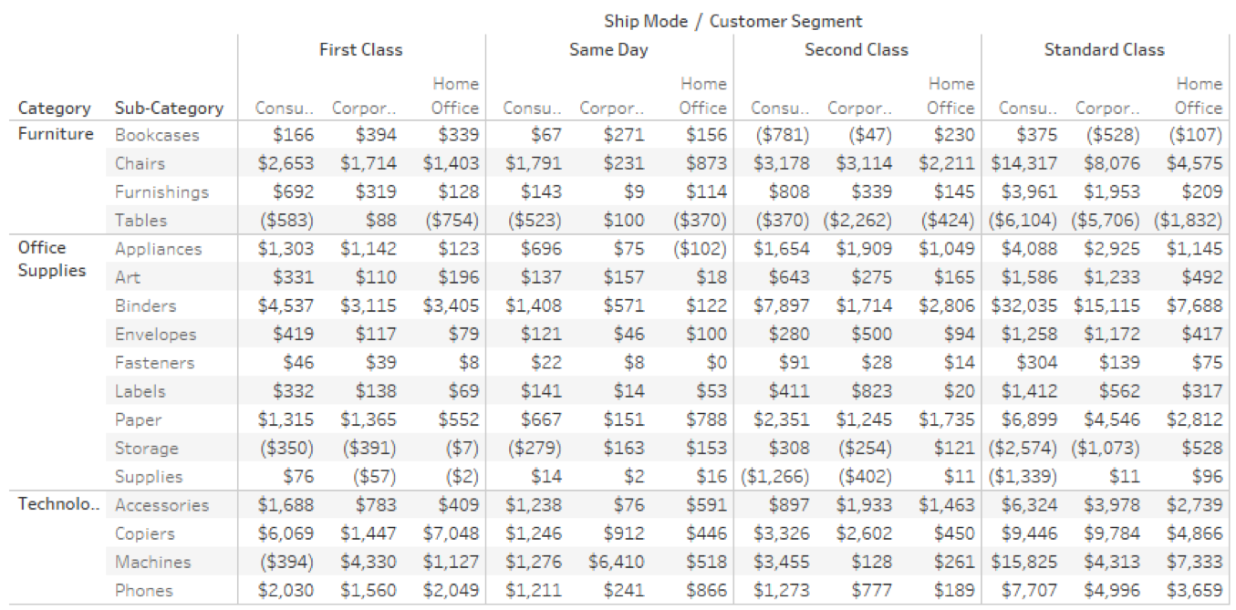
Pretty tough, eh? That’s because we have to compare each result individually to another, one at a time. That’s how our brains are programmed. Computers are very good at that type of operation. Now, let’s see what adding color does to our ability to interpret data.
Here’s the same data as above, but this time as a highlight table and color added:
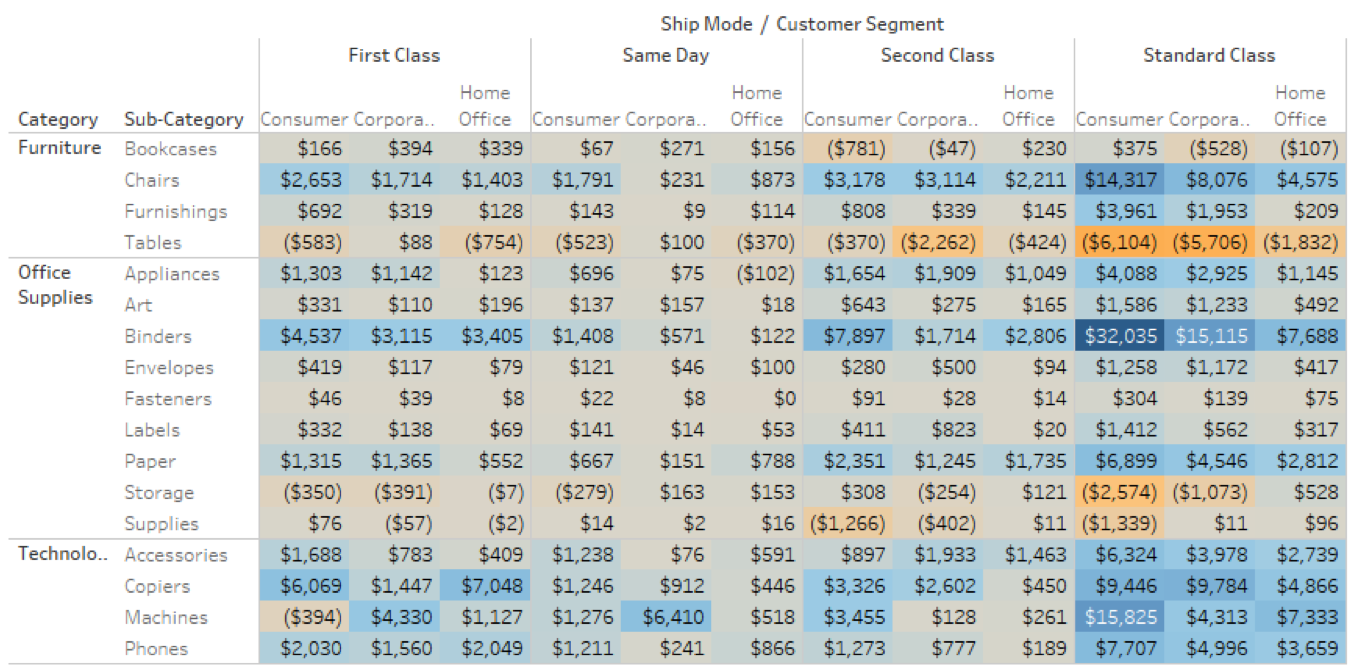
Immediately, our brain processes the entire table and spots the high (Consumers & Binders) and the low (Consumers & Tables). That’s because we’re asking our brain to do something it has evolved over millions of years to handle. Our survival in nature depended on this type of data analysis. This example is the crux of visual analytics and why we’re going to spend as much time making our dashboard “look pretty” as we do in the technical aspects.
Chart Junk
If I show you a new dashboard, there’s going to be a moment where your brain is just in hardcore processing. Your RAM is going to be maxing out to figure out what everything means. In the online marketing world, the threshold for getting web visitors acting on the page rather than processing was about three seconds. After that, I knew I faced a much higher abandonment rate. Make it easy to use and obvious. The same applies for a Tableau dashboard.
The biggest obstacle for usability in that first three seconds is chart junk. It’s all the clutter that naturally creeps up and up with our visualizations: gridlines, legends, axis titles, labels, borders, field headers and more. It’s distracting from the main point of each worksheet and collectively towards the effectiveness of the overall dashboard. How much of this is absolutely necessary? In truth, a lot less than you might think.
Color
In article two of this Deep Dive, I mentioned there was a limit to how many worksheets should go on a dashboard. It’s a point of diminishing returns. More does not mean better. This is also true with color. Too much color is like an assault on the eyes. It puts stress on the viewer to mentally associate what each color means to its corresponding value. For this reason, we should aim to manage our colors with a degree of frugality.
Keep your color palette to four or so primary colors. You can use gradients to represent degrees of intensity within a color, but they should be in the same color scale. Also, be consistent. If green represents sales in one chart, then green should represent sales in ALL charts.
Let’s talk for a moment about color choice. Universally, humans recognize good colors and alarm colors. Good colors are shades of blue and green. Alarm colors are shades of red and orange. Whether it’s from our primordial past as hunter gatherers (i.e. don’t touch the orange frog) or from the conventions of modernity (i.e. traffic lights), everyone intuitively understands what these represent.
We must be mindful of some limitations that our report consumers might have in terms of color blindness. As red-green color blindness is the most common, we shouldn’t rely too heavily on these colors to convey key differences on our dashboard. Provide some context so someone that can’t see hues could still see the data.
Focus the Narrative
Another important aspect to visual best practices is distilling down the intent and purpose of each chart. For instance, is this chart meant to show relative values to the whole? Or is it meant to show actuals? Yes, these determine the types of charts that we’ve employed on our dashboard as we discussed in part two of this Deep Dive, but they also determine how we format the chart itself.
Keep that in mind as you’re determining the best way to convey the message of your data rather than regurgitating a series of numbers. Find the narrative of each chart and let your visual elements reinforce it.
Practicum
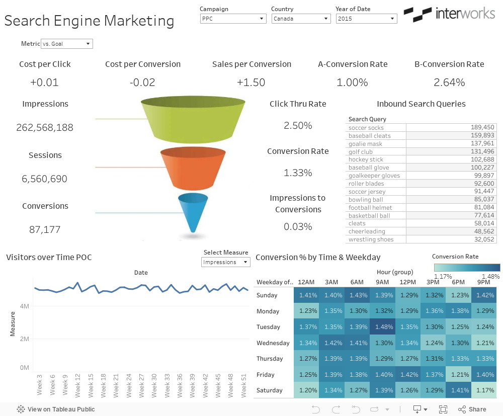
Now that we’ve got some basic concepts under our belt, let’s start to apply them. Our initial view was technically functional, but could use some big changes from a style perspective to help organize our dashboard visually and add consistency for our viewer.
Here’s our starting point:
Remove the Clutter
There’s a lot of clutter here that I can remove. I’ll show these changes as a bulleted list:
- Reduce the font size of the titles for my measure totals represented by a single worksheet
- Move labels as needed for emphasis on the numbers
- Remove chart borders
- Re-label my weekdays to an abbreviated format (i.e. Friday is F)
- Remove field labels
- Lighten my text across the entire chart
- Remove all % labels from my Conversion % by Time & Weekday and convert it from a highlight table to a heat map
- Remove the color legend
- Change “Year of Date” on the filter to simply “Year”
That’ll take out a lot of the non-essential elements that might detract from my dashboard. As a result, some of my tiled objects will be converted to floating, so I can move them around and get them out of the way of the flow of my dashboard.
Improve the Context
I’ve got sections of my dashboard that are implied in the layout, but aren’t demarcated visually. The first one is my row of KPIs across the top in two sections: the core metrics and the results of our A/B testing for our website. The second section is all of the supporting worksheets surrounding my conversion funnel. That’s really just one big visualization composed of lots of little vizzes.
To help frame the different sections of my dashboard, I’m going to format the worksheet titles with some background shading. When necessary, I’ll completely remove the worksheet title and get the same effect by using a text object in the exact same style. For the KPIs, I’m going to shade the worksheet background to make them look like input fields that we might see on a web page.
For example, my KPI section look like this with all my changes:
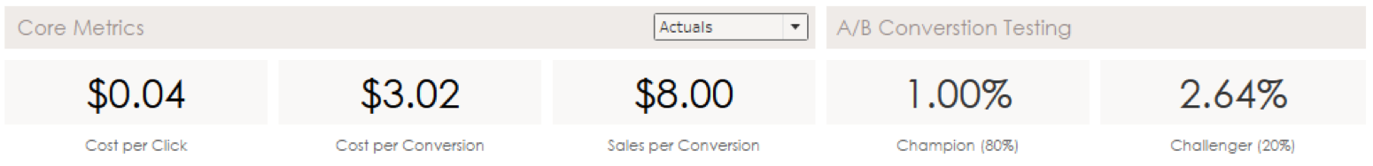
It gives an organization to this section that lets my user know these are all related and important.
Fix the Colors
I don’t have a lot of color, but the color I do have is consistent. For instance, I have two varieties of blue. The hue and saturation are the key elements here. If I go darker or lighter to create a gradient, those two attributes will stay the same. That means these two shades of blue are close, but just different enough not to match. To get deeper into our color palette, I’ll use the Select Color window to get more detail:
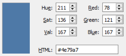
Line Graph & Heatmap Blue
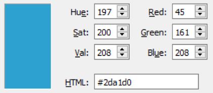
Funnel Blue
Also, my line graph uses the same color for all three measures: impressions, sessions and conversions. My funnel has a clearly defined color palette (green, orange, blue) and I should use that consistently across everything. So, I’m going to add contextual formatting for my line graph tied to my parameter selection. Here are my colors in the Select Color custom colors section:
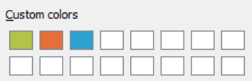
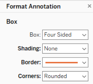
With these three colors in place, I can add a lot of context to my view by using them as borders on my conversion funnel for the appropriate numbers. I’m going to use area annotations around my numbers with no shading, so they are literally floating borders.
For my totals, I’ll use a single color. For my percentages, such as how many impressions it takes to create a conversion, I can use a combination of those two colors by using a KPI donut chart (i.e. a pie chart with a dual axis). It will take some adjustment to get everything sized just right in relation to my other view and everything I’ve just added needs to float on top of that conversion funnel area of my dashboard.
Here’s my overall effect:
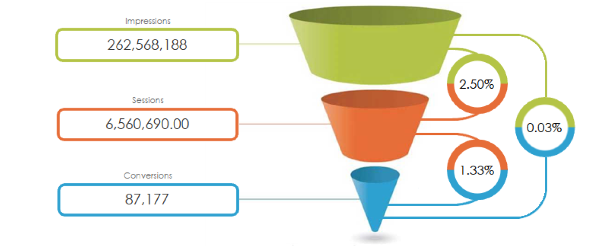
I’ve also created another underlying image to draw lines from my KPI donut charts back to my funnel. This use of color expedites the viewer’s understanding of the data, but doesn’t rely so heavily upon them as to make it impossible for a color-impaired person to interpret it as well.
Finally, our parameter that measures our KPIs as actuals or towards goal, can use a little color as well. When we’re looking at a +/- towards goal, I’ll use color to quickly code them as good or bad. Again, it’s an enhancement that doesn’t impede users with color blindness.
Sharpen the Message
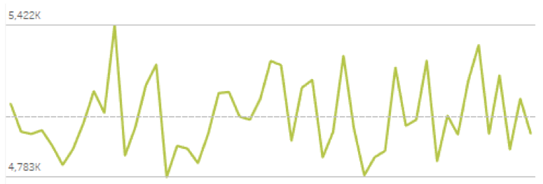
Our line graph showing impressions, sessions or conversions over time is showing actual results. It’s got a scale that’s so large, it is compressing the variance in the line quite dramatically. I’m not able to see much up or down swings as a result, the peaks and valleys.
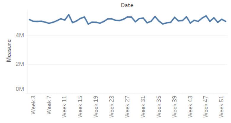
There are a lot of places where my report user can see an actual value in this dashboard, not even considering that each data point in this chart has the actuals inside of the tooltip. My intent of this chart was to show the variance, the seasonality, of each measure over time. This chart is not doing a great job accomplishing that mission.
I’m going to edit my axis so that it is forced to start from zero. That will allow my line graph to focus on only the applicable range of data. To double down on my goal of emphasizing the variance, I’m going to remove both axes altogether. We can add the context of the weekly increment in the worksheet title, “Weekly Performance”. Also, let’s add a reference band with the minimum and maximum of the table, along with a reference line to show the average. I’ll format them to be as unobtrusive as possible, to add a little bit extra when someone investigates this chart, but not to draw away from the weight of other charts.
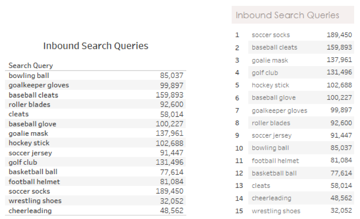
My top Inbound Search Queries need to show the top 15. To help clarify this, I’m going to add a rank table calculation to the beginning of the chart:
Bringing It All Together
With all our changes and a couple of extra flourishes in our dashboard title, we now have a dashboard that looks like this:
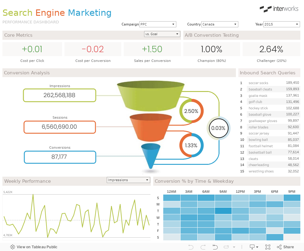
Much more effective and organized, just with some minor tweaks to the style.
What’s Next?
Our journey is not done yet. We’ve got an effective dashboard in terms of its presentation and data, but there’s another variable to consider: performance. Will our dashboard run fast, making it a great user experience? Or will it be slow and drive users away? Or will it be slow enough to cause issues across Tableau Sever, which will make your admins grumpy?
We’ll cover performance and governance in our next installment of the Deep Dive on Dashboard Design. Cheers!