
Robert updates user-submitted Tableau dashboards with visual best practices in this series, resulting in practical before-and-after insights.
I took a holiday break from vizzing for the InterWorks blog, but we’re back with our second installment of This Old Viz. This time, I went to the internet to find public information, landing on a portion of Toyota’s annual reporting.
Sales and Production Version 1
Here is the original spreadsheet from the Toyota website:
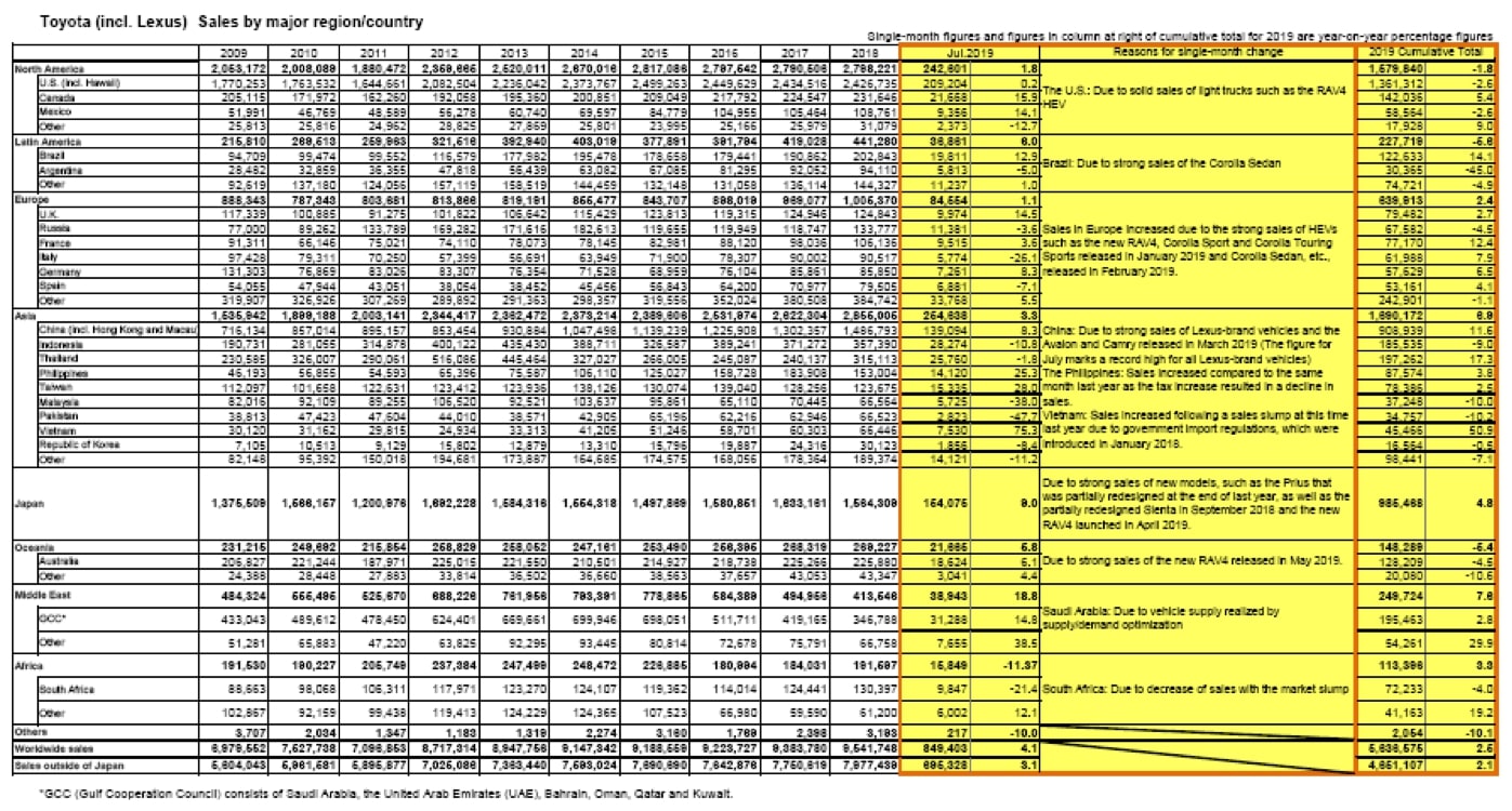
This is your basic Excel spreadsheet. A similar sheet was used to get their production information by country / region.
Sales and Production Version 2
Obviously, this is begging for a viz makeover. Right off the bat, you’re probably looking at the neon yellow columns. It’s practically paralyzing to actually get to any analysis, which should start with the July Cumulative Total column. About a third of this chart is using a single, very strong alarm color and it obfuscates the intent of this view. Plus, I wanted to put some extra polish on these numbers so that this dashboard would complement the visual elements of the more dynamic pages, while also leveraging familiar visualizations. I used this image from Toyota’s annual report as inspiration:
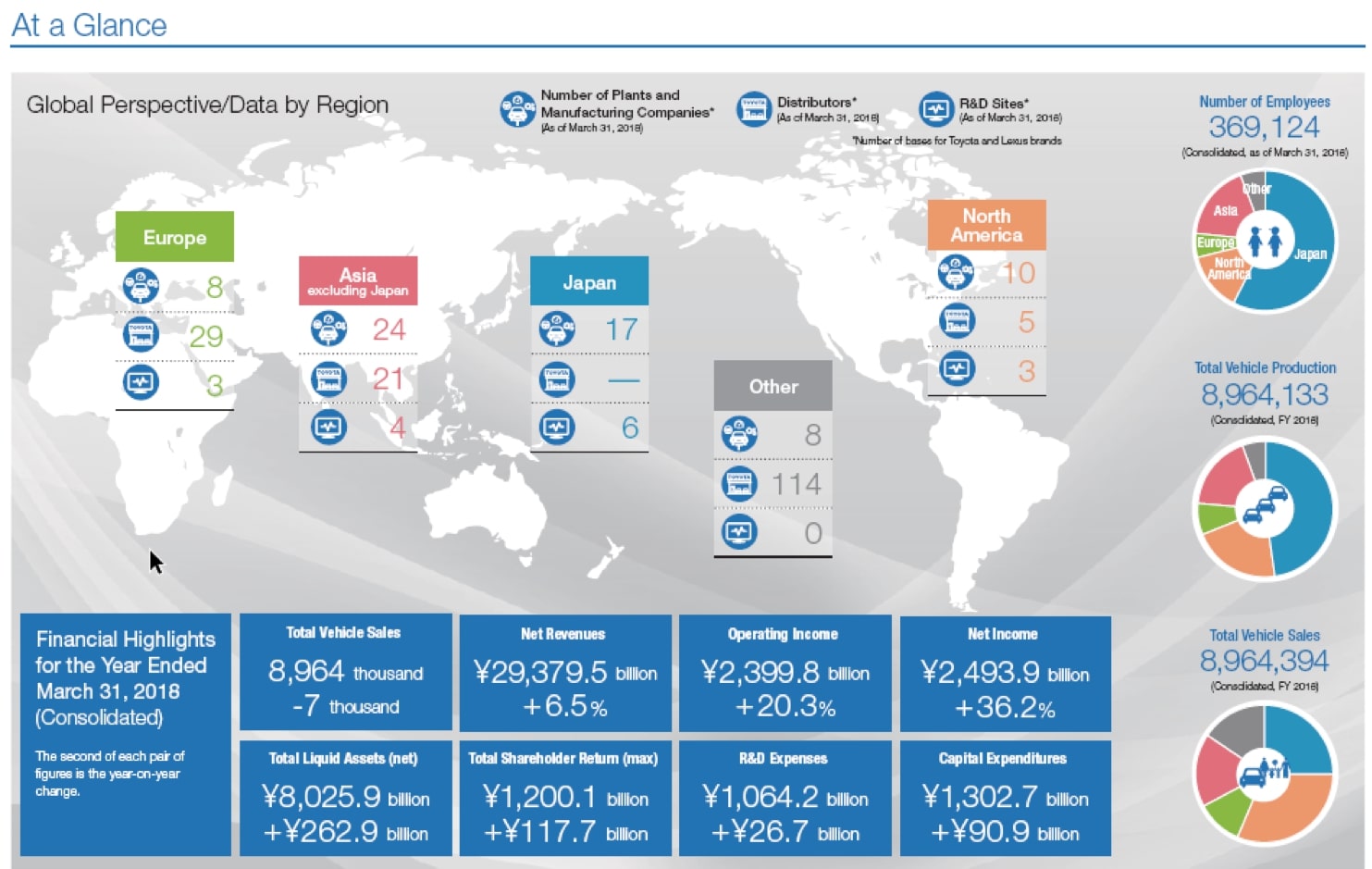
I started by revisiting the chart type within the original crosstab. Crosstabs have a specific function in the tool chest of chart types. It’s best when they’re used as an index for look-up values. Sure, users of this report might want to see the specific sales figure for South Africa in 2013, but in my opinion, there’s more value in highlighting the trend of sales over several years (i.e. line graph). I’m also interested in showing the distribution of Toyota’s global business as a part to the whole. Since Toyota was already using donut charts in their view above, we’ll stick with those. Combining these more useful chart types with this data, along with a more conservative use of color and some interactivity, we can consolidate this wall of numbers into a far more focused report.
Here’s what I came up with:
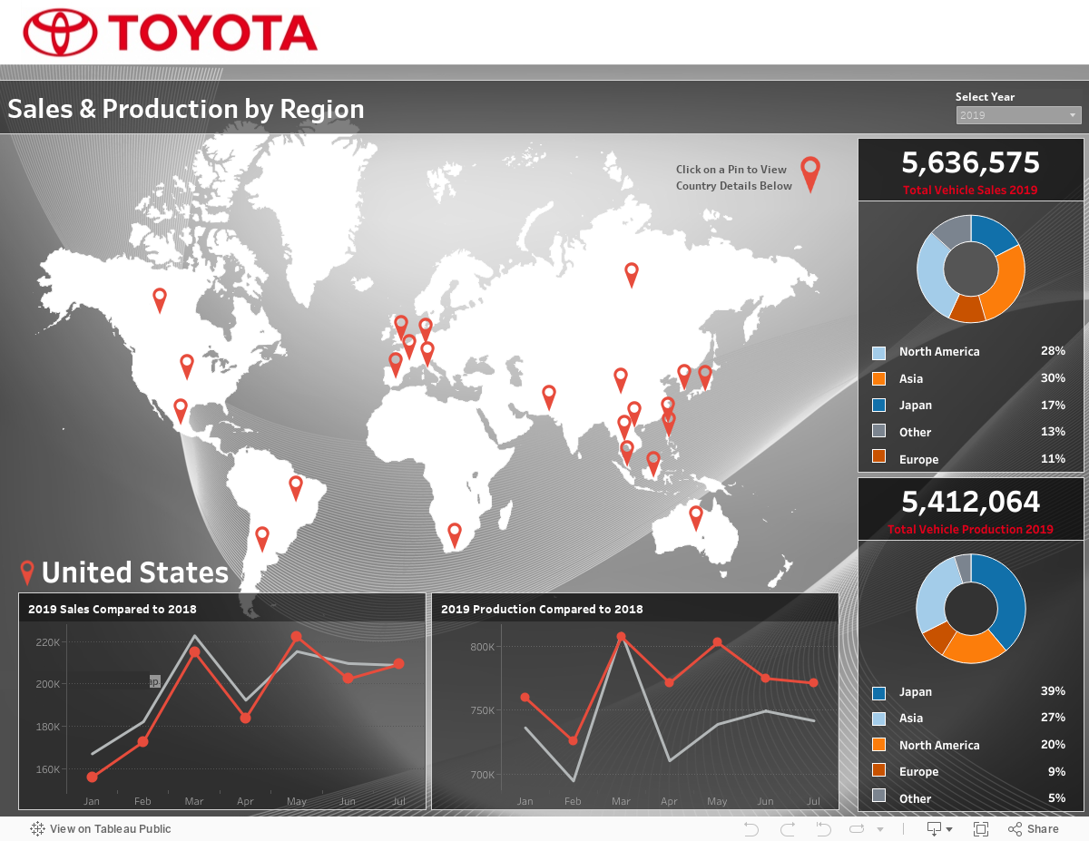
One of my stylistic tells is using the relatively new feature of transparent backgrounds, which I’ve done here with a global map PNG with the pin map overlaid on top of it. I couldn’t use a Tableau map as I didn’t want the countries to be marks and thus selectable.
Interested in Upgrading Your Viz, Too?
If you have some visualizations that you would like to expose to an extreme makeover, please let me know in the comments below. I’m aiming to do one of these each month. The only requirement is that your workbook is publicly available (i.e. data is not sensitive) so that I can share the before and after on the InterWorks blog and Tableau Public.
And for all your Tableau or data needs, remember InterWorks is ready to help!