Our Certified Tableau Trainers are asked a myriad of questions each day. In this series, they share some answers.
This question came from Jerry in a New York City Desktop I class:
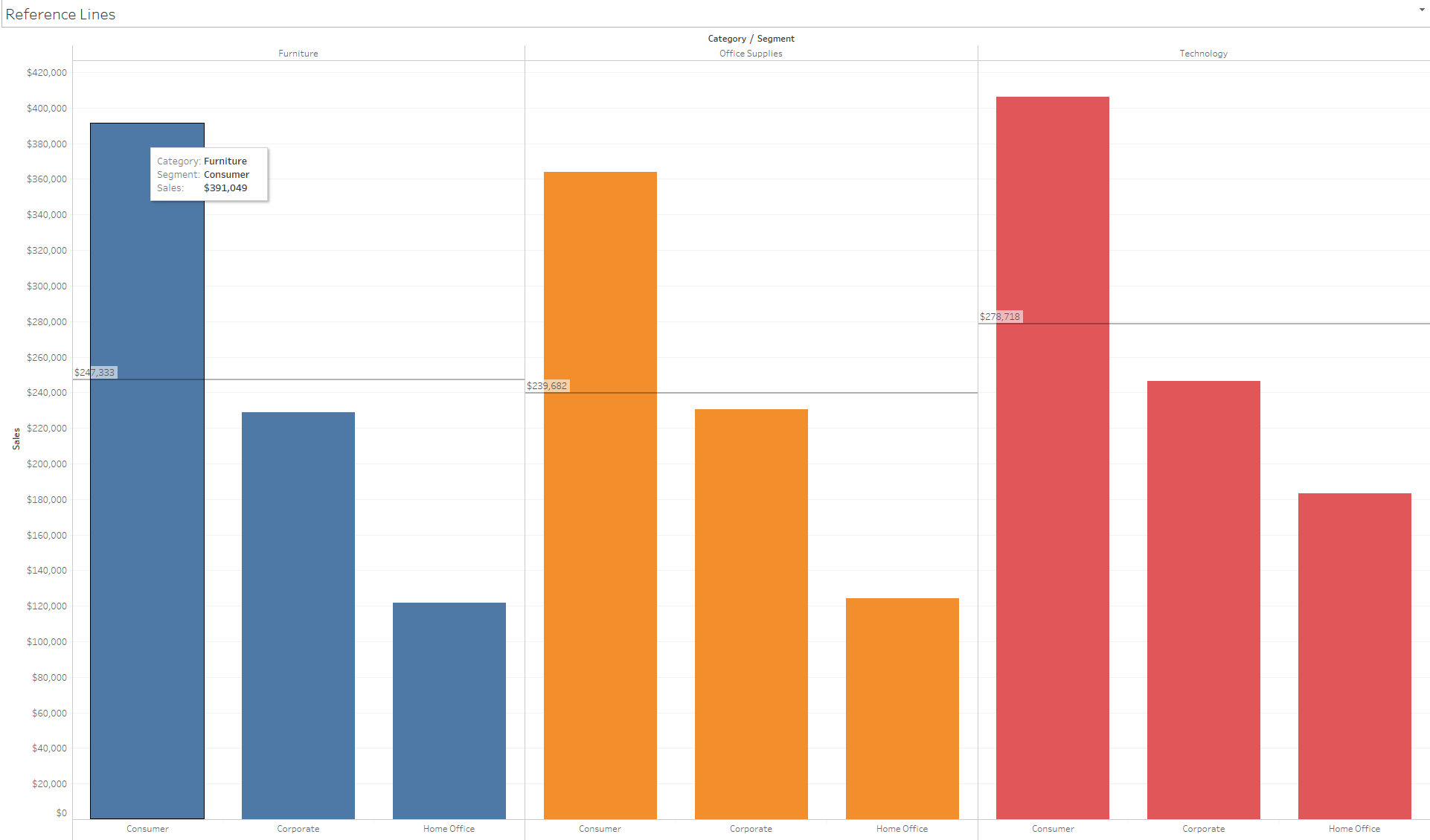
“How can I change this view so my reference line labels are easier to read?”

Great question! I agree – they are kind of tricky to read on the left-hand side of our groups of bars. By default, our reference line labels are brought all the way to the left of our visualizations. Luckily, in Tableau we can change the alignment and size of our reference line labels.
Formatting Labels in Tableau
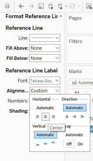
For starters, right-click directly on top of your reference line and select Format. This will open a pane on the left where our Data and Analytics panes usually are. Here we can change how our reference line appears, similar to the options when we first create our reference line. More relevant here are the changes we can make to our Reference Line Label.
The first thing I would do is change the alignment of my Reference Line Label to Center under the Horizontal option.

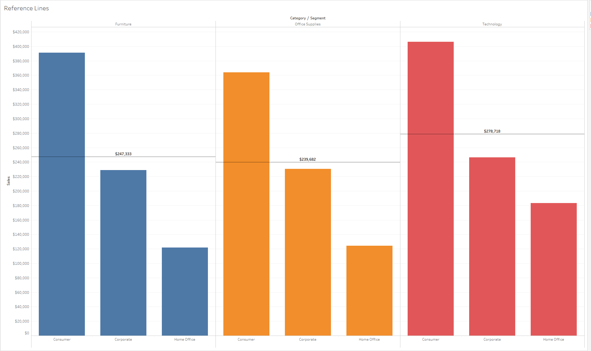
It also may help to bold the reference line font to make it easier to read, especially if you would like the labels to be the focal point of your visualization.

When our bars are sorted descending, and our labels are in the center of our view as well as bolded, it provides a much better visual experience for our users.
Thanks for the great question, Jerry!
