Our Certified Tableau Trainers are asked a myriad of questions each day. In this series, they share some answers.
A common question that often comes up in trainings is:
“How do I add gaps between the bars of my visualizations?”
The first thing to know is whether or not your graph should have spaces between the bars or not. If you are trying to visualize ordered quantitative data broken into ranges, then a histogram is the best type of chart. A histogram is designed without gaps between the bars to indicate where one range ends and the next begins. If your data does not have a natural ordering and is categorical, then a bar chart with gaps between the bars may be the graph for you.
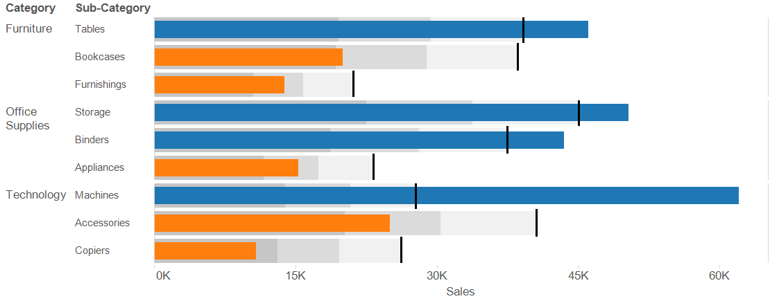
Let’s focus on a bullet graph, which is meant to be shown with space between the bars. If you choose to add distribution bands you may end up with something like the chart below where the bands seem to blend together:

Sometimes it can difficult to differentiate between the individual products without seeing some space between the bands. We can use a quick trick to fix this problem:

- Right-click in the blank space of the view and select Format from the list of menu options.
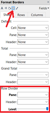
- In the Format pane on the left of your screen, navigate to the Format Borders icon (looks like a little window).
- At the bottom of the Format pane, under the Row Divider section, change the pane dropdown to the thickest line and choose the white color.
- Move the Level slider all the way to the right to draw the lines at the cell level.
Following these steps makes our visualization a little bit easier to read and interpret as the gaps between the individual bars provide our eyes with some of breathing room. Check it out:

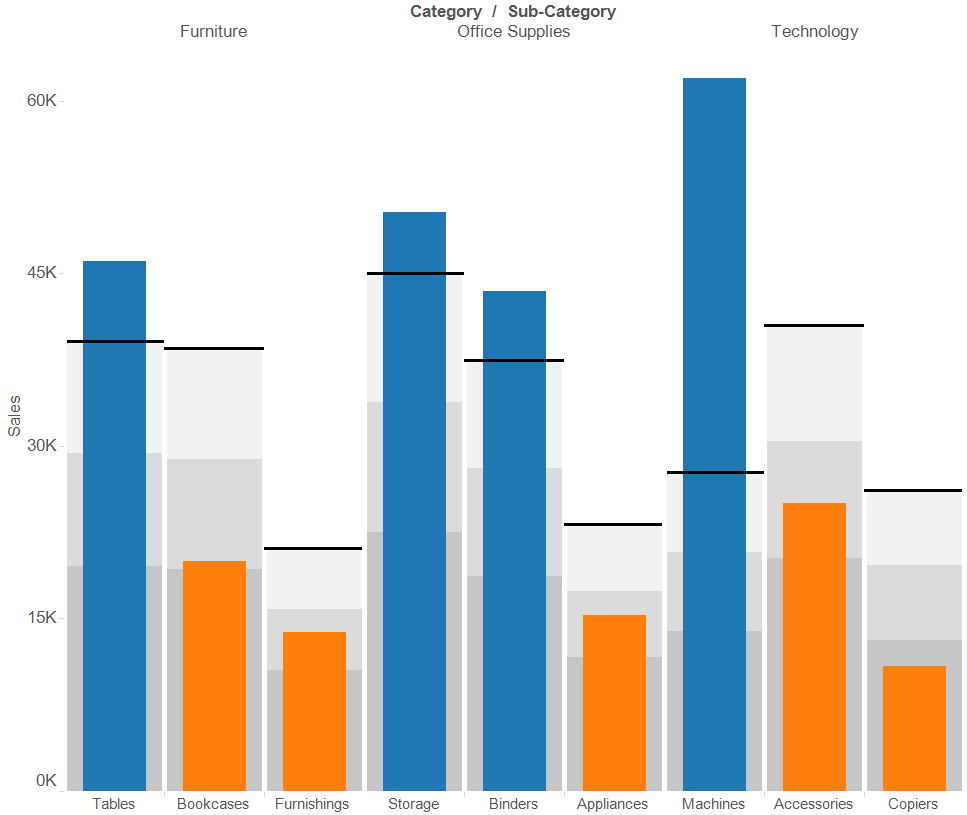
If we wanted to view the visualization as a vertical bullet chart instead, we would follow the same steps listed above but use the Column Divider section instead of the Row Divider. See below:

