
Machine learning is a vehicle through which we can maximize the value of data that already exists. Follow along as Elliott documents his first Udacity Nanodegree program and explores the possibilities machine learning provides.
Welcome back! The holiday season flew by, and if people were feeling generous, then it’s likely many non-profit organizations were showered in charitable donations. What does that have to do with machine learning? Let’s find out as we explore the second project in Udacity’s machine learning nanodegree.
Can We Predict How Customers Will Act?
This project places us in the mindset of a charity organization wanting to accurately predict if individuals are likely to be donors. This is a very common business problem that translates well to almost any industry. Most companies with a database and a list of products or customers could easily find themselves asking similar questions. For example …
- Given our existing customer data, can we predict who will purchase a product we are developing?
- Given our mailing list, can we predict who will respond favorably to our promotions?
- Given our existing customer data, can we predict who will purchase a product we are developing?
- Given our mailing list, can we predict who will respond favorably to our promotions?
The answer is often yes, we can do these things, provided we enlist the help of a model. To sweeten the deal, our models can provide valuable information about the forces driving these desirable outcomes. This can help to inform and guide future strategies and/or models.
In order to skip to the fun part, this project makes the assumption that individuals who make more than $50k per year are very likely to donate to our charity. With that said, our goal is to accurately predict whether or not an individual’s salary exceeds that value. If so, then we contact that person; otherwise, that person will not be contacted.
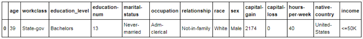
The features we have at our disposal include a mixed bag of numerical and categorical data such as age, marital status, gender and capital gain. See the image below for a glimpse at a single row of our actual data. This data sample lists the predictors we’ll be using in our attempt to identify potential donors.
Checking Our Numbers
It’s usually a good investment of time to investigate our quantitative features. Not all numerical data is created equal; if a quantitative feature doesn’t pass the smell test then, we may not want it in our model. Some red flags we’re looking for include things like our data not following a normal distribution (the classic bell-curve shape), or our data being heavily skewed.
Seeing a chart with skewed data evokes an image in my head of how a dinner table might look in the wake of a sloppy eater: Food crumbs or soup spills are scattered in a long trail leading from the person’s plate all the way back to the source of the food. If our data is clean and proper, there won’t be as much of that sprinkled mess to clean up.
Keep in mind that heavily skewed quantitative features can significantly drag down model performance. Machine learning algorithms tend to make certain assumptions that allow them to be useful, such as the assumption that the shape of the data you provide will follow a normal distribution. If the data does not follow a normal distribution, then your algorithms are liable to produce undesirable models. If you pump water into the gas tank of a car, it won’t do well on the road. Likewise, if you pump unclean data into your algorithm, it won’t generate very good models. Do your due diligence; don’t let potentially useful quantitative features become a burden.
One feature on our list that serves as a poster child for the issues outlined above is “capital-gain.” To keep things simple, let’s loosely define capital gains as money generated by investment assets. See the image below on the left for a glimpse at this feature’s distribution. The image on the right is the ideal distribution (a normal distribution) that we prefer to see:
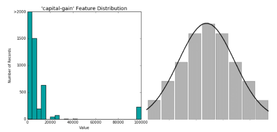
Comparing the two images, it looks like our “capital-gain” feature is not passing the smell test. There is not a normal distribution, and the data skews to the right. There are a lot of people who have zero capital gain. There is also a fair amount of people whose capital gain is between zero and 40k. But then there is an ocean between those values, as well as some very fortunate people who are swimming in 100k+ capital gains.
Clearly this feature doesn’t make the cut in its current form. What should we do about this? We could banish this feature from our model, but that seems like a bad idea since we are trying to identify high-income individuals. After all, wouldn’t you expect a person’s income to be higher if they are raking in large capital gains? It turns out that we don’t need to throw this variable out. With the help of something called a logarithmic transformation, we can turn this messy distribution into something clean that will be useful to our model.
Transforming Quantitative Data
Below you’ll find a before and after picture. On the left, “capital-gain” is shown as it existed out of the box. On the right, it is shown after applying the logarithmic transformation:
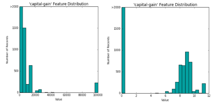
Not too bad! Although this isn’t a perfectly normal distribution, our model will be better off with this transformed “capital-gain” feature than with the original. I would also argue that one of the most beneficial outcomes of this transformation is the separation between the “haves” and “have-nots.”
Before the transformation, the model was stuck with a linear interpretation of capital gain. The gap between $0 and $5k in capital gains was treated no differently than the gap between $95k and $100k in capital gains.
The transformed feature appears to make it more obvious to our model that people with no capital gains are quite different from people with some capital gains. This change could prove to be enormously beneficial to our model’s ability to identify people who are high-income earners versus people who are not.
Scaling the Numbers
Another important consideration is that we are not feeding our data into a human brain that can easily put things into context. As powerful as computers are, we can’t count on them to read between the lines for us. This is particularly important when dealing with numerical features which exist on a diverse array of numerical scales.
If I tell you that someone’s age is 20, 46 or 70, you may immediately be able to infer extra meaning from those numbers due to basic intuition. If two individuals are 50 years apart in age, that’s a pretty significant gap. But is 50 always a significant gap? If you received a $50 dollar raise this year, would that make for a big change in your salary? Probably not.
Our brains tend to immediately place numerical information like this into context, allowing us to understand that age and salary should be assessed on very different scales. A computer doesn’t innately contextualize these numerical scales, so it is essential that we normalize and scale our numerical data to ensure our models don’t get hung up on numerical features solely because of their value ranges.
To be clear, when one numerical feature is represented at a larger scale than others, the result can be that our models emphasize that variable more than the others. This is especially true when an algorithm relies on “distance calculations,” which arise in clustering algorithms. In situations like this, we want our numerical data to be assessed on equal footing so that data points can be correctly assigned to their respective clusters. We don’t want our model to perform such distance calculations on numerical features that exist on different numerical scales, as this would force our model to make classifications based on distances that misrepresent the true relationships existing in the data.
Below is an actual image of our algorithm scaling our numerical data (seriously):

A common method of scaling data is Min-Max scaling. This method scales numerical data so that the lowest value in a set becomes 0 and the maximum value becomes 1. All values between the min and max fall between 0 and 1.
Transforming Categorical Features
In addition to transforming quantitative features, we will often need to transform categorical data into numerical representation. This is easy enough if a categorical feature only contains two values. Take gender, for example, where the available options are typically “male” or “female.” This could be translated to a numerical scale by reassigning “male” to 0 and “female” to 1.
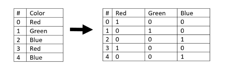
These transformations get a little more complicated when a categorical feature has more than two possible values. In this situation, we can use something called one-hot encoding, which uses dummy variables to represent each categorical value as its own column.
As an example, consider the image below. The feature “Color”’ has been split into three dummy variables named “Red,” “Green” and “Blue.” These dummy variables contain binary numerical representations:
The Naïve Model
Before we go about building our model, we should establish a baseline for comparison. This will give us an at-a-glance sanity check for how useful our model is. If our model performs much better than the baseline, that tells us it’s doing a fair job and we can then quantify the benefits the model provides us. If our model performs worse than the baseline, then it’s back to the drawing board.
The baseline model could be many things. In the case of predicting whether an individual is likely to be a donor, we could simply make the prediction that everyone will be a donor and set that as our baseline.
Evaluating the Naïve Model
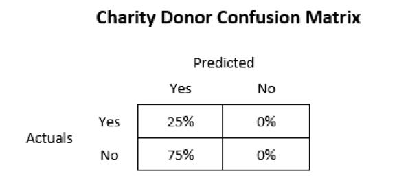
If we assume that everyone is a donor, it turns out that we are correct approximately 25% of the time. In a previous post we discussed that accuracy is only one piece of a model’s performance. We should also consider the F-score, which is the harmonic mean of recall and precision.
Going back to the material we discussed in the previous post, recall will be high when we minimize the number of false negatives, and precision will be high when we minimize the number of false positives. It turns out that our naïve model has no false negatives because we never make a prediction that someone is not a donor. Our precision, however, will be low because the naïve model’s predictions consist of about 75% false positives. See the confusion matrix below as a reference:
Additionally, this project introduces a new spin on the F-score. Instead of weighing recall and precision equally, we can assign more importance to one of the terms. For this project, should we emphasize precision or recall? Why might we want to weigh one as more important than the other?
From my perspective, we want to be confident that our resources are being spent contacting people who are likely to be donors. This indicates that our priority is to minimize false positives rather than minimize false negatives. That means we may want to use the  variation of the F-score as it places stronger emphasis on precision rather than recall.
This involves customizing the “beta” value used to compute our F-score. I won’t dive into the beta value in depth, but a lower beta value modifies the F-score formula to emphasize precision over recall. Inversely, a higher beta value modifies the formula to emphasize recall over precision. Typical beta values are 0.5 (emphasize precision), 1 (standard) and 2 (emphasize recall).
In this project, our baseline ends up being approximately:
- Accuracy = 25%
 = 29%
= 29%
Choosing the Best Algorithm
One of the more interesting and thoughtful exercises in this project involved selecting three algorithms that I thought would do particularly well at predicting potential donors. Diving into all the details would push this post into novella territory, so I’ll keep this as succinct as possible. The algorithms I chose were:
- Random forest
- Logistic regression
- Support vector machine (SVM)
Random forest made the list partly because I like how easy it is to extract feature importance from decision tree models, and partly because I wanted to see how an ensemble method stacks up against Old Faithful (logistic regression) and a more complex algorithm like SVM. However, my biggest consideration in choosing each of these algorithms was their ability to solve the task at hand.
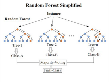
While a single decision tree may be prone to overfitting, the random forest algorithm avoids this pitfall by aggregating the results of multiple decision trees, hence the “forest” in its name. In addition to generating a robust model, a random forest algorithm can be useful for identifying the most important features in a model. Each decision tree that the forest generates will have a “hierarchy” of decision nodes and, in general, the more important features appear at the top of that hierarchy.
Logistic regression is like the wise old sage of dichotomous (yes or no) prediction models. Its roots are in linear regression, but it takes the outputs from a linear regression model to another level. We’ll save further discussion of this algorithm for another post, but keep in mind that this algorithm is generally fast, reliable and consistent. It may not be the fanciest algorithm on the market, but a lot of the world’s business problems have been – and continue to be – solved by logistic regression.
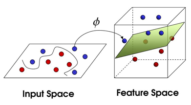
The SVM algorithm is fascinating to me because it is so versatile. This algorithm has yoga-like flexibility due to its ability to transform non-linear functions into a linear space, but the dancing may be very, very slow. That’s part of the tradeoff we will discuss shortly – sometimes if you want incredible performance, you will need to sacrifice speed (and vice versa). As the saying goes, “there is no free lunch.” The below image visualizes an example of how the SVM algorithm can ingest non-linear inputs and find a solution using linear separability:
Comparing the Models
To see how the three algorithms stack up against our naïve baseline from earlier, let’s compare each one on even footing using their default settings. The image below shows the performance of the three models on training data. Note that SVC is the support vector classifier, which represents the support vector machine algorithm discussed earlier.
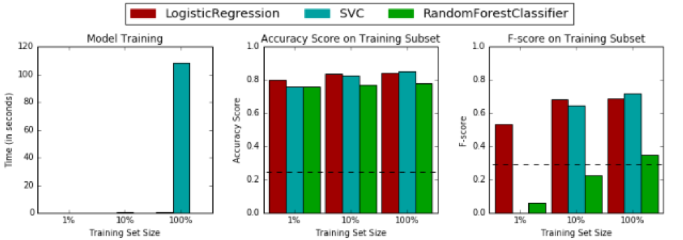
The image below shows the performance on testing data:
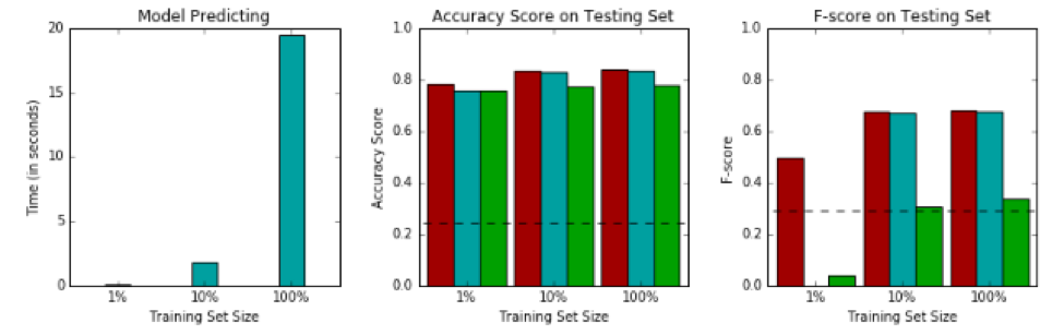
The first thing I want to point out is that our logistic regression model is neck and neck with the other models, which I’ll admit I did not expect. This project successfully planted the seed in my mind that logistic regression is a solid contender and should not be underestimated. At minimum, it can be used as an excellent baseline from which we can assess more complex models.
The second thing that needs to be talked about is the fact that SVM is completely bogarting the time-to-train charts. Do you remember that slow dance I talked about earlier? This is it. The SVM algorithm takes so much time to train compared to random forest and logistic regression that these other two algorithms don’t even show up on the charts.
This raises an important question we should consider: Is the algorithm we are choosing capable of delivering the results we need, when we need them? At what point should we decide to sacrifice our model’s performance to conserve time and resources?
You could have the best model in the world, but if it takes ten years to run and the decisions need to be made next week, that model will be useless. Now in this case, I think the SVM’s long training time is fine because the task is to predict whether individuals will be likely to donate to a charity. That’s not a business question that requires a real-time solution, so it won’t be much of a concern that one model takes a few minutes to run while another takes a few seconds. However, time and resource considerations could be critical if applied to other business problems. These costs should not be ignored when deciding which model to employ.
Here are a few other insights from the model comparison images:
- All three of the selected models outperformed the baseline naïve prediction when trained on 100% of the training subset.
- Random forest takes a big hit to performance when supplied a low volume of training data.
- Logistic regression and the random forest do not need a lot of training data to become useful, which means they could potentially be used by our charity organization if we do not have a lot of data to train the models.
- The SVC algorithm may be prone to overfitting compared to logistic regression based on their relative training/testing performance deltas. The random forest is definitely overfitting, but this can be fixed by customizing the model’s parameters.
Optimizing the Models
Now that we’ve pre-processed our data and explored a few algorithms worthy of predicting who will donate to our charity, it’s time to optimize our final model. I won’t go into details on the process of using grid search and cross-validation to land on an optimal model. This was covered in-depth in a previous post, and I don’t want to repeat the same aspects here. However, I will share some of the results.
Before the optimization exercise, I was asked to decide which of my three chosen algorithms was the best. Having seen the performance of each algorithm using their raw default settings, I placed my money on logistic regression. Below you’ll find the accuracy and F-score for my logistic regression model before and after optimization:
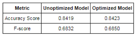
It looks like logistic regression worked great right out of the box, and the improvements we gained from optimization border on insignificant. Now, let’s compare this to the before and after for our random forest algorithm:
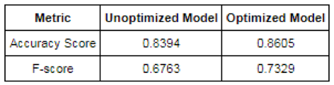
The random forest algorithm had me a little worried when we ran it on the default settings, but it looks like our parameter optimization pushed it ahead of the competition! With its optimized parameters, this model is substantially better than our optimized logistic regression model. More impressive to me than the increased accuracy is the improved F-score, which received an 8% boost. Now that we’ve seen the optimized models, I may need to change my vote to random forest as the best of the three algorithms for predicting charity donors.
A big takeaway for me from this section of the project is that a lot of different algorithms are “good enough” to solve various problems. The difference between good and great performance comes from finding the right mix of model parameter values. This is where cross-validation becomes crucial – without it we are flying blind and are prone to overfitting our models with parameter selections that perform well on training data but not as well on testing data. Complex algorithms such as random forests and support vector machines can yield impressive results, but they require careful optimization. More simplistic algorithms such as logistic regression can get us to a good solution quickly with little need for optimization, but their performance plateaus more rapidly.
Feature Importance
The final component of this project is feature importance. We’ll be focusing on this through two lenses:
- Which features are the most important (provide the most information)?
- Can we eliminate some features and still have a good model?
Some classifiers, such as random forest, allow you to easily extract a list of the most important features in your model. Because I had already implemented random forest throughout this project, I used its output to generate the chart below:
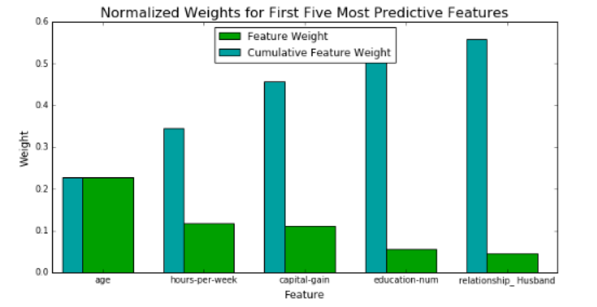
If you focus on the cumulative feature weights, you’ll notice that our model receives diminishing returns for each additional feature it considers. You could argue that there is a point at which it isn’t worth the extra effort of adding another feature if that feature’s contribution is negligible.
Not all features are equally important. Much like a sports team, there are star players. Multiple features can come together to make a strong team, but this team won’t be as good without its best players. Let’s stretch this sports analogy even further. Some of our features can be “benched,” meaning we don’t necessarily need them in the model to have good performance. In a real-world scenario, we might be faced with constraints such as budgets or other resource limitations which may necessitate abbreviating our model from its absolute optimal performance.
For example, if our team already wins 98% of its games, should we allocate the rest of our available budget to secure one more player that will push that win rate to 98.01%? Maybe, but probably not. It’s the same with our models. At some point we make a tradeoff and decide that the extra cost or effort is not worth the return on investment. The goal is to aim for the sweet spot where we extract as much value from our model as our constraints allow, and striking that balance is as much art as it is science.
Once you learn what the most important features of your model are, this information can help to inform business decisions and strategy apart from your model. Don’t underestimate the value that can come from conveying this information in a digestible format to decision makers in your business.
Key Takeaways
We’ve seen how this project took us from a naïve prediction with low accuracy and F-score to a decent model with approximately 86% accuracy and 0.73 F-score. We should feel pretty good about ourselves. This fictitious charity organization will be raking in a lot of donations with a little help from this model. Let’s summarize the key takeaways:
- Pre-processing data before feeding it into your model is a great investment of time.
- Search for quantitative features that are skewed or do not follow a normal distribution and consider transforming them.
- Normalize and scale your quantitative features.
- Consider encoding categorical data into a numerical representation if the learning algorithm you will be using expects numerical inputs.
- Naïve predictions can provide a good starting point to evaluate your models.
- Remember that accuracy does not exist in a vacuum. Consider your model’s F-score and keep in mind the F-score can be modified to emphasize recall or precision.
- Many models will give you decent performance, so think about how the strengths and weaknesses of each model will impact your ability to solve the task at hand.
- Consider the tradeoff of simplicity versus complexity. In general, simple models are useful with minimal optimization, but they can be outperformed by a fine-tuned complex model.
- Be aware of your time and resource constraints. The model with the best potential performance may not always be a practical solution.
- Analyzing feature importance can help you refine and prioritize features. It can also provide insight into the forces driving your business.
That’s it until next time! Thanks for tuning in.