
This blog post is AI-Assisted Content: Written by humans with a helping hand.
Can your smartwatch tell when you had a bad week before you admit it? We built a full data pipeline from Apple Watch to Snowflake to Tableau to find out — and what came back was more honest than we expected.
Click here to see the dashboard.
What you’ll find in this article:
- What brought us to extract, transform, load and analyse the Apple Watch Data.
- How to export your Apple Health data and load it into Snowflake, even when the file is 3.5GB
- How to model the data in Tableau so that each health metric is aggregated the way it actually should be
- How to build a dashboard with three views — General Activity, Performance, and Running and Walking
- And what happens when you look at six years of your own data all at once
What Brought Us to Extract, Transform, Load and Analyse the Apple Watch Data
There’s a version of this blog post that’s purely technical. Data engineer builds pipeline. Analyst builds dashboard. Everyone claps. Done.
But that’s not the full story.
I wear an Apple Watch almost every hour of every day, and I’ve done this for six years. It knows when I sleep well, when I don’t. It knows when I went for a run at 6 a.m. because I needed to clear my head, and when I skipped it. It knows my resting heart rate the morning after a heavy week, and it knows the weeks I hit my stride and felt untouchable. It doesn’t judge. It just records.
I want people to take sport seriously. And I believe in measuring what matters. Luckily I’m an analyst — but I want to make it easier for you, too.
The Watch Knows More than We Thought
Here’s something worth sitting with before we get into the technical details: Your Apple Watch is not just counting steps.
It’s tracking your heart rate variability — a metric that drops measurably when you’re under stress, sleeping badly or recovering from illness, often before you consciously notice any of it. It’s tracking your resting heart rate, which rises with fatigue and alcohol and falls with fitness. It measures your respiratory rate while you sleep. Your blood oxygen. How long you actually spent in daylight. How long you were on your feet. Your VO2 Max — a measure of your aerobic capacity that, according to a growing body of research, is one of the strongest predictors of long-term health and longevity we have.
None of this is science fiction. It’s sitting in a ZIP file on your iPhone right now, waiting to be looked at.
We built this project — a data engineer and a data analyst working together, which is how most real analytics actually gets done — to pull that data out of the Apple Health app and into a proper analytics environment. And we used my own data to do it: 6 years, from 2019 to 2025, wearing the Watch for roughly 99% of the time. Every step. Every workout. Every bad night of sleep. Every comeback.
What came back surprised us — not always in the way you’d hope, but always in the way you need.
Part 1: Getting the Data Out of the Apple Watch — Fadi’s Side of the Story
This section was written by Fadi, Data Engineer.
Apple Health provides a comprehensive data export feature that allows users to download their complete health and fitness history as an XML file. To access this data, navigate to the Health app on your iPhone, tap your profile picture, select “Export All Health Data” and share the resulting ZIP archive.
However, this convenience comes with a challenge: the exported XML file can grow to several gigabytes as it accumulates years of detailed health metrics, from heart rate measurements to workout sessions and sleep data.
The Challenge: Snowflake’s Size Limit
Snowflake’s XML parser has a maximum document size limit of 128MB (134,217,728 bytes) for uncompressed files, which means large Apple Health exports cannot be loaded directly.
To work around this limitation, the XML file must be split into smaller chunks while preserving its structure. The approach involves parsing the original XML, extracting the <Record> elements (which represent individual health data points), and distributing them across multiple files that each stay under the 100MB uncompressed threshold.
Each split file maintains the same root structure with the <HealthData> wrapper element, ensuring they remain valid XML documents. The files are then compressed using gzip, reducing their size by approximately 97% for efficient storage and transfer.
When loading into Snowflake, the STRIP_OUTER_ELEMENT = TRUE option tells the database to remove the <HealthData> wrapper and treat each <Record> as a separate row in a VARIANT column, allowing for flexible querying of the nested health data structure.
The Python Script Process
The split_xml.py script automates the entire splitting process through several key steps:
- Measures the uncompressed size of the source XML file (in this case, 3.48GB)
- Parses the XML using Python’s ElementTree library to locate all <Record> elements — approximately 8 million individual health data points
- Calculates how many output files are needed (35 files) and how many records should go into each file (~228,541 records) based on the 100 MB target size
- For each output file, creates a new XML document with the same root structure, populates it with the appropriate slice of records and writes it to disk
- Compresses each file using gzip and reports both the uncompressed and compressed sizes
This ensures that every file stays comfortably under Snowflake’s 128 MB limit while maintaining valid XML structure.
Table Structure
The Snowflake table is intentionally simple to accommodate the semi-structured nature of Apple Health data. The table is created with a single VARIANT column that can store the entire XML record as a JSON-like object:
CREATE OR REPLACE TABLE staging_table (col VARIANT)
This design allows Snowflake to automatically parse the XML attributes and nested elements into a queryable structure. Once loaded, individual fields can be accessed using JSON notation, such as col:type to get the health metric type or col:value to retrieve the measurement.
This flexible schema is ideal for health data, which contains dozens of different record types with varying attributes, from simple height measurements to complex workout sessions with nested metadata.
Transforming to a Structured Table
While the VARIANT column provides flexibility, you may want to extract common fields into a structured table for easier querying and better performance. The following query creates a new health_data table by extracting key attributes from the XML records stored in the staging table:
CREATE OR REPLACE TABLE health_data(
    creationDate TIMESTAMP_NTZ,
    device STRING,
    endDate TIMESTAMP_NTZ,
    sourceName STRING,
    sourceVersion STRING,
    startDate TIMESTAMP_NTZ,
    type STRING,
    unit STRING,
    value STRING,
    metadataKey STRING,
    metadataValue STRING
) AS
SELECT
    $1:"@creationDate"::TIMESTAMP_NTZ,
    $1:"@device"::STRING,
    $1:"@endDate"::TIMESTAMP_NTZ,
    $1:"@sourceName"::STRING,
    $1:"@sourceVersion"::STRING,
    $1:"@startDate"::TIMESTAMP_NTZ,
    $1:"@type"::STRING,
    $1:"@unit"::STRING,
    $1:"@value"::STRING,
    $1:"MetadataEntry"."@key"::STRING,
    $1:"MetadataEntry"."@value"::STRING
FROM staging_table;
Part 2: 8 Million Records, One Table. Now What? — Alex’s Side of the Story
Fadi’s work delivered a clean, structured Snowflake table. But a table is not an insight. That’s where the second half of this project begins — and it’s where the story gets more interesting.
The data model that comes out of Apple Health is elegantly simple and analytically brutal at the same time. There are essentially three fields that matter: Type (what was measured), Value (the number) and Unit (the scale). Everything — all 8 million records — lives in those three columns.
Before we go further, one important filter: Sourcename. Apple Health aggregates data from every app and device on your phone — the Watch, the iPhone, third-party apps, manually entered records. For this project, we kept only Apple Watch as the source. Including the iPhone would duplicate step counts, distance and other overlapping metrics. One source, one truth.
40+ Activity Types, One Value Column
Here’s where things get complicated — and where a dashboard can either be honest or quietly misleading.
The Value field doesn’t just hold one kind of number. It holds the value for every single one of these activity types:
![]()
Each of these is a fundamentally different thing. Running Speed is an instantaneous velocity — you average it. Step Count accumulates over time — you sum it. Sleep Analysis has no numeric value at all. You calculate it as a duration between a start and an end timestamp. VO2 Max is a slowly-changing physiological estimate — you track its trend, not its daily total.
For those familiar with the distinction: Some of these are flow variables (calories burned, steps taken, distance covered — they accumulate and should be summed) and some are stock variables (heart rate, VO2 Max, oxygen saturation — they describe a state and should be averaged). Treating them identically gives you numbers that are technically computable and completely meaningless.
This is the puzzle that the Tableau layer has to solve.
Part 3: Making the Data Tell the Truth — Building the Calculations
Every metric on this dashboard is the result of a deliberate decision about how that metric should be aggregated. None of them is just SUM([Value]). Here’s how the key calculations work.
A Date Axis That Moves With You
The first calculation is a parameter-driven date field that lets you shift the entire dashboard between year, quarter, month, week, day, hour or minute granularity with a single click:
CASE [Split date axis to]
  WHEN 1 THEN DATETRUNC("year",   [Enddate])
  WHEN 2 THEN DATETRUNC("quarter",[Enddate])
  WHEN 3 THEN DATETRUNC("month",  [Enddate])
  WHEN 4 THEN DATETRUNC("week",   [Enddate])
  WHEN 5 THEN DATETRUNC("day",    [Enddate])
  WHEN 6 THEN DATETRUNC("hour",   [Enddate])
  WHEN 7 THEN DATETRUNC("minute", [Enddate])
END
This powers every chart’s horizontal axis. Want to see the six-year arc of your VO2 Max? Set it to months. Want to understand why last Tuesday felt hard? Drop to hours.
Period and Date Calculations
A set of supporting fields handle time-window awareness across the dashboard:
- Min / Max Startdate & Enddate and Min / Max Enddate & Time — capture the exact boundaries of the selected window
- Days in Date Filter / Days in Date Parameter — count the total days in the current selection, which becomes the denominator for every daily average
- Avg. Daily Value / Avg. Daily Value (Time Period) — general-purpose daily averages built on top of those denominators
Activity Measure Calculations
This is the analytical core of the dashboard. Each calculated field is tailored to how its metric actually behaves:
- Apple Exercise Time, Activity Time, Standing Time — summed in minutes, then formatted in hh:mm for readability. Daily averages divide the total by days in the filter.
- Distance Running/Walking (km) — cumulative distance, summed.
- Step Count, Distance Walking/Running — summed totals with daily average companions.
- Heart Rate, Walking Heart Rate Average — averaged, not summed.
- Resting Heart Rate — averaged. A rising trend here is often the first signal something is off.
- Respiratory Rate (avg. count/min) — averaged. Another quiet early-warning metric.
- Oxygen Saturation (avg. %) — averaged blood oxygen.
- VO2 Max (avg.) — averaged and trended over time. More on this below .
- Physical Effort (total) — summed. This is a flow variable representing cumulative metabolic load.
- Sleeping Time (min) / (hh:mm) — calculated using DATEDIFF between Startdate and Enddate on Sleep Analysis records, since there’s no raw value to sum. An “uncorrected” variant excludes Apple’s sleep stage correction records.
- Sleep Analysis Correction / Start / End — helper calculations for sleep record handling.
- Time Running (min) / (hh:mm) and Running Power — summed running duration and power output.
- Time in Daylight (min) / (hh:mm) — summed and averaged. A surprisingly personal metric, as we’ll see.
- Avg. Daily Running Time, Sleeping Time, Step Count, Time in Daylight — daily-average versions for all the above.
Many measures exist in two formats: A raw number for calculations and a human-readable hh:mm for display. Because “I slept 387 minutes” tells you less than “I slept 6h 27min.”
Part 4: What the Dashboard Actually Shows
The dashboard has three views, switchable via parameter. All views share the same filter row — Year, Quarter, Month, Week and Day selectors, plus the date axis granularity control — so you can zoom from the full 6-year arc down to a single week without leaving the dashboard.
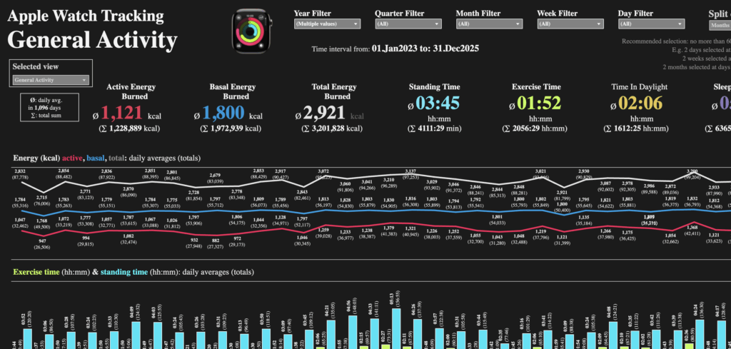
View 1: General Activity — The Honest Baseline
The first view is a mirror. It doesn’t flatter you — it just shows you what you actually did.
KPIs: Active Energy Burned (ø 620 kcal/day), Basal Energy Burned (ø 1,030 kcal/day), Total Energy Burned (ø 1,650 kcal/day), Standing Time (ø 02:04/day), Exercise Time (ø 01:01/day), Time in Daylight (ø 01:00/day), Sleeping Time (ø 03:09/day).
Three charts fill the view: Energy burn (active, basal and total) over time, exercise and standing time side by side, and daylight exposure versus sleeping time, each with reference lines for the daily goals.
That last chart is worth pausing on. One hour of daylight per day, on average. That’s not a lot — and the chart makes the seasonal swings in that number painfully visible. Months of winter with nearly zero outdoor exposure. Spikes in summer. And sleeping time that, averaged across six years, lands significantly below the recommended seven hours.
This is the kind of thing you don’t notice until you plot it. And once you plot it, you can’t unnotice it.
View 2: Performance — The Numbers That Don’t Lie
This is where the metrics get personal. Heart rate, oxygen saturation, respiratory rate, physical effort and VO2 Max — these are the numbers that tell you whether your training is actually working.
KPIs: Heart Rate (ø 93 BPM), Resting Heart Rate (ø 35 BPM), Walking Heart Rate (ø 57 BPM), Oxygen Saturation (ø 96%), Respiratory Rate (ø 16.7 count/min), Physical Effort (ø 1,757 kcal/hr·kg), VO2 Max (ø 44.9 mL/min·kg).
Three charts: The three heart rate variants over time, respiratory rate and oxygen saturation, and the VO2 Max trend alongside total physical effort.
The VO2 Max line is the one I keep coming back to. VO2 Max — your body’s maximum rate of oxygen consumption during exercise — is one of the strongest measurable predictors of long-term health and longevity. Research consistently links higher VO2 Max with lower risk of cardiovascular disease, better cognitive function as you age and greater resilience. It’s not just an athlete’s metric. It’s a life metric.
Mine has been climbing. Not quickly, not in a straight line — there are dips from illness, from travel, from the months when work took over. But the six-year trend is upward, and right now I’m approaching 50 mL/min·kg, a threshold that medical standards classify as excellent for an adult. Getting there takes years, not weeks. And having the chart to prove the direction you’re heading? That’s a different kind of motivation than any training plan can give you.
View 3: Running and Walking — Progress in Motion
The third view is for runners — or for anyone trying to become one.
KPIs: Running Speed (ø 10.74 km/hr), Running Stride Length (ø 1.13 m), Distance Walking/Running (ø 7,553 km total), Step Count (ø 9,200/day), Time Running (Σ 114:23 hh:mm), Running Power (ø 211.9 W).
Three charts: Running speed and stride length over time, distance and step count as daily averages and totals, and total running time alongside total running power output.
Speed and stride length in the same chart is a detail worth dwelling on. Stride length increasing over time, independent of pace, is one of the cleanest indicators of improving running economy — your body getting more efficient, not just faster. It’s not a metric most runners track consciously. But it’s there, quietly accumulating in your Watch data, waiting to be seen.
Conclusion: What the Data Showed — and What to Do With Yours
After six years and 8 million records, what does this dashboard actually tell me?
It tells me I’ve gotten fitter. Meaningfully, measurably fitter — in VO2 Max, in running speed, in stride efficiency, in resting heart rate. It also tells me I’ve had hard stretches: Weeks where the energy numbers flatlined, months where my sleep compressed and my heart rate crept up in ways that look obvious in hindsight.
The data doesn’t know why those things happened. It just knows they did. And knowing that gives you something to work with — a goal to aim for, a baseline to return to, a quiet reassurance that even in the difficult periods, the long arc bends upward.
Exercise is one of the most powerful tools we have for longevity and quality of life as we age. That’s not motivational language — it’s what the research says. And tracking is how you know whether what you’re doing is working. Not just whether you “feel” fitter, but whether the objective indicators are moving in the right direction. VO2 Max improving. Resting heart rate declining. Sleep stabilizing. These things don’t happen overnight, and without measurement, you might not notice them happening at all.
If you wear an Apple Watch, your data is already there. You don’t need a data engineer and a Tableau trainer to make use of it — but having them helps. The pipeline Fadi built and the dashboard I built are replicable. We’ve shown you every step.
Download your data. Build something with it. And then look at it honestly — the good weeks and the bad ones, the progress you’ve made and the goals still ahead.
The watch already knows. Now you can too.
Alex Madrigal is a Data Analyst and Tableau Trainer at InterWorks. Fadi Al Rayes is a Data Engineer at InterWorks.
This article was written based on a very compelling and detailed input from Alex and Fadi, and some help of Anthropic’s Claude.