
This blog post is Human-Centered Content: Written by humans for humans.
When tasked with the ambiguous project to “create a dashboard,” I spun my wheels for a while trying to think of the perfect idea for my first Tableau Public dashboard. If you know me, you know I am a “recovering” perfectionist, and the worst thing you can do to someone like me is give me a completely open-ended project. If the world was my oyster, then I had a world of data to filter through — and that is just way too much to “perfect.”
Wait a minute.
The world wasn’t my oyster — the universe was! As my perspective zoomed out, my project became more focused, and I knew immediately what I wanted to create: A dashboard on the entire universe! Ever since I was a kid, I’ve been fascinated with two things (well, many more than that, but mostly just two things): The microscopically small and the astronomically large. As far as the astronomically large goes, I loved studying the planets, gravitational theory and black holes. As a child, I remember building models of our solar system for fun, by myself, during summer break. To this day, I have a star app downloaded on my phone and completely nerd out every time there’s an eclipse, aurora borealis or planetary parade (which there have been many of recently).
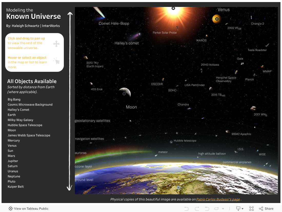
My excitement grew when I found the most beautiful image I have ever seen: A log-scaled map of the entire observable universe. The image displayed in my dashboard is wildly impressive for not only its mathematical foundation but also its blend of high-resolution images of objects so incredibly far away. (Don’t take my word for it: scroll in on an object from the map below and see for yourself!) I built my project around this image.
I hope you have as fun of a time exploring this dashboard as I had building it! Check it out below, and keep scrolling for a step-by-step explanation of the elements I used to put this all together.
The Data Viz
The visual allows users to engage with the map and learn more about the beauty of our vast universe. Users can scroll vertically through the map, and hover and click on objects to ask questions like, “How can I observe this object?” and “How does this object compare to Earth? To other similar objects?” and “How long have we known about its existence?” and many more.
As far as Tableau goes, there are a few features that made my dashboard possible — all of which I learned about through our blog.
- Parameter Actions (which you can read about here and here): Parameter actions are involved in nearly every piece of my dashboard. They are the reason all the visuals from the tooltip and the secondary “Learn More” page based on the user’s selection from the map. The parameters change the visuals to match the selected object’s name, type, visibility, year of discovery, etc.
- Radar Charts: Originally, I had hoped to use the work of Tristan Guillevin at LaDataViz and his custom Viz Extensions. Viz Extensions are easy to use and give Tableau dashboarders many more beautiful possibilities for showcasing their data. However, these resources are currently unavailable on Tableau Public, so I reverted back to my 15 year old self sitting in my Geometry and Algebra II classes. I used Trigonometry to plot the radar charts (SOHCAHTOA, anyone?) and Algebra II to normalize my data. This normalization was only necessary due to the vast scale of the data I wanted to plot and isn’t a typical step for creating radar charts (unless you are also plotting data along a scale of 0.0 AU to 14 million AU)!
- URL Actions: URL actions are how I gave credit and added resources to learn more. You can see them in action by clicking Pablo Budassi’s name at the bottom of the map and by clicking on the image of the selected object from the secondary “Learn More” page. They will direct the reader to the artist’s page and the corresponding Wikipedia page, respectively.
- Image Roles: By using URL Image Roles, I was able to showcase images of the selected objects from the secondary “Learn More” page. This is a cool feature where you simply include the URL of the image in your data and convert it to an “Image Role” in Tableau’s Data Source page. This loads the corresponding images as headers within your visuals. Since I wanted to use the images as the data itself rather than as headers, I had to do some Tableau finagling to get the image to render in a way I was pleased with (by using floating containers — shh, don’t tell my coworkers).
- Invisible Shapes: Utilizing invisible shapes to clean up the appearance of dashboards is another Tableau hack — I would recommend reading this blog post to learn more. On the secondary “Learn More” page, the “Back to Map” button is actually an image with an invisible shape overlaid. I added a dashboard action to the invisible shape, which makes it appear as if the user was selecting the image. In reality, the user is clicking the invisible shape, which is triggering the dashboard action. This was necessary because you cannot add actions to image objects (like my “Back to Map” image) in Tableau.
- Finally, Interworks’ own CBI Studio: With the help of our Custom Background Image (CBI) Studio, I was easily able to plot each of the objects from the map, import those coordinates into Tableau, and overlay them on top of the image for users to select.
The Data
Since I built the dashboard around the map, gathering data wasn’t as straightforward as I would have preferred. Fortunately, I found a few great resources for astronomical data: NASA (of course) and a very fun open-source repository, In-The-Sky. I had ChatGPT make me a list of the most popular objects from the map, and then I downloaded relevant data for each listed object from the two sources described above. This was time-intensive, so I will build a scraper to gather data for the rest of the objects on the map. More info on this coming later!
Then in Tableau, I simply used their relationship model to “join” each of the data sources by the object name (this is not a physical join, which you may be familiar with. Read here to understand the difference between Tableau relationships and joins). This was very simple and made the rest of my dashboarding easy.
As for the images, they were all found from Wikipedia Commons, which is an amazing free resource. Rather than collecting these links and images myself, I used ChatGPT to pull both the corresponding Wikipedia and Wikipedia Commons URLs for each of my objects (I verified they were correct before plugging them in to Tableau, don’t worry!).
The icons used in my visibility and object type visuals were gathered with the help of my colleague, David Duncan, from our Noun Project subscription. He also played a large role in the design of this dashboard — it would not look the way it does without his insight. (Thank you, David!)
Closing Thoughts
If you enjoyed this dashboard or are an astronomy nerd like myself, let me know! I’m always eager to learn more. Stay tuned for future work like this from me. Until then!