“It doesn’t have to look good. It just has to work.”
I have a client who often says this when I start a new dashboarding project. The statement seems paradoxical because design and functionality are so intertwined. As Laws of UX says, “Users often perceive aesthetically pleasing design as design that’s more usable.” So when a dashboard doesn’t look good, it also doesn’t work as well as it could.
My Go-To Tableau Moves
To make dashboards that look good and work well, I found myself using a few UX/UI techniques over and over again last year, so I’m making these my go-to moves for 2021 dashboards:
- Placing KPIs on the side
- Making an interactive sidebar
- Using auto-deselect hacks
- Leveraging invisible shapes
- Including onboarding instructions
Some of these ideas are borrowed from others in the Tableau community, but I’ll briefly describe them below and link you to additional resources along the way. I’ve also incorporated each of these techniques into the template below (which you can also download at the end of the post):
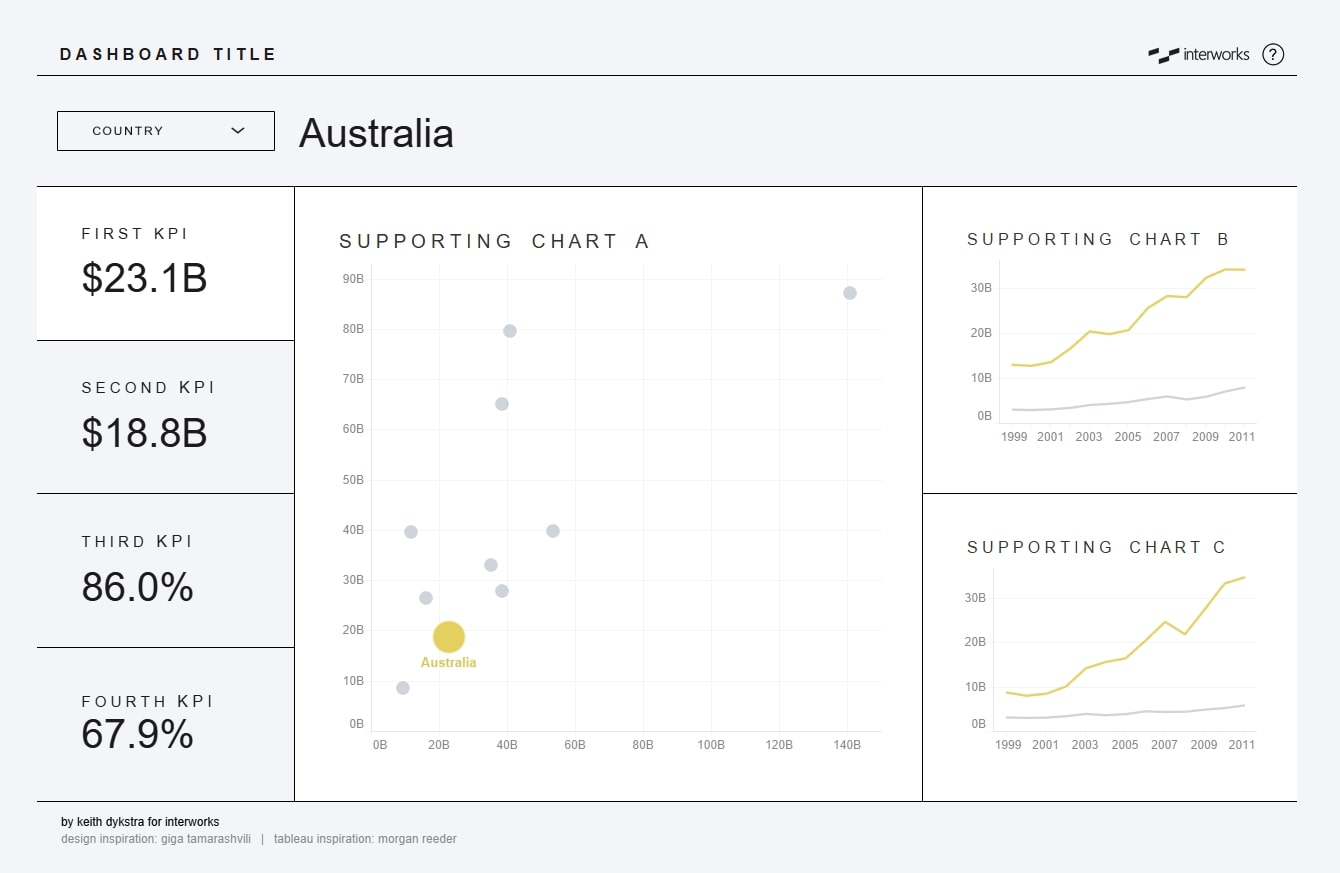
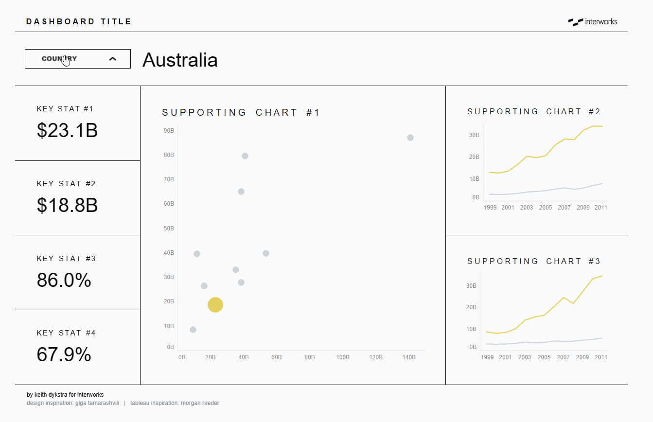
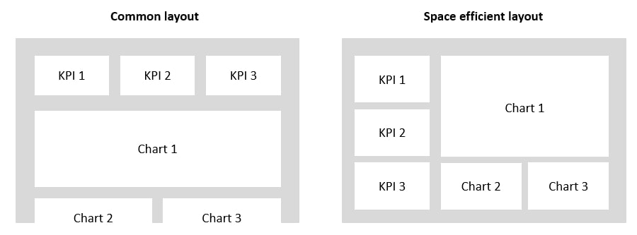
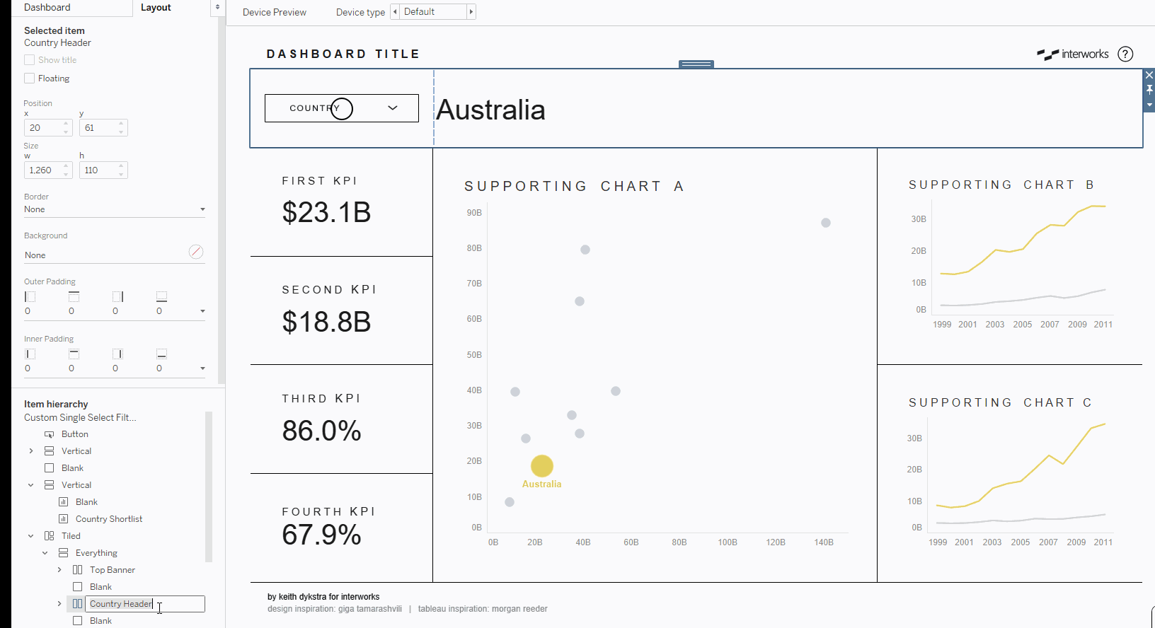
1. Use space more efficiently with KPIs on the side
I reviewed a lot of dashboards this year, and here’s the most common question I asked: “What if we moved the KPIs to the side?” Aligning KPIs horizontally across the top of a dashboard is pretty standard, and sometimes it’s the right choice. But often it leads to charts that are oddly stretched out or cut off. If you’re designing a dashboard for laptops and widescreen monitors, placing the KPIs on the left (stacked vertically) uses the space more efficiently and gives the dashboard a more natural flow:
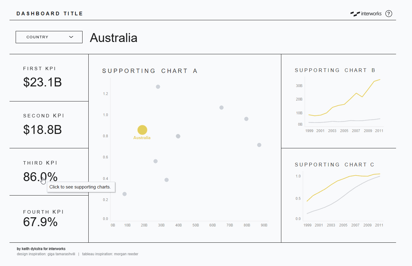
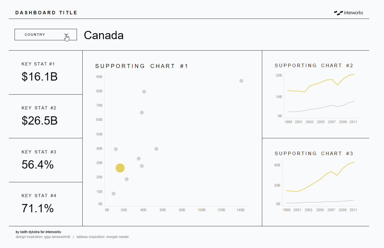
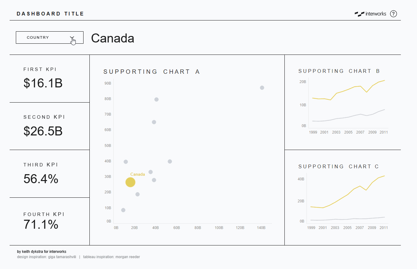
2. Make an interactive sidebar, so users can quickly change charts
When dashboards need to show data from multiple angles, I used to make them longer or add extra tabs. But now I try to build flexibility into a view that fits on one screen. With KPIs on the side like I mentioned above, I can use sheet swapping and parameter actions to change charts with a click. And it doesn’t just work for KPIs. On a recent project, I had a key dimension with three different members. I built a card to summarize the data for each member, stacked them vertically and then used those cards to control a map on the right side:
3. Use auto-deselect hacks to eliminate double-clicking
In a recent project, a user complained that they sometimes had to click a button twice in order for it to work. I started to explain that this was Tableau’s default behavior (retaining a selection until deselected), but then I realized it didn’t matter—to the end user, something was broken and I needed to fix it:
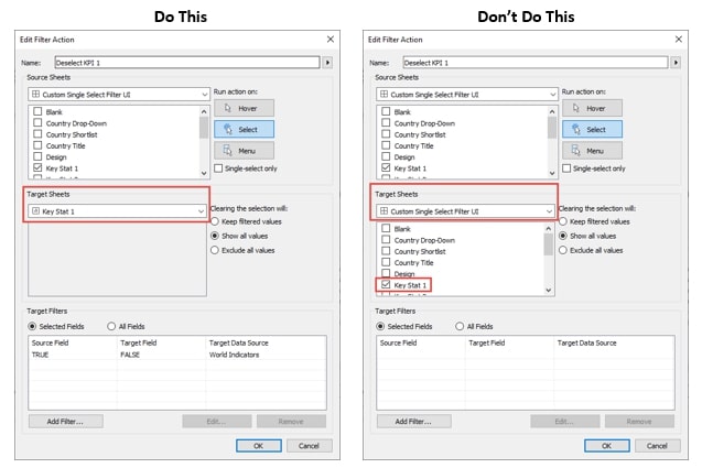
The Tableau community has shared several hacks to get around default selection behavior, but I have two favorites. The first, from Yuri Fal via Luke Stanke, involves a TRUE/FALSE filter action. The second, from Brian Moore, involves a simple highlight action. I’ve used both of them here to provide a much smoother user experience. Get ready to single-click your way into 2021!
Note: Yuri and Luke’s method involves both a highlight and filter action, but in my template, it worked fine without the highlight action – as long as my filter action targeted the sheet directly and not the sheet selected from the dashboard (see image below for the difference):
4. Leverage invisible shapes to prevent distracting highlighting
Auto-deselect hacks are great for changing what happens after a click, but sometimes I want to change the way Tableau behaves before a click. Here’s an example of a sheet I’m using as a button. Hovering over it makes the text look blurry. Not great:
In situations like this, I often float a transparent sheet with a transparent shape on top (Note: This is different than floating a blank dashboard object on top … see the next GIF for more details). I then connect that blank sheet to a dashboard action or use a blank .png as a navigation button. To the end user, it looks like they are clicking on whatever lies beneath the floating blank, but they are actually clicking a blank sheet floating on top, which eliminates the fuzzy highlighting.
This technique is a little hard to show since it involves invisible things, but in the .gif below, you’ll see a circle that I change to a blank image. The worksheet with that image is connected to a parameter action that reveals a drop-down menu when clicked (a technique I describe in detail in this post). If I move that blank image, you’ll notice that the Country text becomes blurry when you hover over it. It’s a minor nuisance, but one that is easy to get around by floating a blank sheet on top:
Additional notes: If the .gif didn’t help, you can download the template at the end of this post to dig deeper or reverse-engineer this. Also, if you’ve never created a blank image, just open PowerPoint, draw a rectangle, remove the shading and border, and then save the image.
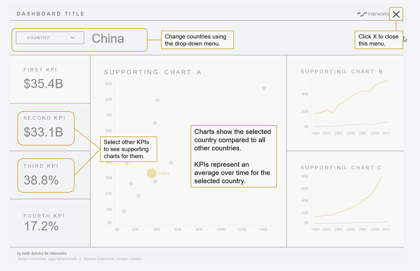
5. Include onboarding instructions using a show/hide container
Onboarding new users got a lot easier in 2019.2 when Tableau introduced the show/hide container feature. People quickly started using the feature to overlay instructions on a dashboard. I was a late adopter and didn’t use the method myself until late this year, but it has quickly become my favorite way to orient users to a new dashboard. It reduces clutter by removing directions that you don’t need to show all the time, and it’s far more user-friendly than linking users to an external guide or video:
Why Details and Design Matter
Some of these tips are admittedly minor user interface adjustments, but small imperfections can distract users from their analysis and cause them to question the credibility of a dashboard. If you’ve done all the hard work to automate sound analysis, taking a few minutes to polish the UX and UI helps users notice the thing that matters most: insights from the data.
If you want to download and reverse-engineer anything, here’s the template. And if you liked these ideas, here are four more tips for making dashboards that users will love and a webinar replay based on these hacks.