Our Certified Tableau Trainers are asked a myriad of questions each day. In this series, they share some answers.
A common question that often comes up in trainings is:
“How do I utilize the Pivot feature in Tableau to make building charts easier?”
What does it mean to pivot data? A pivot is a transformation of data structure from a wide view (many columns) to a long view (condensed columns). There are many benefits to pivoting data, one of which is the ease of building charts and sorting those charts dynamically.
Let’s build a chart that shows our quarterly sales for some of our top selling sub-categories and show them in a descending order:
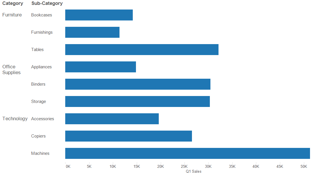
Combing Category, Sub-Category and Q1 Sales, the bar graph shown above was created. I also want to show Q2-Q4 Sales in a stacked bar chart. This can be accomplished by dragging Q2 Sales onto the Q1 Sales axis already in place until the double green rulers appear. This technique invokes Measure Names and Measure Values.

This process can be repeated for Q3 Sales and Q4 Sales until the chart looks similar the one below:
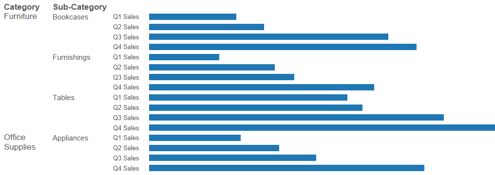
I do not want to see a separated bar for each quarter. Moving Measure Names from Rows and dragging it to Color would create a stacked bar chart. After making a few color and axis formatting changes, we can get the chart below:
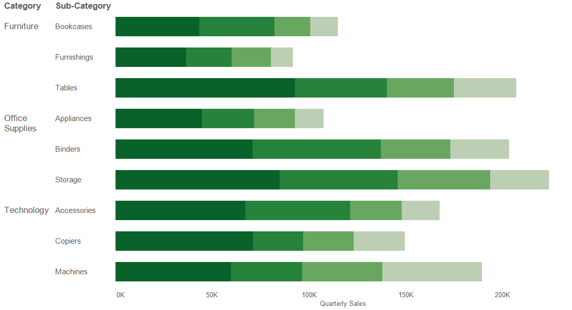
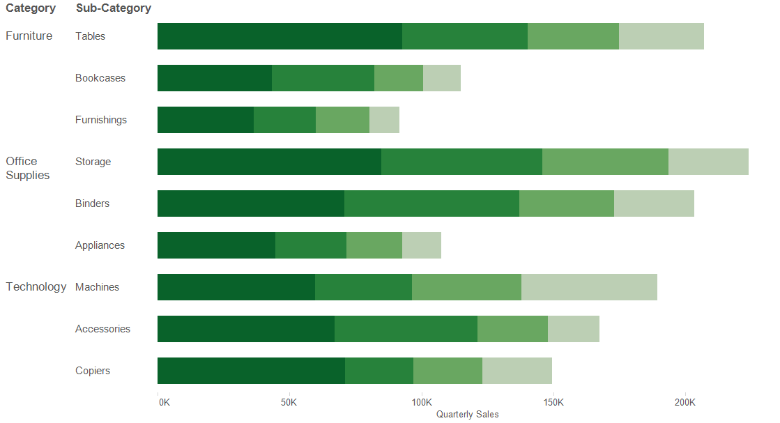
Lastly, it is important to dynamically sort Sub-Categories by adding all the quarterly sales together in a calculated field:

I’ll add the sort on the new Quarterly Sales Total field and get the final chart shown below:
The same chart can be built much quicker if the data is pivoted. Edit the original data source to create the pivot by CTRL + clicking the columns and selecting pivot from the drop-down list:
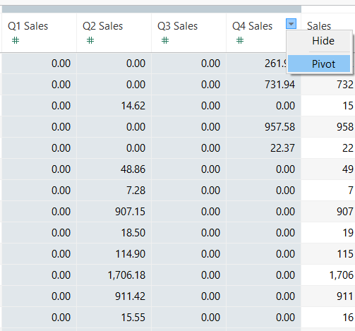
A quick rename of the two pivoted fields, Quarters (which holds the names of Q1 Sales – Q4 Sales) and Quarterly Sales (which holds the sales values for each record of Quarters). In this example, the number of rows quadrupled because the previous four individual columns were consolidated and displayed as rows.
Starting off with Category and Sub-Category, we can create the basis of the chart, but this time using our new pivoted field Quarterly Sales in place of Q1 Sales:
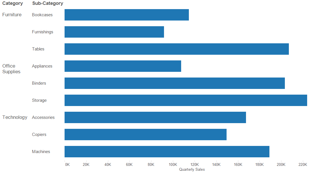
Dragging Quarters to color on the Marks card will break out the bars into the four different quarters, only leaving the dynamically descending sort left to add. Hovering over the Quarterly Sales axis will reveal the quick sort button, which will ensure that the sort is dynamic on the Quarterly Sales field.
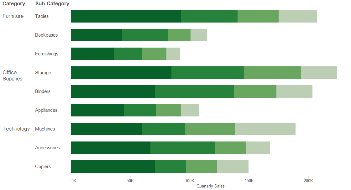
Pivoting can be a useful method for building charts more efficiently and displaying visualizations with little effort.
