
This blog post is Human-Centered Content: Written by humans for humans.
This July, InterWorks held its first company-wide Volunteer Week, giving teams around the world an opportunity to spend time supporting causes that matter to their local communities. Because this was the first time we had organized the event across the company, we wanted to understand what participation looked like. We planned a survey to capture the information and a dashboard in Sigma to help people across InterWorks explore the results.
Before a single survey response came in, I decided to see whether Claude could help me prototype what that dashboard might look like. I asked it to generate synthetic survey data and turn it into a working interactive dashboard. In a few hours, I had a proof of concept and, somehow, a dashboard branded entirely in Oklahoma State orange and black.
Once the real responses arrived, the next step was to rebuild the dashboard in Sigma, learn a new platform on the job and figure out which parts of the prototype were actually worth keeping. This post follows that process from beginning to end: how AI helped me explore an idea before real data existed, where the prototype stopped being enough, what changed when I rebuilt it in a production BI platform and how feedback from coworkers shaped the final result.
Prototyping with Claude took an afternoon. Building the real version in Sigma took longer, but the prototype gave me something valuable to work from. I was not opening Sigma with nothing. I had a visual starting point, even if I had not yet thought through how it should work as a Sigma workbook. Here is how it went.
Step 1: What Claude Got Me
The first round of prototyping was really an experiment. Before I had real survey responses to work with, I wanted to see whether Claude could build an interactive dashboard at all.
To test it, I had Claude create 300 synthetic survey responses and distribute them across our global offices. It even included realistic volunteer organizations, from Iron Gate in Tulsa to Plastic Whale in Amsterdam. I never had to type a single row by hand. From there, the first dashboard came together quickly.
Then I asked for a more ambitious version. It looked better, but for reasons I still do not completely understand, Claude redesigned the entire dashboard in Oklahoma State colors. My best guess is that it connected Stillwater with unrelated context from a slide deck I had worked on earlier that week. Whatever the cause, the result looked less like InterWorks and more like something that belonged on the wall of Boone Pickens Stadium.
To correct it, I gave Claude screenshots of the actual InterWorks website. On the next pass, it rebuilt the dashboard around our real colors, typography and visual style. That reinforced something I already knew but had not fully applied during the first attempt: AI can only work with the context you give it. When I replaced a loose description of the InterWorks brand with real examples, the model no longer had to fill in the gaps itself.
At that point, I had confirmed Claude could produce a convincing interactive prototype. The next question was what would happen once the real Volunteer Week survey responses arrived and the dashboard had to become something people across InterWorks could actually use.
Step 2: The Reality Check
Claude’s version was fast, functional and surprisingly polished, but it was never going to be the final product. The prototype ran from a static CSV. I could regenerate it, re-prompt it and experiment with the layout, but I could not manage it like a real business intelligence asset. It was not designed to refresh as new responses arrived, support ongoing exploration or become something people across the company could consistently use and trust. That is the difference between a useful prototype and a production-ready dashboard with proper security and permissions.
Claude’s prototype could have just as easily become a Streamlit app or something similar, and for some teams, that might have been the right call. But InterWorks is doing a lot of exciting work in Sigma across the company right now, so it was the obvious choice for the production version. It also gave us the option to implement enterprise security, permissions and direct connections to the underlying data if we needed to.
There was only one small complication: I had never used Sigma before. I am currently completing a degree in Business Analytics and Data Science, with a year of experience using tools like JMP and SAS Viya, several years of experience with Excel and one semester-long data visualization course in Tableau. Even with that background, Sigma was completely new to me. This was not a matter of switching from one familiar tool to another. I was learning a new platform on the job, working toward a deliverable people across InterWorks were eventually going to see.
Naturally, my first instinct was to see if AI could make the process easier. I wanted to know whether I could point Claude at Sigma the same way I had pointed it at the InterWorks website and have it build the workbook for me. There was no clean way to do that. Sigma was not going to take a screenshot, interpret my intentions and hand me back a finished workbook. Whatever got built, I was going to have to build myself.
Step 3: Going In Without a Map
So I did what you might expect from someone who had just spent a month watching an AI generate interfaces on command: I treated the Claude prototype as a complete design plan instead of what it really was, a visual starting point. I skipped over sketching how the dashboard should actually work as a Sigma workbook and started rebuilding the prototype by hand.
My first version had one page. Every visualization was stacked beneath the previous one. At the top was a giant hero image with a purple gradient and a thumbs-up sticker because that was what the Claude prototype looked like, and it was the only reference point I had. Technically, it worked, but it also required viewers to scroll through a wall of charts to find anything.
If you want to see what it looks like in motion, check it out here. Otherwise, here’s a quick screenshot:
I had essentially built a webpage inside a BI platform. It worked, but I was not yet taking advantage of Sigma’s navigation and workbook structure. I had successfully recreated the prototype. I had not yet created a good Sigma dashboard.
Step 4: A Few Fresh Sets of Eyes
No one catches everything in their own work. That is why code reviews and design reviews exist in the first place. AI can help with that process too, especially when you ask it to review the same work from a different perspective or give it fresh context.
Derrick Austin touches on a similar idea in Tales from the Trenches: Real AI at InterWorks. He talks about AI and human code review working alongside each other rather than one replacing the other. That was essentially what happened here, just with a dashboard instead of a codebase.
AI helped me get something on the screen quickly, but this part of the project still came down to people. A handful of coworkers caught things in the dashboard that I could not see on my own, and that feedback is what moved it beyond my first attempt. Everyone named below is a coworker, not someone assigned to review this project. I am an intern, and each of them made time in an already full week to look at a dashboard that had nothing to do with their own workload.
Chris looked at the first version for about ten seconds and asked why everything was on one page. Sigma already had a feature designed for exactly this problem: Tabs. Instead of forcing viewers to scroll through the entire workbook, I could organize the content into clear sections and let people navigate directly to what they wanted. That single observation improved the dashboard’s usability more than almost anything I had done up to that point.
Sean and Will took the review further. They worked through the dashboard in FigJam and evaluated the fonts, chart choices, spacing, color usage and overall visual hierarchy. Their feedback marked the difference between a dashboard that technically displayed the data and one that people might actually enjoy using.
Bennett, who was last summer’s intern and is now one of our resident Sigma experts, gave me a crash course in the platform’s more advanced capabilities. Most of what he showed me did not make it into the final workbook, but the goal was never to squeeze every available feature into one dashboard. The value was learning what Sigma could do, when those capabilities might be useful and what I could pull from on the next project.
Once the structure and functionality were in place, David and Madison from our design and marketing teams gave the dashboard a final cleanup. They tightened the visual details and helped turn what I had built into a much more polished final product.
Matt, who is also newer to InterWorks but much more technical than I am, became a sounding board throughout the process. Talking through ideas with someone who could quickly identify what would or would not work saved me from going too far down several unnecessary paths.
Then there were Sara and Kelsey from our Employee Experience team. While neither is a BI developer, they work with internal reporting regularly and are primary stakeholders for this kind of dashboard, which gave their feedback its own kind of weight.
They were not reviewing formulas or questioning the data model. They were telling me when a chart was confusing, when a label did not make sense or when a color choice felt wrong. That is exactly the kind of feedback a company-wide dashboard needs, and it is usually the kind of feedback the person building it is least equipped to give themselves.
Step 5: Where It Landed
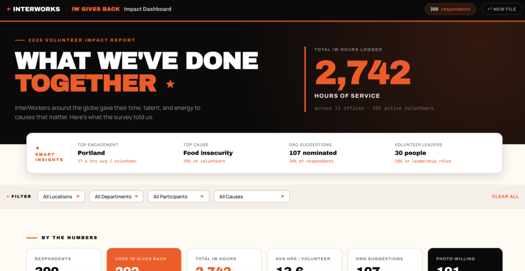
The single scrolling page eventually became four focused tabs: Title. Survey Results. Respondent Summary. Highlights. Instead of one long scroll, each tab now carries its own part of the story, even though none of them depend on the one before it.
Because this was InterWorks’ first company-wide Volunteer Week, the dashboard also became part of documenting what the event looked like in its first year. It gave us a way to see where people participated, how they contributed and which parts of the experience were worth carrying forward.
The public-facing version is only one piece of what we built to celebrate IW Gives Back internally. The full workbook includes additional details and views designed for people inside InterWorks, while the public version focuses on the parts of the story that make sense to share more broadly.
The fonts, colors, spacing and chart selections went through two more rounds of revision after the FigJam session. The hero section changed. The navigation changed. Several visualizations changed. Some ideas were removed entirely. The final dashboard was cleaner, easier to navigate and much more aligned with the way people would actually use it.
None of those improvements came from one perfect prompt. They came from experienced people taking a few minutes to notice things I could not see on my own. Want to check out the final version? Take a look here:
The Throughline
The AI prototype and the Sigma build ended up teaching me the same lesson from opposite directions. With Claude, better context meant better output. When I gave the model only a loose idea of the InterWorks brand, it improvised. When I gave it real examples, it produced something much closer to what I had in mind. That held for more than just color and branding.
Going in, I could not have told you everything a dashboard for our first company-wide Volunteer Week should even contain. The first prototype helped me find that out before I had fixed anything about how it looked. That is probably the more useful takeaway for anyone else picking up AI to build something outside their usual expertise: you often do not know what a good outcome looks like until you have something in front of you to react to, and a rough first pass is a fast way to get there.
With Sigma, the most useful context did not come from screenshots or prompt instructions. It came through feedback. Chris noticed the navigation problem almost immediately. Sean and Will brought real design experience to the workbook. Bennett showed me what the platform was actually capable of, regardless of what would make it into the final version. David and Madison brought the final visual polish. Matt kept me from wandering too far down a few dead ends. Sara and Kelsey’s reviews as stakeholders were invaluable, not just as fresh sets of eyes.
Claude helped me turn an idea into something visible before any real data existed. Sigma gave me the environment to turn that idea into a maintainable BI asset. A handful of thoughtful suggestions helped me make it clearer, easier to use and better than what I would have built alone.
Looking back, the most daunting part was not any single chart or calculation. It was opening a platform I had never used and knowing whatever I built would eventually be seen across the company. At first, every decision, from where to begin to which visualizations to use, felt bigger than it probably was.
What made the process manageable was realizing I did not have to know everything before I started. I could build something, show it to people who knew more than I did, listen to their feedback and improve it. That turned the project from a test of whether I could get everything right alone into something closer to trying things, getting them wrong and fixing them in public.
The AI got me to a working prototype in an afternoon. Building the real version took longer, and feedback made it better.
Built with Claude. Rebuilt in Sigma. Improved with help from people who knew more than I did.
Related
