
This week’s blog is going to be a little different than the previous. We will cover a “Pilot” feature which I know many others would really benefit from releasing in later release of both Tableau Server and Tableau Cloud.
So, let’s say hello, albeit temporarily to Sankey and Radial charts in Tableau Public!
This pilot of the two new chart types will be available until June 30 where on that date all charts will be switched back to automatic on the marks card and visualisations will be lost. That’s not going to stop us playing around and having fun though, is it?
Sankey and Radial charts are these special charts people have had to custom build within Tableau in previous workbooks, with union data back on itself and sometimes complex maths equations. This has become much easier with this new pilot feature and takes building a chart from hours down to minutes in a fantastic, innovative leap forward. Before we jump into building some data and charts, let’s look at what the two new chart types are and when they should be used.
Sankey
A Sankey chart is a type of flow diagram that is best used for visualizing the distribution of data across multiple stages, processes or categories. It emphasizes the flow of resources, energy or quantities through a system, making it particularly useful for illustrating the relationships between inputs and outputs. By using proportional arrows to represent the magnitude of the flows, Sankey charts effectively highlight where resources are allocated, how they change over time or the efficiency of a process.
Radial
On the other hand, a Radial chart, also known as a Circular or Polar chart, is a graphical representation where data points are plotted along the circumference of a circle, with their distance from the centre representing their value. This type of chart is best suited for displaying cyclical or periodic data, such as trends over time or relationships between variables that have circular patterns. Radial charts are effective in comparing multiple data sets or showcasing patterns that might be obscured in linear formats, providing an intuitive and aesthetically pleasing way to visualize complex relationships.
How to Use Sankey and Radial Charts
With both charts, they are good for whole to part relationships or flows, so use cases for them should be valid. Don’t just add one because it looks “cool.” Which may be hard, because they definitely look cool. Remember firstly that visualisations should be understandable and tell a story without requiring huge amounts of time or complex thinking
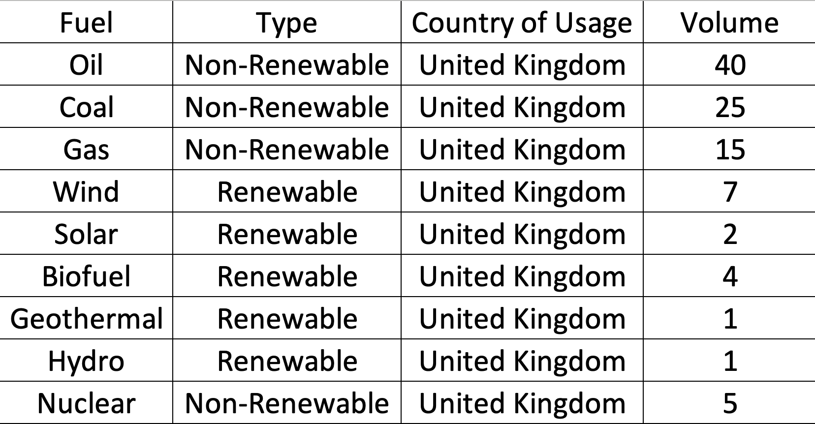
Now for the data, there’s not much in Tableau Public news that mentions data structure, so with a little testing, I realised it’s actually relatively basic, and the same data can be used for both charts. I’ll provide some fake data below for you to add to excel and use or you can download it at the bottom of the post. All you need to remember is each line of your data would be unique and becomes a part of the total volume:
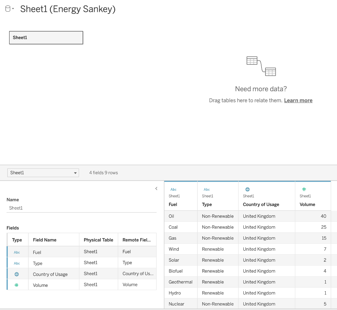
We have our data prepped, head over to Tableau Public and sign in or create and account, we can only use this pilot on Tableau Public Web Authoring for the time being.
Once signed in at the top left click the create dropdown menu and then Web Authoring:

You’ll be presented to a similar Tableau desktop data connection view where we’re going to click, “Upload from computer” to add our new fake energy data. When loaded click, “Update Now” to visualise your data to check all is ok:
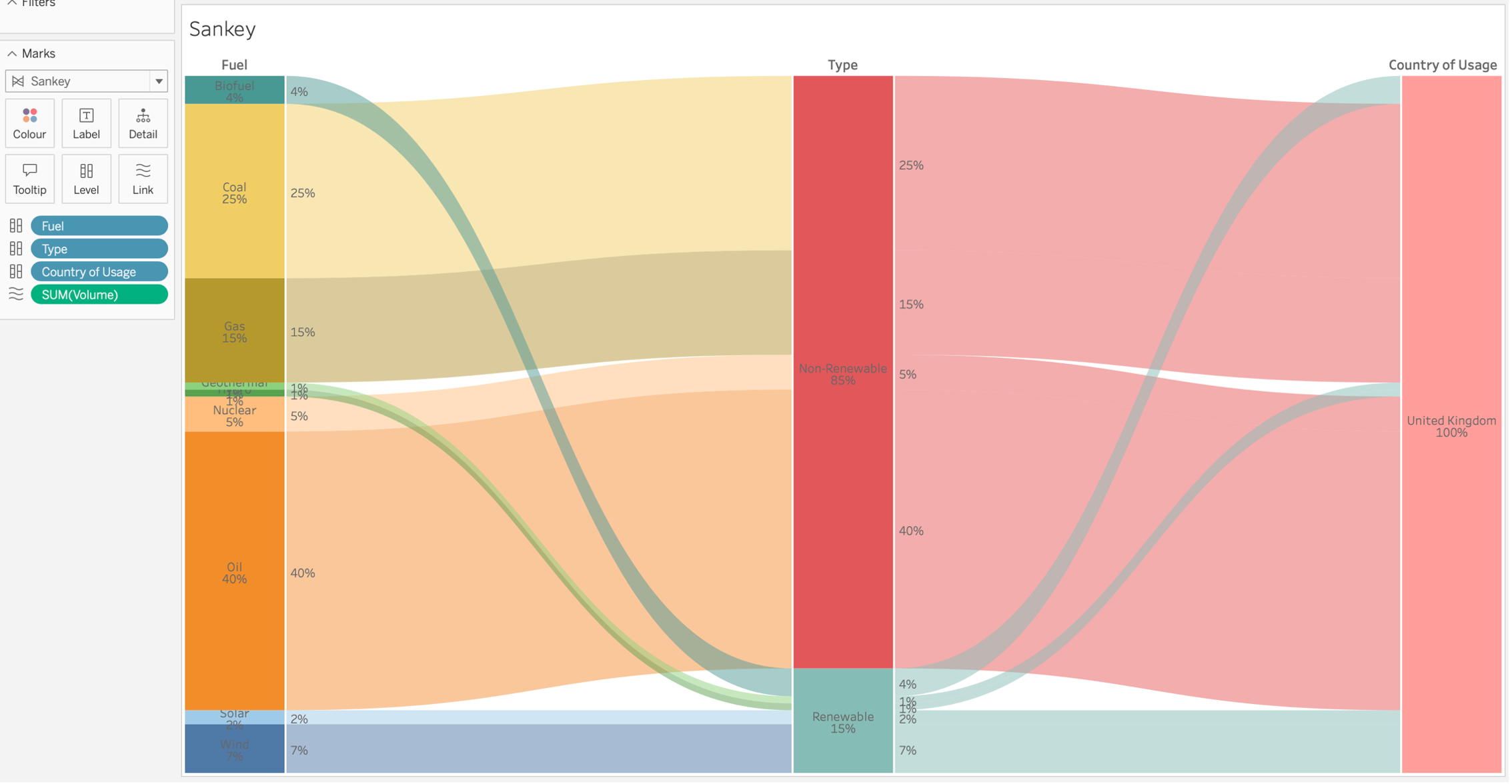
Our first chart, we will build is a Sankey using this data, head to “Sheet1” and rename this “Sankey” to keep things organised. Sankey charts currently don’t appear in “Show Me” and may never do, so we select this on the “Marks” card and rather than Automatic select Sankey and see some key new options appear:
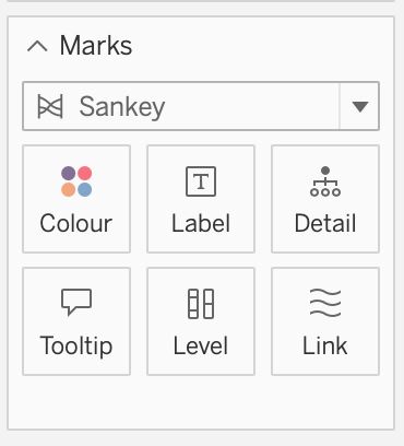
The two main ones to note here are “Level” and “Link,” and you’ll see why shortly. So, let’s start dragging some data onto our Marks starting with dragging “Fuel” onto Level. You’ll see these populated in your visualisation pane with an equal percentage assignment. If we add “Type” and then “Country of Usage” to Level also we will start to see the skeleton of a Sankey take place:
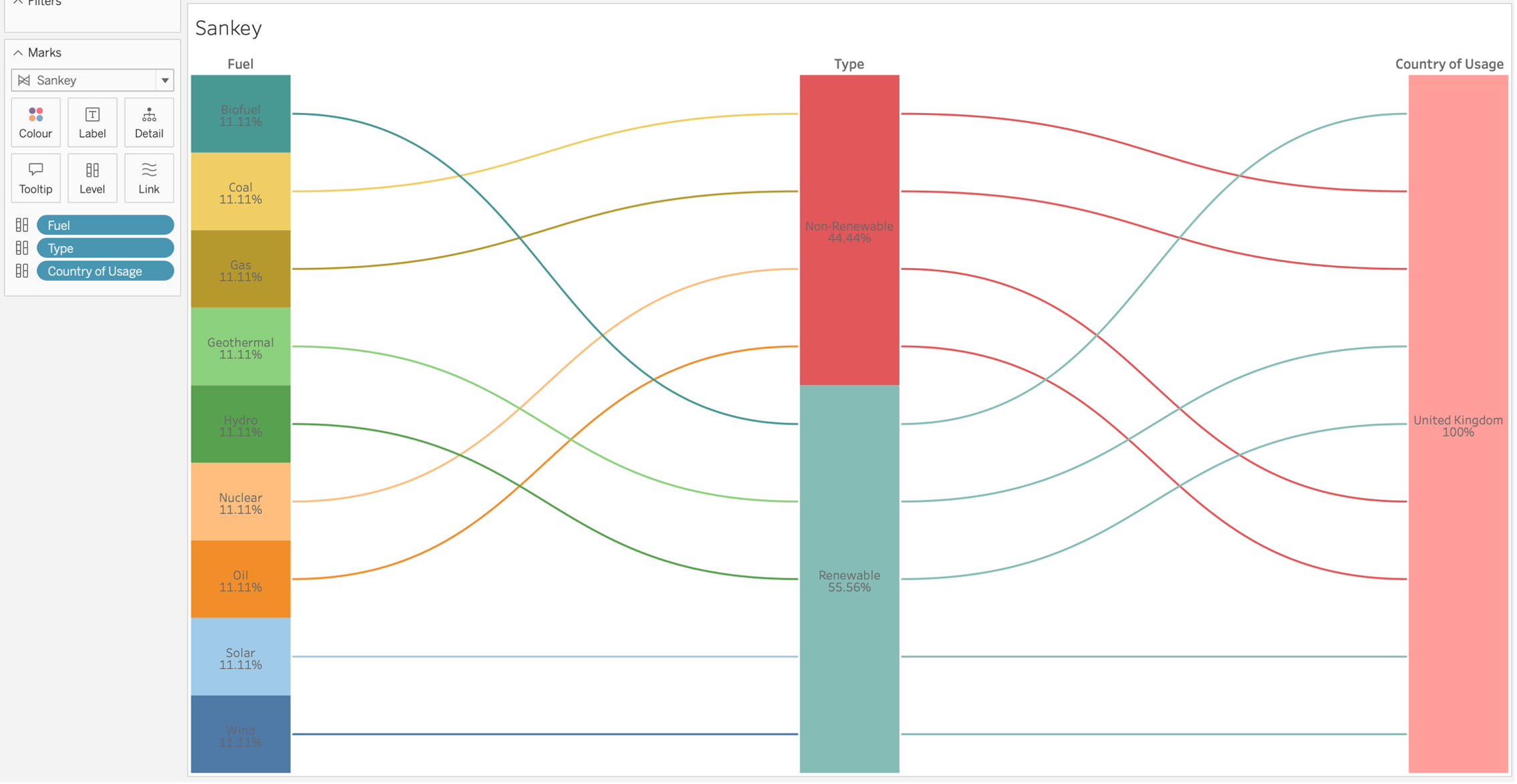
Hang on, we’re not seeing the true reflection of the data within this chart. This is where the Link card comes in. How do we link these levels with values? We drag Volume onto this Card and voila, we have a Sankey! We can visualise the part to whole relationships in our data throughout its journey:
One thing I have noticed in this pilot, is the fact we can’t manually manage or assign colours to our attributes. I’m hoping this is a bug, or will release in the future as it also carried into our next chart the Radial chart.
We’ll create a new sheet and call it “Radial,” and this time, instead of selecting Sankey on the Marks card, lets select Radial. We’ll see our now familiar Level card and in-place of Link we now see Angle:
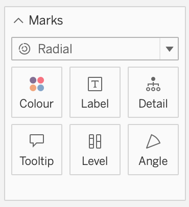
This time, let’s add “Country of Usage” to Level first, followed by “Type” and finally “Fuel.” Houston, we have a problem! I don’t know about you, but it looks like a single block donut chart with hard to read text:
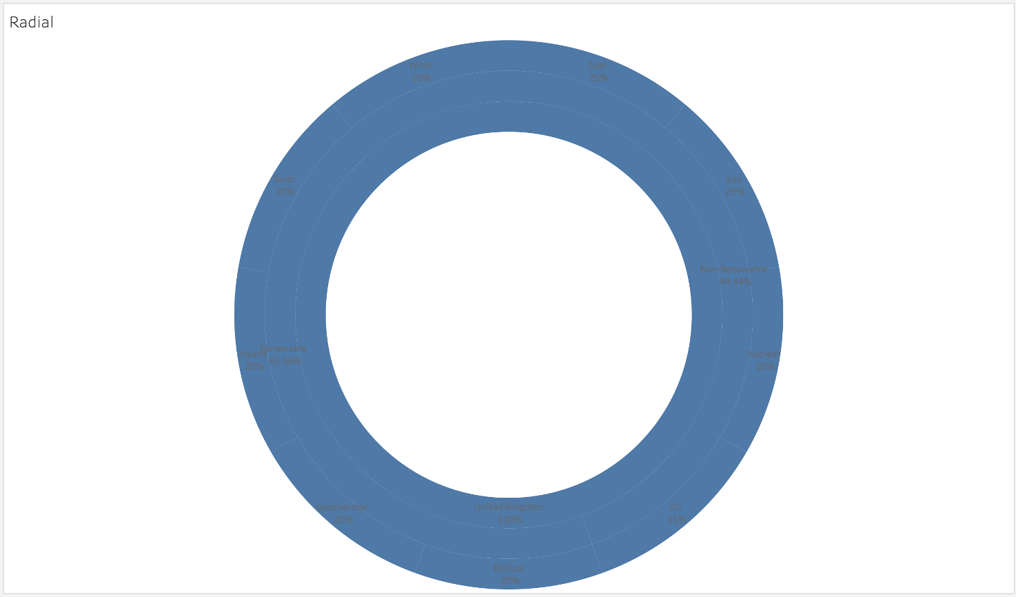
We need to add some Level padding and width, then format the labels to be white. Click the Level card to be presented with your sliders. I like to put my width about 2/3 of the way up and padding around 1/4. You’ll start to see your relationship segments taking shape. Now at the top click “Format” and then Worksheet and in the format panel lets change the font colour to white:
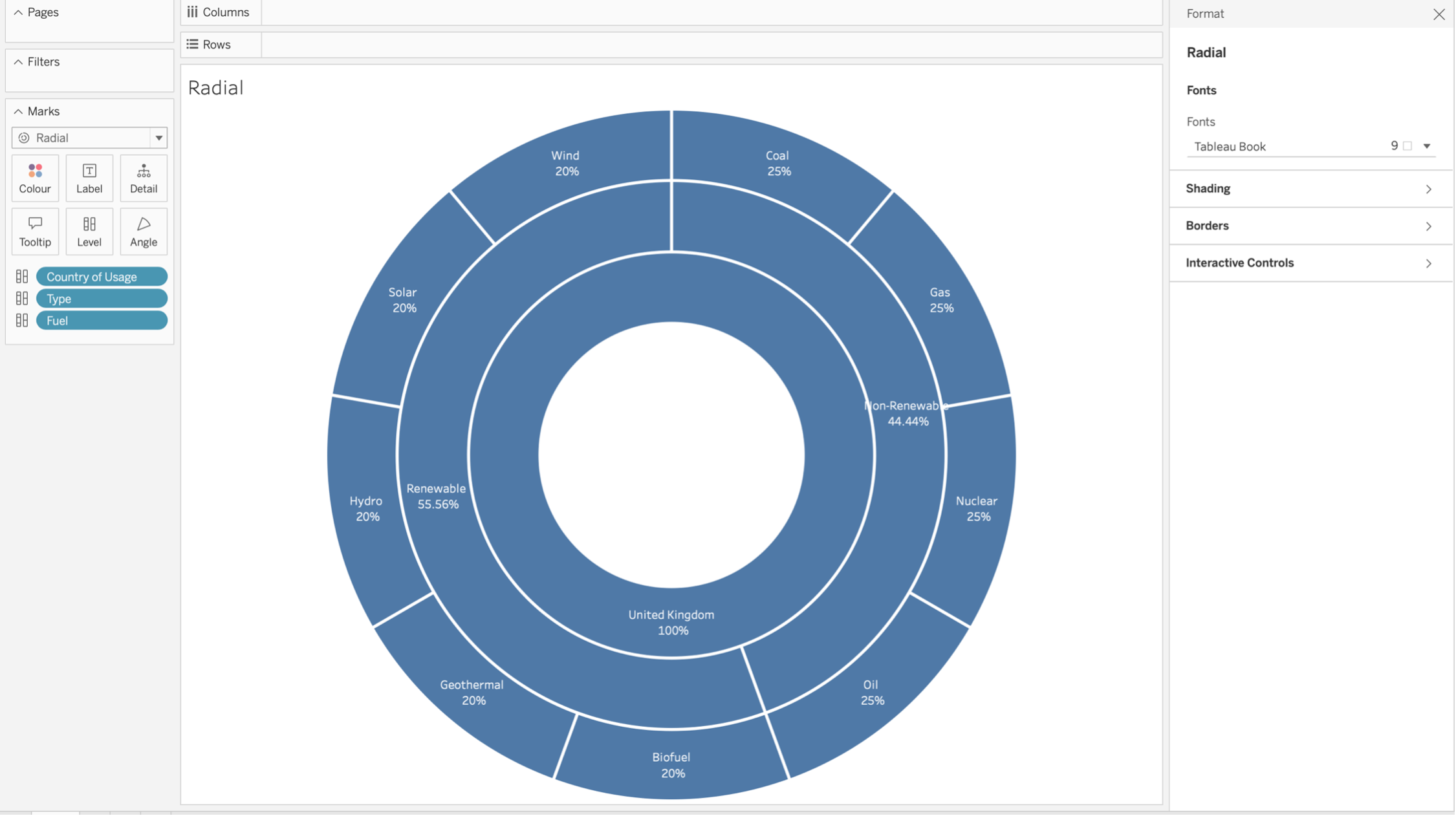
As with the Sankey we have even distribution values, so drag “Volume” onto Angle. We may want to also click Label and untick the option to allow labels to overlap. We can now see how our parts sum to the whole, unfortunately without control of colours or shades we can’t distinguish volume or type changes as we’d like:
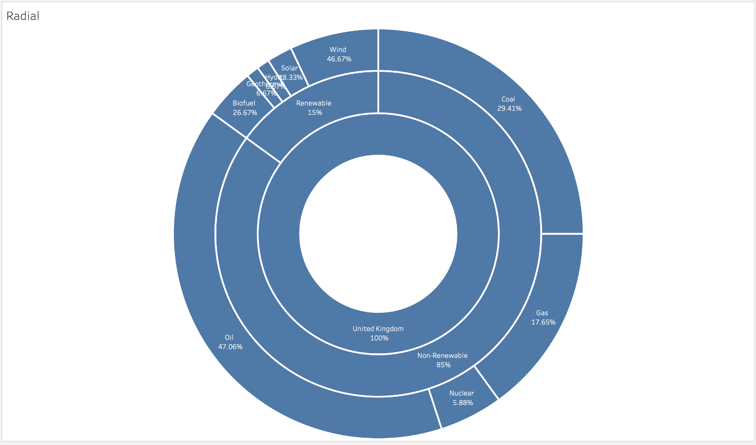
You can remove “Country of Usage” to start to see varying colours which adds value. However, I’d like to see at least colour shading introduced if they open this up as a general lease in the future. Did you notice that this option could be a really easy way to create a donut chart in the future without a dual axis? Pretty neat.
I would live to see this pilot come into both Tableau Server and Tableau Cloud as part of their 2023.3 release so end-users and developers can start seeing new charts, value and time saving benefits as soon as possible. As with any visual, if you get your data structured correctly, we can build some fantastic new visuals within minutes!
We’ve seen new charts become a thing of the past for a while now so this pilot has been a breath of fresh air a lot of the community will welcome with open arms!
Head over to Tableau Public and search for these chart types to look at the fantastic visuals our community have created.