
Tableau has launched a new feature in their latest release of 2023.1, allowing developers and end-users to benefit from axis titles to change based on parameters or calculated fields. As usual nowadays, it works in Tableau Desktop and in Tableau Web-edit. In this blog, we will look at the feature, how to implement it and use cases.
So, let’s dive straight in and start building out this new feature. With these examples, we will be using the Superstore workbook that comes with Tableau Desktop so you can download the latest version and see the feature.
Let’s Build It Out!
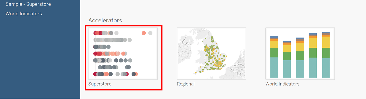
Open Tableau Desktop and at the bottom under accelerators, click “Superstore” here:
Now that we have the workbook and data, let’s go ahead and create a new sheet where we will start building a chart.
In the Data Pane at the top left, make sure the data source “Sample – Superstore” is selected rather than “Sales Target.”
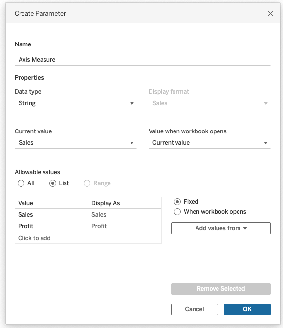
Our goal: have a parameter driven axis where we can switch between viewing [Sales] and [Profit] and have the title change respectively. Let’s go ahead and right click under Parameters and click “Create Parameter.” We will call this “Axis Measures”, select “String” as the data type, “List” as allowable values and add “Sales” and “Profit” as values:
Now we need a calculated field that will select the correct measure based on the parameter selection.
Let’s create a calculated field with name “Measure to show” and add the statement:
CASE [Axis Measure]
WHEN 'Sales' THEN [Sales]
WHEN 'Profit' THEN [Profit]
END
Tip: The reason I didn’t do ‘ELSE [Profit]’ is that we may want to add additional parameter values in the future (such as quantity) and we have the basis to scale the calculation.
Now we need to start building the chart. Let’s drag [Region] onto “Columns” and our newly created calculated field [Measure to show] onto “Rows,” and lastly lets right click the [Axis Measure] parameter and select “Show Parameter.”
So far so good. If we start switching the parameter between [Sales] and [Profit], we can see our chart changing. However the title is still the same — this is not a good user experience, so that’s where our new Dynamic Axis Titles come in to add some clarity.
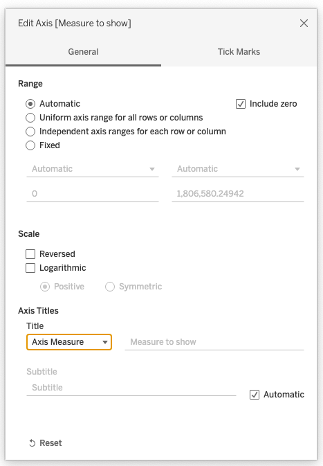
Let’s right click the axis and click “Edit Axis” to bring up the dialog box with our new sub menu. Under “Axis Titles,” we will see “Custom.” Let’s click that, switch it to the name of our parameter [Axis Measure] and then close the dialog box:
We can now see the title has changed to the selection in the parameter instead of our boring field name. Let’s test this by switching between [Sales] and [Profit] again.
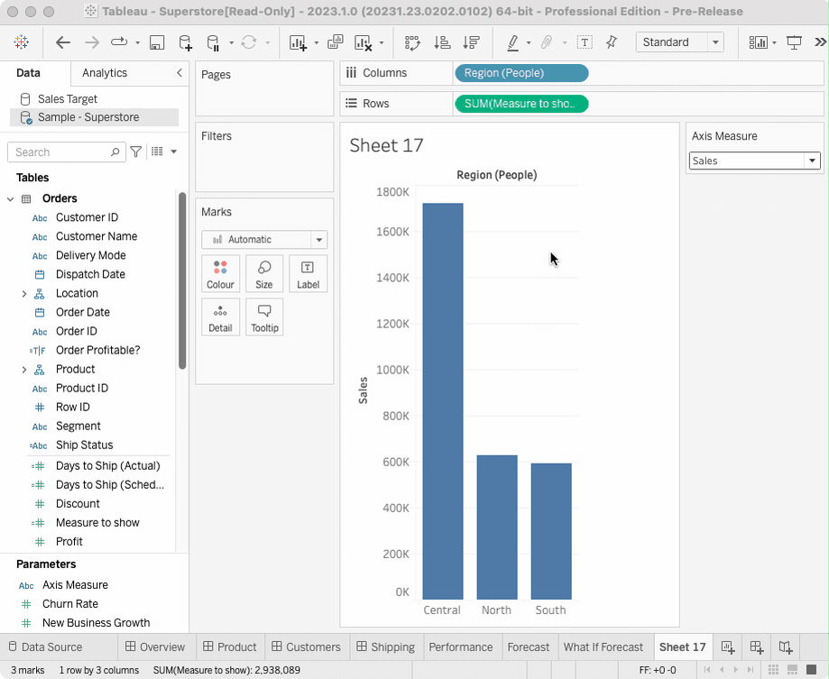
There we go! We can now utilise the same graph to switch between measures with accurate naming for aiding our end users in interpretation and for sharing externally without having to remember the measure we selected. That makes our world a bit easier!
There’s More! Enter LODs!
What about using a fixed calculation to show when the data you’re looking at is up to date in the axis title?
Let’s go ahead and build that solution out, too. Bonus, we don’t need a parameter for this one! Just a new sheet.
In that sheet, we once again create a calculated field. We call this one “Max Order Date Title” and type in the following calculation:
{FIXED: MAX("Orders up to " + STR({FIXED: MAX([Order Date])}))}
What Does This Calculation Do?
The inner “FIXED” is giving us the latest [Order Date] of the data source. If we didn’t have any text like, “Orders up to” in there, this would be enough already. Here, though, we do want that text, but we run into a weird issue: An axis title needs to be exactly one value at a time. Well, that makes sense — we wouldn’t want our axis title being split into 2 values. That wouldn’t make any sense.
Unfortunately, Tableau thinks strings in a field do exactly that: make up more than one value. To go around that, we have to force that string into exactly one possible value at a time, and we can do that with another “FIXED” calculation around it (and no, we cannot put string and date into the same “FIXED,” because they are different data types.)
Building The Chart.
As we did previously, let’s drag [Region] onto “Columns.” However, let’s just add [Sales] to “Rows.” We right click the [Sales] axis, edit it and, in the pop-up dialog box under “Axis Titles,” we once again click “Custom.” Then, we select the data source “Sample – Superstore” and then our freshly-built calculation. Voilá! We now have a dynamic axis title that’s always showing the latest date in our data set.
With everything we do in Tableau, we want to weigh up the pros and cons of new features and their value to the end-users. We want to use this to add clarity and value without complexity. This can be a replacement of some show/hide containers for similar measure switches, or to add some further information to the chart where we had to build a lot of workarounds previously. If you want to work with us on implementing any of these new Tableau features, reach out and we’d be more than happy to help.