Going the Distance in Tableau: Clustering Based on Distance
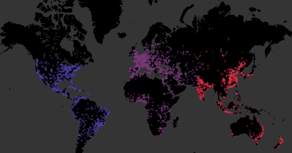
The final example of using distance calculations in Tableau looks at clustering cities based on their relative distance to a selected set of points. This is based on the table calculation method we looked at in the previous two sections, with the formula I called Distance (Table Calc). Effectively, we will have three total copies […]
You Down with SOP?

My kids are terrible at doing their chores. Each day, my highly organized wife leaves a list of items that must be accomplished before the younglings are allowed to breach the lock screen of their mobile devices. Each day, I walk in anticipating the majestic tones of children’s voices echoing throughout the house, insisting the […]
PYD81 – Tableau 2019.2 Features

The release of Tableau 2019.2 is right around the corner, and today, we are talking to the brains behind the latest update. In this episode, InterWorks analytics consultant Robert Rouse welcomes Tableau engineers Samantha Lin and Phil Naranjo as they give us some insight into the features we’ve got coming our way.
Advance with Assist: NOW and TODAY Functions in Tableau
Question: I’m using the NOW function to show the current date and time in an analysis I’m building for our assembly line, but when I add to my report, it’s showing me all data for all of time. How can I get this to show me only what’s current? The NOW function returns the current […]
Going the Distance in Tableau: Dynamically Comparing Different Distribution Centers
In this next scenario, we are going to look at which distribution center is closest to a selected city. This is highly similar to the previous scenario with a change to the setup for the crosstab’s filtering. We need to have a two-level sort similar to the one before, while taking into consideration 1) whether […]
Quantified 106: Communicating Data

It’s episode six, and Will Jones joins the show to share how we communicate data with others. We talk about the importance of understanding your audience, streamlining your message and presenting data in ways that are easy to consume.
Perth Brewalytics Event Debrief
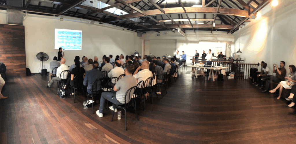
The InterWorks ANZ Team kicked off this year’s first big event with Brewalytics in Perth, Western Australia. This event was run in partnership with Tableau and Snowflake and was attended by over 50 people from more than 25 organisations around Perth. Brewalytics was a great chance to bring together Perth’s data community over a few drinks and […]
Matillion 101: Completing My First Job in Matillion

If you’ve been following along in this Matillion series, you’ve already set up and logged into Matillion. From here, I’m going to talk through the first part of the first job I created in Matillion, leaning heavily on Holt’s recent post about setting up an API profile. Pulling in Metadata to Matillion For my first […]
Spell-O-L: A Data Viz of Hilarious Misspellings
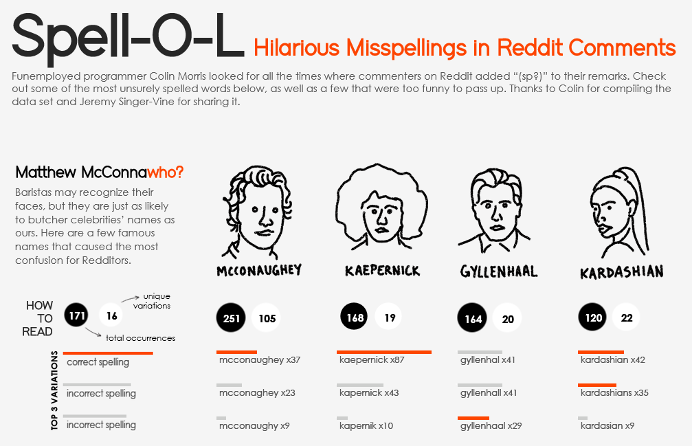
My colleagues and I often joke about how the most interesting visualizations on Tableau Public don’t often have much practical application for the boring world of business dashboards in which we operate. At first glance, my Spell-O-L dashboard is no exception. Telling a Visual Story This visual story about spelling errors in Reddit comments gained […]
A Song of Tableau and Data: Exploring Game of Thrones IMDB Ratings
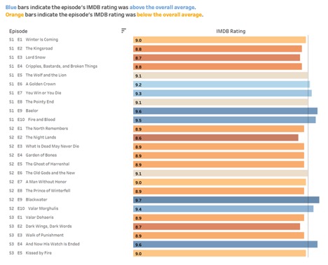
As the masses flock to their couches to re-binge-watch all the episodes of Game of Thrones, salivating for the final season like a pack of ravenous wolves, add this dashboard to your meta nerd repertoire. I Drink and I Know Things When the wine starts flowing and your friends finally take a break from preaching […]