For this week’s #MakeoverMonday project, I wanted to build a divergent stacked bar chart. I used to create these charts every so often in my last job, but I did it by opening up an old Tableau workbook and mindlessly copying the calculations and setup of the worksheet without really understanding what was going on. So, I had a moment of mild panic when I realized I no longer had access to my old work and would need to build this from scratch.
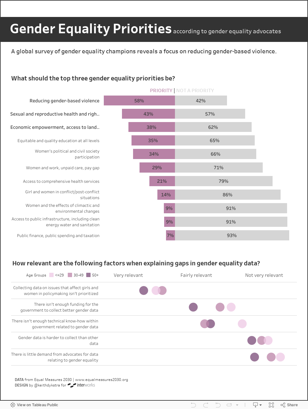
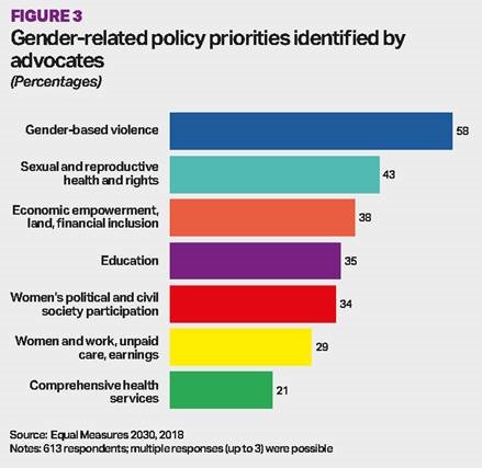
But before I tell you how I saved myself from my own freak-out, what is a divergent stacked bar chart, and why did I decide to use it? Divergent stacked bar charts are often used for Likert scale data (although here’s a fascinating blog post that I read–after I had finished this project–about why you shouldn’t use divergent stacked bar charts for survey data). But just pretend you didn’t read that for a second, ok? The original visualization for this week’s makeover emphasized the percentage of respondents who identified a particular issue as a top priority for promoting gender equality. Since respondents could pick three (out of eleven) issues, I thought the original viz was a little confusing because the numbers added up to more than 100%.
I wanted to improve upon this visualization by showing the percentage of both yeses and nos and by making the positive and negative responses really distinct from each other, but I was stuck without access to my former examples.
As I tried to recall the steps for building this chart, I realized that, as a Tableau trainer, I often force students in my Tableau courses to build a new chart without giving them the steps first. Sometimes, I draw a chart on the board and then tell them to recreate it, thinking about which fields they need on rows, columns, color, size, etc. This forces students to think about how Tableau works. What happens when we drag a measure to the Rows shelf? How does the visualization change if we move the measure to the Columns shelf? The drawing on the board serves both as a starting point, giving them ideas about what to try first, and a finish line, indicating when they’ve figured it out.
So, I decided to take my own advice, and I drew the chart:
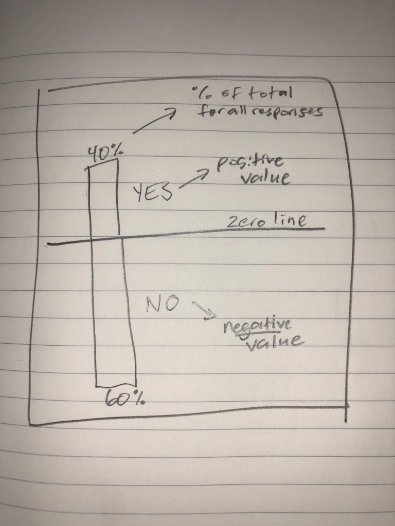
My quick sketch helped me realize I didn’t need a list of steps to build this chart. It was my list of steps! It showed me that I’d need to assign a negative value to the “No” responses in my dataset to get them to display below the zero line. And then, I’d need to display the yeses and nos as a percent of total responses, stretching that value across my rows to achieve the vertical bars (I later swapped my rows and columns to have horizontal bars instead of vertical ones). If you’re interested in the nitty gritty details, here’s how I set up my calculations so I could build the final viz (and if you’re not, just scroll down so you can actually see what a divergent bar chart is!).
In the original data set, “yes” responses were represented as 1s and “no” responses were represented as 0s. To get a negative value for the nos, I wrote an if-then-else statement:
IIF([Value]=1, 1, -1)
The above calculation just evaluates if the value is 1 (a “yes” response) or something else (like 0, a “no” response). If the value is 1, the field returns 1. Else it returns -1. (Note: I named this field “Value – positive or negative,” which I’ll reference in the next step.
Now that I had my positive and negative values, I just needed a calculation to display the yeses and nos as a percent of all responses for that question. I set it up as follows:
SUM([Value - positive or negative])/TOTAL(SUM([Number of Records]))
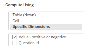
In this calculation, Tableau adds each yes (1) or each no (now -1) in the numerator and then divides by a denominator of total responses (that’s the TOTAL(SUM[Number of Records])) part). But in order to get the correct denominator, I had to set my table calculation to compute using a specific dimension – the [Value – positive or negative] field – essentially telling Tableau to calculate the percent of total for each response (yes or no) within each question. Btw, here’s a great article about setting up table calculations using specific dimensions if you’re not familiar with that yet. This is how my table calculation looked:
Adding that percent of total calculation to the rows shelf stretched the value across my columns, giving me the horizontal bars I wanted. Then I added the response field (yes or no) to color, and dragged a copy of the percent of total calculation to label, wrapping it in an ABS function so both the yes and no percentages displayed as positive numbers. Here’s how the final makeover turned out: