Tableau has two ways of coloring continuous measures: sequential and diverging gradients. The common understanding is that sequential palettes vary the intensity of one color while diverging palettes use two contrasting colors. This is generally true, but there’s much more to the story. Knowing how Tableau handles these can help you take full control of important dashboard design elements.
Sequential Palettes Defined
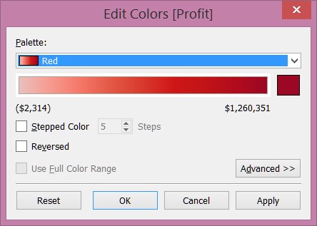
Tableau automatically assigns a green sequential palette when all values in the view are positive and a (reversed) red one when all of them are negative. When editing a color legend for a measure in Tableau, the first drop-down choices other than “automatic” are sequential color palettes. Here’s the Red one:

This would lead us to think sequential palettes are just one color at various intensities. While that’s almost always how they’re used, that’s an incomplete definition. Custom sequential palettes defined in your Tableau preferences file can accept a rainbow of colors. Before getting too excited about that, please read about why a rainbow palette isn’t a good idea.
That begs the question: If it’s possible to specify more than one color, what makes it different from a diverging palette? That little grayed-out check box for Use Full Color Range is an important clue to how Tableau applies sequential palettes to a visualization. Since we can’t change that option, Tableau will automatically use every color in the available range unless I manipulate advanced options for the start, end or center values. This distinction becomes more important when defining and using custom palettes.
Customizing Sequential Palettes
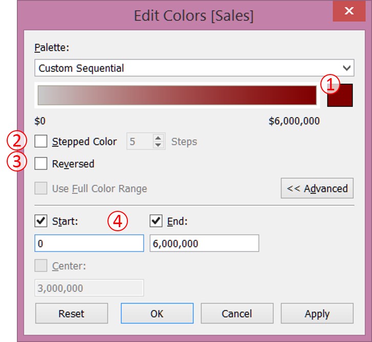
There are four ways to customize sequential palettes in Tableau:
- Specifying the main color
- Changing the number of “steps” between colors.
- Changing the direction
- Changing the start and end values of the range (under Advanced).

Notice the things we cannot change using this dialog. No matter what color we pick, the lowest end of the spectrum will be a very light gray. We also can’t modify the Center value – it will always be halfway between the start and end values.
Another way to control color is to modify your Preferences.tps file as described in this knowledgebase article. An example in the article uses various shades of orange where the first in the list corresponds to the smallest numerical value, and and the last goes with the largest numerical value. The code looks like this:
This method isn’t limited to just one color. To prove it, let’s take an assortment of colors and define them in an ordered-sequential palette, like this:
From this, we get a very psychedelic result which won’t do much to aid a viewer in understanding the data.

The point with this example is to show that a sequential palette may have something other than a light gray-ish color at one end. It may be a different variation of the main color or even a contrasting color. If you want to define a color spectrum which always uses the full range and always has its center at the middle value, sequential palettes are the way to do it.
Diverging Palettes Defined
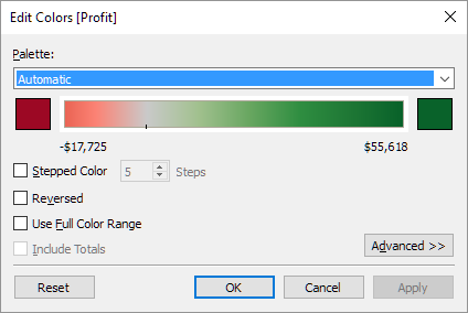
When there’s a mix of positive and negative numbers on a worksheet, Tableau automatically assigns a red-green diverging palette. By default, the center of the spectrum is at zero and the end colors are at equal distances from zero. To illustrate this, here is an example where the darkest green is assigned to the highest number in the view, but the darkest red does not go with the lowest number.

Tableau assigns a lighter red to -$17,725 because the darkest red would correspond to -$55,618 – exactly opposite the maximum positive number. This tells the viewer that the lowest value, in pink, is not as far away from zero as the highest value. If all values are the same sign and a user picks a diverging palette, the end points and center will be set the same way as sequential palettes. Tableau’s automatic choices work well in most cases, but there are times when overriding the default is necessary.
Customizing Diverging Palettes
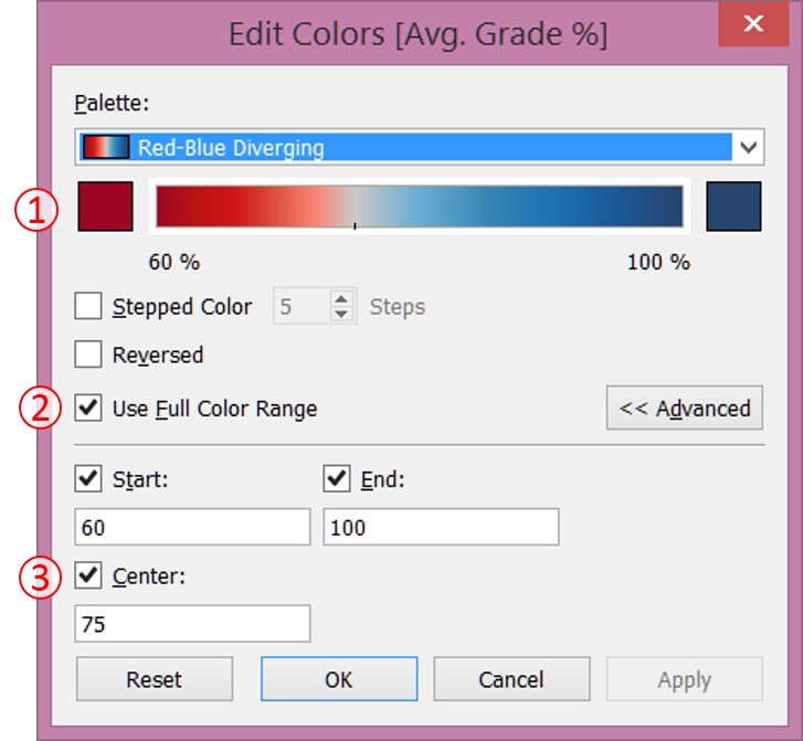
With diverging palettes, we have all the same customization options as sequential palettes with three exceptions:
- The Use Full Color Range option is available.
- The Center value can be changed.
- The Tableau user interface allows us to change two colors, not just one.

In the above screenshot, I have altered some options to better handle student grade percentages. Here, it makes sense to use a diverging palette even though all values are positive. An administrator may want the end of the scale to be at the cutoff for a passing grade and the center of the scale to be at a “C” percentage, which isn’t perfectly in the middle of failing and 100%.
Changing the colors at both ends of the spectrum in the Edit Colors window will blend the two such that values close to the center (usually zero) are colored light gray. As with sequential palettes, changing the preferences file allows more control. Judging from other articles on this subject, it would appear we can only specify the colors at both ends. It turns out that isn’t the case. There are diverging palettes built into Tableau where the center color is a different color, such as Red-White-Green Diverging and Temperature Diverging. This clues us in that Tableau can recognize and use more than two colors.

Let’s look closer at what’s happening. Starting with just two colors in the code below leads to them mixing in the center as a dark gray – much different than what you’d see when picking colors in the dialog box.

By simply adding a lighter gray in between them, we see a better result:

The color between each end can be anything: gray, white, or even a multi-colored rainbow. Again, consider effective visual communication principles before thinking that a rainbow leads to gold.
Skip the Code When Making Custom Palettes
These examples show how to define colors using code in the Preference.tps file. Thanks to a new tool developed by InterWorks, writing all that from scratch is no longer necessary. Our Color Tool for Tableau automatically generates a preferences file with a full range of useful palettes starting with just a base color or an image. Check out this post to learn more and try it out!
