
Having trouble getting rid of your grid lines? Wanting to make your trend line thicker? Need help removing the shading from the headers in your table? You’ve come to the right place.
As a Tableau developer or Tableau data analyst, you’ll need to know how to make some visual adjustments to your sheets from time to time.
In this regard, you’ll have to learn how to change aesthetics and do some basic formatting in the same spirit of a visual designer. Thankfully, Tableau gives you lots of little ways to do your point-and-click adjustments using the Format Menu.
Working With the Format Menu
From your Tableau Workbook, you can open the Format Menu and see a list of the formatting options, which include formatting Font, Alignment, Shading, Borders and Lines:
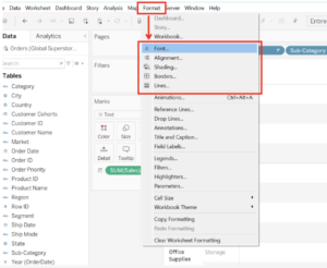
When you choose one of these options, the Format Menu takes over your Data Pane, so you can bounce from any of the formatting controls in an unbroken manner:
Inside the Format window, you can select the icons in place of the listed format options, so you’ll see an “A” for font, some right justified lines for “alignment,” a tilted paint can for “shading,” a four-square for borders (not to be confused with creating a new dashboard) and a series of thin-to-thick stacked lines for “line” formatting:
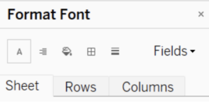 You can target changes specific to your Sheet, or you can look for changes to just your data on Rows or Columns instead.
There’s also a very inconspicuous option to the right of the tile images to adjust fields in your view by selecting the “Fields“ drop-down from the formatting window, as well. This lets you make changes to only one of your fields at a time. Thus, you’ve got lots of formatting at your disposal. So, now, let’s talk about some of the common formatting things you’ll want to accomplish.
Formatting
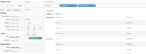
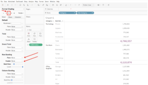
In the example below, I’ve turned on totals for the view (Analysis Menu > Add All Sub-Totals & Show Column Grand Totals) for my table, and then used the Font tile from the Format window to adjust the sub-totals and column grand total uniquely:
Also, I want to get rid of the alternating gray shading that shows up in my table. I must first look at the way my headers are oriented (horizontally on rows), so that helps lead me to my next changes that accomplish this outcome (Removing Row Banding for the Pane & Headers):
From there, I’m feeling like my table is a lot cleaner. Let’s pretend I’m dressing it up for a dashboard, as a supplemental table to go along with some other views. I’d say for smaller text/number tables, this might be commonplace to remove shading. Whereas, for a larger table with hundreds or even thousands of records, the row banding could still prove useful.
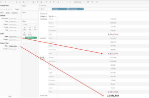
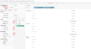
Also, I removed all of the borders that were separating my headers and dividing my rows, totals and grand totals in the table. The result is a crystal-clear table that has no border effects at all anymore. For an added bonus, I went back to the font tile and changed the “Header” text for Totals and Grand Totals to white:
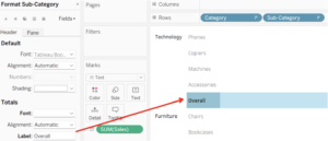
For added fun, I changed the name for Totals in the view to “Overall” instead. Since the text is still there, it now only shows up when selecting or hovering over the Totals rows:
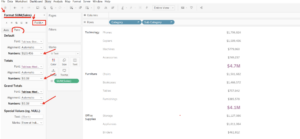
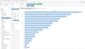
My final change to the table shown below required me to target the specific SUM(Sales) field. I selected that field from the Fields drop-down in the format window and was able to adjust my values to be in currency of USD with no decimal places, as well as my Totals and Grand Totals to show separately as currency, 1 decimal, and units of M (for millions):
Notice: If my sheet had an axis, I could format my “Axis” and “Pane” values separately for my SUM(Sales) field. Let’s change our visual, so we can prove that, and other formatting features, out:
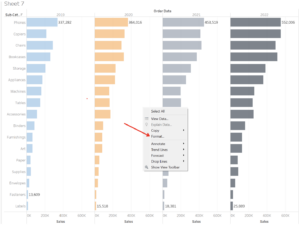
In my new sheet, I have a bar chart that shows SUM(Sales) for each of my Sub-Category members by Year. I turned on the mark labels but am just using a Min/Max option so that my view isn’t overrun with 68 floating values next to bars. I changed the Tableau default colors to ones available from the “Color Blind” color palette option using edit colors from the Color card in the Marks area.
Note: In the view above, I am able to right-click inside any of the white space directly from the view, in between the marks, and provided with a short-cut to get directly to the Format Window:
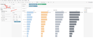
I went ahead and removed the Column grid lines, but if you check out my 9 Tableau Desktop Time Savers, there’s a way you can format all of your sheets to not use Grid Lines universally, which is a retroactive change using the Format Menu > “Workbook” option at the top of your workbook.
My next changes will involve formatting the Min/Max values displayed in my view differently than my axis values. That requires me to format the SUM(Sales) field directly. Again, you can right-click SUM(Sales) on Columns to Format OR right-click directly in the view > choose Format > and “Fields“ from the Format window:
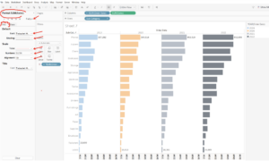
I targeted changes to the Axis first: adjusting font, shading, ticks, number format and alignment. Additionally, I edited the Axis title directly from the view, removing the “Sales” text to steal back that extra space (I’ll make sure I tell my users the bars represent sales in my sheet title instead).
Pro Tip: Notice the format headers for the Axis, once they’ve been changed, will now be “bolded” indicating the defaults have been edited:
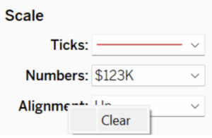
The text shown for the Scale from the Format window has Ticks, Numbers and Alignment all bolded. Should you want to clear one of these back to the original/default, you can right-click directly from the bolded text to “Clear” it.
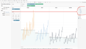
After adding a “year” filter (right-click your date field and choose “show as filter”), adjusting the title (matching the years with the mark colors), and removing the columns and rows divider lines to clean it up a bit more, I have an output I think is ready to be shared with others, potentially on a dashboard.
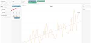
In the example above, a linear trend line has been added to my view. After using trend lines, forecasts, reference lines or annotations, you can simply right-click on those effects in your view and choose “format” to open up formatting-specific options to increase line size, line types, line color, fill color or shading.
Finally, with filters, you guessed it! You simply choose to format the filter from your view, and you are able to adjust the title (if your title changes don’t show from your view, they will on the dashboard) and the body text including the shading color, the font size, style, color, etc. The border is also an option that won’t be shown until you are viewing the filter on the dashboard.
Honestly, my biggest pain point early on when learning Tableau was that formatting lines felt like a wild goose chase. I was always trying to make sense of which lines in my view were actually lines versus borders, and whether or not I needed to adjust the pane or headers, or target rows or columns, etc. As you can see, I’ve gotten far enough along with mastering these that I can mostly tell you what is what (but even I still get lost even after using Tableau for multiple years now).
And, hopefully, some of this is helpful to you, regardless of your level of Tableau proficiency. Stay tuned for some future formatting tips, specifically for dashboards. And as always, contact us for questions, comments or feedback.