
In the second blog of this series, my colleague Alfonso wrote about a common business scenario where companies are struggling to make a decision when presented with many alternatives. Decision paralysis, as it were. Particularly when companies are juggling many goals or criteria, they need a tool that will help them pick the optimal solution.
If you haven’t read it yet, check out that blog to see why we picked Pareto Frontiers as our way to combat decision paralysis, and how we implemented it in Tableau! To see how to incorporate Pareto Frontiers into Tableau without using TabPy as a solution for two set objectives, check out Alfonso’s blog!
Introducing: InterUrban
Coming into my summer internship at InterWorks as a Business Intelligence Intern, I had aspirations of working on meaningful projects and getting exposed to as many new things as possible. InterWorks is truly a learning organization, where I was able to learn and train new skills and have exposure to a variety of departments throughout the company.
One project I was tasked with was to create a public-facing demo that would add to the showcase of InterWorks’ analytical capabilities.
We began our project under the broad scope of knowing we wanted to create an example use-case demonstrating how to use a Pareto Frontier in Tableau to assist in multi-objective decision making. We wanted to use the TabPy Analytics extension to allow the user to choose which objectives they care about the most.
After iterating on a few different ideas, we settled on a site selection use case. This example is relatively easy to understand, and anyone can relate it. Whether an individual is choosing where to take a new job, open a new business franchise or a real estate investor, everyone has to make a decision where they are weighing weigh multiple factors in making their decision, and everyone’s criteria are different.
This blog will explain how to use this demo, and the next blog will detail how we actually built the project in Tableau, with a focus on incorporating TabPy. If you came here for the technical side and not the use case, this other blog is for you!
How To Use the Demo
Our final product can be found here, and I encourage you to explore it for yourself!
Above: The landing page page of the InterUrban dashboard.
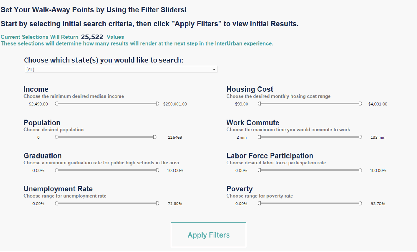
To begin on the initial landing page, the user sets their walk-away points as sliding filters where they would not even consider a result as feasible. Our dataset began with 25,522 of the 41,704 US zip codes — the max amount of data we scraped (InterWorks has not independently validated this data set, as a note).
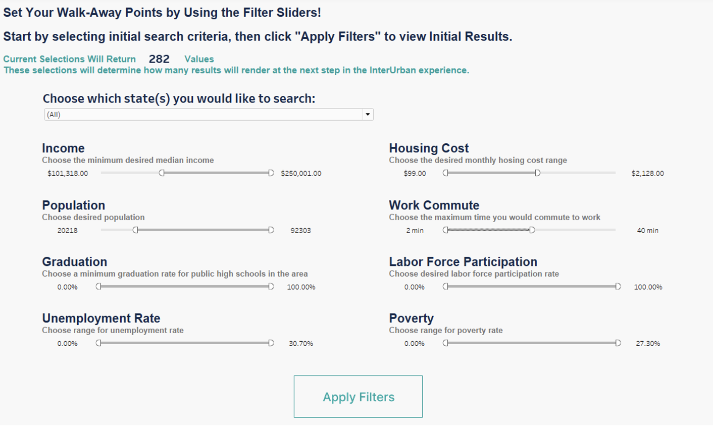
The dashboard user is recommended to customize their filter panel to reflect their desires as the Pareto Frontier on the next page will perform much more efficiently with less data. We recommend filtering down to less than 5,000 locations, ideally just a few hundred to easily distinguish points on the scatterplot. As the filters are changed, the KPI at the top of the landing page will reflect how many zip code values will be evaluated. As you move the filters, it will look like this:
After hitting the “Apply Filters” button, the dashboard will navigate to show the next page:
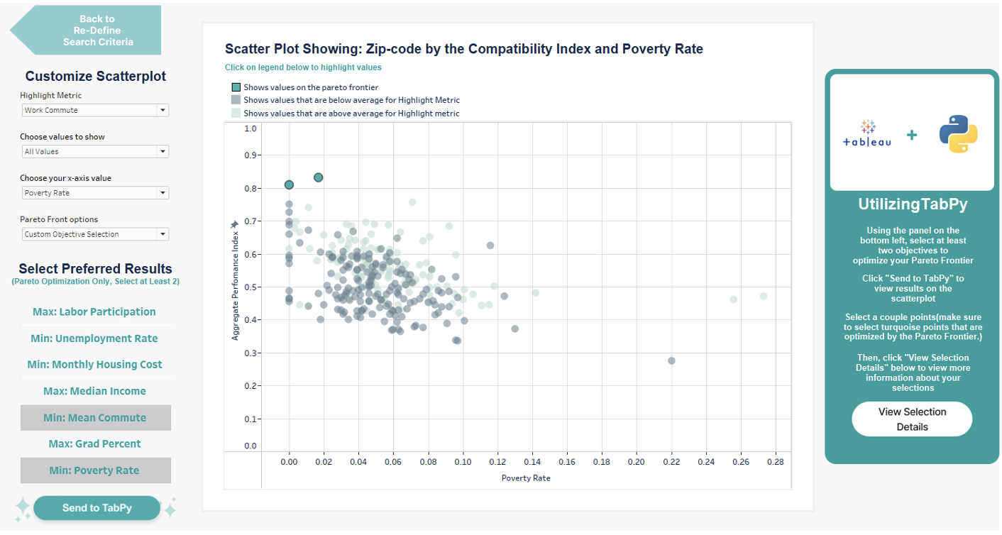
If the user wants to change their initial filters, they could hit the “Back to Re-Define Search Criteria” button in the top left corner. On the left side, the user will see a panel of dropdowns that customize the scatterplot in the center of their screen:
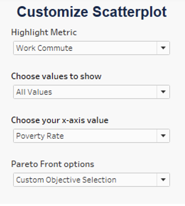
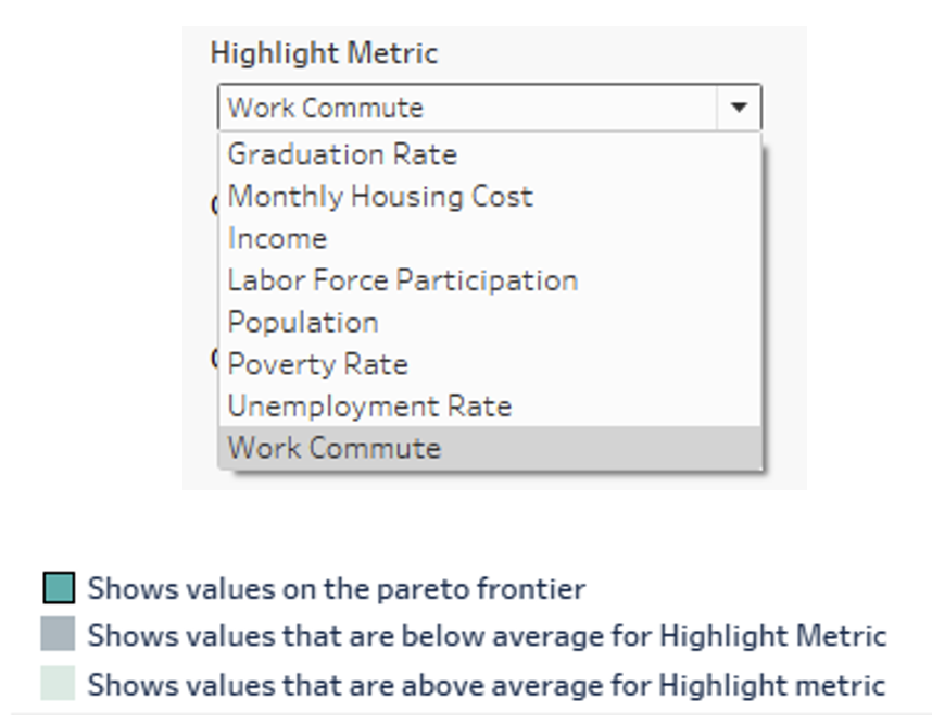
From top down: “Highlight Metric” colors the points on the chart, as you can see displayed in this legend:
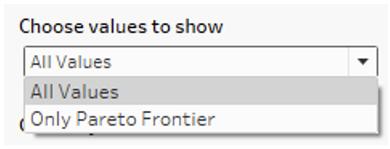
Second, the user can customize whether they want to show only the points on the Pareto Frontier or all the points that were not filtered out by the initial walk away points:
Third, the user can select any of the seven variables listed above to set as the x-axis for the scatterplot, while the Y-axis will remain an “Aggregate Performance Index” that takes all the variables into account equally:
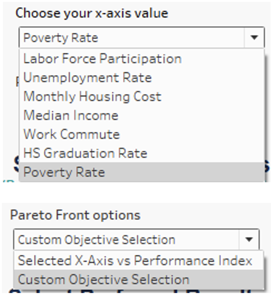
Lastly, the user can choose whether they want to calculate the Pareto Frontier solely based on the selected x-axis vs the Performance Index (traditional 2-variables), or whether they want to use the custom objective selection. If the latter, the user will select which of the seven variables they want to optimize on and click the “Send to TabPy” button in the bottom right. They will see the Pareto Frontier results change in the scatterplot based on selection.
To see the results of the Pareto Frontier optimization, the user clicks on individual points. The user is recommended to pick the turquoise optimal points, but they can select as many as they want by clicking individually or highlighting a range of values. To reset the points, hit escape on your keyboard or click out at any point.
As you select the points, it will look like this:
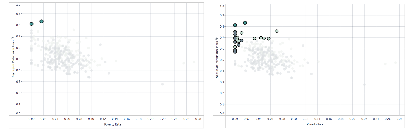
There is an example for selecting only the Pareto Frontier recommended points, but also the Pareto Frontier points plus other slightly less optimal solutions.
On the right, there is a popup describing how to use this dashboard for those not reading this blog:
In the bottom right, click “View Selection Details” to navigate to the next dashboard and see a map plus crosstab of the user’s selected points when completed. Down below, you will see the results on the last dashboard for both when selecting the Pareto Frontier points only, and then also in our second scenario when we selected the other slightly less optimal points:
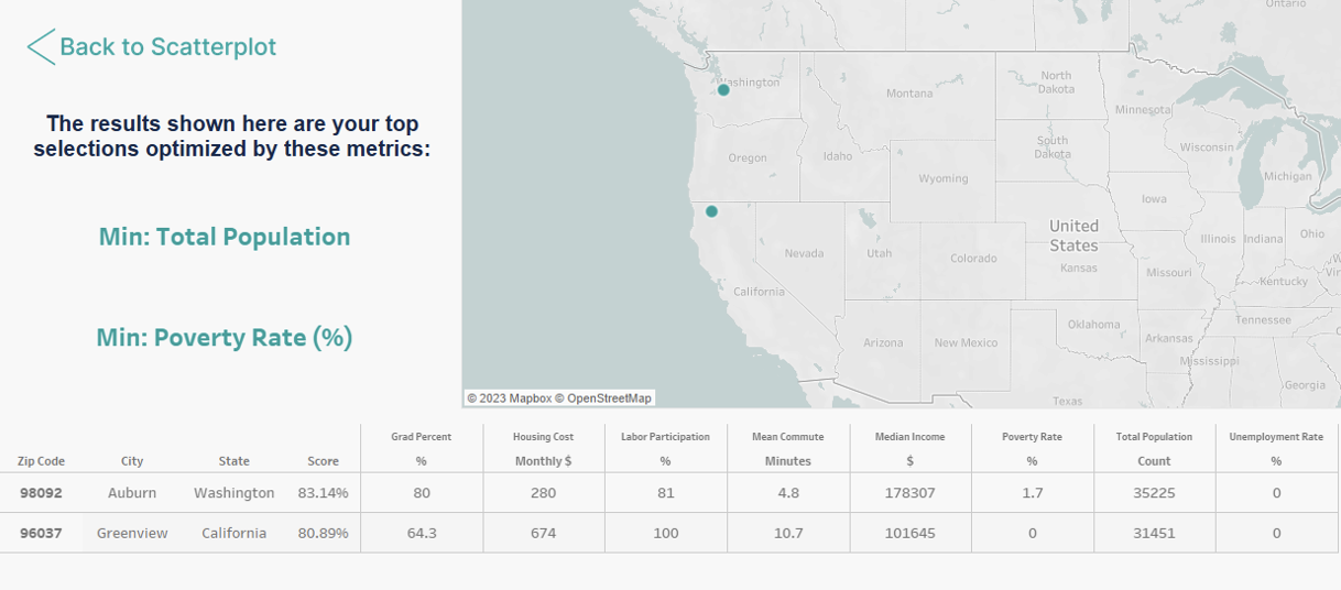
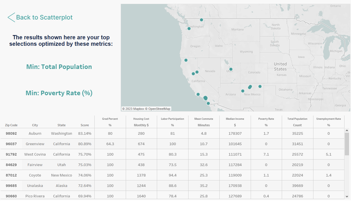
On the last dashboard, the user can click “Back to Scatterplot” in the top left to return to value selection at any point. On the left panel, it will display what metrics the user chose to optimize their results.
On the top right, the user will see a map of the United States displaying all the points the user selected on the last page from the scatterplot. By hovering over each point, a tooltip will display the location, zip code and the weighted average score from the Aggregate Performance Index that factors in all seven variables.
On the bottom half of the dashboard, there is a crosstab displaying the location data, weighted Aggregate Performance Index score and the values from all seven metrics. The rows are sorted from top to bottom in order of their weighted score, i.e., the best recommendations on the Pareto Frontier are displayed first.
After viewing the recommendations, the user would be able to either save these, or return to the filtering and value selection process if desired to view new solutions from different constraints.
Now that you have gotten a chance to get a hands-on demonstration to play with our demo and see the power of these tools, let me explain how we actually built it in Tableau in my next blog. If you came here for the technical side and not the data storytelling, this is the part for you!