
If you haven’t read it yet, visit the previous blog, “TabPy Extension Use Case in Tableau: InterUrban Demo,” to see what the purpose and use case are for our demo, plus how to use it! This blog will be focused on the technical aspects and how we built out the Tableau workbook.
Building Our Demo
While using an analytics extension (in this case TabPy) is the only way to find two-plus-dimensional Pareto Frontiers in Tableau, take a look at Alfonso’s blog to see how a 2-Objective Pareto Frontier can be built natively in Tableau.
While this demo/workbook contains many charts and UI/UX Tableau tips and tricks, this blog will be focused on the incorporation of the TabPy analytics extension and its functionality, as opposed to the nitty gritty of building out the whole workbook. If you find a particular feature interesting and would like to learn more, feel free to contact us and we would be more than happy to assist and help you!
We are unable to publish the workbook to Tableau Public for download due to the analytics extension contained. Analytics extensions can not be published live in Tableau Public since a non-live connection is needed. However, our final product to demo can be found directly on our site!
Before you continue, please visit the Analytics Extension blog to see what TabPy is and how to incorporate it!
Starting off, we brainstormed a list of metrics that one would factor into the user’s decision for geographical site selection, and we ended up with a finalized list containing seven general variables:
- Labor Participation Rate
- Unemployment Rate
- Housing Cost Monthly
- Median Income
- Median Commute Time
- Graduation Rate
- Poverty Rate
Using these seven metrics, we would allow a user to customize what variables mattered to them the most, while also computing an equally weighted aggregate score metric. To get our data, we originally started with our own generated data distributions in Excel, but we went back and wrote some R code to collect “American Community Survey Data (5-Year Estimates 2021)” from the United States Census Bureau through their API. I won’t include the code here, but the data is publicly available.
As part of our demo, there are three main dashboards linked to each other, contained in the same Tableau workbook. The first dashboard represents the filter page to set walk-away points. The next dashboard is for choosing your personal criteria and choosing points to view in more detail. The last page displays the geographic and variable data for your selected points. All three of these dashboards are located within a single .twbx file, with dashboard actions linking the navigation.
Getting To Work
Starting off, I will explain how we incorporated TabPy into the Tableau workbook and created functional visualizations that allowed user interaction and customization. Here is an overarching flow chart showing the step-by-step calculation, actions, etc. While this may look overwhelming, I will break it down and explain each step:
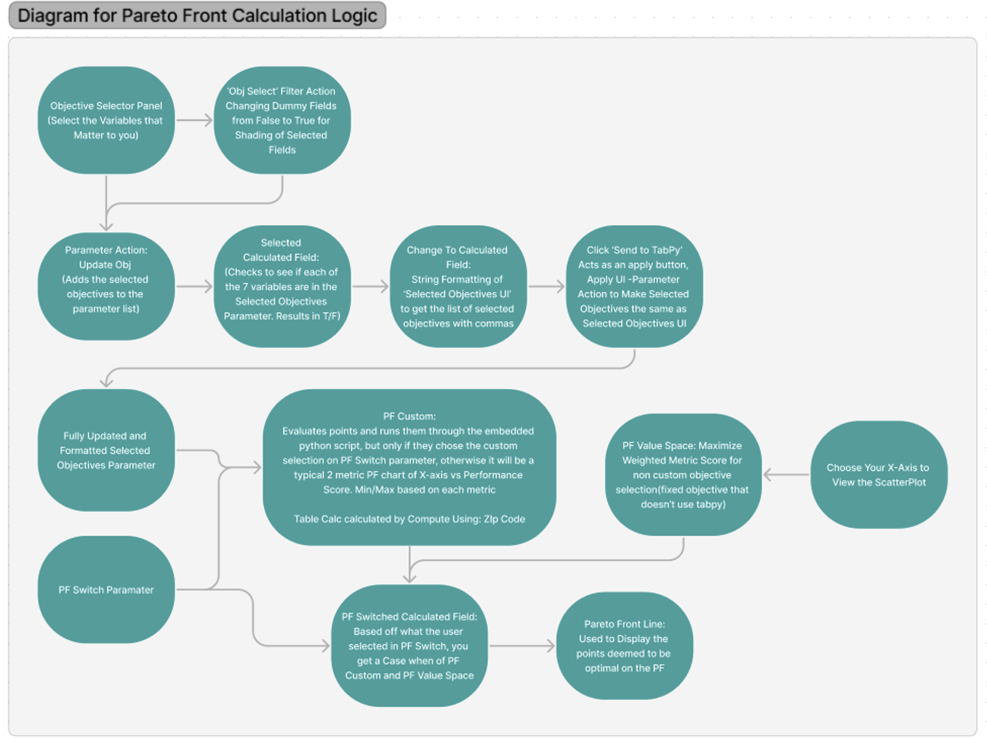
Beginning in the top left corner of the flow chart, we have the Objective Selection panel, where the user selects what variables will be prioritized in the optimization process:
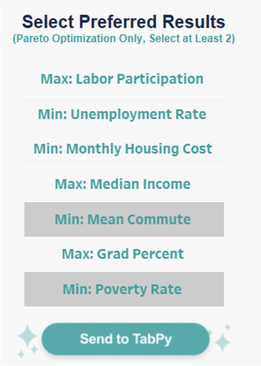
As you may recall from the previous blog explaining how to use the demo, you only need to select these objectives if you want the calculation to factor in more than the default X-Axis vs Weighted Score (Aggregate Performance Index):
As you can see above in the variable list, you can see the grey shading for the selected metrics which helps users recognize what they have selected. As the users click the buttons, the string numeric identifier of the metric is passed to a parameter action and then a calculated field that helps format the string list of the selected metrics into the following structure:
- “Obj1, Obj6, Obj7” or whatever combination of metrics the user selects
Next, the selected metric list is compared to the seven metrics using the Contains() function in another calculated field. This results in a True/False that we can add to the color marks card for the shading, as well as to ensure that the correctly updated list of selected metrics is showing in the new parameter.
If you have questions about any of this calculation logic, please reach out! I want to focus this blog on the Pareto Frontier structure that follows, but wanted to give a simple overview of how we formatted our data in a way that could be piped into our Python code.
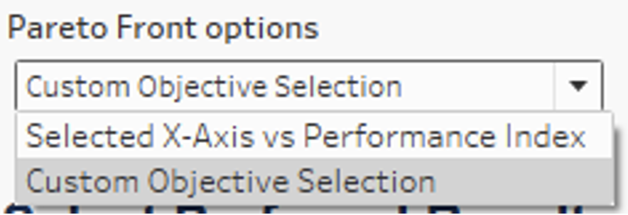
The first part of our calculation begins with the parameter (Pareto Frontier Options dropdown shown above) enabling the user to select whether they want to optimize using multiple custom objectives or just the fixed 2-variable calculation:
![Edit Parameter [PF Switch] menu](https://interworks.com/wp-content/uploads/2023/12/Screenshot-2023-12-12-at-11.59.15-AM.png)
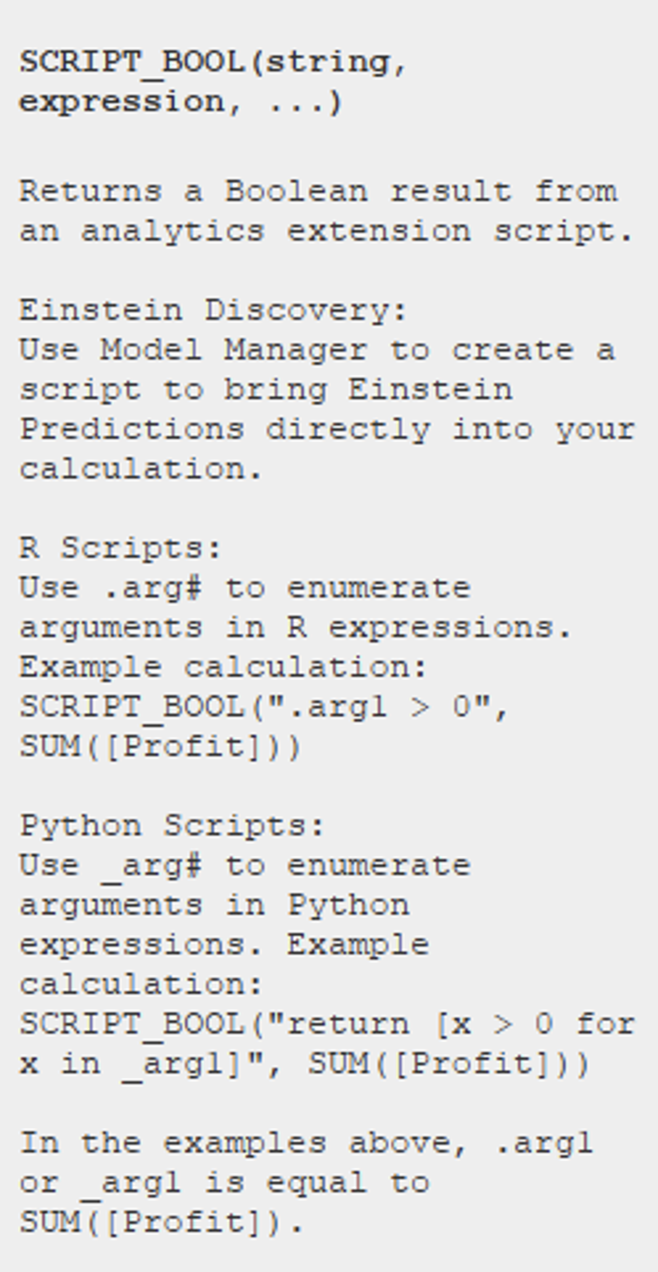
Next, we created a calculated field, PF Custom, to incorporate our Python script. There are four options in calculated fields that you can select from, based off what you want to return. Since we want to return a Boolean, we select Script_Bool(), though you can also select Script_Int(), Script_Real(), or Script_String().
Embedded in our function, we have a Python script:
SCRIPT_BOOL(
"return tabpy.query ('pareto_optimal_custom', _arg1, _arg2, _arg3, _arg4, _arg5, _arg6, _arg7, _arg8) ['response'] if _arg1[0].count(',')>=2 else [False]*len(_arg1)",

//Only evaluate points if PF switch is set to Custom
CASE [PF switch]
WHEN 2 /*this is the Python code */ THEN [Selected objectives]
WHEN 1 /*this is the selected x-axis vs score*/ then ""
END,

//All objectives below
1-MIN([%Labor Participation]),
MIN([%Unemployment Rate]),
MIN([%Housing Cost Monthly]),
1-MIN([%Median Income]),
MIN([%Commute]),
1-MIN([%Graduation]),
MIN([%Poverty]),
)
For the Python script for the function references, see below:
from tabpy.tabpy_tools.client import Client
import numpy as np
import pandas as pd

client = Client('http://localhost:9004/')

def pareto_optimal_custom(objs_to_use, *args):

    if objs_to_use[0]=="":
        return [False]*len(args[0])
    if not "," in list(objs_to_use[0][2:]):
        return [False]*len(args[0])
    objs = objs_to_use[0][2:].strip().split(" , ")

    objs = [int(obj[3:])-1 for obj in objs]
    cols_to_use = [args[i] for i in objs]

    alternatives = np.column_stack(cols_to_use)
    is_efficient = np.ones(alternatives.shape[0], dtype=bool)
    # Eliminate any dominated alternatives
    for i, alternative in enumerate(alternatives):
        if is_efficient[i]:
            # Keep any point with a lower cost
            is_efficient[is_efficient] = np.any(
                alternatives[is_efficient] < alternative, axis=1)
            is_efficient[i] = True
    # Add back in alternatives with identical costs to non-dominated alternatives
    for efficient in alternatives[is_efficient.copy()]:
        is_efficient[np.all(alternatives == efficient, axis=1)] = True
    return is_efficient.tolist()

client.deploy("pareto_optimal_custom", pareto_optimal_custom,
              "Finds Pareto optimal points based on passed values and the list of values to be used", override=True)
Essentially, PF Custom evaluates the possibilities (each Zip Code) and runs them through the pre-deployed python script, but only if they chose the custom selection on the PF Switch parameter. Intuitively, some metrics should be maximized (such as Income or Graduation Rate), while others minimized (such as Poverty or Unemployment Rate). Our pre-deployed script treats all objectives as minimization objectives, so subtracting maximization objective values from one allows us to turn them into minimization objectives.
Alternatively, the user can select a 2-Objective Pareto Frontier chart, where you wouldn’t need TabPy. Once the user selects the variable they want for the x-axis of the scatterplot, the top points on the Pareto Frontier are created using the PF Value Space calculated field shown below. For further details on how to build a 2-Objective Pareto Frontier, visit my colleague’s blog here: Alfonso Blog.
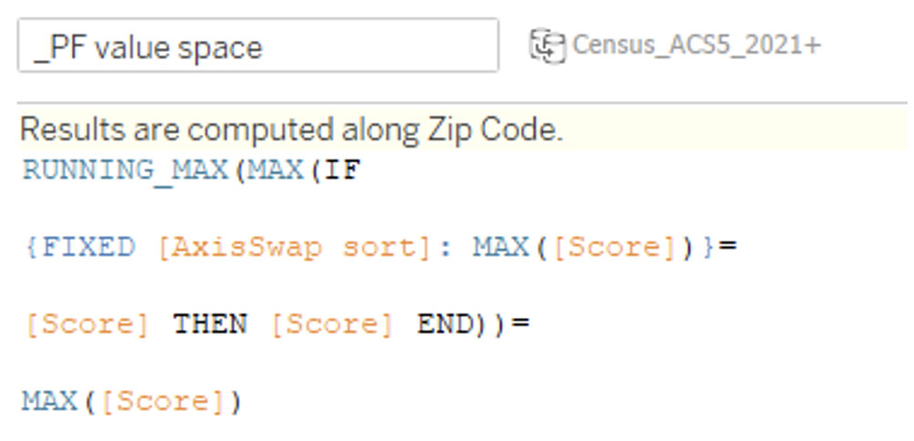
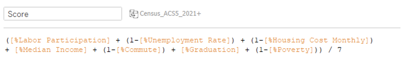
The Score field you see is a simple weighted average of the seven objectives (some min & some max):
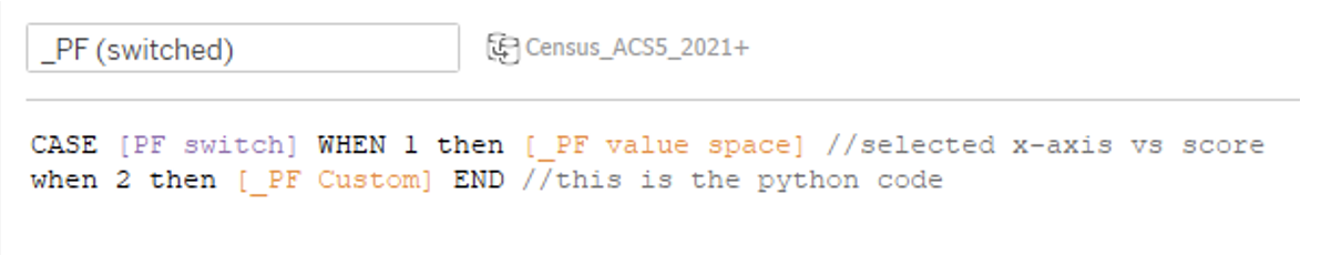
Now that we have the source of calculation for both options based on what the user selects for the PF Switch parameter, we will reference both in another field.
In the PF Switched calculation, we use a simple Case/When statement:
From this calculation, we have our final PF Line calculation, which is used to display the solutions (Zip Codes in our use case) deemed to be Pareto-optimal:
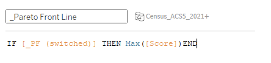
For our use case, we used this PF Line calculation on the color marks card of our scatterplot to make them visually apparent. This main scatterplot on the second dashboard of our demo is built from the AxisSwap on Columns, while we have the sum(score) on rows, with each zip code (on the detail marks card). I created a dual axis chart where I put PF Line also on rows, enabling the two types of colors for our scatterplot.
Outside the filter panel, dashboard navigation and other charts/visualizations I made, this should wrap up how to incorporate TabPy into your Tableau workbook to assist in multi-objective decision making. In our workbook, the user has the ability to choose the X-Axis and have a 2-Objective Pareto Frontier, but you don’t have to incorporate this feature! Interworks and I would be happy to discuss your use case with you and any questions that may arise regarding TabPy, Pareto Frontiers or this demo!
If you made it this far, thanks for your time reading! Below are the other blogs in the series if you haven’t read them yet!