
As of this writing, I am a few weeks away from earning my master’s degree in economics. If I had to distill my years of learning into a catchphrase, it would be something to the tune of, “Simplify and optimize!” A major task in economic thought is to extract from our highly complex world the main determinants of change and leverage them to improve our lives towards the sweet point where things are as good as they can be.
But what is this magical sweet spot? Unfortunately, because we are dealing with the real world, we are working with less of an utopian goal and more of what the economist Homer Simpson describes as a “compromise:”

Thankfully for us, Homer Simpson makes a terrible economist (at least in this interaction — he did teach us that you can exchange money for goods and services, such as peanuts, in other episodes). Here, he proposed the most inefficient solution: the solution that makes both parties worse off.
Now, the opposite solution, where both parties get their best option, is not really feasible — at least not when we have competing interests and goals. Homer can’t take both Bart to the skate park and Lisa to her favorite play at the same time. So, clearly, the sweet spot is somewhere in the middle.
The Sweet Spot in Pareto Frontiers
Finding the “sweet spot” between conflicting objectives is a tricky task, especially when there are multiple of such sweets spots, or when you have more than two objectives (what if Marge didn’t want to go to a play or to the skate park?). When choosing from a large, but finite, set of “solutions,” Pareto Frontiers is a great tool to shortlist potentially interesting options. They map the best trade-offs you can find between objectives.
When a solution lands on a Pareto Frontier, it’s basically saying, “You can’t do better than this without making someone/something else worse off.” More formally, all solutions on the Pareto Frontier are “Pareto optimal,” meaning that no other feasible solution exists that can improve one objective without worsening at least one other objective. While it sounds technical and complicated, it can be quite easy to build a basic one, and we can do it in Tableau!
In what follows, I will walk you through how to build a Pareto Frontier in Tableau when choosing between two objectives. If you want to learn how to build a Pareto Frontier with more than two objectives, make sure you read Wesley’s blog on the subject.
Building the Frontier
To build a Pareto Frontier for two set objectives, let’s start with a basic example. Consider our manufacturer — FactoryWorks, we’ll call it — producing multiple models of their product which vary in size, color and quality. FactoryWorks has taken the initiative to minimize their pollution (measured by tons of CO2).
However, decreasing their pollution increases their per unit cost, as they rely on cleaner materials and less capital intensive production processes. Plotted below is the per unit cost and level of pollution for different manufacturing runs, each with a unique set of production methods and materials used:
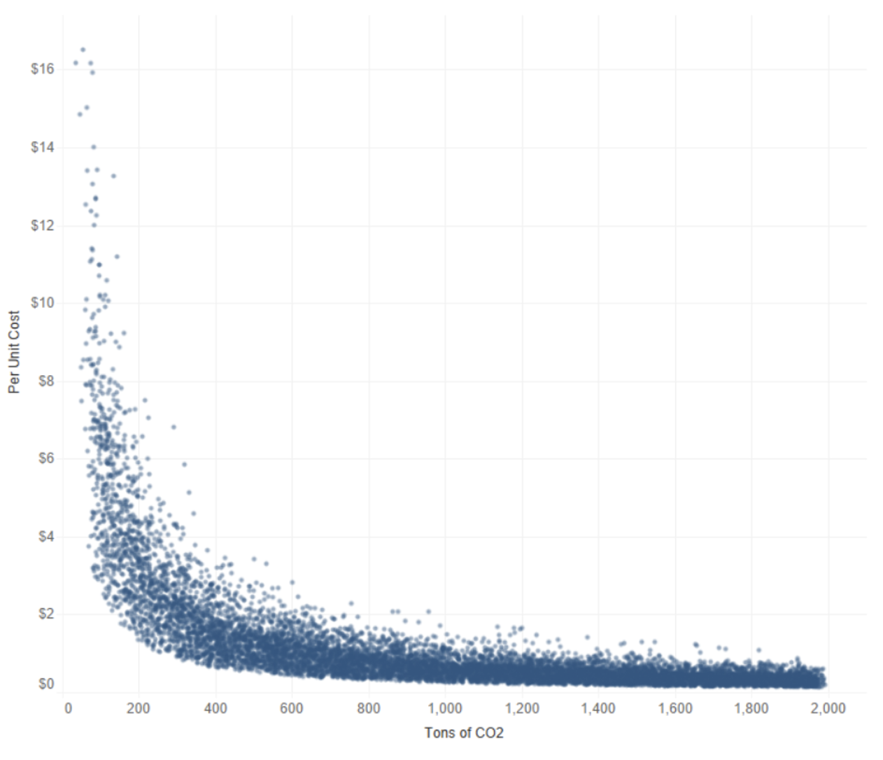
Question: Which production runs are solutions on our Pareto Frontier? That is, which of these points are optimal trade-offs between minimizing per unit costs and minimizing pollution?
Answer: These ones!
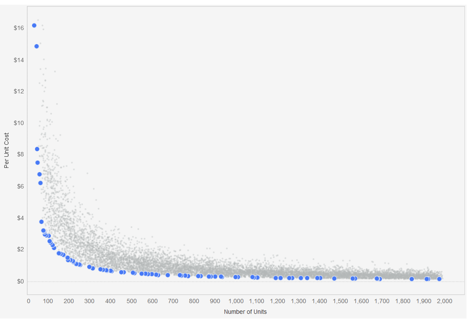
Let’s go over how to build this in Tableau.
Jumping Into Tableau
The intuition behind the Pareto Frontier between the two variables is rather simple. Our first point is going to be the lowest cost of producing one ton of CO2. Our second point will be the lowest cost of producing two tons if and only if it is lower than the lowest cost of producing one ton. Otherwise, we keep going to three, then four, then five (and so on and so forth) tons until we find the next lowest cost. We repeat this process until we’ve looked at our maximum level of pollution (2,000 tons).
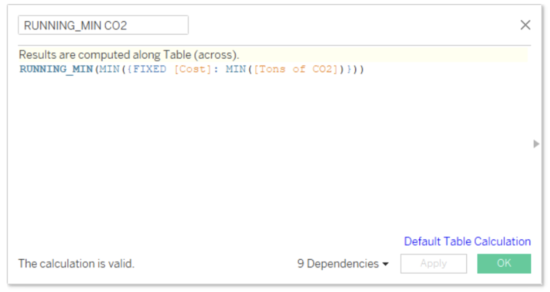
To translate this into Tableau logic, we need to take the minimum cost of each level of pollution with a fixed expression. We then take the RUNNING_MIN() of our minimum costs:
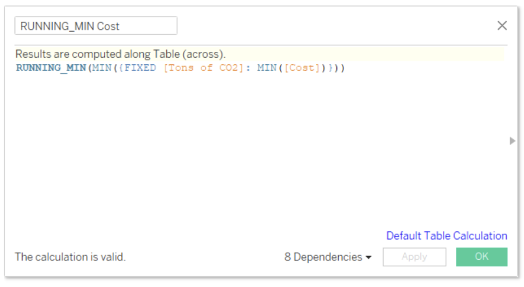
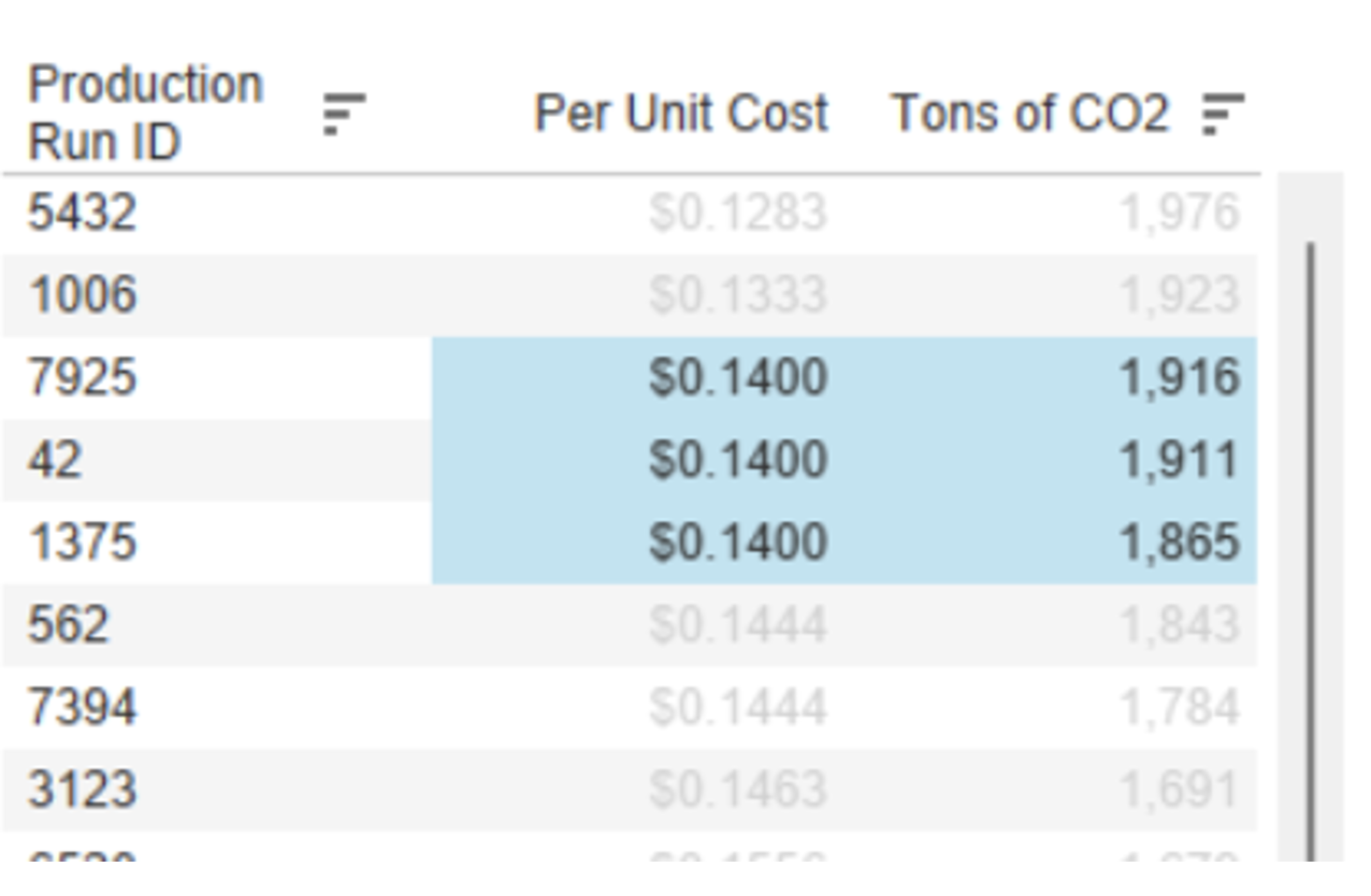
We could have a scenario in which two or more different levels of pollution have the same minimum cost and are picked up by the RUNNING_MIN(). For instance, here is a sample of our RUNNIN_MIN Cost data. As you can see, there are three different levels of pollution for the same $0.14 price, but we only want the lower level of pollution (1,865 tons):
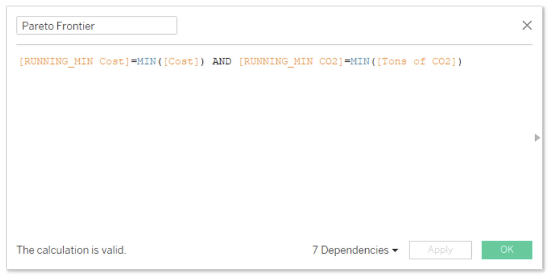
Therefore, we’ll create a mirror calculation of RUNNING_MIN Cost, but this time with CO2. That is, we need to take the minimum level of pollution of each per unit price with a fixed expression. We then take the RUNNING_MIN() of our minimum levels of pollution:
Now we filter for the production runs with the levels of pollution and per unit prices that match our running minimums. Any production run that returns TRUE in this calculation is a solution on our Pareto Frontier!
Now, Let’s Visualize It!
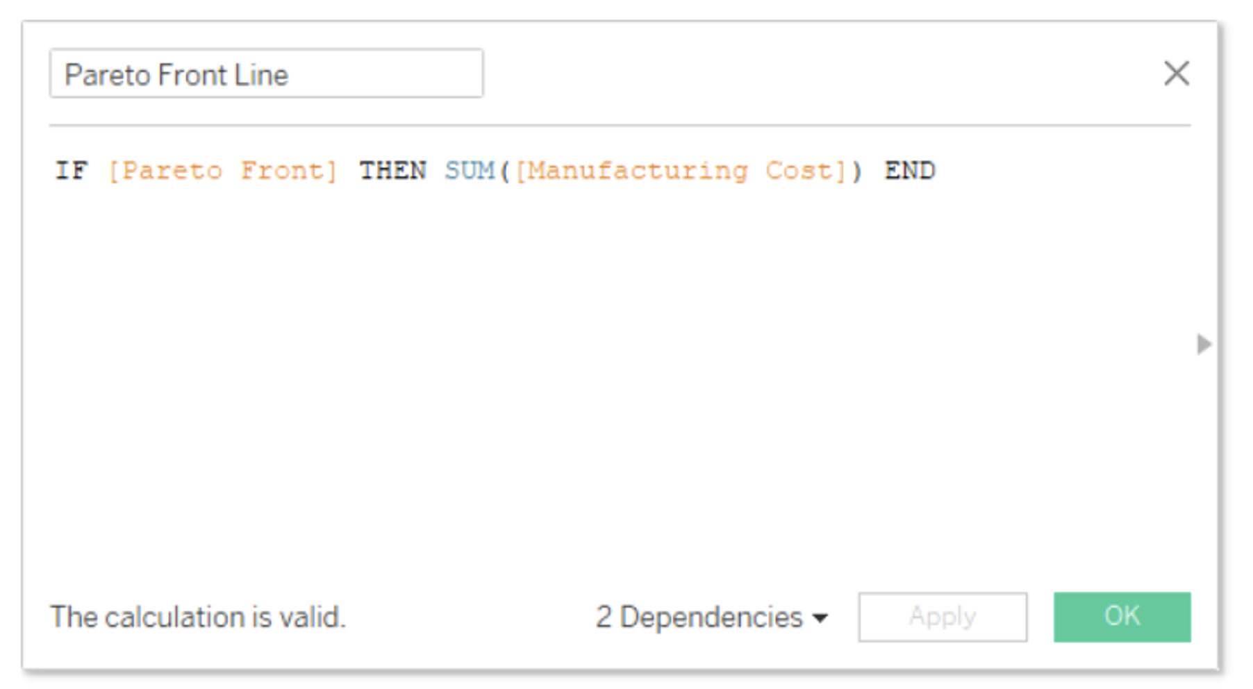
Let’s create two calculation fields, one for production runs on our Pareto front and one for the rest of our runs:
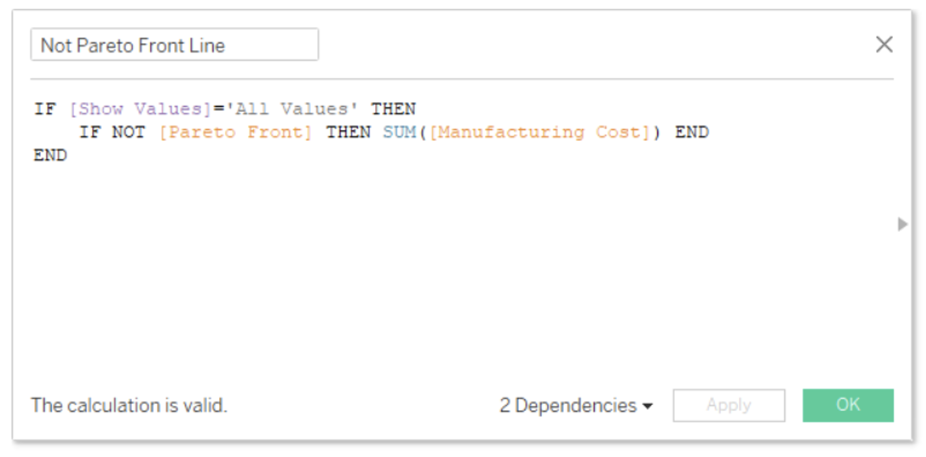
Here I added an extra functionality for the values not in our Pareto Frontier. I created a parameter with which I can choose to view these points. If the parameter is not equal to “All Values,” then it returns a null.
We’re then going to bring these two fields into Rows and set them as Dual Axis with Synchronized Axis. Let’s bring in “Tons of CO2” produced into Columns and the “Production Run ID” into detail. Lastly, we need to adjust our Table Calculations.
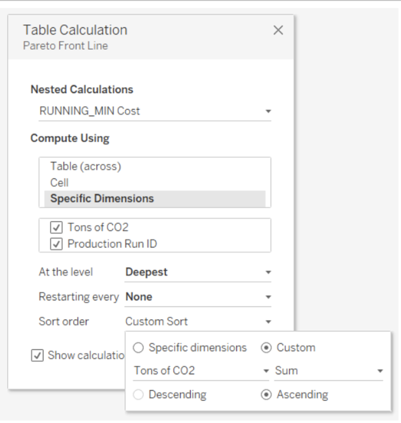
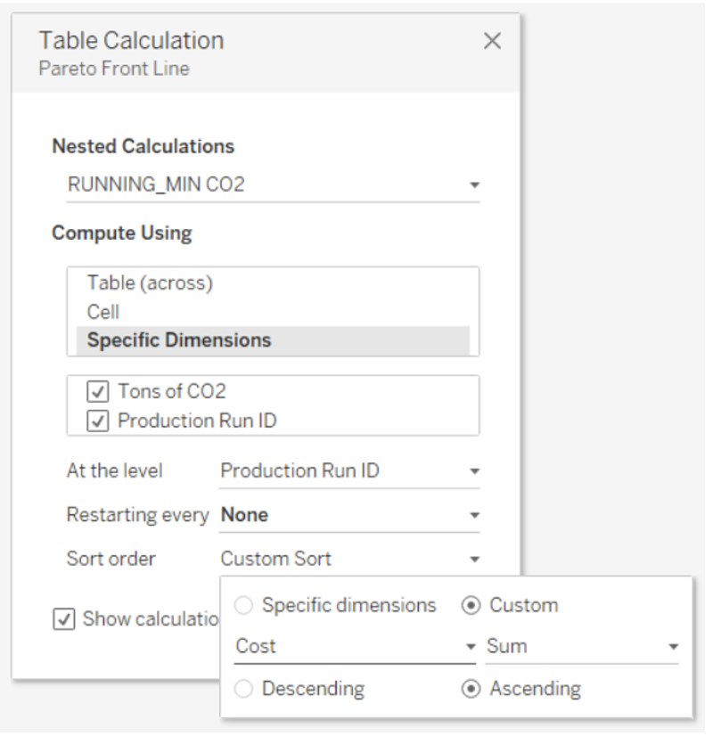
Note: These are Nested Table Calculations, so we need to make sure to apply mirrored settings for RUNNING_MIN Cost and RUNNING_MIN CO2. RUNNING_MIN Cost, for instance, should be computed using Specific Dimensions with “Tons of CO2” and “Production Run ID” checked, and At The Level set to “Production Run ID.” Then, Sort Order needs to be set to Custom using “Tons of CO2” in ascending order. Apply these settings to RUNNING_MIN CO2, but switch the variables:
Lastly, let’s format our points so that our Pareto Frontier is accentuated, and voilà! I give you the finished dashboard:
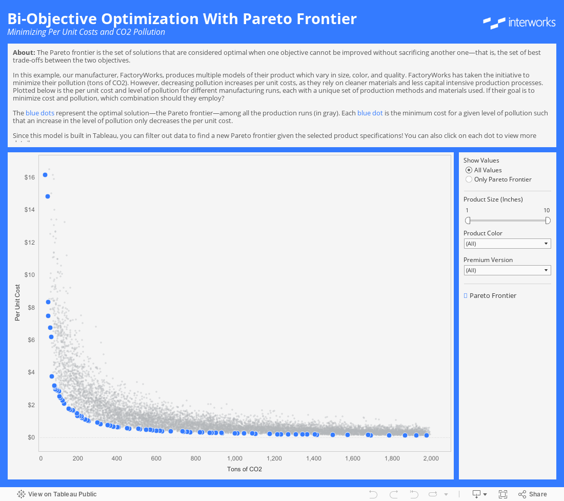
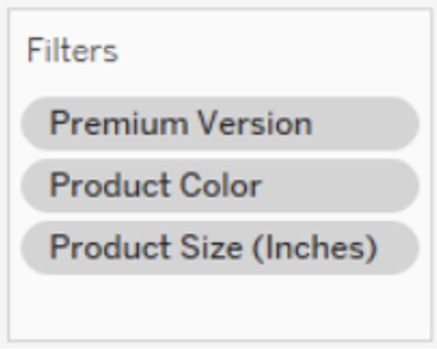
The nice thing about this being built entirely in Tableau is that we can filter the data and remap our Pareto Frontier in real time. For instance, at FactoryWorks, we produce different models of our gadget, based on color, size, and premium option. We just need to set these as filters in Context (since we have those LODs), and we can view our Pareto Frontier for a specific product!
But what if you want to compare more than two objectives at once? We got you covered! Make sure to check out Wesley’s blog. And as always, if you have any questions, feel free to reach out!