Tableau’s suite of tools allows you to connect to a variety of data sources, analyze and visualize your data to find insights, and securely share those insights with the people who need them. Tableau Desktop’s drag-and-drop interface makes it quick and easy to get started creating the most commonly used charts. You can immediately incorporate Tableau into your workflow and have fun exploring and visualizing your data.
My goal today is to get you started using Tableau to improve your workflow, and I want to get you there quickly. To set the stage, let me give you a bit of background into my Tableau journey. I am an educator with more than 20 years of teaching experience. Prior to coming to work at InterWorks, I was a university instructor in both the Department of Education and the Department of Instructional Design and Technology. I love tech, so I was asked to help out with an accreditation project, in which we needed someone to wrangle and share data insights while also creating tools and processes for getting us accredited. I started this project with only messy data and Excel. After two months of struggling, I discovered Tableau. Within two hours of installing Tableau Desktop, I had reproduced what took me two months to do using Excel. I was hooked and haven’t looked back since.
I’d love for you to have an experience similar to mine, but with the added benefit of knowing what I wish I’d understood about Tableau when I first began. Let’s get you off on the right foot (or the left, if that’s how you roll).
The Typical Tableau Workflow
I love questions where the answer is, “It depends.” Questions about the Tableau workflow are those kinds of questions. There isn’t one way to use Tableau, but there are some steps that are pretty typical, so let’s start with a high-level overview of the process you might find yourself using:
- Connect to data. Before you can visualize your data, you will need to connect to your data. Tableau provides native connectors to over 80 different data sources, such as spreadsheets, text files and cloud or on-prem databases. Ideally, you are connecting to data that has been structured and cleaned so that you can jump right into finding those insights. If you find yourself working with messy data, check out my resources at the bottom of this blog.
- Analyze and visualize your data. I like to think of this in two phases. The first phase is the exploratory phase of my workflow. I’ll build charts that break down my data in different ways, so I can get to know my data and start asking questions. Once I’ve identified the data needed to answer my questions, I start my explanatory phase. In this phase, I decide how I want to visualize that data to highlight the insights that answer my questions. I might go through my exploratory and explanatory phases multiple times. As I find new questions that come up based on my exploratory analysis, I’ll probably need to identify new data to answer those questions. Be open to iteration. Data analysis is rarely a linear path.
- Share your insights. Once you have visualized your data and highlighted your insights, you’ll share your work with stakeholders. Your stakeholders may have additional questions, and you might revisit your data and iterate even more. I find that Tableau makes this process fun.
Now, let’s get started talking about Tableau Desktop. I’m going to give you a mix of conceptual and technical understanding, again with the goal of getting you started quickly. You will find that at some point in the future, you are going to want to upskill. Do it! Tableau is a flexible and powerful tool. It provides an easy entry point to new users, but it has flexible functionality for more advanced users who want to do complex charting and advanced visualization design. I’ve been working in Tableau for years, and I have yet to run out of cool things to do and learn. My advice is to enjoy the process. This is a marathon, not a sprint.
Tableau Workbooks
If you’ve worked in Excel (think workbooks with spreadsheet tabs), you will find this section fairly familiar. Similar to an Excel file, we create workbooks in Tableau. A workbook is a collection of worksheets and dashboards. Worksheets are where you build visualizations such as bar charts, line charts, text tables and KPIs. You will often hear the terms worksheet, chart and tab used interchangeably to refer to a worksheet. Dashboards are collections of related worksheets that provide data to help answer specific or related questions.
Get the Data and Follow Along
Let’s use an example to demonstrate from here on. Feel free to follow along with me, if you’d like. You can get the data I’ll be using in my InterWorks External Box folder. I’ve provided the data in several formats, in case you have firewall protocols or other issues downloading files. I’ve also included a file called Instructions for accessing data.boxnote in case you need help.
As you follow along with me in this walkthrough, keep in mind that I will show you one way to do a task, but if you explore the workspace, you will find that the same functionality may be in the menus, toolbar, right-click menus and even some dialog boxes that pop up. There are many ways to work in Tableau; I encourage you to find the way that works best for you.
Launch Tableau Desktop
When you launch Tableau Desktop, it will open on the landing page. Here, you will find learning resources in the Discover pane on the right, sample workbooks at the bottom and the Data Connection pane on the left. Once you start working, your recent workbooks will show up in the Open section in the center. I encourage you to click around. You can’t break anything, so check out the menus, resources and data sources to see what’s available:

Connect to Your Data
Let’s connect to the Get Started data that is linked above.
- If you downloaded the .xlsx file, click on the Microsoft Excel link in the Connection pane and navigate to the file on your computer. Select the file and click Open.
- If you downloaded the .csv or you copied the data into Notepad and saved it as a .txt file, you will select the Text file link in the Connection pane and navigate to the file on your computer. Select the file and click Open.
Preview Your Data
We only have one sheet in the data file, so Tableau automatically brings the sheet of data into the Preview pane. If you ever have more than one sheet to choose from, simply double-click or left-click-drag the sheet you need into the section above the Data Preview area (where it says Drag Tables Here).
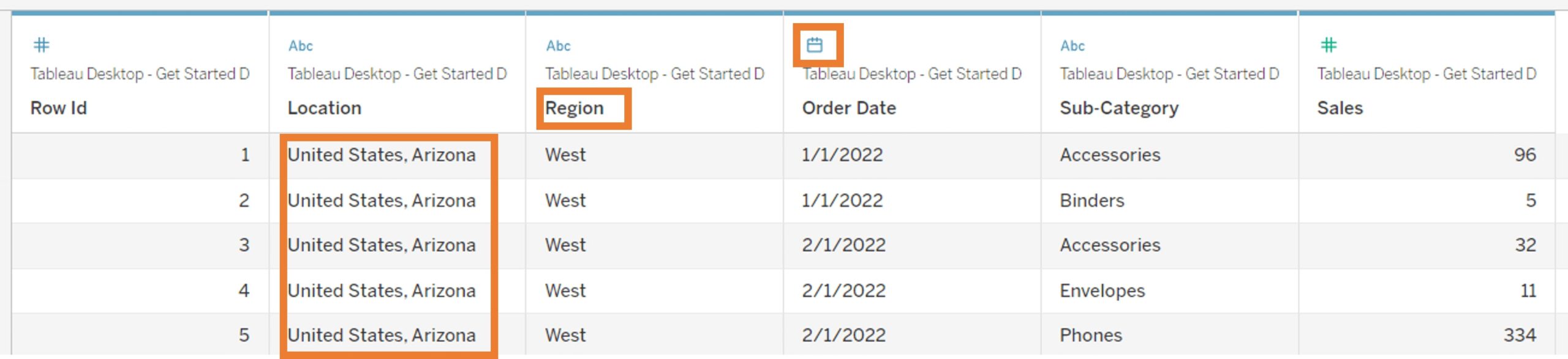
I always recommend spending a few minutes exploring the preview of your data. You will see column headers (a.k.a. field name) for each column in your data, icons representing the data types Tableau interpreted each column to be (strings, numbers, dates) and a sample of the first 1000 records (rows):
There are quite a few things you can do in the Data Preview, so click around and explore. You can’t break anything and nothing you do ever writes back to the data source. In fact, I encourage you to look at the data source again after you finish this walkthrough just to prove to yourself that your original Excel file is untouched.
Clean Your Data
Did you notice that the Location has both country and state in the same column? This is a pretty common problem. Let’s do a bit of clean-up:
- Split Locations by right-clicking in the column header and selecting Split from the menu.
- Right-click in the new column header, Location – Split 1, and rename it to State.
- Click the data type icon, select Geographic Role and State/Province to assign latitude and longitude data to those field members.
Get to Know Your Workspace
Now that our data is clean, we are ready to start exploring and visualizing our data. Click on the Sheet 1 tab at the bottom left of your workbook to get started (if you’ve just opened Tableau for the first time, it might even be highlighted in orange for you).
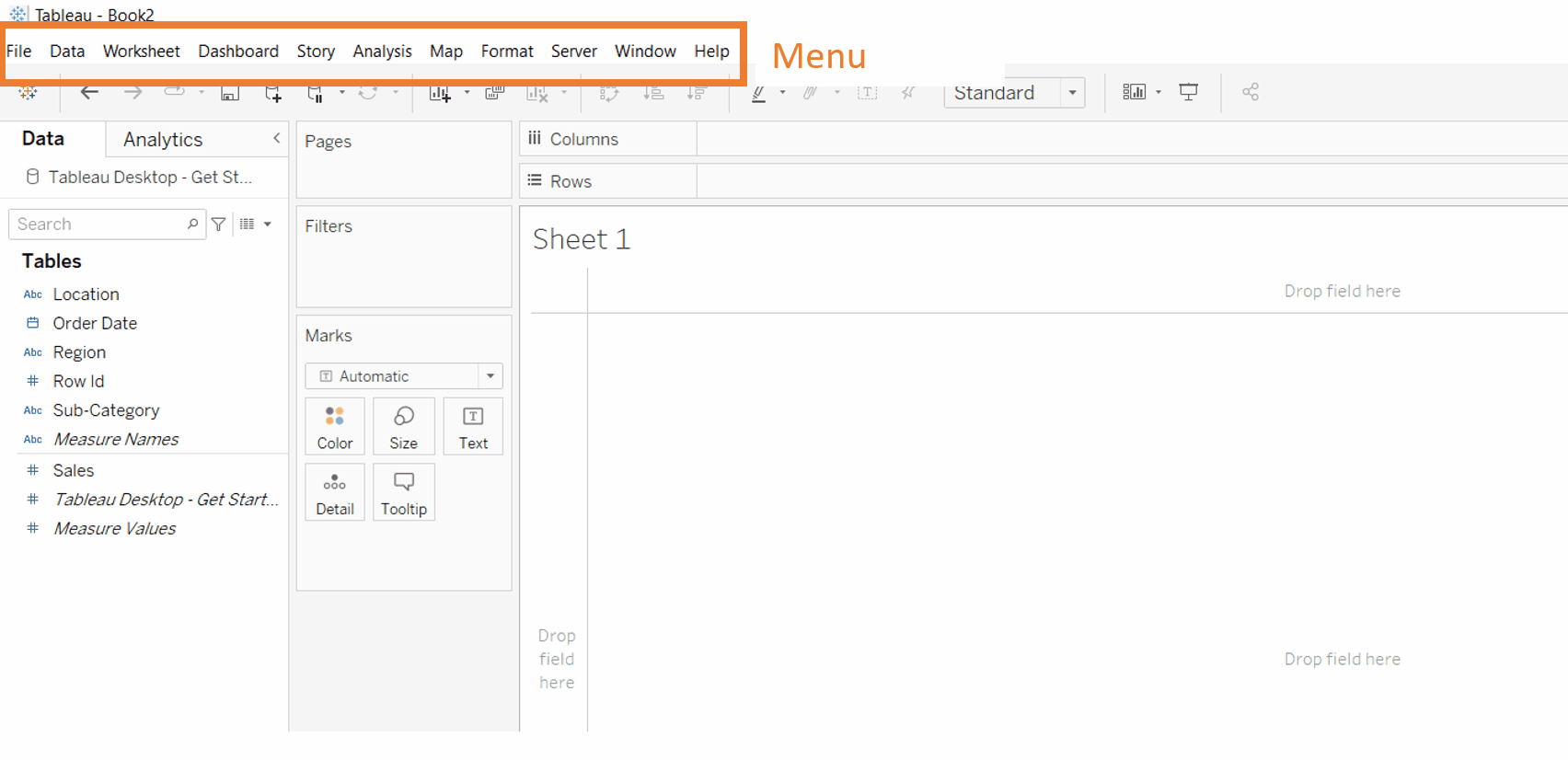
Let’s take a quick tour of the workspace:
- Menu – Explore the different menu options to see what is in each one.
- Toolbar – The toolbar buttons will be greyed out until you have created something to use them with. Hover over each to see a tooltip with its name.
- Worksheet View – This is the area where you will build your visualizations.
- Cards and Shelves – You will drag fields onto these areas to add data to your view.
- Columns and Rows Shelves – Adds headers or axes to the view.
- Filter Card – Adds filters to your view.
- Marks Card – Encodes your visualization (mark type, color, size, shape) or adds additional data to your visualization (tooltips, labels).
- Data Pane – The qualitative data fields are in the top section of the Data pane, and the quantitative fields are in the bottom section. The names you see listed are the column headers from your data. Notice the data type icon? Here, you can change the data types, field names, geographic roles and more, similar to how you did in the Data Preview.
Build Your First Bar Chart
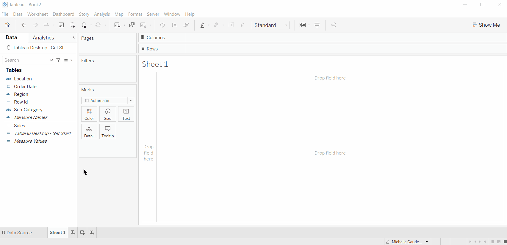
I want to create a horizontal bar chart that shows me the summed sales for each of the product sub-categories in my data. If you look at the Columns and Rows shelves, you’ll notice an icon next to each. Those icons show you the orientation of the headers, or axis tick marks. Some of you may also find it easier to remember that the Rows shelf will create headers or axis tick marks along the vertical axis (Y axis), while the Columns shelf will create headers or axis tick marks along the horizontal axis (X axis). While you are learning, you will likely place them backwards at least once, but no fear! There is an axis swap button in your toolbar:
- Left-click and drag the Sales field from the quantitative section of your Data pane and drop it on the Columns shelf.
- Left-click and drag the Subcategory field from the qualitative section of your Data pane and drop it on the Rows shelf.
- Click the swap axis button in the toolbar (swap back and forth and watch the Sales and Subcategory fields on Rows and Columns).
- Click the Descending Sort button on your toolbar.
- Click the Color card on your Marks card and change the bars to grey.
- Click the Fit dropdown on your toolbar and select Entire View.
Congratulations! You’ve just created your first visualization, and in my opinion, it’s the most useful chart there is! Don’t forget to name the Sheet 1 tab. Double-click on the Sheet 1 tab name and when Sheet 1 turns blue, rename it Sales by Subcategory (you can see me change the name on Sheet 2 in the GIF below).
Before we move on to the next demonstration, I want to take a few minutes to talk about a few things I hope you noticed when you built the bar chart:
- When you dropped Sales (a green field) onto Columns, you got an X axis for the Sales values. In fact, at first, you had a single bar with a value of $863,145. That was the total summed sales for the entire dataset.
- When you added Subcategory (a blue field) to Rows, you got a header for each of the 13 subcategories (along the vertical orientation). These blue fields gave us a breakdown of the sales for each subcategory. If you hover over Phones, you’ll see that it has a summed sales value of $179,515 and if we totaled all of the bars up, we’d be back to $863,145.
The First Concept I Wish I’d Known When I Started My Tableau Journey
The first concept I want you to keep in mind is that Tableau is an aggregator. If I drag a green field to the view, Tableau is going to SUM it by default. Then when we drag a blue field to the view, we are going to segment the value. I like to tell people to remember that the level of detail in the view (a.k.a. segmentation) is the combination of the blue fields on your view (look at your Rows, Columns and Marks card).
What do I mean by blue fields and green fields? Glad you asked. This is one of the most important foundational concepts that I want you to understand.
Blue fields are discrete fields used to segment our data and create headers.
- Discrete fields will often have values that are strings or booleans (T/F), but they can also be numeric values that act like strings (think Row ID). We will discuss dates below, but dates can also be discrete.
- Take, for example, a field called Animals. This field includes the members: cat, dog, horse. It is discrete because an animal can either be a cat or a dog or a horse, but there is no range between cat and dog (unless you are Catdog from the ’90s cartoon).
Animals
Cat
Dog
Horse
Green fields are continuous fields with which we do math in order to get values on an axis or in a table.
- Green fields are numeric and can be integers or floats (a.k.a. decimals). We can SUM, AVG, MIN, MAX, STDV or any other mathematical operation on green continuous fields.
- Take, for example, a field called Age. This field is continuous and can contain any numeric value that represents age from birth to death. Age definitely has a range between values. I can be one year old, 59 years old or anywhere in between. In fact, when we do math on continuous fields we get results that can be any value from the smallest result to the largest. This doesn’t mean that all of the possible values are in my data, but it means we could have values anywhere along the axis when we do math.
Age
1
15
59
After you work in Tableau for a bit, you will start to internalize the concept of Blue Discrete and Green Continuous and you’ll be able to use that knowledge to help you do new and exciting things in Tableau. As you keep practicing, watch how Tableau responds to your actions. One day soon it will click, and you’ll forget that there was a time when you didn’t understand it.
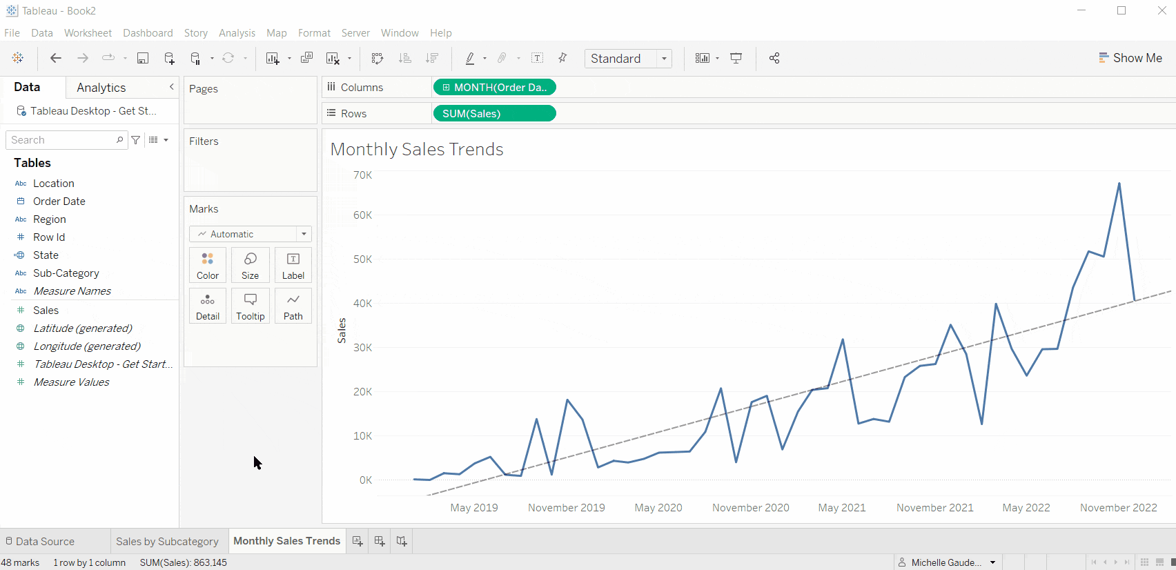
Build a Line Chart
I want to create a chart that lets me see how my Sales have done over time. I have a date field in my Data pane and if you noticed in the Data Preview, it includes four years’ worth of dates at the month level. If you want to check it out now, click on the Data Source tab in the bottom-left of your workbook (left of Sales by Subcategory tab).
Quick Tip: If you left-click-drag a date to Rows or Columns, it will aggregate to the YEAR, and then you’ll right-click on the YEAR field to change it to what you want. OR if you instead right-click-drag the date to Rows or Columns, you will get a dialog box asking you how you want to drop the field. This is my favorite method because it saves me several clicks (they add up):
- Click the New Worksheet icon to the right of Sales by Subcategory tab (hover to see which icons are which).
- Double-click and rename Sheet 2 to Monthly Sales Trends.
- Right-click-drag the Order Date field from the qualitative section of your Data pane to Columns.
- Watch the GIF to see me left-click-drag (yellow highlighter) and then right-click-drag (red highlighter).
- In the Drop Field dialog box, choose the green MONTH(Order Date) option and click OK.
- Left-click and drag the Sales field to your Rows shelf.
- Right-click on the Date axis and delete the Axis Title.
- Right-click in the gridline area of the chart and Show Trend Lines.
The Second Concept I Wish I’d Known When I Started My Tableau Journey
There are two types of dates in Tableau: Blue Discrete Date Parts and Green Continuous Date Values.
Let’s start with the date type we are all used to.
Green Continuous Dates give us a timeline.
- Continuous dates include combined parts of the date (month + year, month + day + year, quarter + year) and sit on specific points in the timeline.
- Continuous timelines are chronological.
- Think of Continuous Dates like any other continuous field; there is a range between values.
- When you change a date to a continuous date or set the aggregation:
- In the Drop Field dialog box, look for the green calendar icons (see GIF above).
- In the right-click menu, look for the section with May 2015 hint (see GIF above).
Blue Discrete Dates give us headers and are often used in date calculations.
- Blue Discrete Dates are the building blocks of dates (year, month, day, week, quarter).
- Discrete dates act like buckets for data (i.e. all January data regardless of year) and are not chronological.
- Think of Discrete Dates like any other discrete field; there is no range between discrete dates.
- Most dates start off as blue fields in the Data pane. When you use that date in your view, you will change it to whatever type of date and aggregation you need.
- When you change a date to a discrete date or set the aggregation:
- In the Drop Field dialog box, look for the blue icons (see GIF above).
- In the right-click menu, look for the section with the May hint (see GIF above).
Troubleshooting Tip: If you find your line charts breaking, make sure you don’t have any blue fields that might be segmenting your data on your timeline.
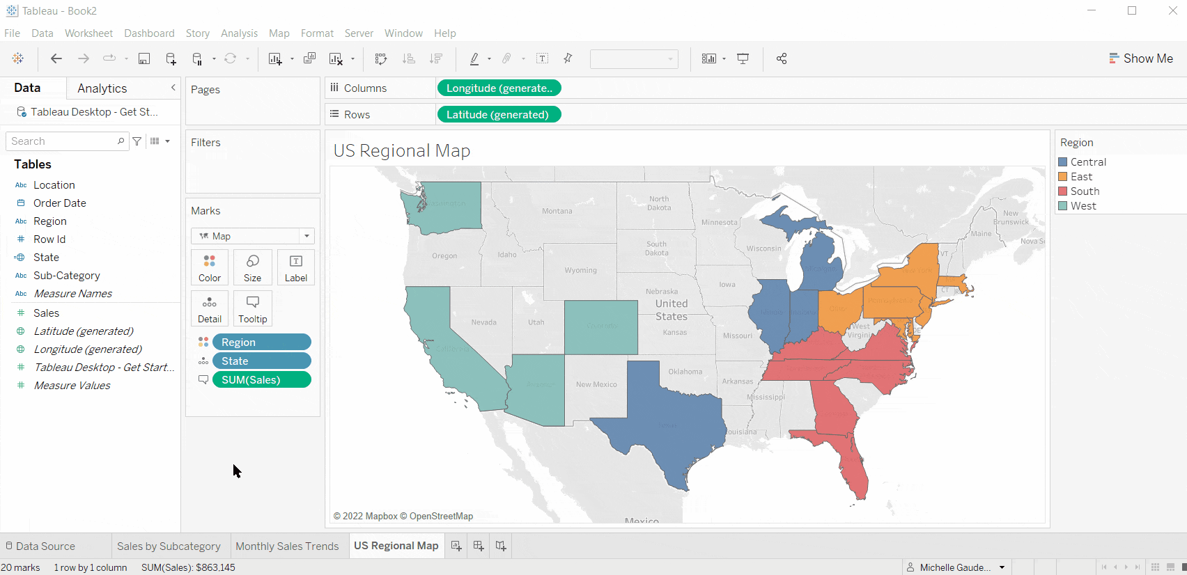
Build a Map
When you downloaded Tableau Desktop, included in the installation was a database of global latitude and longitude coordinates for each of the geographic roles we can assign to data. In our data, we have a field called Locations with the Country and State combined, so we split them off and created a State field. When we assigned the geographic role to State, Tableau created latitude and longitude coordinates for each State in our data. You can see the generated latitude and longitude coordinates in the quantitative section of your Data pane.
I want to create a map showing the States in which I have store locations colored by the Region. To tell Tableau you want a map, you just need to left-click-drag the geographic field to the Detail card on the Marks card. I like to think of this as a trigger pattern, or an action I do that triggers a behavior in Tableau. Tableau will automatically add latitude and longitude to Rows and Columns and will generate a map image on your view:
- Click the New Worksheet icon and rename Sheet 3 to US Regional Map.
- Left-click-drag State from the qualitative section of your Data pane to the Details card on the Marks card.
- Left-click-drag Region from the qualitative section of your Data pane to the Color card on the Marks card.
- Change the mark dropdown on the Marks card from Automatic to Map.
- Left-click-drag Sales from the quantitative section of your Data pane to the Tooltip card on your Marks card.
- Hover over Texas to see the tooltip showing the Texas data.
- Format the Sales number:
- Right-click on Sales in the Data pane.
- Select Default Properties and Number Format.
- Choose Currency (custom) and change the decimal place to zero (this is also where you could set the way negative values look and use unit symbols such as M, K, B).
When you built your map, did you notice that it started with circle marks on each State? When I added Region, a Blue Discrete field, to the Color Card, the mark type stayed set to Automatic and we changed it to the filled map. If we had colored by Sales, a Green Continuous field, the mark type would have changed to filled automatically. You’ll notice and start to anticipate how Tableau reacts based on the types of data you use and where you place them. You can always change the mark type to one more suited to what you are trying to do, if needed.
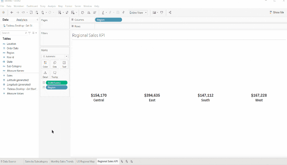
Build a Key Performance Indicator
Key Performance Indicators (KPIs) come in all shapes and sizes, but the one thing they all have in common is that they provide a quick view of a value, trend or summary of your data. The KPI we are going to build is also a great opportunity for me to show you to how to build a text table in Tableau. In fact, I’ll show you how to build a table and then I’ll remove the segmentation and leave only the level of detail we want for this KPI.
I want to show the summed sales for each Region in our data. Using the map, users can see the State sales values, but I want to give the higher overview as a KPI. I am going to format the KPI so that the numbers are large, labeled and quickly readable.
Create a Table
- Click the New Worksheet icon and rename Sheet 4 to Regional Sales KPI.
- Left-click-drag Sales to the Text card on the Marks card.
- Left-click-drag Region to Columns.
- Left-click-drag Subcategory to Rows.
Convert to KPIs
- Drag Subcategory to the trashcan (the blank area under the Marks card).
- Change the Fit dropdown in the toolbar to Entire View.
- Left-click-drag another copy of Region from the Data pane to the Text card on the Marks card.
- Click the Text card to open the editing options.
- Change Alignment to Center.
- Click the Text menu button (box with three dots) to open the Text Editor.
- Highlight SUM(Sales) and make it 14 pt font.
- Highlight Region and make it 12 pt font.
- Highlight both fields and change the font to Tableau Bold and set the color to Black.
- Click Apply to see your changes and then OK to close the editor.
- Right-click Regions on Columns and uncheck Show Header.
Dashboard Best Practices
I now have several visualizations showing different segmentations of the Sales data, and I want to put them all in one place my stakeholders can explore. This is where dashboards enter the scene. Tableau provides interactivity features (for another post) that allow my stakeholders to click on my dashboard to filter, highlight or even drill into more detail based on the questions they have.
People tend to engage with things that make them happy, are easy to use and provide them value. Dashboards and charts are no different. When building a dashboard, keep the following guidelines in mind:
- Display related charts to answer questions. Your dashboard should include the relevant data required to answer the questions your stakeholders have. Don’t be tempted to throw unrelated charts into your dashboard just because you built them.
- Start with high-level overviews. People get overwhelmed when they are presented all of the information at once. Start with KPIs and large segmentations of your data, so stakeholders can get an understanding of the big picture before diving into the weeds.
- Provide additional detail on demand. Use features like tooltips and subtitles to provide detail and context to your charts without cluttering them with tons of labels. Use filters and Tableau’s interactivity functions to let users choose the segmentations of the data they want to drill into.
- Keep it clean and intuitive. Give your viewers rest for their eyes with whitespace. They will appreciate it! Make sure they know what to do, where to click, what charts to look at first. Check out the InterWorks Checklist for Dashboard Design to get more information.
Build a Dashboard
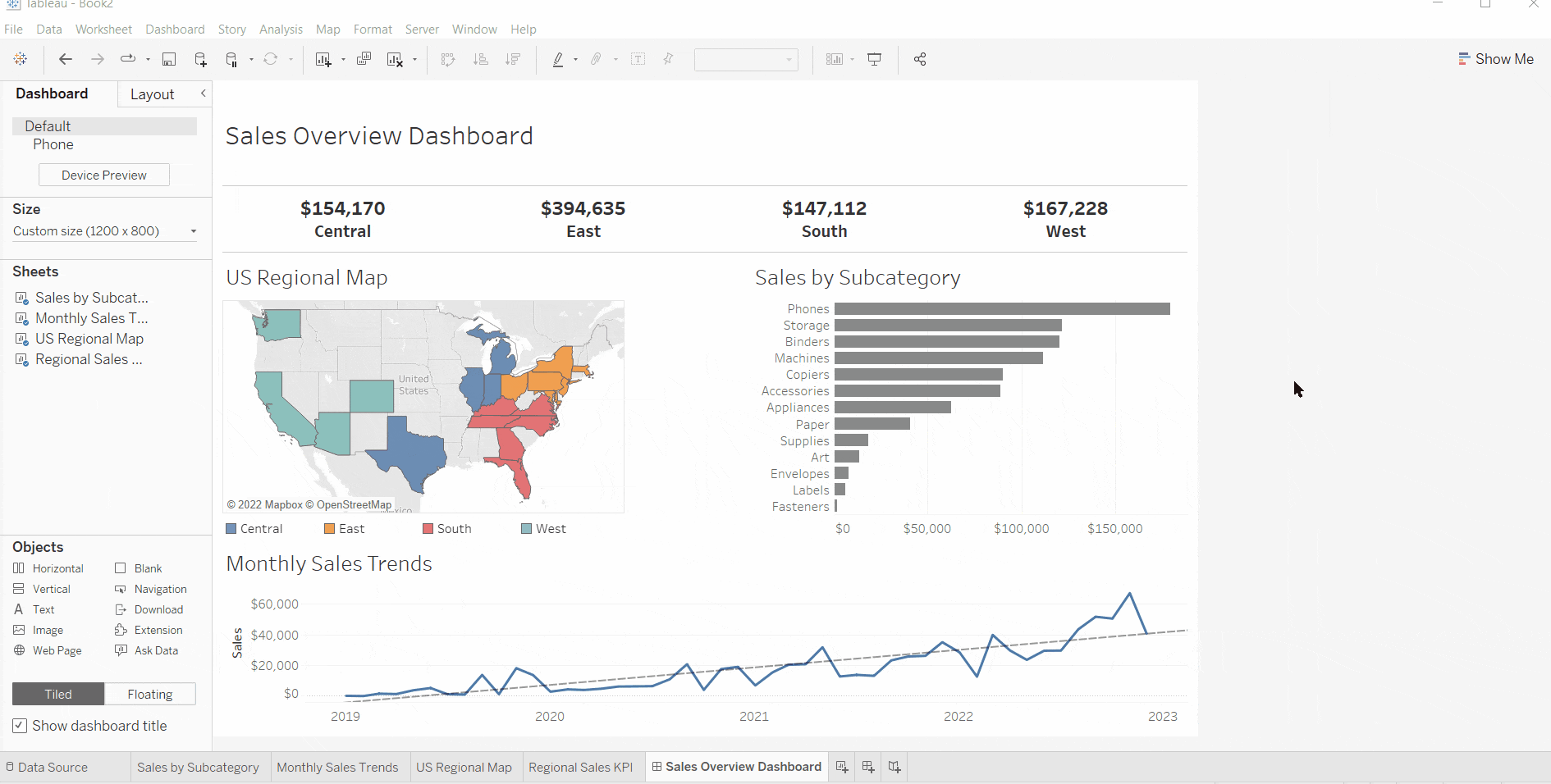
Let’s add the four visualizations we’ve created to a dashboard and then make it clean:
- Click the New Dashboard icon to the right of the KPI tab. Rename Dashboard 1 to Sales Overview Dashboard.
- Click the size dropdown in the Dashboard pane and increase the width and height to a size you like (I’m using 1200 x 800).
- Drag the US Regional Map from the Sheets section of the Dashboard pane to the Dashboard View.
- Drag Sales by Subcategory to the Dashboard View and put it between the map and the color legend.
- Drag the Regional Sales KPI to the top of the Dashboard View.
- Drag Monthly Sales Trends to the bottom of the Dashboard View.
- Click the Show Dashboard Title checkbox at the bottom of the Dashboard pane.
- Resize the dashboard title and charts; click and drag the border to resize.
- Hide extra chart elements:
- KPI: Right-click to hide the title.
- Bar Chart: Right-click and edit Axis to delete the axis title.
- Bar Chart: Right-click on the Subcategory field label to hide field labels for Rows.
- Move the color legend under the map:
- Drag the handlebar on the top border.
- Right-click and uncheck the legend title.
- Click the drop-down arrow on the legend toolbar and select Arrange Items and Single Row.
- Resize the legend.
- I added a blank object from the Dashboard Objects and resized it to give more whitespace between the map and the bar chart.
BONUS!
I want to show you one more thing. Remember earlier when I said you could allow stakeholders to click and filter your dashboard? I want to have my viewers click a State on the map and filter the bar chart and the line chart to show only data for the selected State. However, I want to leave the KPI alone.
Are you ready?
- Click on the Dashboard menu and select Actions.
- On the dialog box, click Add Action and select a Filter Action.
- Name the action State Filter.
- The Source is the sheet we want to click on, so select only the map.
- Running the action on Select will activate the filter when the user clicks a State.
- The Target is the sheet we want to filter—the bar chart and the line chart but neither the KPI nor the map (uncheck both).
- Clearing the selection will show all values.
- Click OK and OK again, and test your new filter!
How awesome and easy was that!?!
I hope I have gotten you excited about what you can do, and do pretty quickly, using Tableau. See how you do in the first two hours using what you’ve learned here. Let me know how it goes. I’m always excited to hear about your Tableau stories!
Happy visualizing!
Want More InterWorks Support?
Here are some fundamental resources to keep you going:
- Tableau Essentials – Scroll to the bottom to see the full list of topics. I am actively updating this series to include updates and new images. While the images may look a bit dated, the content is still relevant.
- A Lite UI Checklist for Dashboard Design – There is a convenient PDF download at the end of this post. Check out David’s awesome advice to make your dashboard effective and enjoyable to use.
- Virtual Event Recap: Data Prep in Tableau Desktop – This blog includes a webinar recording and tons of resources to help with every aspect of the data-prep process.
Are you looking for more comprehensive assistance? Maybe something more niche? At InterWorks, we can help with more than Tableau. From IT networking and cloud migration to custom training and strategic roadmapping, we’d love to partner with you. Reach out to our team, and let’s talk about what you want to accomplish with your data. Chances are good that we have expertise and experience in the solution that will help you achieve your goals. We look forward to beginning the conversation!